9 Best Practices for User Interface Design in 2025

In a crowded digital marketplace, a seamless and intuitive user interface (UI) is the defining line between a product that thrives and one that gets left behind. Users now expect digital experiences that are not just functional, but also effortless and delightful to interact with. A well-executed UI directly translates to higher engagement, better customer retention, and a stronger bottom line for any business.
This article moves beyond generic advice to provide a detailed roadmap for creating superior digital products. We will explore nine core best practices for user interface design, each packed with actionable strategies and real-world examples. You will learn how to implement everything from a user-centered design process and clear visual hierarchy to responsive layouts and robust accessibility standards.
Whether you're a startup founder looking to build an MVP, a product manager scaling a platform, or a CTO extending your team's capabilities, mastering these concepts is crucial. This guide provides the foundational knowledge needed to build interfaces that not only meet user expectations but exceed them, ensuring your product achieves its business goals. Let’s dive into the essential elements that will elevate your UI from merely functional to truly exceptional.
1. Master User-Centered Design (UCD)
At its core, User-Centered Design (UCD) is an iterative design philosophy that places the end-user at the heart of the entire process. Instead of creating an interface and expecting users to adapt, UCD adapts the interface to meet users' needs, behaviors, and goals. This foundational approach is a cornerstone of the best practices for user interface design because it ensures the final product is built on a bedrock of empathy and real-world data.

The UCD process prioritizes solving genuine user problems, leading to interfaces that are not only functional but also intuitive, enjoyable, and valuable. A classic example is Airbnb’s booking flow, which was refined through countless hours of user observation and testing to reduce friction and build trust. Similarly, Slack’s highly customizable workspace features directly resulted from understanding how different teams communicate and organize their work.
Actionable Takeaways for UCD
To successfully implement UCD, start by deeply understanding your audience. This involves continuous engagement with users at every stage of development.
- Conduct Pre-Design Research: Before a single pixel is placed, conduct user interviews and surveys to gather qualitative and quantitative insights. This initial discovery phase prevents designing based on flawed assumptions.
- Develop User Personas and Journey Maps: Create detailed user personas to represent your target audience segments. Map their potential journeys to identify pain points and opportunities for improvement within the interface.
- Test Prototypes Early and Often: Build low-fidelity wireframes or interactive prototypes and test them with real users. This iterative feedback loop is crucial for catching usability issues before they become expensive to fix.
- Involve Stakeholders in Research: Invite product managers, developers, and executives to observe usability testing sessions. Witnessing user struggles firsthand creates a powerful, shared sense of empathy and urgency.
2. Maintain Rigorous Consistency and Standards
Consistency is the silent partner of intuitive design. It involves maintaining uniformity in design elements, interactions, and behaviors across an entire interface and, ideally, across multiple products on the same platform. This practice, a key tenet of the best practices for user interface design, ensures that users don't have to learn new rules for different parts of your application. When elements look and behave predictably, users can apply prior knowledge to navigate new features, significantly reducing cognitive load and increasing efficiency.

This principle is powerfully demonstrated by established design systems like Apple’s Human Interface Guidelines and Google’s Material Design. When you switch between Gmail, Google Drive, and Google Calendar, the consistent placement of menus, button styles, and iconography creates a seamless, unified experience. This predictability builds trust and makes the entire ecosystem feel familiar and easy to master. Similarly, Salesforce's Lightning Design System ensures that its complex B2B applications remain cohesive and learnable for enterprise users.
Actionable Takeaways for Consistency
Building a consistent interface requires a systematic approach, grounded in a centralized source of truth that guides every design decision.
- Establish a Comprehensive Design System: Create a detailed design system or style guide that documents colors, typography, spacing, component states, and voice and tone. This serves as the single source of truth for designers and developers.
- Use Design Tokens: Implement design tokens (variables for visual properties like color, spacing, or font size) in your codebase. This ensures that any update to a core style propagates automatically across the entire application, enforcing consistency programmatically.
- Conduct Regular Audits: Periodically review your interface to identify and correct inconsistencies that have emerged over time. These audits are crucial for maintaining design integrity, especially as new features are added and teams evolve.
- Promote Shared Ownership: Ensure both designers and developers are trained on the design system and feel responsible for upholding its standards. Consistency is a team sport that thrives on shared understanding and collaboration.
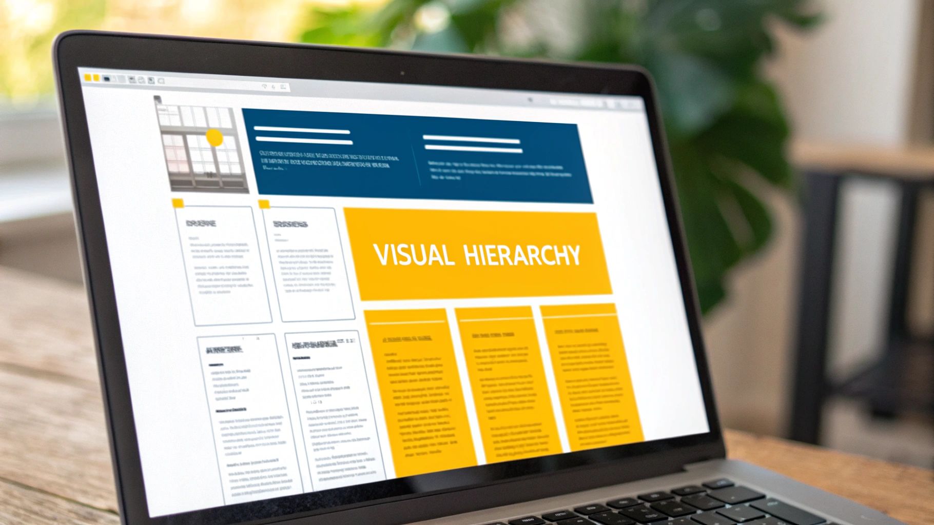
3. Clear Visual Hierarchy
A clear visual hierarchy is the art of arranging interface elements to signal their relative importance and guide the user's eye naturally through the content. It’s a fundamental principle among the best practices for user interface design because it turns a chaotic jumble of information into a clear, scannable, and intuitive path. By strategically using size, color, contrast, and spacing, designers can create a logical flow that directs attention to what matters most.
This practice is essential for reducing cognitive load, allowing users to process information effortlessly without feeling overwhelmed. Think of Spotify's interface, where album art is prominent, followed by the song title, and then the artist name, creating an immediate sense of priority. Similarly, Medium’s article layouts use powerful typography and spacing to distinguish headlines, subheadings, and body text, making long-form content highly readable and digestible. This deliberate organization is what makes a design feel both professional and user-friendly.
Actionable Takeaways for Visual Hierarchy
To establish an effective hierarchy, you must make deliberate choices about which elements should capture attention first. This ensures users can complete their tasks efficiently.
- Establish a Spacing System: Implement a consistent spacing model, such as an 8pt grid system. Using multiples of a base unit (e.g., 8px, 16px, 24px) for margins and padding creates a rhythmic, organized, and visually harmonious layout.
- Leverage Size and Scale: The most important elements, like primary headlines and call-to-action buttons, should be the largest. This immediately draws the user's eye and establishes a clear starting point for their journey.
- Use Color and Contrast Strategically: Employ a limited color palette to highlight interactive elements and key information. High contrast should be reserved for the most critical components, guiding focus and improving accessibility.
- Test with the "Squint Test": Zoom out or squint at your design until the text becomes blurry. The elements that still stand out are the ones with the strongest visual weight. This simple test quickly reveals if your hierarchy is working as intended.
4. Responsive and Adaptive Design
Responsive and Adaptive Design is the crucial practice of crafting interfaces that deliver an optimal viewing and interaction experience across a vast range of devices, from desktops to tablets and mobile phones. Instead of creating separate, rigid designs for each screen size, this approach uses flexible layouts, scalable images, and fluid grids that automatically adjust to fit the user's screen. Embracing this is a fundamental best practice for user interface design in today's multi-device world.

This methodology ensures that usability and aesthetic appeal are never compromised, regardless of how a user accesses the interface. A prime example is The Guardian's website, which provides a seamless reading experience whether viewed on a large monitor or a small smartphone. Similarly, frameworks like Bootstrap have popularized responsive principles, enabling developers to build interfaces that look and function great everywhere. This approach is essential for maintaining user engagement and ensuring accessibility for all.
Actionable Takeaways for Responsive and Adaptive Design
Implementing a successful responsive strategy requires a mobile-first mindset and a focus on content hierarchy. Prioritizing the mobile experience first forces you to focus on what's most important.
- Adopt a Mobile-First Approach: Start designing for the smallest screen first and then progressively enhance the layout for larger screens. This popular methodology, championed by Luke Wroblewski, ensures the core experience is solid on constraint-heavy devices.
- Utilize Flexible Layouts with CSS: Master modern CSS tools like Flexbox and Grid to create layouts that can fluidly contract and expand. These tools provide powerful control over alignment and spacing across different viewport sizes.
- Optimize Media and Assets: Serve different image sizes and resolutions based on the user's device and screen density. This dramatically improves loading times, which is a critical factor for mobile users.
- Test on Real Devices: While browser emulators are useful for quick checks, nothing beats testing on a variety of actual physical devices. This is the only way to accurately gauge performance, touch target accuracy, and overall usability. For additional insights, learn more about mobile app development tips on getnerdify.com.
5. Prioritize Intuitive Navigation
Intuitive navigation is the invisible hand guiding users effortlessly through your interface. It’s a critical component of the best practices for user interface design because if users can't find what they're looking for, the most brilliant features become useless. This principle, famously summarized by Steve Krug's "Don't Make Me Think," dictates that navigation should be self-evident, predictable, and consistent, allowing users to accomplish their goals with minimal cognitive load.
A well-designed navigation system feels natural because it aligns with users' mental models and expectations. Consider Amazon's mega-menu, which effectively organizes a massive inventory into logical categories, or Dropbox's simplified folder structure that mirrors desktop file systems. These examples succeed by creating a clear information architecture that reduces confusion and empowers users to explore confidently. The goal is to make finding information feel like second nature, not a puzzle.
Actionable Takeaways for Intuitive Navigation
To build a navigation system that users love, focus on clarity, familiarity, and user feedback from the very beginning.
- Conduct Card Sorting Exercises: Before finalizing your sitemap, use card sorting to understand how users naturally group and label content. This user-driven approach ensures your information architecture is logical to the people who will actually use it.
- Use Familiar Navigation Patterns: Leverage established conventions like a top navigation bar for websites or a bottom tab bar for mobile apps. These familiar patterns reduce the learning curve and make your interface immediately understandable.
- Implement Clear Visual Cues: Use breadcrumbs, highlighted active menu items, and consistent headings to show users exactly where they are. This "You are here" signposting prevents disorientation and builds user confidence.
- Test Navigation with First-Time Users: Observe new users attempting to complete key tasks without any guidance. Their initial struggles are invaluable for identifying confusing labels, hidden links, or illogical pathways that need refinement.
6. Accessibility and Inclusive Design
Accessibility and inclusive design are crucial practices that ensure interfaces are usable by everyone, regardless of their abilities or circumstances. This approach extends beyond accommodating disabilities to consider people in diverse situations, such as those with slow internet connections or temporary injuries. Making this one of the core best practices for user interface design demonstrates a commitment to ethical responsibility and expands your potential user base.
This philosophy prioritizes creating equitable experiences, leading to more robust and user-friendly products for all. For instance, Microsoft’s Inclusive Design toolkit has guided the creation of features like the Xbox Adaptive Controller. Similarly, Twitter's feature for adding alternative (alt) text to images allows users of screen readers to understand visual content, making the platform more inclusive. Following an essential website accessibility checklist can provide a structured path to compliance and better usability.
Actionable Takeaways for Accessibility
Integrating accessibility from the start is more efficient than retrofitting it later. This requires a conscious effort throughout the design and development lifecycle. You can learn more about making your website accessible and dive deeper into this topic.
- Follow WCAG 2.1 AA Guidelines: Adhere to the Web Content Accessibility Guidelines (WCAG) as your baseline standard. These guidelines cover a wide range of recommendations for making web content more accessible to people with disabilities.
- Prioritize Semantic HTML: Use HTML elements according to their intended purpose. Proper use of headings (
<h1>to<h6>), landmarks (<main>,<nav>), and form labels ensures that assistive technologies can interpret the page structure correctly. - Ensure High Color Contrast: Check that your text and interactive elements have a sufficient contrast ratio against their background. This is vital for users with low vision or color blindness. Use tools to verify your color palette meets at least the AA standard.
- Test with Assistive Technologies: Regularly test your interface using keyboard-only navigation and screen readers like NVDA, JAWS, or VoiceOver. Involve users with disabilities in your testing process to gather authentic feedback and uncover real-world barriers.
7. Effective Feedback and Error Handling
Effective feedback is the silent conversation an interface has with its user, confirming actions, indicating status, and preventing confusion. This systematic approach involves providing clear, timely information about what the system is doing. When done correctly, it builds user confidence and reduces anxiety. A core part of this practice is graceful error handling, which transforms frustrating dead ends into helpful guidance, a critical component of the best practices for user interface design.
This principle ensures users are never left guessing. Consider Stripe’s real-time form validation, which provides immediate feedback on field entries, preventing submission errors before they happen. Another powerful example is Gmail’s “Undo Send” feature, which offers a brief window to reverse an action, providing a safety net that users deeply appreciate. To provide truly effective feedback and enhance user delight, delve into the subtle yet powerful role of microinteractions. Mastering the best practices for microinteractions in UX design can elevate your interface from functional to fantastic.
Actionable Takeaways for Feedback and Error Handling
To implement robust feedback loops, anticipate user actions and design clear, constructive responses for both successes and failures.
- Be Specific and Solution-Oriented: Instead of a generic "Invalid Input" message, state exactly what is wrong and how to fix it, such as "Password must contain at least one number."
- Use Positive and Human Language: Avoid technical jargon or accusatory language like “illegal operation.” Frame messages constructively and politely to guide the user without causing frustration.
- Implement Contextual Feedback: Provide feedback directly where the action occurs, like inline validation next to a form field. Use visual cues like loading spinners or progress bars for actions that take time.
- Test Error Scenarios Thoroughly: Actively try to break the system during development. Test edge cases, invalid data entries, and network failures to ensure your error messages are helpful and your interface recovers gracefully.
8. Performance and Loading Optimization
Performance and loading optimization is the critical practice of ensuring an interface loads quickly and responds smoothly to user interactions. In an era of shrinking attention spans, speed is no longer just a feature; it's a fundamental aspect of the user experience. A slow interface creates frustration and can lead to abandonment, while a fast, responsive one builds user confidence and satisfaction. This practice is a key component of the best practices for user interface design because it directly impacts usability and perception.
This design principle is about both actual and perceived performance. LinkedIn’s use of skeleton screens, which display placeholder shapes where content will appear, makes the app feel faster even before all data has loaded. Similarly, Instagram’s progressive image loading, where a blurry, low-resolution version appears first and sharpens as it loads, provides immediate visual feedback. These techniques manage user expectations and make waiting less noticeable, creating a seamless experience. For more detailed technical insights on optimizing speed and responsiveness, explore various strategies to improve mobile app performance.
Actionable Takeaways for Performance and Loading Optimization
To deliver a high-performance interface, focus on both technical optimizations and user-centric feedback mechanisms. A fast UI is the result of deliberate design and development choices.
- Implement Perceived Performance Improvements: Use design elements like skeleton screens, progress bars, and animations to provide immediate feedback during loading states. This makes the wait time feel shorter and more engaging.
- Optimize the Critical Rendering Path: Prioritize loading above-the-fold content first. Defer the loading of non-critical CSS and JavaScript to ensure users see meaningful content as quickly as possible.
- Compress and Optimize Assets: Ensure all images, videos, and other media are properly compressed and served in modern formats (like WebP for images) without sacrificing quality. Leverage a Content Delivery Network (CDN) to serve assets from locations closer to the user.
- Regularly Audit and Monitor: Use tools like Google PageSpeed Insights and Lighthouse to regularly audit your interface’s performance. Continuously monitor metrics to catch and address performance regressions before they impact users. Learn more about improving app performance on getnerdify.com.
9. Minimalism and Cognitive Load Reduction
Minimalism in UI design is the practice of presenting only the most essential elements, content, and functionality to the user. This "less but better" philosophy directly tackles cognitive load, which is the mental effort required to use an interface. By deliberately removing visual clutter and unnecessary components, you create a design that is clean, clear, and focused, making it one of the most effective best practices for user interface design.
This approach ensures that every element on the screen serves a distinct purpose, guiding users toward their goals without distraction. A prime example is Google's search homepage, a masterclass in minimalism that prioritizes a single user action. Similarly, Apple's iOS interface philosophy emphasizes clarity and deference to content, using ample white space and simple iconography to keep the focus on what matters to the user.
Actionable Takeaways for Minimalism
Implementing a minimalist aesthetic requires disciplined prioritization and a deep understanding of user needs. It's about strategic subtraction, not just removing things arbitrarily.
- Prioritize Ruthlessly: Apply the 80/20 rule to features. Identify the 20% of functionalities that 80% of your users need and make them prominent. Less critical features can be moved to secondary menus or settings.
- Use Progressive Disclosure: Don't overwhelm users with every option at once. Reveal advanced features or complex information only when a user requests it, keeping the initial interface simple and approachable.
- Leverage White Space: Treat white space (or negative space) as an active design element. Use it generously to create visual hierarchy, improve readability, and give content room to breathe.
- Focus on Core User Tasks: Constantly audit your interface to ensure every element directly supports a core user task. If an element doesn't contribute to helping the user achieve their goal, question its existence.
Best Practices for UI Design Comparison
| Aspect | User-Centered Design (UCD) | Consistency and Standards | Clear Visual Hierarchy | Responsive and Adaptive Design | Intuitive Navigation | Accessibility and Inclusive Design | Effective Feedback and Error Handling | Performance and Loading Optimization | Minimalism and Cognitive Load Reduction |
|---|---|---|---|---|---|---|---|---|---|
| Implementation Complexity 🔄 | High - iterative process requiring skilled UX resources | Medium - requires discipline and initial setup of design system | Medium - needs careful balance and regular review | High - complex testing and adaptive layouts | Medium - challenging for complex apps, ongoing maintenance | High - specialized knowledge and thorough testing | Medium - balancing helpfulness without clutter | High - ongoing monitoring and optimization | Medium - careful prioritization and continuous auditing |
| Resource Requirements 🔄 | Significant time and user involvement | Time-consuming initial design system setup | Moderate design effort for typography and spacing | Extensive testing on multiple devices | User research and iterative testing required | Additional development time and specialized testing | Development effort for real-time feedback and error states | Investment in asset optimization and monitoring | Focus on simplicity may require redesign of workflows |
| Expected Outcomes 📊 | ⭐⭐ High user satisfaction, engagement, and conversion | ⭐⭐ Consistent UI, reduced cognitive load, faster dev | ⭐⭐ Improved scanability and comprehension | ⭐⭐ Seamless multi-device experience, accessibility | ⭐⭐ Reduced frustration, higher task success | ⭐⭐ Broader user base, legal compliance, improved usability | ⭐⭐ Reduced errors, increased trust and confidence | ⭐⭐ Faster load times, better retention and SEO | ⭐⭐ Faster comprehension, less anxiety, timeless design |
| Ideal Use Cases 💡 | Complex, user-focused products needing deep insights | Platforms needing uniformity and scalable design | Content-rich interfaces needing clear information flow | Multi-device applications requiring adaptability | Sites/apps with diverse content and deep navigation | Products targeting diverse abilities and compliance needs | Systems with critical task flows requiring error control | Performance-sensitive applications with large user bases | Interfaces needing simplicity and focus on primary tasks |
| Key Advantages ⭐ | Data-driven, reduces support costs, increases conversions | Builds trust, easy maintenance, reusable components | Guides attention effectively, enhances accessibility | Future-proof, cost-effective vs. separate apps | Improves findability, reduces cognitive load | Expands market, improves SEO, social responsibility | Builds confidence, prevents errors, clear communication | Enhances perceived speed, reduces bounce rates | Reduces mental load, improves usability, ages well |
Transforming Principles into Powerful User Interfaces
Mastering the best practices for user interface design is not a one-time task but a continuous journey of refinement, testing, and learning. Throughout this article, we’ve explored nine foundational pillars that transform good interfaces into truly exceptional ones. Each principle, from the foundational philosophy of User-Centered Design (UCD) to the practical necessity of performance optimization, is a critical piece of a larger puzzle. They are not isolated rules but interconnected concepts that work in synergy to create a seamless and intuitive user experience.
The ultimate goal is to build interfaces that feel invisible. When a user can navigate, find information, and complete tasks without ever consciously thinking about the layout, the buttons, or the menus, you have achieved a state of design excellence. This is the power of implementing a strong visual hierarchy, ensuring intuitive navigation, and ruthlessly minimizing cognitive load. The most successful products don't just look visually appealing; they empower users by removing friction and making complex processes feel simple.
Bridging Theory and Actionable Results
To truly internalize these concepts and translate them into tangible outcomes for your startup, enterprise, or nonprofit, you must move from passive learning to active application. Don't let this guide become just another bookmarked article. Instead, use it as a practical checklist for your next project or a diagnostic tool for an existing one.
Here are your actionable next steps:
- Conduct a UI Audit: Use the nine practices discussed as a scorecard to evaluate one of your current applications. Where does it excel? Where are the critical gaps in accessibility, feedback, or consistency? This process will reveal immediate opportunities for high-impact improvements.
- Prioritize a Single Principle: Trying to fix everything at once can be overwhelming. Pick one area, such as Effective Feedback and Error Handling, and dedicate your next development sprint to perfecting it. Small, focused wins build momentum and deliver noticeable value to your users.
- Champion Accessibility from Day One: Integrate accessibility checks into your design and QA processes from the very beginning, not as an afterthought. This proactive approach not only expands your audience but also enhances the experience for all users and protects your brand.
By consistently applying these best practices for user interface design, you are not just building screens; you are building trust, fostering user loyalty, and creating a powerful engine for business growth. The investment you make in a superior UI directly translates into higher engagement, better conversion rates, and a stronger competitive advantage. Embrace these principles not as constraints, but as a framework for creativity and a guide to building products that people love to use. Your users, and your bottom line, will thank you.