7 Best Web Form Design Examples for Better UX

Attractive forms don't automatically convert. The best form is the one users finish, and that usually depends less on visual polish than on interaction model, field strategy, accessibility, and what happens after submission. Teams still lose a large share of starts before completion. Industry benchmarking cited in form abandonment research reports an average web form abandonment rate of 67.9%, with B2C lead-capture forms at 72.3% and e-commerce account-creation forms at 71.1%.
That's why the best web form design isn't a beauty contest. It's a set of business decisions. Should the experience feel conversational or document-like? Should the form collect data, or trigger approvals, signatures, and CRM workflows? Should a team optimize for brand control, implementation speed, or lower operating cost?
The seven options below work best when treated as design patterns, not just software picks. The evaluation lens is practical: clarity, cognitive load, accessibility, data handling, integrations, and operational follow-through. For founders, CTOs, product managers, and marketing leaders comparing build partners as well as tools, Nerdify can support the work behind these choices through UX/UI design, web and mobile development, digital marketing, and Nicaragua-based nearshore delivery.
Table of Contents
- 1. Services
- 2. Typeform
- 3. Jotform
- 4. Formstack
- 5. Paperform
- 6. Tally
- 7. Fillout
- Top 7 Web Form Builders: Feature Comparison
- Turn Form Patterns Into a Better Funnel
1. Services
Nerdify Services fits this list differently from the other entries because it isn't a form builder. It's the delivery partner for teams that need the form itself, the surrounding product, the backend workflow, and the growth layer to work together. That matters when a form isn't just a contact box, but a funnel entry point, onboarding gate, quote request, checkout path, or mobile workflow.
Nerdify is a Nicaragua-based nearshore development partner with 9+ years of experience and 100+ projects across 10 countries. For companies evaluating the best web form design in a broader product or campaign context, that range is useful. The same partner can handle UX/UI, responsive web development, iOS and Android work, integration logic, and the marketing layer that drives qualified traffic into the form.
Where Nerdify fits best
This is the strongest option when off-the-shelf builders won't solve the whole problem. A startup may need a fast lead-gen flow tied to CRM enrichment and analytics. An enterprise team may need an accessible intake experience connected to internal systems. A product team may need forms embedded inside an account area, not hosted on a separate platform.
A practical advantage is alignment across disciplines. When design, development, and growth teams work from the same requirements, forms are less likely to break between departments. That reduces a common problem where marketing optimizes conversion, product optimizes data quality, and engineering inherits the cleanup.
Practical rule: Choose a studio, not just a tool, when the form changes downstream operations, customer qualification, or application logic.
Trade-offs and decision factors
Nerdify isn't the fastest path for a simple newsletter form, and it shouldn't be. A full-service partner makes more sense when the form experience affects multiple systems or needs stronger control over accessibility, validation behavior, analytics, and post-submit journeys.
The main limitation is that the services page doesn't provide detailed scope, pricing, or packaged comparisons. Teams will usually need an initial conversation to define the right delivery model, whether that's end-to-end execution or nearshore staff augmentation.
A good fit usually looks like this:
- Cross-functional delivery: UX/UI, web, mobile, and digital marketing can be scoped together instead of split across vendors.
- Nearshore collaboration: Time-zone alignment and cultural proximity help when teams need active iteration, not handoff-heavy outsourcing.
- Growth plus product thinking: Form completion is only one metric. Lead quality, routing, follow-up speed, and lifecycle performance matter too.
- Flexible engagement: Some teams need a product squad. Others need specific engineering or design capacity added to an internal roadmap.
For organizations treating forms as business infrastructure rather than page furniture, Nerdify is the strongest option in this list.
2. Typeform
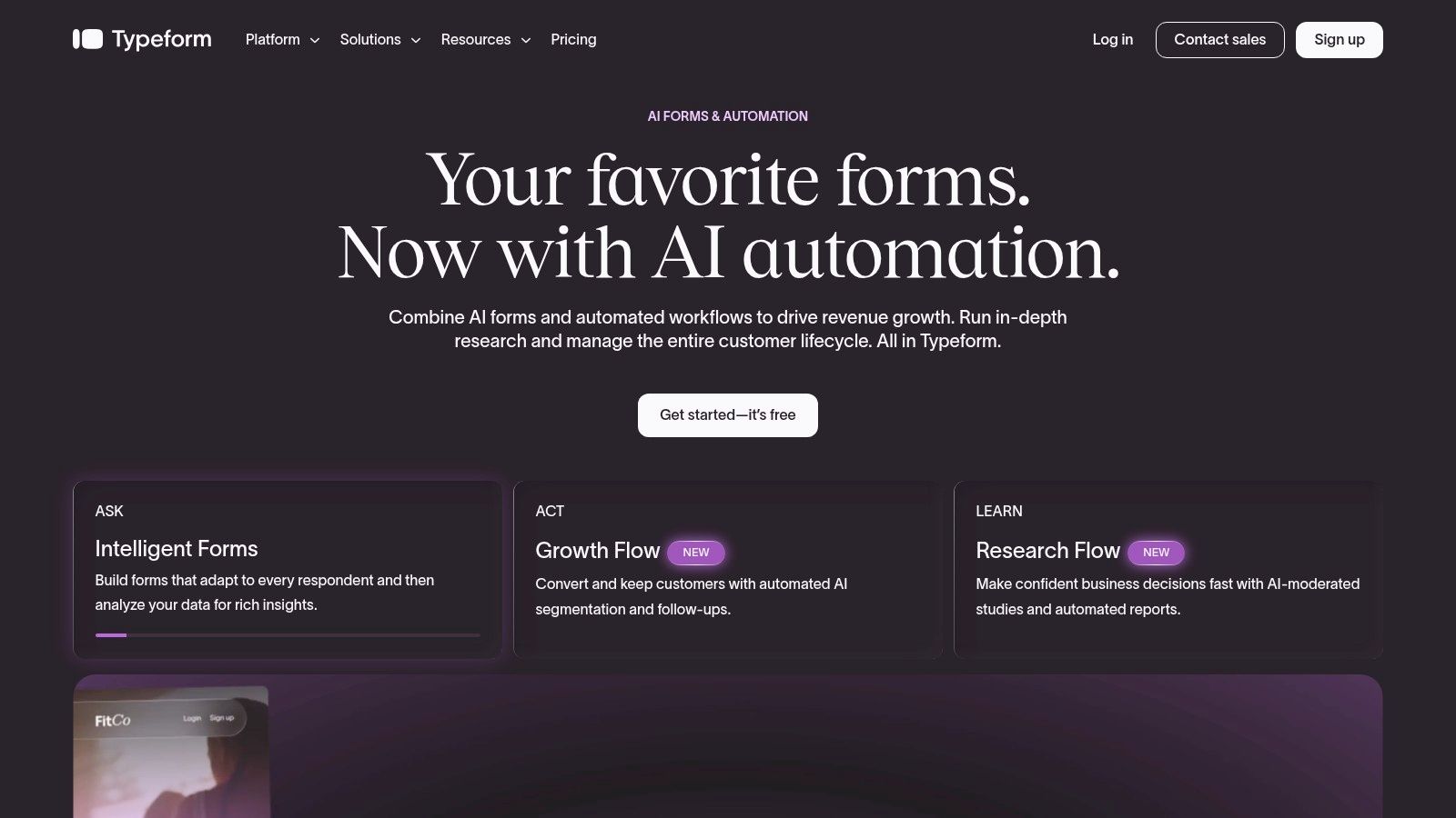
Typeform is the clearest example of the conversational pattern. One question appears at a time, the interface feels light, and the form behaves more like guided dialogue than a document. That approach works well for lead capture, quizzes, short surveys, and qualification flows where pacing matters as much as field count.
The appeal is simple. Typeform helps teams turn a form into an interaction. Brand controls are strong, logic is mature, and the product has expanded into AI-assisted creation and outcome-based experiences. For marketers and product teams refining front-end experience, the same principles behind strong user interface design patterns show up here clearly.
Best use cases and caution points
Typeform is usually strongest when every answer should feel deliberate. That makes it effective for demo requests, campaign microsites, onboarding questions, and research flows where a wall of fields would feel heavier. It's less effective when users need to scan many fields at once, compare entries, or jump around quickly.
A hidden trade-off with conversational forms is reviewability. They reduce visible complexity, but they can also slow down expert users who'd rather complete everything in one pass. That's why Typeform often performs best for moderate-length interactions, not dense transactional forms.
Conversational forms can feel easier before a user starts. They're not always easier once the user wants to edit, skim, or compare inputs.
Other practical pros and cons matter too:
- Strong upside: Conditional logic, embeds, hidden fields, webhooks, APIs, and duplicate-prevention support serious campaign use.
- Brand advantage: Teams can produce forms that feel closer to a polished landing page than a utility widget.
- Enterprise readiness: SSO and dedicated support make it viable beyond small teams.
- Plan friction: Lower tiers include response caps, so fast-growing campaigns can outgrow the entry plan quickly.
Typeform is one of the best web form design choices when interaction quality is the product. It's less compelling when teams need a low-cost high-volume intake engine.
3. Jotform
Jotform fits a different pattern from the form builders that win on polish alone. It is the practical choice for teams that need one platform to publish many kinds of forms, with different owners, approval steps, payment setups, and compliance constraints.
That changes the evaluation.
A marketing team might use it for gated content and event registration. Operations might use the same account for internal requests, intake forms, and approvals. Schools, nonprofits, and service businesses often value that spread more than having one highly distinctive interaction style. For teams working on improving website conversions across the full funnel, that matters because form performance depends on workflow fit, not just visual presentation.
Jotform works best as a repeatable multi-format form system. Templates, widgets, payment fields, approval flows, and e-sign features reduce the need to patch together separate tools for each new request. In practice, that lowers setup time and makes it easier to support departments that all need forms, but not the same form.
The trade-off shows up in user experience governance. A flexible builder gives teams room to solve edge cases. It also gives them room to publish inconsistent layouts, unclear labels, and bloated field sets. Accessibility can suffer for the same reason if each department treats the builder as a blank canvas instead of following shared standards.
Three considerations usually decide whether Jotform is the right fit:
- Workflow range: It handles registrations, payments, consent capture, approvals, and signatures well enough for many organizations to standardize on one tool.
- Operational predictability: Limits around submissions, views, and storage are easier to plan around than pricing models that hide usage behind add-ons.
- Business context: Higher-tier options support regulated use cases, but smaller teams should expect to move past the free plan quickly if the form is public and active.
I recommend Jotform when the main job is scaling form production across a business without custom development for every workflow. I am more cautious when the form itself is the brand experience, or when several teams will publish independently without design review. In those cases, the platform can still work, but only if product, marketing, and development agree on patterns before volume creates inconsistency.
4. Formstack
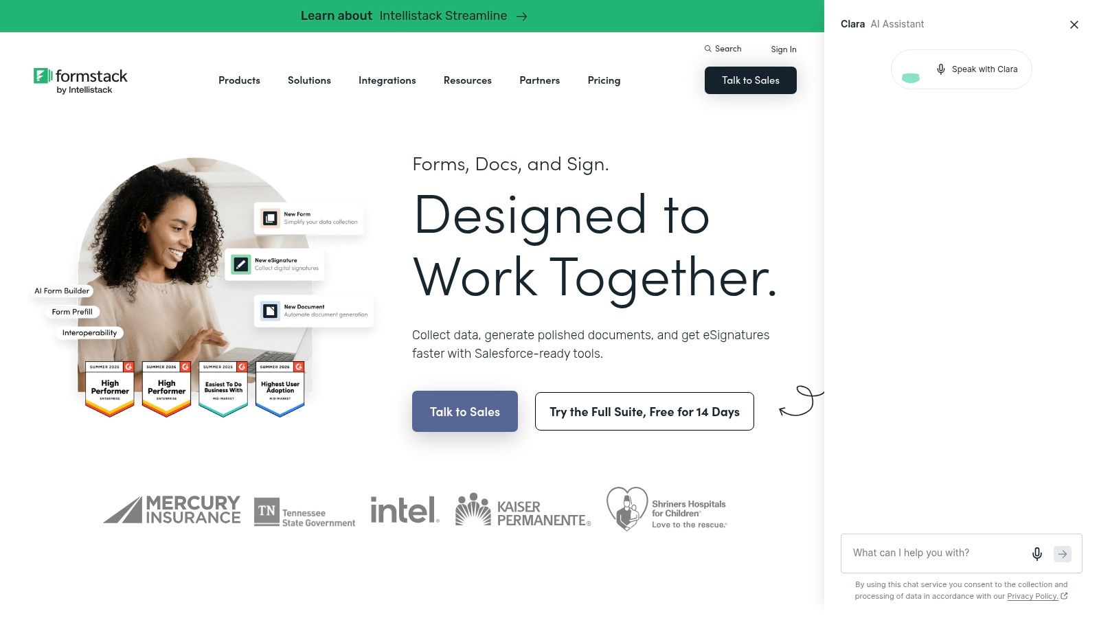
Formstack fits a different form pattern than the lighter builders in this list. Its strongest use case starts after the submit button. Teams choose it because a form triggers approvals, creates documents, requests signatures, updates internal systems, and leaves an audit trail that operations teams can trust.
That makes Formstack less about visual novelty and more about process control. For healthcare groups, finance teams, higher education, and larger HR operations, that trade-off is often correct. The form still needs to be clear and easy to complete, but the buying decision usually depends on routing logic, governance, and system fit.
A practical test helps here. If a missed field, delayed approval, or broken handoff creates staff work, compliance risk, or revenue delay, Formstack deserves a serious look. If the form only needs to capture a lead and send an email alert, it is usually more platform than the job requires.
Accessibility matters more in this pattern because these forms often support critical tasks, not optional marketing interactions. Teams that adopt Formstack still need to configure fields, labels, error states, and keyboard behavior carefully. Accessible website design practices should be part of implementation standards from the start.
What stands out is the way the product suite supports a governed workflow:
- Forms plus downstream actions: Submissions can feed approvals, documents, and signatures instead of stopping at data collection.
- Salesforce alignment: The Salesforce-native path is useful for organizations that already run core processes in that environment.
- Compliance and security fit: It is better suited to regulated intake and internal controls than builders aimed at simple campaign forms.
- Higher implementation load: Pricing, setup effort, and admin overhead can feel heavy if the workflow is simple or short-lived.
I usually recommend Formstack to organizations that want a repeatable intake system, not just a better-looking form. Product teams get more predictable workflows, marketing avoids duct-taped handoffs, and development spends less time maintaining one-off process fixes. The trade-off is straightforward. Teams give up some speed and simplicity in exchange for stronger operational control.
5. Paperform
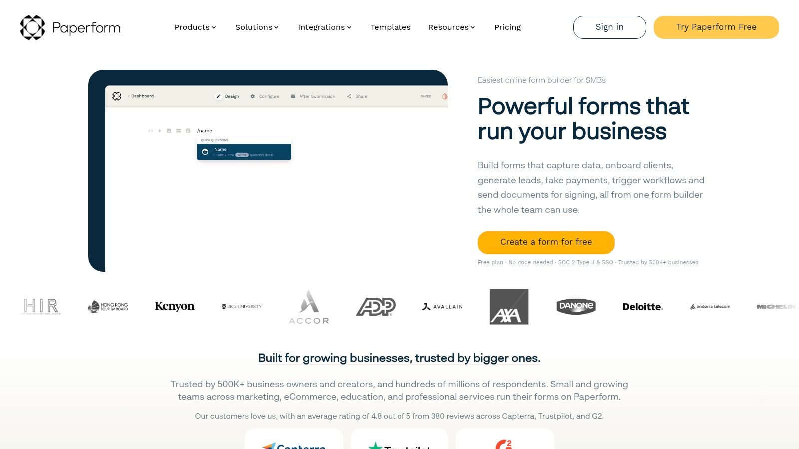
Paperform fits a specific form pattern: the form-as-page. It works well when users need more than fields before they commit. Pricing context, service details, policy notes, examples, and payment steps can live in the same experience instead of being split across a landing page and a separate form.
That changes the design job.
With Paperform, the question is not just whether the form collects data cleanly. The question is whether content and inputs belong together in one workflow. For bookings, applications, paid registrations, custom quotes, and service intake, the answer is often yes. For a simple newsletter signup or short lead capture form, this pattern usually adds more reading and more production work than the funnel needs.
A strong Paperform build tends to follow a clear sequence: explain the offer, answer the obvious objections, ask only for the information needed, then move into scheduling or payment. That structure can improve completion because users do not have to piece together the transaction from multiple pages. It can also hurt completion if the team treats the form like a mini website and keeps adding sections.
Paperform is a good fit if the form itself carries part of the sales conversation. Common use cases include:
- service businesses that need inquiry, qualification, and payment in one place
- consultants and agencies selling scoped packages or discovery sessions
- education and event teams handling registration with added context
- teams replacing a custom landing page plus embedded form stack with one managed asset
The product has enough depth for operational use, not just presentation. Payments through Stripe, PayPal Business, Square, and Braintree support commercial flows. Logic, calculations, scoring, PDFs, webhooks, and API access make it viable for quote builders, booking flows, and intake processes that need structured follow-up. Accessibility still depends on implementation choices. Long, content-heavy layouts can be harder to scan, especially on mobile or for keyboard and screen reader users, so heading structure, labels, error handling, and section length need careful review.
Pricing and plan limits matter here because Paperform often gets chosen by small teams that want a polished customer-facing experience without custom development. If branded controls, custom domains, or advanced workflow features sit behind higher tiers, the business case changes quickly. I usually recommend Paperform when a team wants one asset that can inform, qualify, and convert. If the goal is speed, low cost, and minimal editing overhead, a simpler builder is usually the better call.
6. Tally
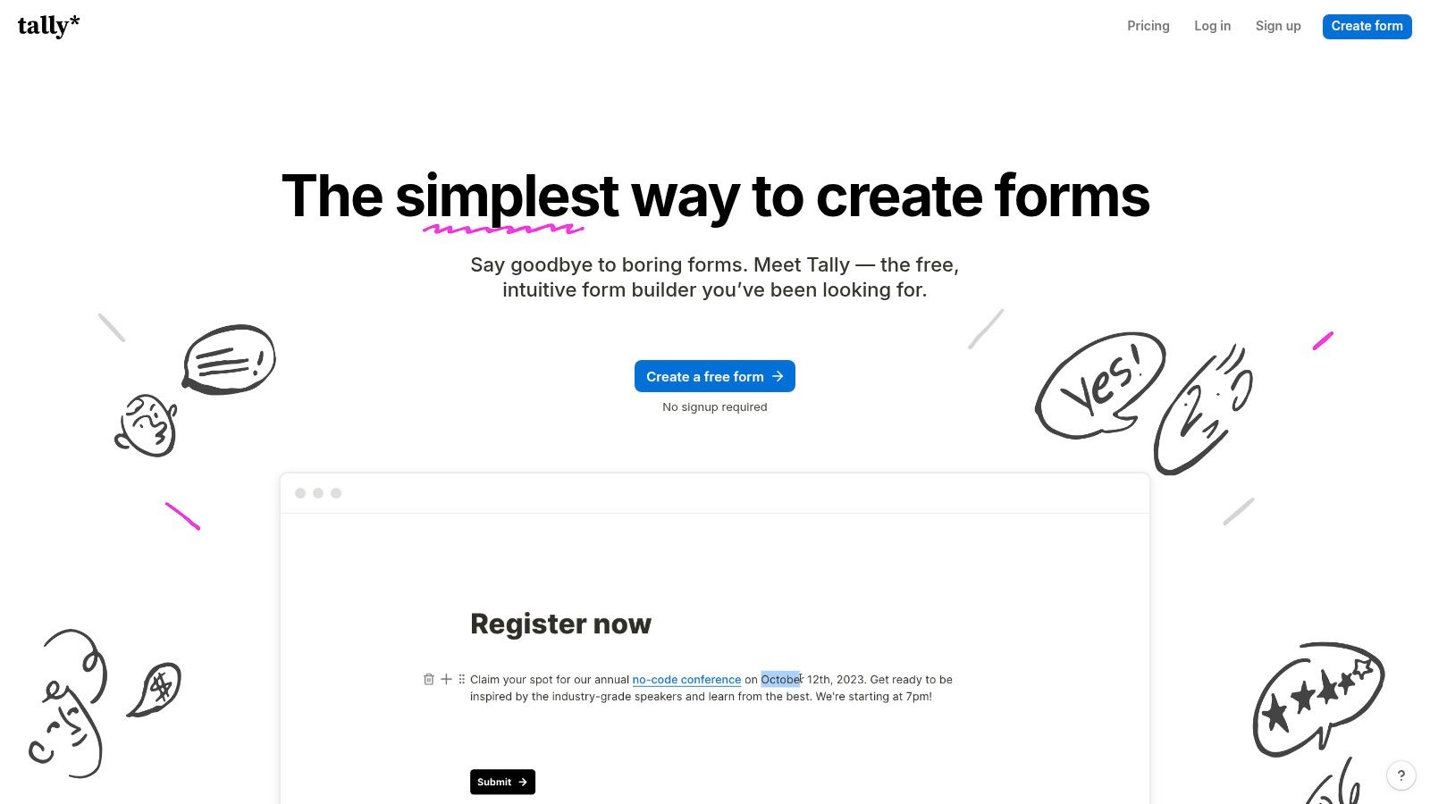
Tally usually wins before a design review starts. It removes the cost and setup friction that stop early-stage teams from testing a form idea in the first place. For founders, growth marketers, and operations leads, that changes the decision from "should we build this?" to "what can we learn this week?"
The product works best as a lightweight form pattern for fast-cycle workflows. Waitlists, lead capture, onboarding questionnaires, research surveys, internal requests, and simple intake flows all fit well because the editing experience is closer to drafting a page than assembling a rigid component set. That has a real implementation benefit. Non-technical teams can ship quickly without asking engineering to style, host, and maintain every experiment.
I usually frame Tally as a speed-first choice with a surprisingly long runway. Logic, calculations, file uploads, signatures, webhooks, and integrations cover more than basic marketing forms, so teams can validate a process before they commit to a heavier stack. That matters in product and marketing environments where the form is part of discovery, not a final system.
The limits show up later, and they show up in predictable places.
Teams with strict brand governance may find the presentation controls too light. Organizations with deeper reporting needs may outgrow the analytics model. Compliance review can also cut both ways. EU hosting may help some companies clear policy checks faster, while others need to confirm data handling, residency, and vendor approval before launch.
That makes Tally a strong fit for one specific pattern: forms as experiments. It is less suited to programs that already depend on polished multi-stakeholder governance, advanced attribution, or tightly controlled front-end consistency. If the job is to test a workflow quickly and keep implementation effort low, Tally is one of the better choices in this group. If the form is already a core operational asset, budget for the point where a simpler tool starts creating process debt.
7. Fillout
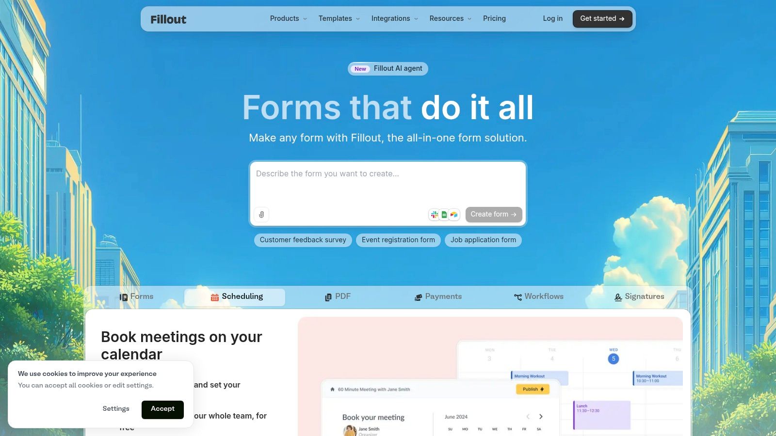
Fillout is the strongest choice here for integration-led operations. Its core appeal isn't just form building. It's the ability to connect forms with tools like Airtable, Notion, Google Sheets, HubSpot, and other systems without forcing per-seat pricing.
That matters for collaborative teams. Unlimited seats across plans remove a common cost penalty as more marketers, operators, and product stakeholders need access. Fillout is well suited to organizations where forms are effectively the front door to a shared data model.
Strong fit for connected systems
Fillout works well when forms need to read from and write to structured records, not just dump submissions into an inbox. Scheduling, workflows, pre-fill behavior, database-aware logic, and collaboration support that use case. For many product and operations teams, that's the difference between a form tool and an application layer.
The pricing structure is also easier to forecast than seat-based platforms. But teams should watch feature gating. Some of the strongest growth features live in higher plans, including analytics, custom domains, and expanded submission flexibility.
One design lesson is especially relevant here. Controlled Google research found that replacing an 11-field form with a 4-field version increased form submissions by 160% and improved conversion by 120%, according to Luke Wroblewski's summary of the Google study. Fillout's strength is that teams can simplify what users see while still enriching or prefetching data behind the scenes.
Practical trade-offs
- Integration depth: Excellent for Airtable, Sheets, Notion, HubSpot, and workflow-driven operations.
- Collaboration model: Unlimited seats are useful for cross-functional environments.
- Styling flexibility: Custom CSS and brand controls support stronger front-end consistency.
- Upper-tier dependence: Analytics, unlimited responses on the Business plan, and some enterprise integrations require upgrades.
Fillout is one of the best web form design choices when the form is tightly connected to a live system of record.
Top 7 Web Form Builders: Feature Comparison
| Product | 🔄 Implementation complexity | ⚡ Resource requirements | ⭐ Expected effectiveness | 📊 Expected outcomes | 💡 Ideal use cases / Key advantages |
|---|---|---|---|---|---|
| Nerdify (Services) | High, custom product builds, longer onboarding | Significant, nearshore team, retainer/project budgets | ⭐⭐⭐⭐⭐ | End-to-end delivery, faster time-to-market, measurable user growth | Startups/scaling businesses needing full‑stack product + marketing; one‑stop partner, transparent PM |
| Typeform | Low, SaaS, one-question UX, quick setup | Low–Medium, subscription; response caps on lower tiers | ⭐⭐⭐⭐ | Improved completion rates and branded lead capture | Branded surveys/lead gen; enterprise SSO available; upgrade for higher limits |
| Jotform | Low–Medium, template/widget-driven builder | Low–Medium, tiered plans; advanced compliance on higher tiers | ⭐⭐⭐⭐ | Feature-rich forms with payments, approvals, e-signatures | Payment forms, compliance (HIPAA on Gold/Enterprise), strong template library |
| Formstack (Forms) | Medium–High, workflow and document automation | High, higher starting price; add-ons for compliance | ⭐⭐⭐⭐ | Automated intake→document→sign workflows; enterprise CRM integration | Regulated industries and Salesforce-native workflows; suited for business‑critical processes |
| Paperform | Low–Medium, designer‑friendly, page‑style forms | Low–Medium, payments on all tiers; branding/custom domain on paid plans | ⭐⭐⭐⭐ | Branded payment/booking flows, PDFs and quotes | Payment-heavy bookings/quotes and designer-focused forms; good theme/branding control |
| Tally | Very Low, fast build, document-like editor | Low, generous free plan (unlimited forms/submissions); some limits on files/branding | ⭐⭐⭐⭐ | Rapid prototyping and high-volume forms on free tier | Startups/teams needing cost-effective forms; check file size and branding limits |
| Fillout | Low–Medium, forms with deep DB/CRM integrations | Low–Medium, predictable pricing, free 1,000 responses/month | ⭐⭐⭐⭐ | Strong data integrations, collaboration, conversion analytics (on higher tiers) | Database-aware forms (Airtable/Notion/Sheets), teams needing unlimited seats and predictable pricing |
Turn Form Patterns Into a Better Funnel
The best web form design depends on the job. Conversational tools like Typeform work well for focused lead capture and lightweight qualification. Broad builders like Jotform fit teams with many operational use cases. Workflow platforms like Formstack make sense when compliance, routing, and signatures matter. Paperform is strong for branded transactions. Tally is ideal for low-cost validation. Fillout is a smart pick when forms need to connect tightly to databases and shared operations.
The bigger lesson is that shorter isn't always the whole answer. Layout and step structure affect completion in different ways. Single-column forms were completed 15.4 seconds faster than multi-column forms, and multi-step forms have been reported to achieve about 14% higher completion than equivalent single-page forms, with an optimal 3 to 4 steps for most forms according to multi-step form completion benchmarks. Teams should treat this as a design decision, not a slogan.
Accessibility deserves the same weight as conversion. Real-world failure remains common. The 2026 WebAIM Million scan cited in accessible web form guidance found unlabeled form fields on 51% of homepages, and the average homepage had 6.9 form inputs, up 36% in three years. Practical standards are straightforward: visible associated labels and grouped related fields through fieldset and legend are recommended in Orange's form accessibility guidance. Form controls should also follow the same order in code and on screen, as the U.S. Web Design System form guidance advises, and required fields plus error messaging should be clearly marked in ways described by Orange's form design recommendations.
For many teams, the highest-value actions are consistent across platforms.
- Remove nonessential fields: Ask only for information needed at the current step.
- Explain requirements early: Don't wait until submission to reveal format rules or missing context.
- Support all users: Keyboard access, labels, field order, and understandable errors aren't optional.
- Test mobile behavior: Touch targets, autofill behavior, and step flow shape real completion rates.
- Connect follow-through: Route submissions into the right CRM, workflow, or product path immediately.
- Measure drop-off: Track abandonment by field group or step so optimization focuses on actual friction.
Teams also benefit from studying adjacent conversion surfaces such as booking page design patterns that build trust, because the same trust and clarity principles often determine whether a user completes a form or leaves.
If a form sits inside a broader product, campaign, or workflow redesign, the tool choice is only part of the answer. The stronger move is usually to align UX/UI, engineering, analytics, and go-to-market execution from the start.
Nerdify helps companies design and build form experiences that do more than collect data. The team supports UX/UI design, web and mobile development, digital marketing, and nearshore staff augmentation for lead-gen flows, onboarding, transactional forms, and workflow-connected applications. To discuss a project, visit Nerdify.