9 Essential Conversion Rate Optimization Strategies for 2025
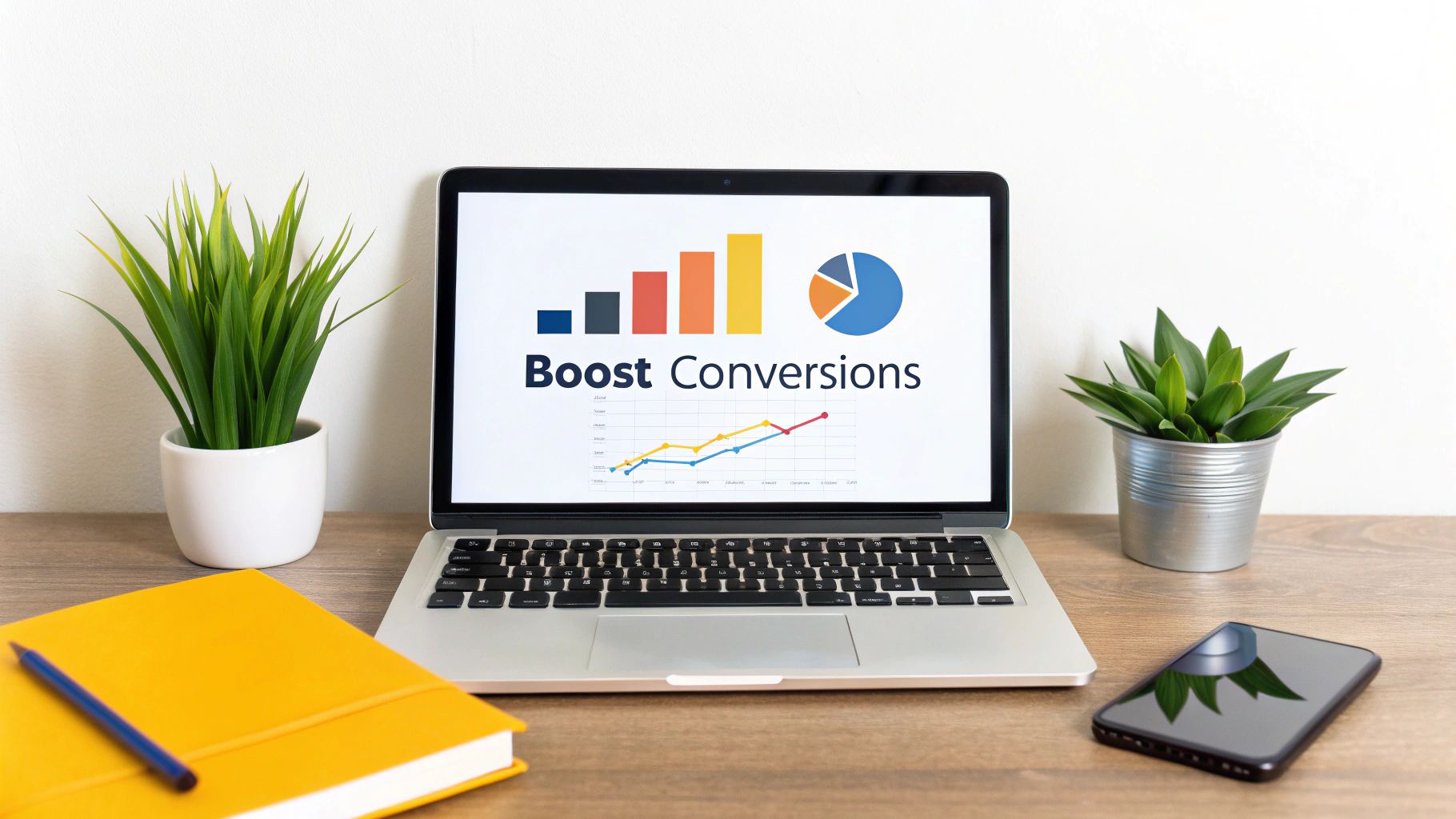
In the competitive digital marketplace, driving traffic to your website is only half the battle. The real challenge, and the key to sustainable growth, lies in converting those visitors into loyal customers, subscribers, or leads. This is where conversion rate optimization (CRO) becomes your most valuable asset. It's the systematic, data-driven process of enhancing your website and marketing funnels to increase the percentage of users who take a desired action, whether it's making a purchase, filling out a form, or signing up for a newsletter.
This guide moves beyond generic advice to provide nine powerful, field-tested conversion rate optimization strategies that deliver measurable results. We will dissect each tactic, from the fundamentals of A/B testing and landing page optimization to more advanced methods like personalization and exit-intent recovery. You will get actionable steps, real-world examples, and the insights needed to implement these strategies effectively. The fundamental goal of CRO is to boost the number of visitors who complete a desired action on your site. For a broader understanding of improving website performance, explore these detailed tips on how to increase overall website conversions to build a solid foundation.
Prepare to transform your digital presence from a simple online brochure into a high-performance conversion engine. The following strategies are your playbook for turning clicks into customers and maximizing the return on your marketing investment. By understanding and applying these principles, you can create a user experience that not only attracts visitors but also guides them seamlessly toward conversion, turning your website into a strategic tool for business growth.
1. A/B Testing (Split Testing)
A/B testing, also known as split testing, is the foundational practice of modern conversion rate optimization strategies. It’s a methodical experiment where you compare two versions of a digital asset, like a webpage or an email, to see which one performs better. By randomly showing version A (the control) to one segment of your audience and version B (the variation) to another, you can collect empirical data to determine which version more effectively achieves a specific goal, such as clicks, sign-ups, or purchases.
This approach eliminates guesswork and allows product managers, marketers, and developers to make decisions based on actual user behavior. Companies like Booking.com have built their entire growth model on this principle, running thousands of tests simultaneously to incrementally improve user experience and booking rates.
How to Implement A/B Testing
Implementing an effective A/B testing program involves a structured process that ensures your results are reliable and actionable. It’s more than just changing a button color; it’s about scientific validation.
- Formulate a Hypothesis: Start with a clear, testable hypothesis based on data or user research. For example: "Changing the CTA button text from 'Submit' to 'Get My Free Quote' will increase form submissions because it clarifies the value for the user."
- Isolate One Variable: To know what caused the change in performance, test only one element at a time. This could be a headline, a hero image, a call-to-action (CTA), or a form field.
- Achieve Statistical Significance: Run your test long enough to gather sufficient data and reach at least a 95% statistical confidence level. This ensures the results aren't due to random chance. Tools like Optimizely or VWO can automate this calculation.
- Analyze and Document: Once a winner is declared, implement the change. Crucially, document the hypothesis, results, and learnings to build a knowledge base that informs future optimization efforts. Even failed tests provide valuable insights.
2. Landing Page Optimization
Landing page optimization is a critical conversion rate optimization strategy focused on refining dedicated, standalone web pages built for a single conversion objective. Unlike a homepage that serves many purposes, a landing page is designed to eliminate distractions and guide a visitor from a specific traffic source, like a PPC ad or email campaign, toward one clear action, such as making a purchase or filling out a form.

This hyper-focused approach creates a seamless user journey by maintaining "message match" between the ad and the page, ensuring visitors find exactly what they were promised. Companies like Unbounce have championed this methodology, with co-founder Oli Gardner demonstrating how removing site navigation can increase conversions by keeping users focused on the intended goal. A well-optimized landing page acts as your best digital salesperson, working 24/7 to convert traffic into tangible business results.
How to Implement Landing Page Optimization
Effective landing page optimization is a blend of persuasive design, compelling copy, and user psychology. It involves a systematic approach to building and refining pages that resonate with your target audience and drive action.
- Maintain Message and Design Consistency: Ensure your headline, copy, and imagery directly reflect the ad or link the visitor clicked. This reassures them they're in the right place and reduces bounce rates.
- Focus on a Single Call-to-Action (CTA): Every element on the page should support one primary goal. Avoid multiple competing offers or navigation links that could distract the user. Use a contrasting color for your CTA button to make it visually prominent.
- Leverage Social Proof: Strategically place testimonials, case study snippets, or client logos near the conversion point (like a form or "buy now" button). This builds trust and validates the user's decision.
- Streamline Forms and Above-the-Fold Content: Place your most critical information and the CTA "above the fold" so users see it without scrolling. For lead generation forms, only ask for essential information; Moz famously increased sign-ups by 52% just by reducing its form from nine fields to seven. These changes are often key components of a successful project, and you can explore more about how to redesign a website for better performance.
3. Personalization and Dynamic Content
Personalization and dynamic content are advanced conversion rate optimization strategies that move beyond a one-size-fits-all approach. This method involves tailoring the user experience in real-time based on visitor data, such as their behavior, location, device, or past interactions. By automatically changing messaging, offers, and design elements to match individual user segments, you create a more relevant and engaging journey that speaks directly to their needs.

This strategy leverages customer data to make every interaction feel unique and valuable, significantly increasing the likelihood of conversion. Giants like Amazon have perfected this, with its recommendation engine driving an estimated 35% of its total revenue. Similarly, Netflix saves over $1 billion annually by personalizing content suggestions to reduce churn and keep users engaged, proving the immense ROI of a well-executed personalization strategy.
How to Implement Personalization and Dynamic Content
Effective personalization requires a thoughtful approach to data collection and implementation. It’s about delivering relevance at scale without being intrusive, turning anonymous visitors into loyal customers.
- Start with Segmentation: Begin by grouping your audience into meaningful segments. A simple yet powerful start is differentiating between new versus returning visitors. You can show a welcome offer to new users and display recently viewed items for returning ones.
- Leverage Geolocation Data: Use a visitor's location to display relevant information, such as the nearest store, local currency and language, or region-specific promotions. This simple adjustment makes the experience immediately more relevant.
- Maintain Message Consistency: Personalize content based on the traffic source. If a user clicks an ad promoting a 20% discount on shoes, ensure the landing page headline and hero image reflect that same offer to create a seamless journey.
- Use Behavioral Triggers: Implement recommendation engines for e-commerce or use exit-intent technology to present a personalized retention offer just as a user is about to leave. These triggers convert moments of potential abandonment into opportunities.
4. Social Proof and Trust Signals
Social proof is a powerful psychological phenomenon where people assume the actions of others in an attempt to reflect correct behavior for a given situation. In the context of conversion rate optimization strategies, this means leveraging customer testimonials, reviews, case studies, and trust badges to build credibility and reduce user anxiety. When potential customers see that others have purchased, used, and benefited from your product or service, it validates their decision-making process and makes them more likely to convert.

This strategy, famously detailed by Dr. Robert Cialdini in Influence, taps into our innate desire to follow the crowd. E-commerce giant Booking.com masters this by showing how many people are currently viewing a property, while SaaS company Slack showcases logos of prominent clients like IBM and Target to build enterprise credibility. These signals assure visitors that they are making a safe and popular choice.
How to Implement Social Proof and Trust Signals
Effectively integrating social proof requires more than just adding a testimonial to your homepage; it's about strategically placing trust-builders throughout the customer journey to overcome objections and build confidence.
- Display Customer Reviews and Testimonials: Place authentic testimonials with real names and photos near key conversion points, like a checkout page or a sign-up form. Use specific results, for instance, "This tool increased our lead generation by 40%."
- Showcase Trust Badges and Certifications: Feature security seals (like SSL certificates), payment provider logos (Visa, PayPal), and industry-specific certifications near forms where users enter sensitive information. This is crucial for reassuring users about data privacy.
- Leverage Numbers and Client Logos: Quantify your success by displaying figures like "Trusted by 10,000+ happy customers" or "500,000 downloads." For B2B businesses, showcasing the logos of well-known clients provides instant credibility.
- Utilize Real-Time Activity Notifications: Use tools like Proof to show recent purchases or sign-ups. For example, a notification saying "Jane from New York just bought the Pro Plan" creates a sense of urgency and popularity, encouraging others to act. Learn more about how these tactics increase website conversions and build user confidence.
5. Simplified Forms and Checkout Process
One of the most impactful conversion rate optimization strategies involves simplifying forms and checkout processes. This approach targets the final, most critical steps of the user journey, where friction can directly translate to lost revenue. The core principle is that every additional field, step, or decision required from a user increases the cognitive load and provides an opportunity for them to abandon the process. By streamlining data collection to only what is absolutely necessary, businesses can significantly reduce abandonment rates.
This strategy is about removing barriers. Companies that master this see immediate returns. For instance, Expedia famously increased its annual profit by $12 million simply by removing a single, optional "Company Name" field from its booking form. This small change reduced user confusion and friction, leading to a substantial lift in conversions. Similarly, ImageShack saw a 33.5% increase in registrations after cutting their sign-up form from 10 fields down to just 4.
How to Implement Form and Checkout Simplification
Effective simplification is a process of ruthless editing and user-centric design. It’s not just about removing fields; it's about making the entire experience feel effortless and trustworthy.
- Audit and Justify Every Field: Begin by analyzing your existing forms. For each field, ask: "Is this information absolutely essential to complete this transaction or create this account?" If the answer is no, or if it can be collected later, remove it.
- Implement User-Friendly Features: Enhance the user experience with features like inline validation, which provides real-time error feedback instead of waiting until submission. Use smart defaults (e.g., pre-selecting the user's country based on IP) and enable browser autofill for addresses and payment information to minimize manual typing.
- Offer a Guest Checkout Option: Forcing users to create an account before a purchase is a major conversion killer. Always provide a clear, visible guest checkout option. You can always prompt them to create an account on the post-purchase thank you page, where the friction is much lower.
- Visually Guide the User: Use a single-column layout, which is easier to follow, especially on mobile devices. For longer processes that can't be shortened, use a progress indicator (e.g., "Step 1 of 3") to manage user expectations and show them how close they are to completion. This small visual cue can reduce anxiety and keep users engaged.
6. Urgency and Scarcity Tactics
Urgency and scarcity are powerful psychological triggers that leverage the human fear of missing out (FOMO) and loss aversion. By creating a sense of limited time (urgency) or limited availability (scarcity), businesses can effectively motivate visitors to stop procrastinating and take immediate action. This is one of the most direct conversion rate optimization strategies for shortening the consideration phase of the buyer's journey.
This strategy is highly effective because it provides a compelling reason to convert now instead of later. E-commerce giant Amazon masterfully uses this with its "Lightning Deals," which feature both a countdown timer and a stock level indicator to create a potent combination of urgency and scarcity. Similarly, Booking.com uses messages like "Only 1 room left at this price" to encourage immediate bookings.
How to Implement Urgency and Scarcity
Authenticity is the key to successfully implementing urgency and scarcity. Deceptive tactics can permanently damage brand trust, so your claims must always be genuine. This strategy is about highlighting real limitations, not inventing them.
- Be Specific and Transparent: Vague statements like "Limited time offer" are less effective than concrete ones. Use specific numbers like "Only 3 left in stock" or visible countdown timers for time-sensitive promotions.
- Combine Urgency with Scarcity: The most powerful applications merge both principles. For instance, "Early bird pricing ends in 24 hours or when the first 50 tickets are sold" creates a dual motivation to act quickly.
- Use Visual Cues: Prominently display your urgency elements. Countdown timers, low-stock notifications, and real-time activity messages ("20 people are viewing this now") should be clearly visible near the call-to-action button.
- Maintain Authenticity: Never use fake scarcity or restart timers disingenuously. Customers will see through this, leading to a loss of credibility. Ensure your offers are genuine to build long-term trust and loyalty. Even failed implementations provide valuable data for future conversion rate optimization strategies.
7. Clear and Compelling CTAs (Call-to-Action)
The call-to-action (CTA) is the gateway to conversion, guiding users from passive browsing to active engagement. Optimizing your CTAs involves crafting buttons and links with language and design that are impossible to misunderstand and difficult to resist. An effective CTA clearly states the action a user should take, communicates the value of that action, and stands out visually from the rest of the page content.
This strategy is fundamental to all conversion rate optimization strategies because even the most persuasive page will fail if the final step is unclear or unappealing. Small changes in wording, color, or placement can yield dramatic results. For instance, Unbounce famously increased conversions by 90% simply by changing their button text from "Start your free 30-day trial" to the more personal "Start my free 30-day trial," highlighting the power of first-person perspective.
How to Implement Compelling CTAs
Crafting a high-performing CTA is a blend of psychology, copywriting, and design. It requires a user-centric approach focused on clarity and motivation.
- Use Action-Oriented, First-Person Language: Replace generic words like "Submit" with specific, value-driven commands. Use first-person phrasing like "Get My Free Quote" instead of "Get Your Free Quote" to create a sense of ownership and reduce psychological friction.
- Focus on Design and Visibility: Your CTA must look like a clickable button. Use a contrasting color that aligns with your brand but pops on the page. Ensure it's surrounded by ample white space to draw the eye, and make it at least 44x44 pixels for easy tapping on mobile devices.
- Communicate Clear Value: The user should know exactly what will happen when they click. Instead of "Learn More," try "See Pricing Plans" or "Download the 2024 Report." Explicitly stating the benefit removes uncertainty and increases the likelihood of a click.
- Test Placement and Repetition: The "best" CTA placement varies. While above the fold is common, a CTA after a key value proposition or at the end of a long page can also be effective. For longer pages, consider repeating the CTA every one or two screen scrolls to ensure it's always accessible.
8. Page Speed Optimization
In the digital world, speed is not just a feature; it's a fundamental expectation. Page speed optimization is the process of reducing your website's load time to enhance user experience and, consequently, conversion rates. Slow-loading pages are a primary driver of user frustration and bounce rates, directly impacting your bottom line. Research from Google and other industry leaders consistently shows that even a one-second delay can cause a significant drop in conversions.
This essential strategy is non-negotiable for any modern business. For instance, Walmart discovered that for every one-second improvement in page load time, its conversions increased by 2%. Similarly, Mozilla saw 60 million more Firefox downloads per year after cutting its page load time by 2.2 seconds. This proves that investing in speed is one of the most effective conversion rate optimization strategies you can deploy.
How to Implement Page Speed Optimization
Improving your site's speed involves a series of technical enhancements that collectively reduce the time it takes for a user's browser to render your content. It requires a focused effort on both front-end and back-end performance.
- Audit Your Performance: Begin by diagnosing your current speed using tools like Google PageSpeed Insights and GTmetrix. These platforms provide a detailed breakdown of performance bottlenecks and suggest specific areas for improvement, from unoptimized images to slow server response times.
- Compress and Optimize Assets: Large images and media files are common culprits of slow load times. Compress all images before uploading them, and consider implementing lazy loading, which defers the loading of off-screen images until the user scrolls to them.
- Leverage Caching and CDNs: Implement browser caching to store static assets locally on a returning visitor's device, significantly speeding up subsequent visits. Use a Content Delivery Network (CDN) to distribute your assets across global servers, ensuring faster delivery to users regardless of their location.
- Streamline Your Code: Minify your HTML, CSS, and JavaScript files to remove unnecessary characters and reduce file sizes. Remove any unused plugins or scripts that add bloat to your site. To dive deeper into specific techniques, explore these proven tips for fast loading. For a comprehensive guide on this topic, learn more about how to improve website speed on getnerdify.com.
9. Exit-Intent Popups and Abandonment Recovery
Exit-intent technology is a powerful tool in your conversion rate optimization strategies arsenal, designed to re-engage users at the exact moment they’re about to leave your site. This technology tracks mouse movements and triggers a targeted popup or message when a user's cursor moves towards the browser's close or back button. This provides a crucial last-chance opportunity to convert an abandoning visitor into a lead or customer.
This approach effectively interrupts the exit pattern without disrupting the initial browsing experience. When implemented correctly, it can recover a significant percentage of otherwise lost traffic. Companies like DigitalMarketer have famously used exit-intent popups to recover 10-15% of abandoning visitors by offering high-value lead magnets, turning potential bounces into valuable email subscribers.
How to Implement Exit-Intent Popups
A successful exit-intent strategy is about offering the right value at the right time, not just interrupting the user. It requires a thoughtful approach to avoid being perceived as intrusive and to maximize conversions.
- Offer Genuine, Contextual Value: Don’t just ask for an email. Provide a compelling reason for the user to stay. Offer an exclusive discount, a free downloadable guide relevant to the page they were on, or a reminder of the items left in their cart. Rugs USA, for example, reduced cart abandonment by 11.6% by presenting targeted offers.
- Segment Your Audience: Don't show the same message to everyone. Tailor your popups based on user behavior. A new visitor might see a welcome discount, while a returning visitor who viewed specific product pages could see a more targeted offer or a case study.
- Keep it Simple and Frictionless: The goal is a last-second conversion, so make it easy. Use minimal form fields, ideally just an email address. The popup's design should be clean, on-brand, and feature a clear, can't-miss "X" button for users who aren't interested.
- Control Display Frequency: Annoying users is a conversion killer. Use frequency capping to ensure the same visitor doesn't see the popup repeatedly. Tools like OptinMonster allow you to set rules, such as showing it only once per session or once every 30 days.
Conversion Rate Optimization Strategies Comparison
| Item | Implementation Complexity 🔄 | Resource Requirements 🔄 | Expected Outcomes 📊 | Ideal Use Cases 💡 | Key Advantages ⭐ |
|---|---|---|---|---|---|
| A/B Testing (Split Testing) | Medium - requires hypothesis, traffic splitting, and statistical analysis | Moderate - needs sufficient traffic and testing tools | Reliable data-driven insights, improved conversions | Testing single changes to optimize elements like CTAs, headlines | Objective results, reduces guesswork, builds continuous improvement culture |
| Landing Page Optimization | Medium - involves design, copywriting, and ongoing testing | Moderate to High - design and copywriting expertise needed | Higher conversion rates, better ad quality scores | Dedicated campaign or product pages focused on conversions | Focused user experience, easy campaign tracking, personalization possible |
| Personalization and Dynamic Content | High - complex data integration, real-time content adaptation required | High - needs robust data infrastructure and analytics | Significant lifts in engagement and conversion rates | Tailored user journeys based on behavior, location, device | Deep visitor relevance, stronger customer relationships, maximized ROI |
| Social Proof and Trust Signals | Low to Medium - simple to implement but requires ongoing management | Low to Moderate - content creation and maintenance | Increased trust and conversion rates by 15-35% | Reducing purchase anxiety across all industries | Builds credibility fast, cost-effective, leverages authentic customer voices |
| Simplified Forms and Checkout Process | Low to Medium - mostly design and UX changes, requires testing | Moderate - UX design and possible dev resources | Reduced abandonment and increased form completions | E-commerce checkout, lead capture forms | Significant reduction in drop-offs, improves mobile experience, easy wins |
| Urgency and Scarcity Tactics | Low to Medium - simple UI changes but requires authentic offers | Low to Moderate - content creation and monitoring | 20-30% conversion rate increase on proper use | Promotions, limited offers, inventory clearance | Drives immediate action, overcomes procrastination, effective in sales funnels |
| Clear and Compelling CTAs | Low - small copy and design changes, requires A/B testing | Low - minimal design and copywriting resources | Can yield large conversion improvements | All conversion-focused pages | Easy to test and optimize, improves user direction, multiplatform effectiveness |
| Page Speed Optimization | High - technical expertise in coding, hosting, and optimization required | High - developer time, hosting/CDN costs | Direct increase in conversions, better SEO and UX | All websites needing faster load and better rankings | Improves conversions and SEO, reduces bounce rates, critical for mobile users |
| Exit-Intent Popups and Abandonment Recovery | Medium - needs behavior tracking and popup tools, plus design/testing | Moderate - software tools and copy/design resources | Recovers 10-15% abandoning visitors | E-commerce carts, lead generation | Last chance to convert visitors, grows email lists, non-intrusive if done well |
Putting It All Together: From Strategy to Sustainable Growth
You now have a comprehensive playbook of powerful conversion rate optimization strategies, from the foundational precision of A/B testing to the psychological nuance of scarcity tactics. We’ve explored how to refine landing pages, build trust with social proof, personalize user journeys, and streamline the path to purchase. Each of these nine strategies represents a significant opportunity to turn more visitors into valuable customers, but their true power is unlocked when they become part of a continuous, integrated process.
The journey to a higher conversion rate is not about finding a single "magic bullet." Instead, it's about building a systematic, data-driven engine for growth. The most successful businesses, from agile startups to established enterprises, treat CRO not as a one-off project but as a core business discipline. They foster a culture of curiosity and experimentation, where every assumption is questioned and every change is validated with real user data.
Your Actionable Roadmap to Higher Conversions
Transforming this knowledge into tangible results requires a clear plan. Avoid the temptation to implement everything at once. This approach, often called "throwing spaghetti at the wall," makes it impossible to measure what’s actually working. Instead, adopt a methodical approach.
Here’s a practical framework to get started:
Establish Your Baseline: Before you change anything, you need a clear picture of your current performance. Dive into your analytics tools (like Google Analytics 4) to identify your key conversion funnels. Where are users dropping off? Which pages have the highest bounce rates? This data will reveal your biggest opportunities for improvement.
Formulate a Hypothesis: Based on your data, pick one area to focus on. For instance, if you notice high cart abandonment, your hypothesis might be: "Simplifying the checkout form by removing optional fields will reduce friction and increase completed purchases." A strong hypothesis is specific, measurable, and testable.
Prioritize and Test: Select one of the conversion rate optimization strategies discussed in this article that directly addresses your hypothesis. Use a prioritization framework like PIE (Potential, Importance, Ease) to decide which test to run first. Launch an A/B test and let it run long enough to achieve statistical significance.
Analyze, Learn, and Iterate: This is the most critical step. Did your change produce the expected lift? Why or why not? Analyze the results, document your learnings, and use that insight to inform your next hypothesis. Whether the test wins or loses, you gain valuable information about your audience.
The Long-Term Value of a CRO Mindset
Mastering these conversion rate optimization strategies provides more than just a temporary lift in metrics. It fundamentally changes how you understand and serve your customers. Each test, each piece of user feedback, and each data point brings you closer to what your audience truly wants and needs. This deep customer empathy becomes a powerful competitive advantage, enabling you to build better products, craft more resonant marketing messages, and create superior user experiences.
The ultimate goal is to build a high-performance website that not only converts but also delights users, turning them into loyal advocates for your brand. This creates a virtuous cycle: a better user experience leads to higher conversions, which fuels business growth, allowing you to reinvest in further improvements. For CTOs, product managers, and marketing teams, this framework transforms your digital presence from a static brochure into your most effective tool for sustainable customer acquisition and long-term success. The path to doubling your conversion rate begins not with a massive overhaul, but with a single, well-informed test. Choose your starting point, launch your first experiment, and begin your journey toward optimization mastery today.