Mastering how to create customer journey map: A Practical Guide
A customer journey map is your way of visualizing every single interaction a person has with your brand. It starts from the moment they first hear about you and follows them all the way through to becoming a loyal, repeat customer.
To build one, you need to dig into user data, create detailed customer personas, and then carefully plot out their actions, feelings, and frustrations at every stage. What you get in the end is a powerful visual that turns a web of complicated customer interactions into a clear, actionable playbook for your entire business.
Why Your Business Needs a Customer Journey Map
Let's be real—a customer journey map is so much more than a pretty diagram. It’s your strategic guide to understanding how people actually experience your business. This isn't about what you think they do; it's about seeing your brand directly through their eyes, from that initial Google search to the moment they recommend you to a friend.
So many companies operate on assumptions about their customers, creating a huge disconnect between their strategy and the real-world user experience.
This tool is essential for turning clunky, complex interactions into a smooth, intuitive experience. It creates a visual story that every single team—from marketing and sales to product development and customer support—can understand and get behind. When everyone is on the same page about the customer's path, those frustrating internal silos start to crumble, and real collaboration begins.
If you're in the B2B space, this is especially critical. For a deeper look at the strategic side, check out these insights on integrating customer journey mapping into your B2B marketing strategy.
Bridging the Gap Between Assumption and Reality
The biggest win from a customer journey map is that it forces your team to operate based on reality, not guesswork. Without one, you're essentially flying blind. For example, your analytics might tell you that users are bouncing from a specific page, but the map can reveal why. It might be because they feel overwhelmed by too many options—a crucial emotional pain point that raw data alone would never show you.
A journey map challenges your assumptions about when the journey truly begins and ends, thus identifying as many opportunities for innovation as possible. It forces you to move from an internal, process-focused view to an external, human-centered one.
This shift in perspective is what truly separates good companies from great ones. Once you pinpoint those moments of friction and, just as importantly, moments of delight, you can make smarter decisions that directly boost your bottom line.
A well-researched map helps you:
- Increase customer retention: When you understand what frustrates customers, you can fix it. By improving their experience, you give them a reason to stick around, which directly impacts loyalty.
- Encourage team-wide collaboration: The map becomes the single source of truth. Suddenly, the marketing team sees how their campaigns impact sales conversations, and the product team understands how a new feature is affecting support ticket volume.
- Provide proactive service: By anticipating customer needs and potential snags at specific touchpoints, you can solve problems before they even bubble up. This is how you move from a reactive support model to a proactive one.
Ultimately, knowing how to create a customer journey map gives you a serious competitive advantage. It’s the key to building more empathetic, effective, and profitable relationships with the people who keep your business alive: your customers.
1. Get Your Bearings: Goals, Scope, and Stakeholders
Before you ever put pen to paper (or sticky note to whiteboard), you have to know why you're building a customer journey map. A map without a clear destination is just a pretty picture. It's the groundwork you do right now that separates a game-changing strategic tool from a file that gathers digital dust.
The whole point is to move from a vague idea—"we should understand our customers better"—to a concrete, actionable plan.
Your first job is to define a single, powerful objective. Don't try to boil the ocean. A map that tries to fix everything will end up fixing nothing. Instead, get specific. Are you trying to slash customer churn in the first 90 days? Or is the real goal to boost conversions on your free trial page?

This razor-sharp focus dictates everything that follows. A map designed to smooth out the new user onboarding process will look completely different from one aimed at improving the post-purchase support experience.
Define Your Persona and Scope
Once your "why" is clear, you need to define your "who." It’s tempting to create a generic map for an imaginary "user," but this approach is far too vague to be useful. A journey map is only as good as the persona it’s built for.
Think about it: a startup founder evaluating your software has a totally different set of needs, questions, and frustrations than an enterprise manager who needs a scalable, compliant solution. You have to pick one to start. Before you go any further, make sure you know how to create buyer personas that are based on real research, not just office assumptions.
Rally the Troops: Align Your Internal Teams
A customer journey map built by one department in a vacuum is dead on arrival. The real power of a map comes from creating a shared, single source of truth about the customer experience across your entire company. That means you need buy-in and insights from every team that touches the customer.
This is why a kickoff workshop is non-negotiable. Get key people from different departments in a room together for a structured brainstorm.
- Marketing: They own the awareness and consideration stages. They know what channels bring people in and which messages actually work.
- Sales: This team is in the trenches, hearing customer objections and navigating the final decision-making hurdles every day.
- Product & Development: They live and breathe the product experience, from onboarding friction to feature adoption challenges.
- Customer Support: Your support reps are on the front lines. They hear the raw, unfiltered feedback and frustrations straight from your users.
This workshop isn't just an info-gathering session. It's about building a shared, customer-obsessed mindset. That "aha!" moment happens when the sales team hears exactly which confusing feature is causing a spike in support tickets.
Use a whiteboard (physical or digital) and have each department contribute their knowledge about what the customer is doing, thinking, and feeling at each stage. This internal brain dump becomes the skeleton of your map.
For example, your support team might point out that 40% of new users get stuck on the exact same setup step in their first week. That's a massive pain point the product and marketing teams might have no idea about. Weaving these cross-departmental insights together is what makes your map a true reflection of reality—and a powerful catalyst for change.
Gathering the Data That Brings Your Map to Life
A journey map built on assumptions is just a work of fiction. To create something truly useful, you need to ground it in reality—your customer's reality. This is where you put on your detective hat and dig into the data to uncover the real story of their experience.
The best maps are built on a blend of two types of data: qualitative (the "why") and quantitative (the "what"). One tells you what people are actually doing, while the other explains the motivations and emotions driving those actions. This combination is what elevates a simple flowchart into a powerful strategic tool.
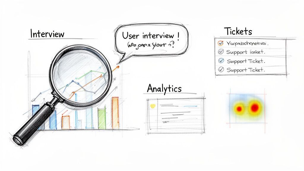
Uncovering the Why with Qualitative Research
Qualitative data is the heart and soul of your journey map. It provides the human context—the thoughts, feelings, and frustrations—that raw numbers simply can't capture.
The most direct way to get this information? Talk to people.
- User Interviews: These one-on-one chats are invaluable. Instead of asking a leading question like, "Was our checkout easy?" try something more open-ended: "Can you walk me through the last time you bought something on our site?" You’ll uncover surprising details you would never have thought to ask about.
- Support Ticket Analysis: Your customer support team is sitting on a goldmine. Sift through support tickets, live chat transcripts, and emails to spot recurring complaints. If you see dozens of people asking the same question about your return policy, that’s a clear friction point to add to your map.
A journey map based solely on assumptions is an internal wishlist. A map built on real user research becomes a roadmap to solving actual problems and driving business growth.
Of course, getting this right takes more than a few casual chats. To learn how to structure this process effectively, check out our guide on how to conduct user research and gather genuinely actionable insights.
Finding the What with Quantitative Data
While interviews tell you the story, quantitative data provides the hard evidence. This is where you look at user behavior at scale to see where people are going, where they're dropping off, and how they’re interacting with your product.
A few powerful sources for these numbers include:
- Website Analytics: Tools like Google Analytics are non-negotiable. You can trace common user paths, see which pages get the most attention, and pinpoint exactly where people are leaving. For example, a high exit rate on your pricing page might mean your value proposition isn't clear or your pricing is confusing.
- Heatmaps and Session Recordings: Tools like Hotjar or FullStory are fantastic for this. Heatmaps give you a visual aggregate of where users click, move, and scroll, while session recordings let you watch anonymized videos of real user sessions. You might discover users are repeatedly trying to click on a non-interactive element, revealing a clear design flaw.
This data-driven approach isn't just a "nice-to-have." Industry reports show that 72% of businesses that use journey maps see a significant improvement in customer engagement.
Choosing Your Customer Research Methods
So, which methods should you use? The honest answer is: it depends on your goals, timeline, and budget. The most powerful insights almost always come from a mix of both qualitative and quantitative approaches.
To help you decide, here’s a quick breakdown of the common methods.
| Method | Type | Best For Discovering | Potential Drawbacks |
|---|---|---|---|
| User Interviews | Qualitative | Deep motivations, emotions, and specific pain points. | Time-consuming; small sample size. |
| Support Tickets | Qualitative | Recurring frustrations and common product issues. | Lacks context of non-vocal users. |
| Website Analytics | Quantitative | User paths, conversion rates, and drop-off points. | Doesn't explain the "why" behind the behavior. |
| Heatmaps | Quantitative | How users interact with a specific page or interface. | Can be misinterpreted without user feedback. |
| Surveys | Mixed | Customer satisfaction at scale and demographic data. | Low response rates; potential for biased answers. |
Combining these sources is where the magic really happens. Your analytics might tell you that users are abandoning the signup page, but a user interview is what will tell you why—because they were annoyed by a required phone number field. This complete picture is what makes a customer journey map a truly indispensable tool.
From Data to Story: Visualizing Your Customer’s World
You've done the hard work of research and gotten your team on the same page. Now it’s time for the magic to happen. This is where you take all those interview notes, analytics reports, and survey results and weave them into a story—your customer's story.
Think of yourself as a detective laying out clues on a board. Each piece of data is a clue, and your job is to arrange them in a way that reveals the full picture of the customer's experience, from their perspective.
Building the Backbone: The Core Journey Stages
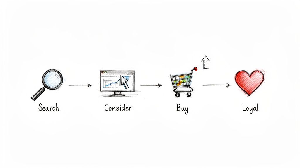
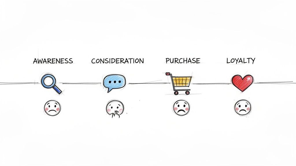
Every customer's journey has a beginning, a middle, and an end. The first step in building your map is to define these major milestones. They form the horizontal timeline of your map, giving structure to everything else you'll add.
While the specifics might change depending on your business, most journeys follow a familiar path:
- Awareness: This is the "aha!" moment. A potential customer realizes they have a need or a problem, and they stumble across your brand for the very first time.
- Consideration: Now they’re in research mode. They're digging into your offerings, comparing you to competitors, and looking for reviews or case studies to see if you’re the real deal.
- Purchase: The moment of truth. After all their research, they decide to commit and become a customer.
- Retention: The journey doesn't end at the sale. This stage covers their experience using your product, getting support, and integrating it into their lives or workflow.
- Loyalty: The ultimate goal. A happy customer not only comes back for more but starts telling their friends and colleagues about you. They become your advocate.
Nailing these stages down first creates the skeleton of your map. It’s the framework you’ll flesh out with the real, human details.
Adding the Human Element: Actions, Thoughts, and Feelings
With your stages set, you can start layering in what makes the journey human. This is where you go beyond a simple flowchart and start building real empathy. For each stage, you’ll want to detail what your customer is doing, thinking, and feeling.
Let's imagine a startup founder who's looking for a nearshore development team.
- Doing (Actions): These are the tangible steps they take. In the Consideration stage, our founder might be "Googling 'best nearshore developers'," "Reading agency case studies," or "Scheduling three different consultation calls." These are observable behaviors.
- Thinking (Thoughts): Get inside their head. What questions are they asking themselves? Our founder is likely wondering, "Will this team actually get my vision?" or "Is their pricing transparent, or are there hidden fees?" These are their motivations and worries.
- Feeling (Emotions): This is the emotional arc of the journey. During the Purchase stage, the founder could feel a rush of excitement mixed with a healthy dose of anxiety about the investment. Mapping these emotions—even on a simple high/low scale—shows you the journey’s peaks and valleys.
Key Insight: Those emotional lows are pure gold. A moment of frustration, confusion, or doubt is a flashing red light showing you exactly where your process is broken. It’s a roadmap for improvement.
Pinpointing Touchpoints and Channels
Okay, let's get specific. A touchpoint is any interaction a customer has with your brand. A channel is where that interaction happens. It’s crucial to separate the two to create a truly actionable map.
Let’s go back to our startup founder in the Awareness stage:
| Customer Action | Touchpoint | Channel |
|---|---|---|
| Reads an article about scaling a tech team | Content Discovery | Organic Search (Google) |
| Sees a sponsored post from an agency | Social Media Ad | LinkedIn Feed |
| Gets a recommendation from a colleague | Word-of-Mouth | Email or Slack |
Mapping this out shows you which channels are working at each stage and, more importantly, where you might have gaps. Is the tone of your LinkedIn ad consistent with the welcome email a new lead receives? This level of detail is what separates a pretty picture from a powerful tool.
This entire process is also getting a major boost from technology. While old-school mapping could take weeks of manual work, AI-powered tools are now able to generate real-time maps that can handle thousands of journey variations. In fact, a Forrester Buyer's Guide predicts that by 2026, the best platforms will be able to connect all this data directly to business outcomes—something central to what we do at Nerdify.
To tie all these elements together—stages, actions, thoughts, feelings, touchpoints, and channels—you need a solid framework. To get a running start, check out our detailed user journey mapping template. It provides the structure you need to turn raw data into a compelling story that uncovers friction and lights the way forward.
Choosing the Right Tools to Visualize Your Map
Alright, you’ve done the hard work of research and data crunching. Now it’s time for the fun part: bringing your customer journey map to life. Let's be honest, a map that lives and dies in a spreadsheet is a map no one will ever use. Your real goal here is to transform all those raw data points and insights into a compelling, digestible story that your entire team can understand at a glance and actually get excited about.
The tool you pick for this will make a huge difference in how your map is built, shared, and kept up-to-date. It's less about finding the single "best" tool on the market and more about finding the right fit for your team's workflow, budget, and the complexity of the journey you're trying to capture.
From Digital Whiteboards to Specialized Platforms
The world of mapping tools is vast, with options for just about every need. Some teams love the creative freedom of a blank canvas, while others need the guardrails that a dedicated platform provides.
Let’s look at the main options you'll encounter:
Collaborative Whiteboards: Think tools like Miro or Mural. These are fantastic for real-time, cross-functional collaboration. They act like an infinite digital wall where you can throw up sticky notes, draw arrows, and paste in images. They’re absolutely perfect for those initial messy brainstorming and workshop phases, letting sales, marketing, and product teams all jump in and contribute at the same time. Their biggest strength is their sheer flexibility, but they don't have the pre-built journey mapping structure you'd find elsewhere.
Diagramming Software: If you're aiming for a more structured, polished final product, tools like Lucidchart or Visio are a great choice. They come loaded with templates and smart connectors that help you create clean, professional-looking diagrams. While they aren't as fluid for live brainstorming, they shine when it comes to producing a final, presentation-ready version of your map.
Specialized Journey Mapping Platforms: Then you have platforms like Smaply or UXPressia, which are built from the ground up specifically for this task. They come with dedicated templates that already have sections for personas, stages, touchpoints, and even emotional graphs. They essentially guide you through the process, making sure you don’t forget any critical components. That built-in structure is their biggest advantage, making them ideal for teams that want a repeatable, standardized process.
Choosing a tool isn't just a technical decision; it's a strategic one. The right tool will encourage collaboration and ensure the map becomes a living document, not a static artifact that's outdated a week after it's made.
From my experience, a hybrid approach often works best. Start the messy, collaborative work on a flexible whiteboard like Miro. Once you've got the core structure nailed down, move it into a more formal tool like Lucidchart or Smaply to create the final, shareable version. This gives you the best of both worlds: total creative freedom upfront and a polished, professional document at the end.
Design Tips to Make Your Map Instantly Understandable
The visual design of your map is every bit as important as the data inside it. A cluttered, hard-to-read map will just get ignored. You're aiming for clarity and immediate impact.
Here are a few practical design tips I've picked up to make sure your map actually gets used:
Use Color-Coding Strategically: Don't just make it pretty; make it functional. Assign different colors to represent emotions (green for positive, yellow for neutral, red for negative) or different channels (blue for the website, orange for email). This kind of visual shorthand makes it incredibly easy to spot trends and pain points without having to read every single word.
Leverage Icons and Imagery: A simple icon can communicate an idea much faster than text. Use them to represent channels (a phone for calls, an envelope for email) or customer actions. And always, always include your persona’s headshot. It's a small touch that keeps the focus squarely on the human at the center of the journey.
Create a Clear Visual Hierarchy: Guide the reader’s eye with different font sizes and weights. The journey stages should be the most prominent element on the page. Next up are the customer's actions and emotions. Less critical details can be smaller. This hierarchy ensures that anyone can grasp the main story in seconds and then dive deeper if they need more context.
Alright, you've done the hard work. You’ve built a fantastic, data-driven customer journey map. It’s a thing of beauty, a testament to solid research and getting everyone in the same room. But let's be honest—its real value isn't just in looking pretty on a wall or sitting in a shared drive. A map that just sits there is an artifact. A map that drives real, strategic change? That's your engine for growth.
It's time to shift gears from analysis to action. All those insights you've uncovered are your new roadmap for making things better. This is where you turn those frustrating pain points into brilliant opportunities and use customer feedback to build a product and experience they’ll love.
First, Triage Your Opportunities
Your journey map probably lit up like a Christmas tree with friction points and chances to improve. If you try to tackle everything at once, you'll burn out your team and barely move the needle. The trick is to be ruthless with your prioritization. You need to focus on what will give you the biggest bang for your buck—for both your customers and the business.
A simple, yet incredibly powerful, way to do this is with an impact vs. effort matrix. Just plot every opportunity on a simple four-quadrant grid.
- High-Impact, Low-Effort (Quick Wins): These are your no-brainers. Jump on them immediately. Think of things like rewriting a confusing headline on a key landing page or adding a helpful tooltip to a part of your app that always trips people up.
- High-Impact, High-Effort (Major Projects): These are the big, game-changing initiatives. Maybe it’s a full overhaul of your customer onboarding flow. They’ll eat up resources, but the payoff is massive.
- Low-Impact, Low-Effort (Fill-Ins): These are nice-to-haves. Small tweaks you can sprinkle in when you have a bit of downtime, but don’t let them distract you from the bigger fish.
- Low-Impact, High-Effort (Time Sinks): Avoid these like the plague. They're a black hole for time and energy with almost nothing to show for it.
This little exercise forces you to think strategically about where your team’s energy goes, making sure every move is deliberate and aimed at something that matters.
A Blueprint for Action Across Teams
The real magic of a customer journey map is how it gets everyone speaking the same language. It breaks down those pesky departmental silos by showing exactly how everyone's work—from marketing to support—connects to the big picture of the customer experience.
Here’s how different teams can grab the map’s insights and run with them.
For the Product Team
The journey map is basically a cheat sheet for your product roadmap. See a recurring pain point in the "Retention" stage? That’s not just a complaint; it’s a signal that you might have a missing feature or a clunky design. Instead of guessing what to build next, the product team can use the map to create a development pipeline that solves real, documented frustrations.
For the Marketing Team
Marketing can use the map to fine-tune their messaging from top to bottom. If the map shows customers get a bit anxious during the "Consideration" phase, the marketing team knows exactly what to do: spin up some targeted case studies, testimonials, or a detailed competitor comparison to build confidence. It’s all about getting the right message to the right person at the right time.
A customer journey map shifts everyone's focus from isolated departmental goals to a single shared mission. Suddenly, success isn't just about conversion rates or ticket times—it's about working together to nail the end-to-end customer experience.
For Customer Support
The map helps support teams get ahead of problems, shifting them from reactive fire-fighting to proactive problem-solving. By seeing the common hurdles customers hit before they send a frustrated email, the support team can build out preemptive resources. If tons of users get stuck on a specific integration, why not create a killer step-by-step video tutorial and send it to new users automatically?
Assign Owners, Measure Everything
An idea without an owner is just a wish. Once you’ve prioritized your list of initiatives, every single one needs a name next to it. That person is responsible for seeing it through to the finish line. This step alone is crucial for turning good intentions into actual results.
And you can’t just stop there. You have to define what "done" and "successful" look like. Vague goals like "improve the user experience" are impossible to track. Get specific with Key Performance Indicators (KPIs) for each project.
Are you trying to fix a high drop-off rate on your signup page? Your KPI could be a 15% increase in form completion rate. Improving the onboarding process? Aim for a 20% reduction in support tickets from new users in their first week. Setting concrete goals is non-negotiable, and it all starts with a solid grasp of the core user experience metrics that truly show if you're making a difference.
By turning your map into a living, breathing action plan—with clear owners and measurable goals—you’ve completed the most important step of all. You've transformed a static document into a dynamic tool that will fuel continuous improvement and keep your customer at the absolute center of your universe.