How to Make Website Accessible: Essential Guidelines for Inclusion

When we talk about making a website accessible, we're talking about designing and building it so that people with disabilities can actually use it. It’s a practical process that involves things like adding descriptive alt text so screen readers can explain images, ensuring every feature works with keyboard-only navigation, and maintaining strong color contrast so text is easy to read.
Ultimately, it’s about crafting a web experience that works for everyone, no matter their physical or cognitive abilities.
Why Digital Accessibility Is Non-Negotiable
Before we get into the nuts and bolts of how to implement accessibility, we need to get on the same page about why it's so important. This isn't just another box to check or a technical task to hand off to developers. It’s a fundamental mindset shift that recognizes the internet should be a space for all.
At its heart, digital accessibility is about people. It ensures that a blind person can understand your product photos through their screen reader, a user with motor impairments can get through your checkout without a mouse, and someone with a cognitive disability isn't overwhelmed by a chaotic layout. When we build websites without thinking about these users, we're putting up digital barriers that exclude huge groups of people.
The Human and Ethical Imperative
Think of it this way: accessibility is the digital version of a wheelchair ramp. You wouldn't build a public library with only stairs, right? That would effectively tell people with mobility issues they aren't welcome. The very same principle applies to the web. An inaccessible website sends a message—whether you intend it or not—that some users are less important than others.
Embracing accessibility is a real commitment to inclusivity. It shows your brand values every single potential user, which in turn builds community and trust. This people-first approach goes far beyond legal checklists; it weaves empathy right into your company's DNA.
"Making things accessible is a fundamentally human challenge that needs human solutions in human contexts. At any point during the creation of a web page, a blog post, its design, sourcing of images, or writing, issues can creep in."
This really gets to the core of it. Accessibility isn’t a one-and-done fix. It's an ongoing, team-wide effort that demands human-centered thinking at every single step of a project.
The Overlooked Business Case
If the ethical argument isn’t enough, there's also a powerful business case for accessibility. Globally, there are roughly 1.3 billion people—that’s about 16% of the world's population—living with some form of disability. And yet, fewer than 4% of the top websites are fully accessible. That's a staggering gap.
The combined global spending power of people with disabilities and their families is estimated at a massive $13 trillion. This represents a huge, and largely ignored, market. You can dive deeper into these website accessibility statistics to see the full picture.
Ignoring this demographic is like leaving piles of cash on the table. Businesses that get this right and truly prioritize accessibility often see some serious benefits:
- Expanded Market Reach: You tap into a loyal customer base that your competitors are probably overlooking.
- Enhanced Brand Reputation: You build a positive public image as an inclusive, forward-thinking organization.
- Improved SEO: So many accessibility best practices—like semantic HTML and proper alt text—are exactly what search engines love to see.
In the end, making your website accessible isn’t a chore. It's a strategic move that sparks innovation, improves the user experience for everyone, and aligns your business with the modern world's expectation of inclusivity.
Building Your Site on an Accessible Foundation
True web accessibility isn't about slapping on a widget or adding a few lines of complex code after the fact. It starts at the very beginning, with the skeleton of your site: the HTML. Getting this right from the ground up gives you the biggest accessibility win for the least amount of effort.
Think of semantic HTML as the architectural blueprint for your website. When you use tags like <header>, <nav>, <main>, and <footer>, you're doing much more than just organizing content. You're giving assistive technologies, like screen readers, a clear, logical map to follow.
A screen reader can announce, "main navigation," when it encounters a <nav> tag or jump straight to the <main> content. This gives users with visual impairments a sense of the page's layout, letting them navigate efficiently instead of having to listen to every single element. It’s the digital equivalent of clear, helpful signage in a physical building.
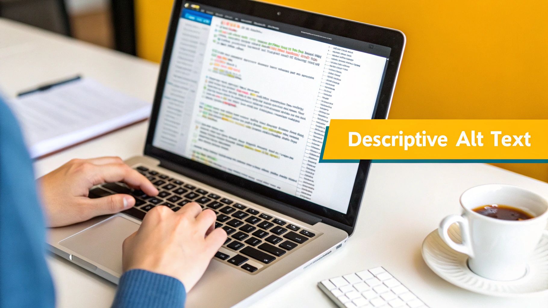
Mastering Alt Text for Images
Images are fantastic for visual appeal, but they can be major roadblocks for some users if you're not careful. This is where alternative text (alt text) comes in. Alt text is simply a short, written description of an image that screen readers announce aloud, giving vital context to anyone who can't see it.
The trick is to write descriptive yet concise alt text. It’s a bit of an art. Instead of something generic like alt="product", try painting a picture with your words: alt="Red running shoe with white laces, angled to show the sole's grip."
Of course, not every image needs a novel. If an image is purely decorative—think abstract background patterns or stylistic flourishes—it's best to use an empty alt attribute (alt=""). This signals to screen readers that the image can be safely ignored, preventing pointless distractions from the main content.
A common mistake I see is leaving the alt attribute off entirely. When you do that, some screen readers attempt to read the image's file name, resulting in a jumbled mess like "IMG_8734.jpg." It's a jarring and confusing experience that's easily avoided.
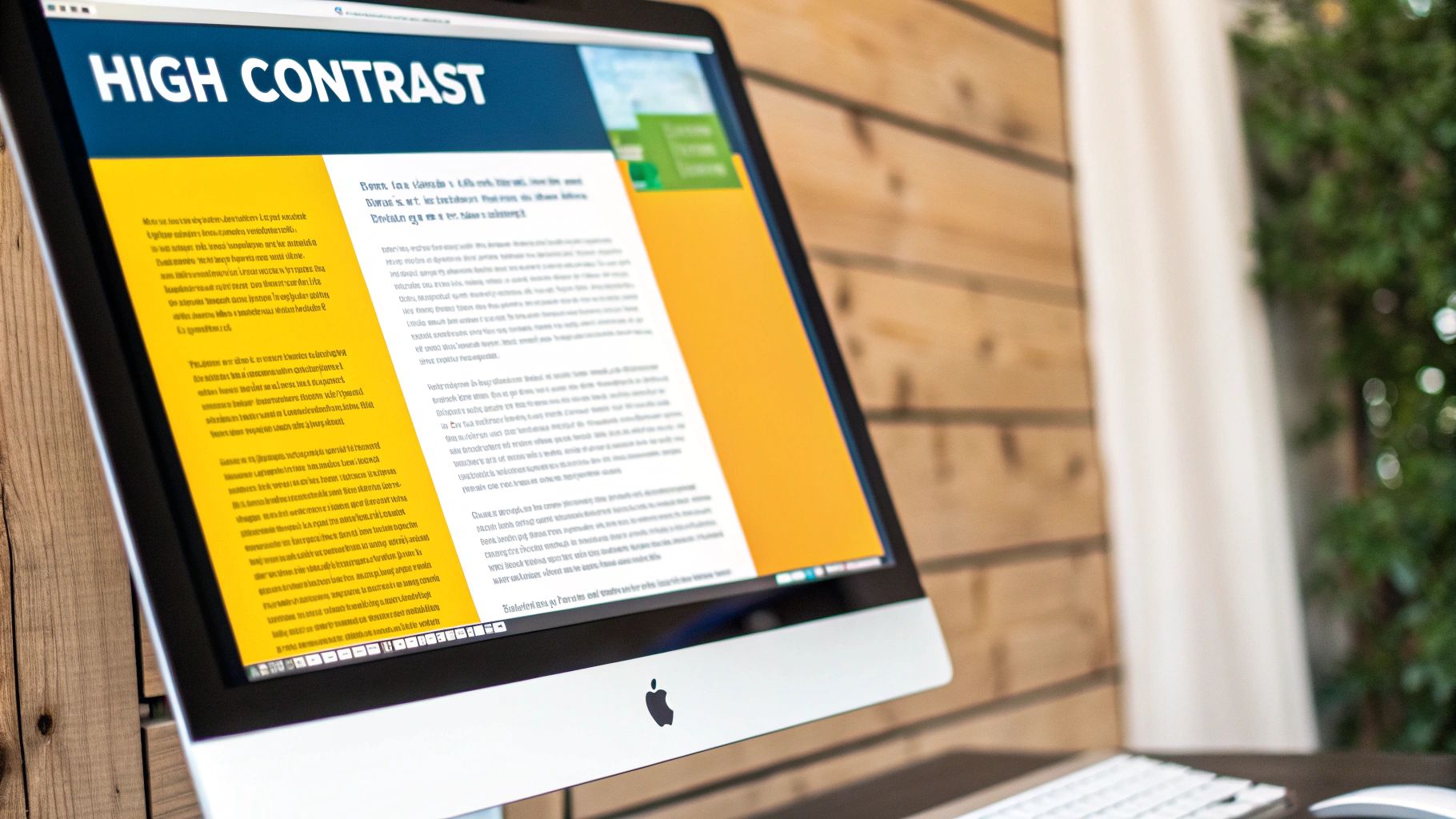
Ensuring Sufficient Color Contrast
One of the most frequent and easily fixed accessibility hurdles is poor color contrast. That light gray text on a white background might look sleek, but for users with low vision or certain types of color blindness, it can be completely illegible.
The Web Content Accessibility Guidelines (WCAG) set clear, measurable standards to follow. The minimum contrast ratio should be 4.5:1 for normal text and 3:1 for large text (which is defined as 18pt or 14pt bold).
Thankfully, you don't have to eyeball it. There are plenty of fantastic, free tools to help you get it right:
- WebAIM's Contrast Checker: A go-to, straightforward tool. Just plug in your foreground and background colors to get an instant pass/fail grade.
- Adobe Color: This one is great for designers, as it not only checks your ratios but also suggests compliant color alternatives.
- Browser DevTools: Did you know most modern browsers have a contrast checker built right in? You can inspect any element on your page and get an immediate report.
Fixing contrast is usually just a quick CSS tweak, but the impact on readability is massive. By focusing on these fundamentals—semantic HTML, proper alt text, and strong color contrast—you're laying the groundwork for a truly accessible site. When you’re ready to tackle more ambitious projects, understanding the structured process of custom web application development will show you how these principles scale up from day one.
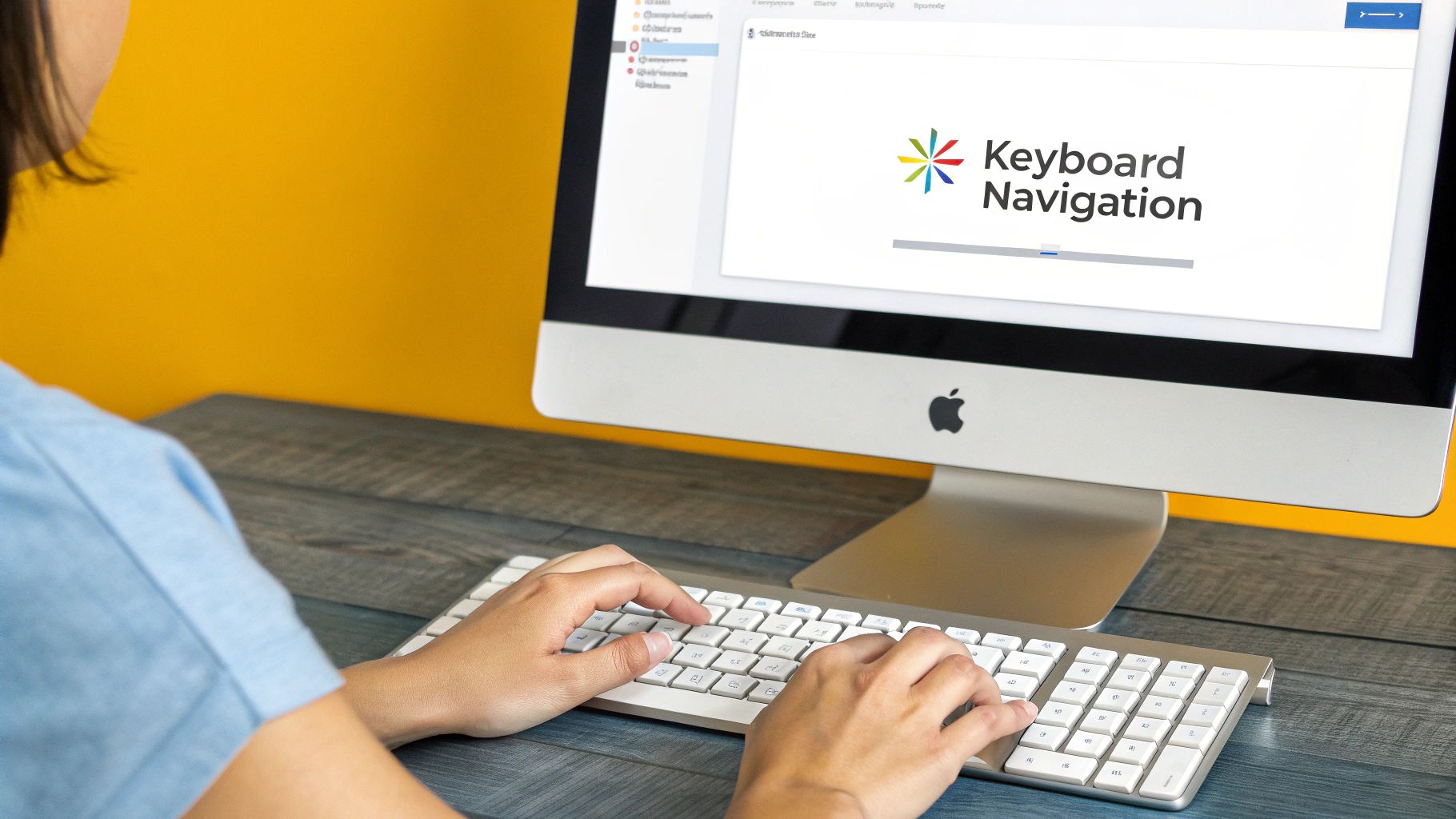
Designing for Keyboard-Only Navigation
Here’s a quick test: unplug your mouse and try to use your favorite website. For many people, this isn’t a test—it's just how they navigate the web every day. Users with motor disabilities, those who rely on screen readers, and even power users often depend entirely on a keyboard.
Ensuring your site works flawlessly without a mouse isn't just a compliance task. It's about building an experience that is intuitive and free from frustrating dead ends for a much wider audience.
Create a Logical and Predictable Focus Order
When someone hits the Tab key, they expect to move through the page’s interactive elements—like links, buttons, and form fields—in a sequence that makes sense. This path, known as the focus order, should naturally follow the visual layout of the page, usually top-to-bottom and left-to-right.
The good news? If you've used clean, semantic HTML, the browser does most of this work for you. The focus order will just work. Trouble usually brews when we get creative in the wrong ways, like using <div>s or <span>s with JavaScript click events to mimic buttons, or by forcing a different order with the tabindex attribute.
The
tabindexattribute feels like a powerful tool, but it's one I see misused constantly. Giving an element a positivetabindex(liketabindex="1") yanks it out of the natural document flow, creating a jarring and confusing path for the user. It's almost always a sign that the HTML structure itself needs to be fixed, not patched over.
Design a Highly Visible Focus Indicator
One of the most common and easily fixed accessibility issues is a missing focus indicator. That’s the outline that appears around an element when you tab to it. Designers often remove it with outline: none; because it clashes with their aesthetic, but in doing so, they make the site completely unusable for keyboard navigators. It’s like trying to find your way in the dark.
Instead of hiding it, make it a feature. A custom, high-contrast focus style can improve usability while reinforcing your brand.
Here are a few tips I've picked up for creating better focus styles:
- Go Beyond the Default: Don't settle for the browser's thin, dotted line. Make it bold and obvious.
- Ensure High Contrast: Your focus ring needs to stand out clearly against the background, just like your text.
- Don't Rely on Color Alone: Combine the outline with another visual change, like a subtle background shift, to help users with color vision deficiencies.
You can handle this right in your CSS. I'm a big fan of using the :focus-visible pseudo-class, which cleverly applies your styles only when a user is navigating with a keyboard, not when they simply click with a mouse.
/* A clear, branded focus style / :focus-visible { outline: 3px solid #005fcc; / A bold, high-contrast blue */ outline-offset: 2px; border-radius: 4px; }
This tiny CSS snippet makes a world of difference for the keyboard user experience.
Avoid Keyboard Traps and Add Skip Links
Two things that will make a keyboard user want to close the tab instantly are keyboard traps and navigation overload.
A keyboard trap is exactly what it sounds like: a user can tab into a component—say, a complex widget or a modal pop-up—but can't tab back out. They're stuck. The only escape is to reload the page. Every single interactive element you build must have a clear keyboard path both in and out.
For sites with massive navigation menus, "skip to content" links are a lifesaver. This is a simple link, often the very first focusable element on a page, that lets a user bypass the entire header and jump straight to the main content. It’s a huge win for efficiency and a core tenet of good accessibility. Adding one is a simple, powerful way to show you’re serious about building a site that works for everyone.
Using ARIA to Enhance Complex Interfaces
Sometimes, native HTML just isn't enough. We build these incredibly dynamic and complex components—think custom dropdowns, sortable tables, or multi-step forms that update on the fly—and standard HTML tags don't have the vocabulary to describe what's happening.
This is precisely where ARIA (Accessible Rich Internet Applications) comes into play. It’s an essential part of any modern developer's accessibility toolkit, acting as a bridge between your custom code and assistive technologies like screen readers. ARIA adds that missing layer of context, explaining an element's purpose and state without changing how it looks or functions for visual users.
The First Rule of ARIA
Before you start sprinkling ARIA attributes into your code, you need to internalize the most important rule: No ARIA is better than bad ARIA.
This isn't just a catchy phrase; it's a critical guideline. Used incorrectly, ARIA can make a website less accessible, creating confusion and frustration for users who rely on assistive tech. A close second to this rule is to always use a native HTML element if one already exists for the job. You don't need ARIA for a standard link, button, or checkbox—HTML handles those perfectly on its own.
Think of ARIA like seasoning. You wouldn't cover a steak in salt before tasting it. You start with the core ingredient—your semantic HTML—and then add just enough ARIA to enhance the experience where needed. Overdo it, and you’ll ruin the meal.
Common ARIA Roles and Properties in Action
So, how does it work? ARIA uses a system of roles, states, and properties that you add directly to your HTML. A role defines what an element is (like role="tab"), while states and properties describe its current condition (like aria-selected="true").
Let’s walk through a classic example: a custom-built accordion menu. For a user with a screen reader, two things are crucial: knowing it’s a control that reveals content, and knowing whether that content is currently open or closed.
This is a perfect use case for aria-expanded.
You can return any item within 30 days of purchase.
aria-expanded="false"clearly tells a screen reader that the content is currently collapsed. When the user clicks the button, your JavaScript should flip this value totrue.aria-controls="faq-content-1"programmatically links the button to thedivit manages, making the relationship crystal clear to the assistive technology.
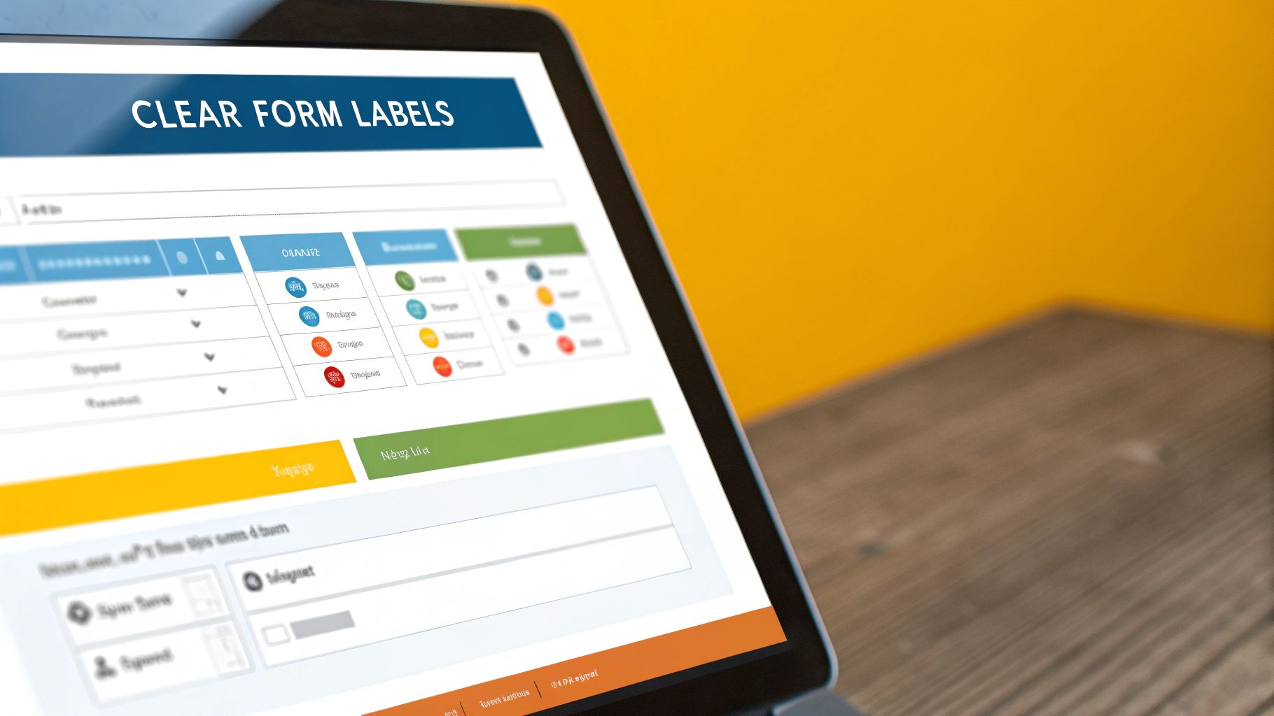
Adding Clarity with Labels
What about those little interface elements that have no text? Icon buttons are the most common culprit. A magnifying glass icon visually screams "search," but for a screen reader, it's just a silent graphic.
This is an easy fix with aria-label. It gives an accessible name to an element that would otherwise be a mystery.
Investing in these practices is no longer a niche concern; it's a core business strategy. The global market for accessibility tools is projected to hit $893.7 million by 2031. Despite this, a staggering 73% of disabled customers still face accessibility barriers on more than a quarter of the websites they visit. You can explore more accessibility trends and statistics to see just how wide the gap is between awareness and action.
By using ARIA thoughtfully to fill in the gaps left by standard HTML, you make your complex interfaces navigable for everyone, turning a potentially frustrating experience into a seamless one.
Auditing Your Website for Accessibility
Think of web accessibility not as a final destination, but as an ongoing journey. Making a site truly accessible means you’re never really done. To get it right, you need a solid framework for testing—one that blends the raw power of automated tools with the irreplaceable nuance of human review. This combined approach is the only way to catch everything from glaring code errors to subtle snags in the user experience.
Starting with Automated Scans
Your first pass should always involve an automated scanner. These tools are the accessibility equivalent of a spellchecker; they're incredibly fast and fantastic for catching the "low-hanging fruit." They'll quickly flag common, code-level mistakes that violate WCAG standards.
But here’s the catch: they aren't a magic bullet. An automated tool can tell you an image is missing its alt text, but it can’t tell you if the existing text is actually helpful or just gibberish. That’s where you, the human, come in.
Picking the Right Automated Tool
There are several powerful tools out there that can give you a running start, and many of them are free. Two of the most respected are WAVE and Axe, both available as handy browser extensions.
- WAVE (Web Accessibility Evaluation Tool): Created by the experts at WebAIM, WAVE overlays icons and indicators directly onto your page. It gives you a rich, visual report that’s perfect for getting a quick, high-level overview.
- Axe DevTools: Built by Deque, Axe plugs right into your browser's developer console. It's a favorite among development teams because it's known for its accuracy and for producing very few "false positives."
These tools are invaluable, but it's crucial to understand their limits. Automated testing can realistically only catch about 30-40% of all potential accessibility problems. They simply can't grasp the quality of the user experience, the logical flow of your content, or the context behind your design choices. This is precisely why any real quality assurance in software development must involve a human being.
The scale of the problem these tools can uncover is frankly staggering. The 2025 WebAIM Million report, which analyzed the home pages of the top one million websites, found that a jaw-dropping 94.8% had detectable WCAG 2 failures. If you want to grasp the full scope of this issue, you can read the full analysis on the WebAIM project page.
Getting Your Hands Dirty with Manual Checks
Once the machines have done their part, it’s time to roll up your sleeves. Manual auditing is where you step into your users' shoes and experience your site as they do.
Here’s a look at what the WAVE tool shows you. It provides an immediate, actionable list of problems to tackle.
A good manual audit is structured, almost like a pre-flight checklist for a pilot. You'll be looking for things that automated tools just can't see.
A Look at Your Manual Testing Checklist
Keyboard-Only Navigation: Can you get to and use every single interactive element—links, buttons, form fields—using only the Tab, Shift+Tab, Enter, and Spacebar keys? This is non-negotiable for screen reader users and those with motor impairments.
Visible Focus States: When you tab through the site, is there a clear, high-contrast outline around the element you're currently on? If not, keyboard users are flying blind, with no idea where they are on the page.
"Skip to Content" Links: Does a "Skip to Content" link pop up when you first hit the Tab key? And does it actually work? This is a massive quality-of-life feature that lets users bypass repetitive navigation headers.
Zoom Functionality: Crank your browser zoom up to 200%. Does the site still work? Is any content or functionality cut off or hidden? The layout must reflow gracefully for users with low vision.
Choosing Your Accessibility Testing Method
Deciding where to focus your efforts can be tough. Each testing method—automated, manual, and user testing—has a distinct role to play in a comprehensive accessibility strategy. This table breaks down their strengths and weaknesses to help you decide when to use each one.
| Testing Method | Primary Use | Pros | Cons |
|---|---|---|---|
| Automated Scans | Quickly identifying code-level, widespread WCAG violations. | Fast, efficient, great for CI/CD pipelines, excellent for catching low-hanging fruit. | Only catches 30-40% of issues, cannot assess context or user experience, can produce false positives. |
| Manual Audits | Verifying keyboard navigation, focus states, and logical content flow. | Catches critical UX issues automated tools miss, provides a deeper understanding of site structure. | Time-consuming, requires training and expertise, can be subjective without a clear checklist. |
| Screen Reader Testing | Simulating the experience of blind or low-vision users. | Provides invaluable, real-world insight into navigational barriers and content clarity. | Steep learning curve for new users, requires testing on multiple screen reader/browser combos. |
Ultimately, a blended approach is best. Use automated tools for broad sweeps, follow up with detailed manual checks, and cap it off with screen reader testing to truly understand the end-user experience.
The Ultimate Test: A Screen Reader Walkthrough
The single most eye-opening manual check you can perform is to use your site with a screen reader. This is the only way to get a true sense of how users who are blind or have low vision navigate your content.
The two most common (and free) screen readers are:
- NVDA (NonVisual Desktop Access): The most popular screen reader for the Windows platform.
- VoiceOver: Built directly into every Apple device, from macOS to iOS.
Here's the real test: turn off your monitor. Now, try to complete a core task on your website, like filling out the contact form or purchasing a product. Can you figure out what each form field is for? Are the buttons clearly labeled? Does the reading order actually make sense? This one exercise will reveal more about your site’s real-world accessibility than anything else.
Nothing—not even the most meticulous audit—can ever replace feedback from actual users with disabilities. Their lived experience provides insights that no checklist or tool ever could. If you are serious about accessibility, user testing with disabled individuals is non-negotiable.
By weaving together the speed of automation with the deep, empathetic insights from manual and screen reader testing, you build a sustainable process. You’ll move beyond just fixing bugs and start truly improving the digital experience for everyone.
Got Questions About Accessibility? Let's Clear Things Up.
Diving into web accessibility can feel like opening a can of worms. Suddenly, you're hit with a barrage of acronyms, technical standards, and strong opinions. It's a field where the learning curve can seem steep at first.
My goal here is to cut through that noise. I want to give you clear, straightforward answers to the questions I hear most often from teams just getting started. Let's tackle everything from the different WCAG levels to the heated debate over accessibility overlays.
What's the Deal with WCAG Levels A, AA, and AAA?
When you hear someone mention accessibility standards, they're almost certainly talking about the Web Content Accessibility Guidelines (WCAG). These are the global gold standard, and they're broken down into three different levels of conformance. Each level builds on the one before it.
Level A: This is the absolute floor. Think of it as the foundational, non-negotiable stuff. If you don't meet these criteria, some people literally won't be able to use your site. It’s the essential starting point.
Level AA: This is the sweet spot and the target for most organizations around the world. Level AA tackles the most common and significant barriers for users with disabilities. It’s what most laws and legal standards point to, offering a robust and practical level of accessibility.
Level AAA: This is the highest level—the gold medal of accessibility. Meeting every AAA standard is a fantastic goal, but it’s often not practical or even possible for every piece of content. It involves very specific and sometimes restrictive design choices, like incredibly high color contrast ratios that can impact brand aesthetics.
For almost everyone, aiming for Level AA conformance is the right move. It strikes the perfect balance, making your site truly usable for the vast majority of people without demanding an overhaul that's out of reach.
Are Accessibility Overlays a Good Idea?
Ah, the great overlay debate. This is probably one of the most contentious topics in the accessibility community, and for good reason. You’ve likely seen the ads for these third-party tools. They're typically a snippet of JavaScript that promises to magically find and fix all your accessibility problems with "one click."
The reality? The consensus among accessibility professionals is a resounding "no." These overlays rarely fix the deep, underlying code issues. In fact, they can sometimes create new problems by clashing with the assistive technology a person is already using, making the experience even worse.
"In a stunning press release, Level Access has revealed that it plans to buy accessibility overlay company UserWay for about $99 Million. For those who are unaware, accessibility overlays are JavaScripts that claim to fix accessibility issues automagically."
This big-money acquisition shows just how much financial incentive is behind these tools, but it doesn't change the facts on the ground. Real accessibility comes from a human-first approach baked into your design and development process. It's about fixing the foundation, not just slapping a coat of paint over the cracks. There’s simply no shortcut to genuine inclusion.
We're Ready to Start. What's the First Thing We Should Do?
Getting an accessibility initiative off the ground can feel like trying to boil the ocean. With so much to learn and do, it’s easy to get stuck before you even begin. My advice is always the same: start with the simplest actions that deliver the biggest impact.
Don't dive headfirst into a complicated code audit. Instead, focus your energy right here:
- Get Your Team on the Same Page: Before writing a single line of code, make sure everyone—designers, developers, and content writers—understands why this matters. Share some resources, watch a few videos of screen reader users, and have a real conversation about the human impact.
- Do the Keyboard Test: This is hands-down the single most powerful first step. Unplug your mouse. Now, try to use your website. Can you get to every page? Can you fill out a form? Can you click every button? This one simple test will uncover a shocking number of critical issues.
- Check Your Colors: Low color contrast is a huge barrier for people with low vision, and it's so easy to fix. Use a free tool like the WebAIM Contrast Checker to find and fix text that’s hard to read. This is a quick win that delivers an immediate improvement.
Focusing on these practical first moves builds momentum and makes the whole process feel manageable. From there, you can start integrating accessibility into your regular workflow. For development teams, this approach fits perfectly with modern, iterative methods. If you want to learn more about structuring this work, our guide on agile software development best practices has some great insights on how to fold new priorities into your sprints.