Improve User Experience Design with Real-World Methods

To truly improve user experience design, you have to stop thinking of it as a final coat of paint and start treating it as the foundation of your entire business strategy. Exceptional UX isn't about flashy visuals. It’s about crafting interactions that feel so intuitive, efficient, and genuinely helpful that they directly boost user retention and, ultimately, your bottom line.
A user-centric approach is the most dependable path to turning casual visitors into dedicated advocates for your brand.
Why Investing in UX Design Drives Business Growth

Let's get past the vague notion that "UX is important" and look at the real-world business impact. Every time someone gives up on a confusing checkout, deletes a clunky app, or bounces from a slow website, that’s a real loss. It’s lost revenue, and it’s a hit to your brand's credibility.
Today's users have sky-high expectations. They aren’t just looking for a product that functions—they expect an experience that feels effortless and values their time. A poorly designed interface or a confusing user journey introduces friction, which is the mortal enemy of engagement and conversion.
The Real Cost of Poor UX
Imagine this: a confusing navigation menu on your e-commerce site isn't just a minor annoyance. To a potential customer, it’s a dead end. They'll likely leave and buy from your competitor whose site makes it dead simple to find what they're looking for. This isn't just a theory; it's a reality playing out millions of times a day.
The numbers back this up. For instance, 38% of users will abandon a website if they find the layout unattractive or difficult to navigate. This single statistic shows just how critical visual appeal and clear structure are for holding onto an audience. You can dig deeper into these user behavior trends to see the full scope.
At its core, user trust is directly linked to your design decisions. When a website feels unprofessional or is a pain to use, people naturally start to doubt its credibility and security.
Connecting User Experience to Business Metrics
A well-executed user experience creates a positive ripple effect across your most important business metrics. It's not some siloed design task; it's a central engine for growth. When you commit to improving your user experience design, you're making a direct investment in:
- Higher Conversion Rates: Something as simple as streamlining a checkout flow can drastically cut down on abandoned carts.
- Stronger Customer Loyalty: A consistently enjoyable and reliable experience gives people a reason to come back, which directly increases their lifetime value.
- Lower Support Costs: When a product is intuitive, people can figure things out on their own. This means fewer support tickets and less strain on your team.
- A Better Brand Reputation: Positive experiences create positive buzz. People talk, and soon you've built a reputation for quality and user-friendliness.
The following table breaks down the core elements of modern UX and how they translate directly into tangible business results.
Key Drivers of Modern User Experience
This table summarizes the core elements that directly impact user engagement and business success, based on recent user behavior data.
| UX Element | Impact on User Behavior | Business Implication |
|---|---|---|
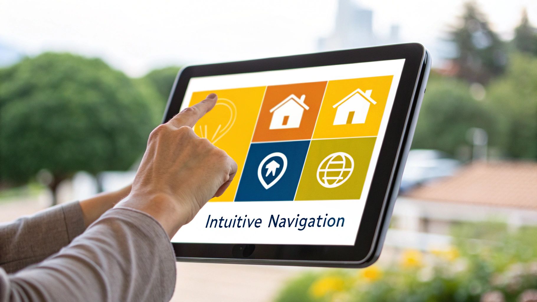
| Intuitive Navigation | Users can find what they need quickly, reducing frustration and bounce rates. | Increased page views, lower bounce rates, and higher conversion potential. |
| Fast Load Times | Keeps users engaged; slow speeds cause immediate abandonment. | Improved SEO rankings, better user retention, and reduced bounce rates. |
| Mobile Responsiveness | Ensures a seamless experience across all devices, where most users are. | Captures the majority of web traffic, improves Google ranking, and boosts mobile conversions. |
| Clear Calls-to-Action (CTAs) | Guides users toward desired actions, removing ambiguity from the journey. | Higher click-through rates, more leads, and increased sales. |
Ultimately, prioritizing UX is a proactive strategy. It shifts your team from a reactive mode—constantly fixing problems—to a preventative one, where you design experiences that avoid those problems in the first place. This guide will walk you through a practical roadmap to do just that, from initial research to advanced testing and iteration.
Building a Foundation with Smart UX Research
Before you even think about wireframes or code, the real work to improve user experience design begins. This is the research phase, and it’s about far more than just gathering data. It’s about asking the right questions to solve the right problems. I’ve seen too many projects jump straight into design, and it’s a classic mistake—like building a house without a blueprint. It almost always leads to expensive fixes and a product that just doesn't connect with its audience.
Good UX research is your best defense against designing based on assumptions. It forces a critical shift in perspective, moving from "Here's what we think users want" to "Here's what users actually need." This isn't about looking for validation for your brilliant idea; it's about uncovering the real-world behaviors, frustrations, and goals that should guide every single decision you make from here on out.
Uncovering Truths with User Interviews
User interviews are your direct connection to the person on the other side of the screen. The goal here isn’t to fish for compliments or get simple yes/no answers. You're digging for the "why" behind their actions. A single, well-run interview can expose friction points you never even knew were there.
The key is to ask open-ended questions. Instead of asking, "Do you find this feature easy to use?" try something like, "Could you walk me through how you’d normally accomplish this?" This simple switch encourages them to narrate their thought process, revealing every moment of hesitation, confusion, or frustration.
For instance, a user might tell you they love your app's dashboard. But when you ask them to find a specific report, you might watch them click through three different menus before landing on the right one. That hesitation is pure gold. It’s a pain point they didn't articulate, one that a generic question would have completely missed.
After conducting hundreds of these sessions, one thing is crystal clear: what users say they do and what they actually do are often worlds apart. Watching them in action gives you unfiltered insights that are far more valuable than their opinions alone.
Creating Personas That Build Empathy
User personas are frequently misunderstood. They’re not just marketing segments with a stock photo attached. A truly effective persona is a tool for empathy. It’s a detailed, fictional character born from your research that represents a core user group, giving your entire team—from engineers to marketers—a specific person to design for, not just a vague, faceless audience.
A powerful persona digs much deeper than just age and location. It absolutely must include:
- Goals and Motivations: What is this person trying to achieve with your product? What’s their underlying drive?
- Frustrations and Pain Points: What obstacles are they facing right now, both in general and with similar tools?
- Behaviors and Habits: How do they typically interact with technology? What does their day-to-day look like?
- A Real Quote: A direct quote from an interview that perfectly captures their main need or attitude.
This detail transforms "the user" into "Sarah, the freelance consultant who needs to track her hours quickly between client calls." Suddenly, every design choice can be measured against a simple, powerful question: "Does this actually help Sarah?"
Dissecting the Competition with Purpose
In UX, competitive analysis isn’t about stealing a competitor's feature list. It’s a strategic deep-dive to find opportunities by learning from what others do well—and, more importantly, what they do poorly. You're looking for gaps in the market and points of friction in their products that you can solve with a more thoughtful design.
First, identify 2-3 direct and indirect competitors. Then, become their customer. Don't just glance at screenshots on their website. Sign up for a trial, complete their core tasks, and truly experience their user journey from start to finish.
As you use their product, document everything. Ask yourself critical questions:
- Where did I get stuck or feel confused?
- What part of their onboarding was surprisingly smooth?
- How does their information architecture guide me (or fail to)?
- What promise are they making, and does their UX actually deliver on it?
This hands-on analysis gives you an invaluable benchmark. If a competitor is known for a clunky, multi-step checkout process, you’ve just found your opening: a seamless checkout can become your killer feature. This process is a crucial input for your overall strategy, and you can learn more about how to master your app development project plan today to see how research feeds a successful roadmap. By understanding where others are falling short, you can strategically position your product to win.
Bringing Your Vision to Life Through Purposeful Design

Alright, you've done the hard work of listening to your users. Now comes the exciting part: turning all those valuable insights into a real, working interface. This is where you truly start to improve user experience design by giving your ideas a tangible form, moving from abstract concepts to concrete layouts.
The journey starts small and intentionally rough. We're talking simple wireframes—the digital equivalent of a pencil sketch. These are basic, blocky layouts that focus purely on structure and flow, without getting bogged down by colors or fonts just yet.
This "low-fidelity" approach is a game-changer. It allows you to experiment and make changes quickly and cheaply. Trust me, adjusting a simple sketch takes a few minutes, while tweaking a fully coded interface can burn through days of development time. Nailing the structure early saves you a world of headaches down the road.
Structuring Content with Information Architecture
Before you can even think about what a screen will look like, you have to decide how to organize everything on it. This is the art and science of information architecture (IA), and it’s the invisible framework that holds any great user experience together. When IA is done right, users find what they need without a second thought.
Think of it like setting up a grocery store. You wouldn't just toss products onto shelves at random. Instead, you create logical aisles like "Produce," "Dairy," and "Frozen Foods." This makes the whole shopping trip intuitive and efficient.
In digital design, it's the exact same principle. A solid IA means grouping related features together, using clear and predictable labels for navigation, and maintaining a consistent structure. When your IA is strong, users feel like they almost psychically know where to click next.
Guiding the Eye with Visual Hierarchy
Once your information is organized, visual hierarchy takes the stage. This is all about using visual cues—like size, color, and placement—to communicate what's most important on the page without spelling it out. It's how you direct a user's attention.
A big, bold headline will always command more attention than a small paragraph of text. A bright call-to-action button practically jumps off the screen against a muted background. These aren't just stylistic flourishes; they are powerful tools for reducing a user's mental effort.
Here are a few classic techniques for establishing a strong visual hierarchy:
- Size and Scale: Bigger elements feel more important. Use this to your advantage for headlines and key buttons.
- Color and Contrast: A pop of vibrant color is perfect for drawing the eye to a critical action, like an "Add to Cart" button.
- Whitespace: Don't be afraid of empty space! Surrounding an element with a bit of room makes it stand out and gives the whole design a cleaner, more breathable feel.
The real goal of visual hierarchy is to create a clear path for the user's eye to follow. A well-designed page should guide them from the most critical information down to the secondary details in a natural, effortless sequence.
This is a core pillar of the entire design process. For a broader look at how all these stages connect, our guide to mastering the UX design process steps provides a complete roadmap.
From Wireframes to Interactive Prototypes
The design process isn't a single step but an evolution. It moves through stages of increasing detail and realism, starting with basic sketches and ending with a polished model that looks and feels just like the finished product.
| Stage | Description | Key Focus |
|---|---|---|
| Low-Fidelity Wireframes | Simple black-and-white layouts. Often just boxes, lines, and placeholder text. | Structure, core layout, and the overall user flow. |
| Mid-Fidelity Wireframes | More detail is introduced, like actual text labels and grayscale UI elements. | Content placement, spacing, and the hierarchy of elements on the page. |
| High-Fidelity Prototypes | A visually complete and interactive mockup with colors, fonts, images, and branding. | Visual appeal, fine-tuning interactions, and formal usability testing. |
Moving through these stages lets you gather feedback early and often. Low-fidelity wireframes are fantastic for checking your core concepts with the team and key stakeholders. High-fidelity prototypes, in contrast, are essential for testing the feel of the product and smoothing out any usability kinks before writing a single line of code. To see these principles in action, check out this fantastic UX/UI case study for a concept app; it's a great example of how these stages build on each other.
By building up from a simple foundation to a detailed, interactive prototype, you ensure every design choice is deliberate and directly informed by your initial user research. This is how you create an experience that isn't just nice to look at, but genuinely works for the people using it.
Validating Designs with Effective Usability Testing

So, you’ve got your wireframes mapped out and your prototypes looking sharp. But how do you know if they'll actually click with real people? This is where usability testing comes in, and frankly, it's the moment of truth that can make or break your efforts to improve user experience design.
Think of it less as a test and more as a conversation. You're watching someone interact with your creation for the first time, and their actions will tell you more than any design review ever could. Without this step, you’re just guessing. I’ve seen some stunningly beautiful interfaces completely fall flat because a critical button was cleverly hidden or the checkout flow had one tiny, confusing snag.
True usability testing isn't about asking people if they like the design. It’s about giving them a goal and watching what happens. The feedback is raw, honest, and gold for any designer.
Choosing Your Testing Approach
Not all usability tests serve the same purpose. The right method really boils down to your budget, your timeline, and the specific questions you need answered. Your main options fall into two camps: moderated and unmoderated testing.
A moderated test is like having a co-pilot. You, the facilitator, are right there with the user (in person or virtually), guiding them through the tasks. This is invaluable because you can ask follow-up questions the moment they pause or look confused. It’s the best way to get at the why behind their actions and is perfect for exploring complex user journeys.
Unmoderated testing, on the other hand, is more of a self-guided experience. You set up the tasks on a platform, and users complete them on their own time while their screen and voice are recorded. This approach is much faster and more scalable, allowing you to gather feedback from a wider audience without breaking the bank. It's a fantastic choice for validating specific, straightforward tasks. To figure out what's best for your project, you can dig into this breakdown of 7 essential usability testing methods to use in 2025.
One of the most common pitfalls is mistaking subjective preference for a usability flaw. A user might say they "don't like the color blue," which is an opinion. But if they "couldn't find the blue 'Save' button," that's a critical usability issue you need to fix.
Planning and Conducting Your Tests
Jumping into testing without a plan is a recipe for chaos. You'll end up with a mountain of vague feedback and no clear direction. Before you even think about recruiting participants, you need to know exactly what you’re trying to learn.
A solid test plan should cover these bases:
- Objectives: Get specific. What do you need to know? A good objective sounds like: "Can a user find a product, add it to their cart, and get to the payment screen in under 2 minutes?"
- Participant Profile: Who are you building this for? Define your ideal tester, from their demographics to their comfort level with technology. Testing with the wrong people will give you completely skewed results.
- Key Tasks: Don't try to test everything. Focus on 3-5 core tasks that are absolutely essential to the user's success with your product.
When the test begins, your role is to be a quiet observer. Put the participant at ease and remind them you're testing the design, not their skills. Your instinct might be to jump in and help when they struggle, but don't. Those moments of friction are precisely where your most important insights are hiding.
Analyzing Feedback and Iterating
Once you've wrapped up your sessions, the real work starts. You’ll be sitting on a mix of hard numbers (task success rates, completion times) and qualitative insights (user quotes, observed frustrations).
Start by looking for patterns. I find a simple spreadsheet is great for this. As you review your notes and recordings, themes will emerge. When four out of five people get stuck on the same navigation link, you’ve found a fire you need to put out.
Next, you need to prioritize. Not all feedback carries the same weight. I like to categorize issues to decide what to tackle first:
- Critical: A showstopper. The user can't complete a core task. Fix this now.
- Serious: Creates major frustration but doesn't completely block the user. This should be next on your list.
- Minor: A small annoyance or cosmetic issue. Good to fix when you have time.
This cycle of testing, analyzing, and refining is the engine of great UX. Each iteration gets you closer to an experience that feels effortless for your users, because it's been shaped by their actual behavior.
Future-Proofing Your Product with Advanced UX Trends
If you want to improve user experience design in a way that lasts, you have to look past today's best practices and start thinking about what users will demand tomorrow. This isn't about jumping on every shiny new trend. It's about strategically picking up on shifts that will lead to more inclusive, trustworthy, and genuinely engaging products.
Building a product that still feels relevant in a few years means getting a handle on where technology and user expectations are heading. We're seeing huge movements, from the practical applications of AI to a non-negotiable demand for ethical design. Let's dig into the key trends that are already shaping the future of UX.
Embracing Accessibility as a Core Feature
For far too long, accessibility was just another box to check on a compliance list—an afterthought tacked on at the end of the project. That whole mindset is quickly becoming a relic. The best design teams now see accessibility not as a niche constraint, but as a gateway to innovation and a much larger market.
This goes way beyond simple alt text and high-contrast color schemes. Modern accessibility involves a much deeper, richer set of features. We're seeing a clear shift toward building experiences that are inclusive from the ground up. This means weaving in features like text-to-speech, voice navigation, and customizable color profiles—not just to meet a legal standard, but because it opens your product up to more people.
Immersive tech is another huge part of this. Augmented reality (AR), for instance, is set to grow massively, letting people interact with products in ways we couldn't before. Think of how Gucci uses AR lenses for a virtual shoe try-on. It's a powerful and practical application you can read more about in this exploration of top UI/UX design trends.
When you design for the widest possible range of human abilities, you don't just help a specific group; you almost always end up with a better, more intuitive product for everyone.
Building Trust Through Ethical Design
In a world full of data breaches and privacy scandals, users are rightfully skeptical. A polished interface just can't cover up shady data practices anymore. This is where ethical design comes in. It’s a firm commitment to being transparent, protecting privacy, and looking out for the user's well-being, and it’s fast becoming a key reason why customers choose one product over another.
This is about more than just throwing up a privacy policy link in your footer. It’s about fundamental changes in how you operate:
- Radical Transparency: Use plain, simple language to explain why you need certain data and exactly what you'll do with it. No legalese.
- Giving Users Control: Make it dead simple for people to manage their own data, tweak privacy settings, and opt out of tracking whenever they want.
- Avoiding "Dark Patterns": This is a big one. You have to actively reject all those sneaky design tricks that push users into doing things they wouldn't normally do, like pre-checked marketing boxes or ridiculously confusing cancellation flows.
When you prioritize ethical design, you're not just building a product; you're building a relationship. That trust is incredibly difficult to earn and almost impossible to win back once it's broken.
The Rise of AI in UX
Artificial intelligence isn’t some far-off concept from a sci-fi movie anymore—it’s actively changing how we work in the UX field. From the initial research phase all the way to personalization, AI gives us powerful new ways to create smarter and more responsive user experiences.
One of its biggest impacts so far has been on UX research. AI can chew through enormous amounts of user feedback, session recordings, and heatmap data in a tiny fraction of the time it would take a human researcher. This lets teams pinpoint user frustrations and behavioral patterns with incredible speed and precision.
For the end-user, AI is the engine behind hyper-personalization. Instead of a one-size-fits-all experience, AI can adapt content, product recommendations, and even UI elements based on an individual's behavior. We all see this with Netflix and Spotify, which learn our tastes to serve up content that feels like it was picked just for us. That level of personal touch is quickly becoming the baseline expectation.
To really get ahead, it's smart to look at how AI is being used in adjacent fields. For example, checking out different types of AI marketing software can give you ideas for how automation and personalization are influencing the entire customer journey. This wider perspective helps you build a smarter, more cohesive product from top to bottom.
Common Questions About Improving User Experience
Even with a solid plan, you're bound to run into questions when you’re in the trenches trying to improve user experience design. Let's tackle some of the most common ones I hear from teams, with practical answers to clear up confusion and keep you moving forward.
How Can I Improve User Experience with a Limited Budget?
This is a big one. The good news is you don't need a huge budget to make a real difference. The trick is to get creative and focus on high-impact, low-cost activities that deliver the most value for your time.
I often suggest starting with some "guerrilla" usability testing. Grab a few friends, colleagues, or even family members and ask them to perform a couple of essential tasks on your website or app. It's amazing what a fresh set of eyes can uncover—they'll almost immediately stumble upon issues you've become completely blind to.
You can also lean on a wealth of free tools.
- Google Analytics is a treasure trove for spotting exactly where users are abandoning a process.
- Free versions of heatmap tools are fantastic for showing you what people are actually clicking on (and what they're ignoring).
By zeroing in on the critical usability problems that these simple, scrappy methods reveal, you can make significant headway without needing to fund a massive, top-to-bottom redesign.
It’s a common misconception that great UX requires a huge investment. In reality, the most valuable insights often come from quick, scrappy tests that cost nothing more than your time.
What Is the Difference Between UI and UX Design?
Ah, the classic question. Getting this right is fundamental. I find a simple restaurant analogy works best to clear things up.
User Experience (UX) Design is the entire dining experience. It's everything from the first moment you think about the restaurant, to making a reservation, how you're greeted at the door, the atmosphere, the clarity of the menu, the quality of the food, and even the process of paying the bill. UX is about the overall journey—was it logical, enjoyable, and did it meet your needs?
User Interface (UI) Design, on the other hand, is the presentation of the food on the plate, the style of the silverware, and the font used on the menu. UI is all about the specific visual and interactive elements a person engages with—the buttons, the icons, the color palette, and the typography.
In short, UX is the strategic thinking behind the entire journey. UI is the beautiful and functional execution of that strategy's touchpoints. You absolutely need both to create a successful product.
How Do I Measure the ROI of UX Improvements?
To truly prove the value of your UX work, you have to connect your design changes to tangible business metrics. This is how you start speaking the language of executives and stakeholders: results. The goal is to paint a clear "before and after" picture that's directly tied to key performance indicators (KPIs).
Before you roll out any changes, you need to establish a baseline. What do your key metrics look like right now? After you implement the improvements, you'll track those exact same metrics to measure the impact.
| Metric to Track | Example UX Improvement | How to Measure ROI |
|---|---|---|
| Conversion Rate | Streamlining a multi-step checkout process into a single page. | Measure the percentage increase in completed purchases after the redesign. |
| Task Completion Rate | Simplifying the navigation menu to make a key feature easier to find. | Track how many more users successfully complete that task without getting lost. |
| User Retention | Redesigning the onboarding flow to be more engaging and helpful. | Monitor the percentage of new users who return to the app after 7, 14, and 30 days. |
| Support Ticket Volume | Adding a detailed FAQ section or helpful tooltips to a complex feature. | Measure the reduction in support tickets related to that specific part of the product. |
When you can directly link your efforts to these kinds of numbers, you’re no longer just saying you made the product better—you're proving it with hard data. This approach makes it infinitely easier to get buy-in and funding for future projects to improve user experience design.