The Ultimate User Experience Audit Checklist: 9 Key Areas for 2026

In a competitive market, a seamless user experience (UX) is no longer a luxury-it's a critical driver of conversions, retention, and brand loyalty. But how do you systematically identify and fix the hidden friction points that are costing you customers? The answer is a thorough UX audit. A user experience audit is a comprehensive evaluation of your website or application against a set of established usability principles and best practices. It's not about subjective opinions; it's a data-driven process to uncover what's working, what's not, and why.
This process moves beyond guesswork, providing a clear roadmap for improvements that align directly with user needs and business objectives. Before diving into the audit itself, it's beneficial to understand what user experience design entails at a foundational level, as this context clarifies why each checklist item is so crucial for success. A well-executed audit provides the evidence needed to prioritize fixes, justify design decisions to stakeholders, and create a more intuitive and effective product.
This definitive user experience audit checklist breaks down the process into 9 distinct, actionable areas, providing a structured framework to help you improve usability, boost accessibility, and ultimately, drive better business results. You will learn how to scrutinize everything from your navigation and information architecture to your forms, visual consistency, and technical performance. Whether you're a startup founder, a product manager, or a marketer, this guide will equip you with the tools and knowledge to transform your digital product into a user-centric powerhouse. Get ready to turn insights into action.
1. Navigation & Information Architecture
Navigation and information architecture (IA) form the skeleton of your digital product. They dictate how users find information, discover features, and move through your application. A strong IA ensures that content is logically organized and easily accessible, typically within two or three clicks. This crucial element in any user experience audit checklist directly impacts cognitive load; when users can predict where to find what they need, their experience feels intuitive and efficient, boosting both engagement and task completion rates.
Why It's a Priority
Poor navigation is a primary driver of user frustration and site abandonment. If users cannot find what they are looking for quickly, they will leave. This audit point is foundational because it affects every other aspect of the user journey. It's the difference between a user seamlessly booking a rental on Airbnb, guided by its clear faceted search, and a user getting lost in a maze of confusing menus.
Actionable Audit Steps & Tips
To effectively evaluate your navigation and IA, integrate these specific actions into your audit process:
- Conduct Card Sorting: Use tools like OptimalSort to run card sorting exercises with target users. This helps validate whether your content categories and labels (your taxonomy) align with user mental models, not just internal business logic.
- Analyze User Paths: Implement analytics tools like Google Analytics or Hotjar to track user flows. Identify pages with high exit rates or navigation paths that lead to dead ends. These are clear indicators of navigational bottlenecks.
- Limit Top-Level Items: For optimal cognitive load, restrict the main navigation menu to 5-7 distinct categories. If you have more, consider grouping related items under a broader parent category.
- Test Across Devices: Your navigation must be responsive. Test its usability on various screen sizes. For instance, Apple’s mobile sites use progressive disclosure, showing top-level categories first and revealing sub-categories upon interaction to avoid overwhelming small screens.
- Use Clear Labels: Avoid jargon or vague terms. Your navigation labels should be descriptive and unambiguous. A/B test different labels to see which ones perform better.
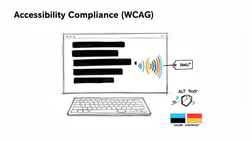
2. Accessibility Compliance (WCAG 2.1 Standards)
Accessibility ensures your digital product is usable by everyone, including people with disabilities. It’s not just a feature but a fundamental aspect of inclusive design. This crucial checkpoint in any user experience audit checklist involves verifying your site or app against the Web Content Accessibility Guidelines (WCAG) 2.1, specifically aiming for Level AA compliance. This covers everything from color contrast and keyboard navigation to screen reader compatibility and semantic HTML, making your product more robust and legally sound.
Why It's a Priority
Neglecting accessibility excludes a significant portion of the population (over 1 billion people worldwide live with some form of disability) and exposes your business to legal risks. Beyond compliance, accessible design often leads to a better experience for all users. For instance, high-contrast text is easier for everyone to read in bright sunlight, not just those with visual impairments. Microsoft’s Inclusive Design methodology, applied across its products, demonstrates how designing for diverse abilities drives innovation and improves usability for a broader audience.
Actionable Audit Steps & Tips
To properly assess your product’s accessibility, incorporate these specific actions into your audit:
- Use Automated Scanners: Start with automated tools like Axe, WAVE, or Lighthouse to perform a first-pass screening. These tools can quickly catch low-hanging fruit like missing alt text, low contrast ratios, and improper ARIA roles.
- Conduct Manual Testing: Automated tools only catch about 30% of accessibility issues. Manually test key user flows using only a keyboard and then with a screen reader like NVDA or JAWS to uncover deeper usability problems. For a full breakdown, you can learn more about how to make a website accessible.
- Check Color Contrast: During the design phase, use tools like the WebAIM Contrast Checker to ensure all text and meaningful UI elements meet the WCAG 2.1 AA ratio of at least 4.5:1 (or 3:1 for large text).
- Involve Users with Disabilities: The most effective way to find real-world barriers is to include users with diverse disabilities in your testing sessions. Their direct feedback is invaluable for creating a truly inclusive experience.
- Implement Semantic HTML: Ensure your code uses appropriate HTML5 elements (
<nav>,<main>,<button>). This provides essential context for assistive technologies and improves SEO as a byproduct.
3. Performance & Load Time Optimization
Performance and load time are not just technical metrics; they are fundamental components of the user experience. Page speed directly impacts user satisfaction, conversion rates, and even search engine rankings. This crucial checkpoint in a user experience audit checklist involves measuring key performance indicators like Google’s Core Web Vitals (Largest Contentful Paint, First Input Delay, and Cumulative Layout Shift) to identify bottlenecks and optimization opportunities, especially for mobile users who may be on slower network connections.

Why It's a Priority
A slow-loading page is a primary cause of user abandonment. Research consistently shows the high cost of delays; Amazon famously found that every 100ms of latency cost them 1% in sales. Conversely, improvements yield significant rewards. After Pinterest reduced perceived load times by 40%, they saw a 15% increase in sign-ups. Slow performance creates a perception of unreliability and frustrates users before they even interact with your content, making it a critical barrier to engagement.
Actionable Audit Steps & Tips
To thoroughly assess and improve your site’s performance, incorporate these targeted actions into your audit:
- Establish a Performance Budget: Use tools like Performance Budget Calculator to set firm limits for metrics like page size, image weights, and script counts. Enforce these budgets within your development and CI/CD pipelines to prevent performance degradation over time.
- Optimize All Images: Implement modern image formats like WebP, which offer superior compression. Use responsive images with the
srcsetattribute to serve appropriately sized visuals for different devices, preventing mobile users from downloading large desktop images. - Utilize a Content Delivery Network (CDN): Serve static assets like images, CSS, and JavaScript from a CDN. This distributes your content across geographically diverse servers, reducing latency by serving files from a location closer to the user.
- Minimize and Defer JavaScript: Audit your JavaScript bundles to remove unused code. Defer the loading of non-critical scripts until after the main content has rendered to speed up the initial page view. For a deeper dive, you can explore strategies on how to improve website speed.
- Implement Lazy Loading: For pages with extensive content, use lazy loading for images and videos that are below the fold. This ensures that these assets are only loaded when they are about to enter the user's viewport, improving initial load times significantly.
4. Mobile Responsiveness & Device Compatibility
With mobile traffic dominating the digital landscape, ensuring your application provides a seamless experience across all devices is no longer optional. Mobile responsiveness and device compatibility focus on how your design adapts to various screen sizes, from smartphones and tablets to desktops. This element of your user experience audit checklist is critical for reaching and retaining a wider audience, as it ensures that usability, readability, and functionality are never compromised, regardless of the user's device.
Why It's a Priority
A poor mobile experience directly correlates with high bounce rates and lost conversions. Users expect sites to work flawlessly on their phones; if they have to pinch-to-zoom or struggle with tiny buttons, they will quickly abandon the task. Shopify's mobile-first platform, for example, has been instrumental in boosting mobile commerce conversions for its merchants. By prioritizing a responsive and touch-friendly interface, it caters to the growing number of consumers who shop exclusively on their mobile devices.
Actionable Audit Steps & Tips
To properly assess responsiveness and compatibility, move beyond simple browser resizing and adopt a more rigorous testing methodology:
- Test on Real Devices: While browser emulation is useful for quick checks, it cannot fully replicate the nuances of touch interaction, device-specific rendering bugs, or hardware performance. Use a real-device cloud service like BrowserStack or test on physical hardware.
- Throttle Network Speeds: Users access your site on varied network conditions. Use browser developer tools to simulate slower connections (like 3G or 4G) to identify performance bottlenecks and ensure your site remains usable for everyone.
- Evaluate Touch Targets: All interactive elements, including buttons, links, and form fields, must be large enough to be tapped accurately without zooming. Aim for a minimum target size of 48x48 pixels as recommended by accessibility guidelines.
- Check Orientation Changes: Users often rotate their devices between portrait and landscape modes. Your layout should adapt gracefully without breaking or hiding crucial content.
- Use Responsive Typography: Ensure text reflows correctly and remains legible on all screen sizes. Implement fluid typography techniques where font sizes scale based on the viewport width, like Medium does to provide a consistent reading experience.
5. Forms & Input Validation
Forms are the digital handshakes between your user and your business, often serving as the final step in a conversion funnel. This audit point examines everything from field design and data validation to error handling and multi-step flows. A well-designed form feels like a guided conversation, while a poor one is an interrogation. Including this in your user experience audit checklist is vital, as it directly impacts conversion rates, data quality, and user trust.
Why It's a Priority
Forms are where the most critical user actions occur: signing up, making a purchase, or submitting a lead. High friction at this stage leads directly to abandonment and lost revenue. For example, Stripe’s checkout form is a masterclass in simplicity, asking only for essential information in a single, focused view to minimize cognitive load and drive completions. Poorly handled errors or confusing layouts are a direct cause of user drop-off.
Actionable Audit Steps & Tips
To thoroughly assess your forms and validation logic, follow these specific steps during your UX audit:
- Minimize Required Fields: Audit every form field and ask, "Is this absolutely necessary for this step?" Defer optional information or collect it post-conversion to reduce initial friction.
- Provide Real-Time Validation: Use client-side validation to give users instant feedback as they type. Slack’s sign-up form does this well, confirming valid inputs with a green checkmark and flagging errors inline before the user attempts to submit.
- Use Specific Input Types: Implement HTML5 input types like
type="email"ortype="tel". This triggers the correct keyboard on mobile devices, making data entry faster and less error-prone. - Write Clear Error Messages: Replace generic messages like "Invalid input" with specific, helpful instructions such as, "Please enter a valid email address."
- Support Autofill and Password Managers: Use standard HTML attributes like
autocomplete="given-name"orautocomplete="current-password"to enable browser autofill and password manager compatibility. - Test for Accessibility: Navigate your forms using only a keyboard and test them with a screen reader. Ensure all fields have associated labels and that error messages are announced clearly to all users.
- Implement Progress Indicators: For multi-step forms with five or more steps, use a progress bar or step counter. This manages user expectations and reduces the likelihood of abandonment.
6. Visual Design & Brand Consistency
Visual design and brand consistency are the face of your digital product, shaping user perceptions and building trust from the very first interaction. This element of your user experience audit checklist covers the cohesive application of colors, typography, spacing, iconography, and component states across all touchpoints. A strong, consistent visual language reduces cognitive load by creating familiarity and predictability, making the interface feel more professional, reliable, and intuitive.
Why It's a Priority
Inconsistent design creates a fragmented and jarring user experience, which can erode trust and signal a lack of quality. When buttons, fonts, or color schemes change unpredictably from one page to the next, it forces users to re-learn the interface, causing confusion and frustration. Conversely, a consistent visual system, like Slack's friendly and approachable style, not only strengthens brand identity but also makes the product easier to learn and use, directly contributing to user satisfaction and retention.
Actionable Audit Steps & Tips
To properly assess your product's visual and brand integrity, incorporate these detailed actions into your audit:
- Establish a Comprehensive Design System: Create and document a single source of truth for all UI components, patterns, and styles. Use design tokens for colors, spacing, and typography to ensure any changes can be propagated system-wide with ease.
- Audit UI Components Systematically: Take screenshots of key components like buttons, forms, and cards across your entire application. Group them to visually identify inconsistencies in styling, spacing, or interaction states (e.g., hover, active, disabled).
- Enforce a Clear Typographic Hierarchy: Define and document a strict hierarchy for headings (H1-H6), body text, and captions. Verify that this structure is applied consistently to guide the user's eye and improve content scannability.
- Leverage Shared Libraries: Use tools like Figma or Sketch with shared component libraries. This ensures that both designers and developers are pulling from the same standardized set of assets, drastically reducing the risk of one-off, inconsistent implementations.
- Document Brand Guidelines: Create clear do's and don'ts for logo usage, color application, and voice and tone. Make this documentation accessible to all teams to maintain brand integrity across marketing materials and the product itself.
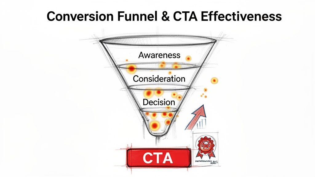
7. Conversion Funnel & CTA Effectiveness
The conversion funnel maps the journey a user takes to complete a key goal, from initial awareness to final action. Closely tied to this journey is the effectiveness of your Calls-to-Action (CTAs), the buttons and links that guide users forward. A comprehensive user experience audit checklist must evaluate this synergy, as a frictionless funnel with compelling CTAs directly translates user engagement into measurable business outcomes like sign-ups, purchases, or leads.
Why It's a Priority
This audit point directly impacts your bottom line. Even minor friction in the conversion path or an unclear CTA can cause significant user drop-off, tanking conversion rates. Optimizing this flow is the difference between a user abandoning their cart and completing a purchase. For example, Dropbox’s iconic high-contrast, orange "Sign Up Free" CTA is a masterclass in clarity and visibility, effectively moving users from interest to action.
Actionable Audit Steps & Tips
To rigorously assess your conversion pathways and CTAs, incorporate these steps into your audit:
- Map and Analyze Funnels: Use goal tracking in Google Analytics to define and monitor your conversion funnels. Identify stages with the highest drop-off rates and use tools like Hotjar to watch session recordings of users who abandon the process.
- A/B Test CTA Variables: Systematically test one element at a time, such as copy, color, size, or placement. Test a benefit-driven headline (“Get Your Free Ebook”) against an action-driven one (“Download Now”) to see what resonates.
- Optimize CTA Copy and Placement: Use first-person language (“Claim My Discount”) to create a stronger connection. Place primary CTAs where users naturally look, like the top-right corner or center of the screen, and ensure they stand out with a contrasting color.
- Implement Secondary CTAs: For users not yet ready to commit, provide a lower-commitment alternative, such as "Learn More" or "See a Demo." This keeps them engaged without forcing the primary conversion. If you're looking for more strategies, you can learn how to increase website conversions with detailed guides.
- Provide Clear Feedback: Ensure CTAs have distinct states (hover, active, disabled) and provide immediate feedback, like a loading spinner, to prevent duplicate submissions and confirm the user’s action was received.
8. User Feedback & Error Handling
Effective user feedback and error handling are the conversational elements of your interface. They communicate the application's state, guide users through complex tasks, and prevent frustration when things go wrong. From a simple "Saved!" notification to a detailed error message, this system of communication makes the product feel responsive and trustworthy. Auditing this part of your user experience audit checklist is essential for reducing user friction, minimizing support tickets, and building user confidence.
Why It's a Priority
Poor feedback leaves users in the dark, wondering if their action was successful, while unhelpful errors create dead ends. A user who repeatedly encounters a vague "Error Occurred" message will quickly abandon the task and likely the product. In contrast, Stripe’s API documentation provides developers with specific, actionable error codes that accelerate integration, turning a potential point of failure into a positive learning experience. This audit point directly impacts task completion and long-term retention.
Actionable Audit Steps & Tips
To assess and improve your system's communication, focus your audit on the following actions:
- Test All Error States: Go beyond the "happy path" and intentionally trigger errors. Document every error message for clarity, tone, and helpfulness. Are users blamed ("You entered an invalid date"), or is the message constructive ("Please enter a date in MM/DD/YYYY format")?
- Provide Inline Validation: For forms, check fields as the user types. Offer real-time positive feedback (e.g., a green checkmark for a valid email) and immediate, specific corrections for mistakes. This prevents users from discovering all their errors only after hitting "Submit."
- Implement Clear System Status: For any action that takes more than a second, use a loading spinner or progress bar. After a successful action, provide explicit confirmation, like a toast notification that says "Profile Updated" or Gmail's "Message Sent" alert.
- Offer an "Undo" Option: For destructive actions like deleting an item, provide a short window to undo the action. This simple feature significantly reduces user anxiety and prevents irreversible mistakes.
- Establish Feedback Channels: Integrate a simple way for users to report bugs or provide suggestions directly within the app. Beyond basic bug reporting, understanding essential user experience testing methods is crucial for effectively gathering feedback and addressing user pain points.
9. Cross-Browser & Device Compatibility Testing
Cross-browser and device compatibility ensures your digital product provides a consistent, high-quality experience for all users, regardless of how they access it. This involves testing appearance and functionality across different browsers like Chrome, Firefox, and Safari, and on various devices from desktops to smartphones and tablets. Neglecting this part of a user experience audit checklist can lead to a fragmented user experience, where a feature that works perfectly on one device is broken on another, eroding trust and causing significant user drop-off.
Why It's a Priority
Your users access your site from a wildly diverse ecosystem of hardware and software. A layout that breaks on Safari or a button that is unresponsive on an older Android device is a direct failure to serve a segment of your audience. This audit point is crucial for maintaining brand consistency and ensuring equitable access. For instance, Netflix's commitment to compatibility across thousands of device models is key to its global dominance, ensuring subscribers have a reliable viewing experience everywhere.
Actionable Audit Steps & Tips
To thoroughly assess your product's compatibility, integrate the following steps into your audit:
- Prioritize Based on Analytics: Use your analytics data to identify the most popular browsers, devices, and screen resolutions among your actual users. Focus your manual and automated testing efforts on these high-traffic combinations first.
- Leverage Emulation & Real Devices: Use browser developer tools and services like BrowserStack for initial emulation, but always validate critical user flows on actual physical devices. Emulators can miss touch interaction nuances and device-specific hardware bugs.
- Automate Visual Regression Testing: Implement tools like Percy or BackstopJS to automatically compare screenshots of your UI across different browsers and deployments. This helps catch unintended CSS changes and visual bugs before they reach users.
- Adopt Progressive Enhancement: Design your product with a baseline of functionality that works on all browsers, then layer on more advanced features for modern browsers. This ensures universal access, a principle expertly applied by sites like Gov.uk.
- Establish a Clear Support Policy: Define and communicate which browser versions and devices your application officially supports. This helps manage user expectations and focuses your testing resources effectively. GitHub’s carefully managed deprecation of Internet Explorer 11 is a great example of this.
9-Point UX Audit Checklist Comparison
| Checkpoint | Implementation Complexity 🔄 | Resource Requirements ⚡ | Expected Outcomes 📊 | Ideal Use Cases 💡 | Key Advantages ⭐ |
|---|---|---|---|---|---|
| Navigation & Information Architecture | Medium–High — requires research, taxonomy and iterative testing | Moderate — UX/IA designers, analytics, user testing | Better discoverability, lower support, improved conversions | Content-heavy sites, marketplaces, complex apps | Scalable structure, improved SEO, reduced friction |
| Accessibility Compliance (WCAG 2.1 Standards) | Medium — audits, remediation, and ongoing training | Moderate–High — accessibility experts, testing tools, assistive tech testing | Broader audience, lower legal risk, improved SEO & UX | Public services, regulated industries, inclusive brands | Legal protection, market expansion, better usability |
| Performance & Load Time Optimization | High — architecture changes, asset and code optimization | Moderate — dev/SRE, CDN, monitoring and profiling tools | Faster load times, higher conversions, lower hosting costs | High-traffic sites, e-commerce, mobile-first products | Direct conversion uplift, SEO boost, cost savings |
| Mobile Responsiveness & Device Compatibility | Medium — responsive design, touch patterns, reflow testing | Moderate — designers, QA on real devices, responsive frameworks | Consistent cross-device UX, improved mobile conversions | Mobile-heavy audiences, PWAs, retail apps | Broader reach, future-proof layouts, improved accessibility |
| Forms & Input Validation | Medium — client/server validation, UX and security trade-offs | Low–Moderate — dev, QA, analytics for testing | Higher conversion rates, better data quality, fewer support tickets | Checkout flows, sign-ups, lead-gen forms | Reduced abandonment, improved data integrity, clearer UX |
| Visual Design & Brand Consistency | Medium — design system creation and governance | Moderate — UI designers, component library, documentation | Stronger brand perception, faster product scaling | Brand refreshes, multi-platform products, scaling teams | Professional credibility, faster implementation, consistent UX |
| Conversion Funnel & CTA Effectiveness | High — analytics, experimentation, multi-team coordination | High — CRO specialists, analytics/A-B tools, tracking setup | Measurable conversion uplifts and revenue impact | Landing pages, e-commerce funnels, SaaS onboarding | High ROI from small changes, data-driven growth |
| User Feedback & Error Handling | Low–Medium — comprehensive error states and messaging | Low — dev/content effort, feedback and notification tooling | Reduced frustration, fewer support requests, actionable insights | Transactional apps, complex workflows, SaaS platforms | Improved retention, clearer guidance, product insights |
| Cross-Browser & Device Compatibility Testing | High — broad coverage, regression and automation strategy | High — device/cloud services, QA engineers, automation tools | Consistent experience, fewer production regressions | Large-audience products, enterprise apps, long-lived platforms | Quality assurance at scale, reduced incidents, graceful degradation |
Turning Your Audit into Actionable Growth
You've navigated the comprehensive user experience audit checklist, meticulously examining everything from navigation and information architecture to performance and error handling. This is a monumental achievement, marking a critical transition from assumption-based design to data-informed optimization. You now possess a detailed blueprint of your digital product's strengths and, more importantly, its opportunities for significant improvement. However, the true value of this audit is not in the document you’ve created, but in the decisive actions you take next. An unactioned report is just a collection of observations; a prioritized action plan is the catalyst for growth.
The journey from insight to impact begins with strategic prioritization. Your findings will range from minor cosmetic tweaks to major architectural overhauls. Trying to tackle everything at once is a surefire path to paralysis. Instead, focus on creating a clear, strategic roadmap that delivers tangible results quickly while paving the way for larger transformations.
From Findings to a Prioritized Roadmap
The most effective way to organize your audit results is by plotting them on an impact/effort matrix. This simple yet powerful tool helps you categorize each identified issue and focus your resources where they will matter most.
- Quick Wins (High Impact, Low Effort): These are your immediate priorities. Items like fixing broken links, clarifying a confusing Call-to-Action (CTA) button, or correcting glaring accessibility failures often fall into this category. They require minimal development resources but can dramatically improve the user experience and boost key metrics. For a product manager or CTO, these wins build momentum and demonstrate the immediate value of the UX audit.
- Major Projects (High Impact, High Effort): These are transformative initiatives. Think redesigning a complex conversion funnel, overhauling your mobile responsiveness, or implementing a new information architecture. These projects require careful planning, budget allocation, and integration into your development sprints. They promise substantial returns but must be managed as strategic initiatives, not quick fixes.
- Fill-Ins (Low Impact, Low Effort): These are minor improvements you can tackle when resources are available. Adjusting font consistency, tweaking color palettes for better brand alignment, or refining microcopy might fit here. While not urgent, completing these tasks contributes to a more polished and professional user interface over time.
- Reconsider (Low Impact, High Effort): These are the "money pits" to avoid. If an issue requires significant development time but offers only marginal user benefit, it should be deprioritized or even discarded. This category ensures your team's valuable time is spent on work that truly moves the needle.
Fostering a Culture of Continuous Improvement
A user experience audit checklist should not be a one-time emergency procedure. Instead, view it as a foundational tool for building a continuous improvement cycle. The digital landscape and user expectations are in constant flux; what works today may be obsolete tomorrow.
Key Takeaway: A successful UX audit is not a destination, but a recurring event in the lifecycle of a healthy digital product. It’s the difference between reactive problem-solving and proactive experience enhancement.
To embed this into your workflow, schedule regular, smaller-scale audits. A quarterly review of your conversion funnel or an annual deep dive into accessibility compliance keeps your product aligned with user needs and business goals. This proactive stance prevents small usability issues from snowballing into major conversion blockers, ensuring your application remains competitive, efficient, and user-centric.
Ultimately, by methodically working through your audit findings, you are doing more than just fixing problems. You are investing in your users. You are demonstrating that their time, effort, and trust are valued. This commitment transforms a functional product into an exceptional one, fostering the loyalty and advocacy that drive sustainable growth. The path forward is clear: prioritize, execute, measure, and repeat. Your users, and your bottom line, will thank you for it.