Designing Dashboards Best Practices: Quick-Start Guide

Dashboards are the command centers of modern business, transforming raw data into strategic insights. Yet, many fail, becoming a confusing mess of charts and numbers that hinders decision-making rather than enabling it. The difference between a powerful tool and a digital paperweight lies in a thoughtful, user-centric approach. Mastering the principles of designing dashboards best practices is no longer optional; it's a critical skill for creating interfaces that are not just visually appealing, but also intuitive, actionable, and indispensable.
In this comprehensive guide, we'll explore 10 proven principles that will empower you to build dashboards that users not only understand but rely on to drive success. We move beyond generic advice to provide specific, actionable strategies you can implement immediately to elevate your data visualization game. These best practices address everything from establishing a clear visual hierarchy and choosing the right chart types to optimizing for mobile devices and ensuring accessibility for all users. To truly transform raw data into actionable insights, understanding core principles of Business Intelligence is key. For example, exploring Business Intelligence solutions like Power BI can provide the foundational tools necessary for effective data presentation.
This article is designed for product managers, CTOs, and development teams aiming to create high-performance applications that deliver real value. Whether you're building a new dashboard from scratch or refining an existing one, these insights will help you turn data chaos into a clear, compelling narrative that empowers informed decisions. Let's dive into the techniques that separate cluttered, confusing interfaces from the clean, powerful dashboards that fuel business growth.
1. Establish Clear Visual Hierarchy
A dashboard’s primary goal is to communicate crucial information at a glance. Without a clear visual hierarchy, users are met with a wall of data, forcing them to hunt for what matters most. Establishing a strong visual hierarchy is one of the most fundamental designing dashboards best practices because it creates an intentional path for the user's eye, guiding them from the most critical insights to supporting details in a logical sequence.
This isn't just about aesthetics; it's about cognitive efficiency. By strategically using visual cues like size, color, and placement, you reduce the user's cognitive load, enabling them to understand the data faster and make quicker, more informed decisions.
How to Implement a Strong Visual Hierarchy
A well-structured hierarchy organizes information based on importance, ensuring the most vital KPIs and metrics are immediately visible.
- Strategic Placement: Leverage natural scanning patterns. Most Western users read in an F-pattern, starting at the top-left, scanning across, moving down, and scanning across again in a shorter line. Place your most important, high-level KPIs (e.g., "Total Revenue" or "Active Users") in the top-left corner. This prime real estate guarantees they are seen first.
- Size and Scale: Make the most important elements the largest. A headline KPI showing a 20% increase in sales should be displayed in a larger font or a bigger card than a secondary chart detailing sales by region. The difference in scale immediately signals which piece of information demands more attention.
- Color and Contrast: Use color to draw the eye to key data points. A bright, contrasting color can highlight a critical alert or an underperforming metric, while a more muted palette can be used for contextual, less urgent information. Avoid using too many vibrant colors, as this can create visual noise and dilute the hierarchy.
Key Insight: A successful visual hierarchy doesn't just present data; it tells a story. The most important number should act as the headline, with supporting charts and tables serving as the body paragraphs that add context and detail.
By mastering visual hierarchy, you transform a potentially chaotic collection of charts and numbers into an intuitive, scannable, and powerful decision-making tool. This foundational practice ensures your dashboard is not only informative but also immediately usable.
2. Limit Information Density (Use White Space)
A common mistake in dashboard design is attempting to display every possible piece of data at once. This approach, often driven by a fear of omitting something important, results in a cluttered and overwhelming interface. Limiting information density by embracing white space is one of the most critical designing dashboards best practices because it enhances clarity, reduces cognitive strain, and directs the user’s focus to the most essential information.
White space, or negative space, is the empty area around and between elements. It's not wasted space; it's an active design element that provides visual breathing room, separates distinct sections, and improves overall readability. By being selective about the data you present, you empower users to absorb key insights quickly without getting lost in noise.
How to Implement Effective Use of White Space
A well-balanced dashboard prioritizes essential information and strategically uses space to guide the user and prevent visual fatigue.
- Prioritize Ruthlessly: Before adding a widget, ask if it's truly essential for the dashboard’s primary goal. Show only the most critical, high-level metrics by default. Think of the clean, minimalist interfaces of platforms like Notion or Basecamp, where focus is placed on core information, not every available detail.
- Implement Progressive Disclosure: Hide secondary or more granular data until the user explicitly asks for it. Use collapsible sections, tooltips that appear on hover, or links that open detailed views in a modal or separate page. This keeps the main view clean while still providing access to deeper insights when needed.
- Group Related Elements: Use white space to create logical groupings of related metrics and charts. The space between groups visually signals that they are separate concepts, making the dashboard layout intuitive and easier to scan. Aim for a balanced composition, where roughly 20-30% of the canvas is dedicated to white space.
Key Insight: Information density isn't about how much you can fit on a screen; it's about how much the user can comprehend at a glance. Less is often more. A clean, uncluttered dashboard respects the user's attention and makes the data presented far more impactful.
By mastering the use of white space, you create a focused, calming, and highly effective user experience. This practice ensures your dashboard serves as a clear signal amidst the noise, rather than contributing to it.
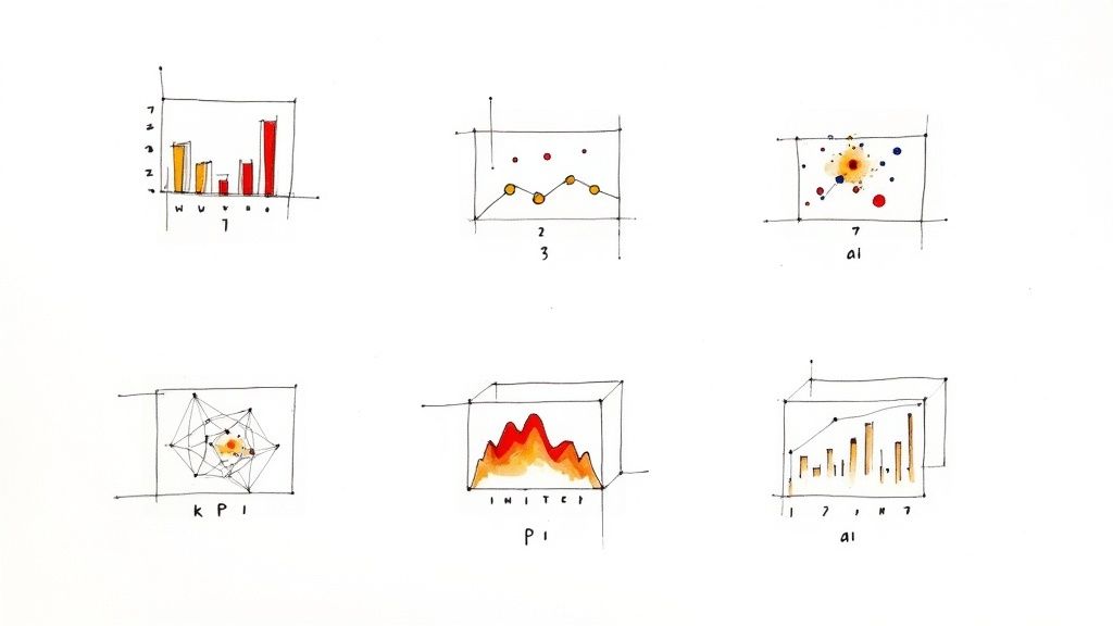
3. Choose Appropriate Visualization Types
The power of a dashboard lies in its ability to translate raw data into understandable stories. A core component of this translation is selecting the right visualization for the right data. Choosing an inappropriate chart can not only confuse the user but also actively misrepresent the information, leading to flawed conclusions. This makes selecting the correct visualization one of the most critical designing dashboards best practices, ensuring that the data’s true meaning is communicated with clarity and precision.
This principle is about matching the data’s relationship (e.g., comparison, distribution, composition) with a visual format that best highlights that relationship. A well-chosen visualization reduces the time to insight, while a poor one creates ambiguity and forces users to work harder to understand the message.
How to Implement Appropriate Visualizations
Selecting the right chart type is a blend of science and art, guided by the data's purpose and the audience's needs.
- Understand Data Relationships: First, identify what you want to show. Are you comparing values (bar chart), showing a trend over time (line chart), revealing a correlation (scatter plot), or displaying parts of a whole (pie or donut chart)? Each relationship has an ideal visual counterpart. For example, GitHub’s contribution graph is a perfect heat map for showing intensity over time.
- Keep Your Audience in Mind: Use chart types that your audience can easily interpret. While a candlestick chart is standard for a financial dashboard, it would be confusing for a general marketing audience. Stick to conventional charts unless a more complex one offers significant, undeniable value. To see how a dashboard can simplify complex data, you might review the Learnd Carbon Calculator project, which effectively visualizes environmental impact data.
- Prioritize Clarity Over Complexity: Avoid 3D charts, which can distort perspective and make values difficult to compare accurately. Similarly, use dual-axis charts with extreme caution, as they can be easily misread. Simplicity is almost always more effective.
Key Insight: The visualization isn't just decoration; it's the narrative device. Your goal is to choose the chart that tells the most accurate and compelling story with the least amount of user effort.
By thoughtfully pairing data with the correct visualization, you ensure your dashboard not only presents information but also delivers genuine, actionable insights without distortion or confusion.
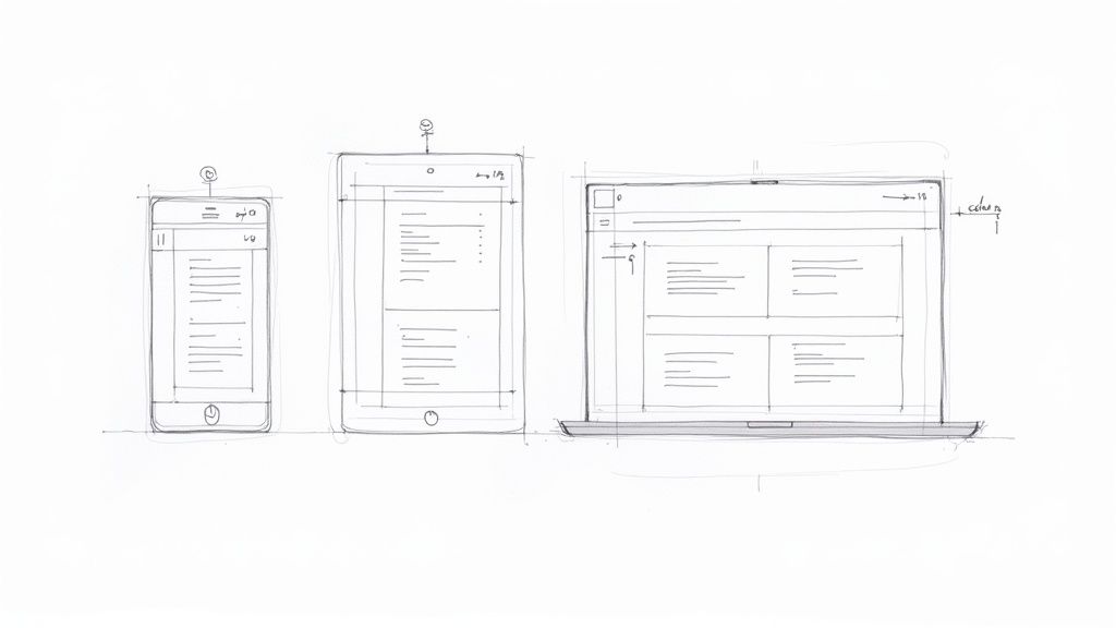
4. Ensure Responsive and Mobile-First Design
In today’s multi-device world, users expect seamless access to information whether they are at their desk or on the go. A dashboard that is unusable on a smartphone is a dashboard that is often unavailable when a critical decision needs to be made. Ensuring responsive design is a crucial aspect of designing dashboards best practices because it guarantees functionality and readability across desktops, tablets, and mobile devices.
This approach is about more than just shrinking a desktop view; it's about thoughtfully adapting the user experience for different contexts. A mobile user may need to quickly check a single KPI, while a desktop user might perform a deep-dive analysis. A responsive, mobile-first design respects these different user needs, ensuring the dashboard remains a powerful tool regardless of the screen it's viewed on.
How to Implement a Responsive and Mobile-First Design
Adopting a mobile-first mindset means designing for the smallest screen and then progressively enhancing the experience for larger ones. This forces you to prioritize the most essential data.
- Prioritize and Stack: On a mobile device, screen space is at a premium. Identify the single most critical KPI or chart and display it prominently at the top. Instead of complex multi-column layouts, stack dashboard components vertically in a single, scrollable column. This creates an intuitive and digestible flow.
- Design for Touch: Mobile interaction is touch-based, not pointer-based. Ensure all interactive elements like buttons, filters, and chart legends have large enough touch targets, with a minimum size of 44x44 pixels, to prevent frustrating tap errors.
- Optimize Performance: Mobile users are often on slower networks. Optimize your dashboard by compressing images, minimizing complex queries, and using efficient data loading techniques. A fast-loading mobile dashboard is significantly more usable. Many responsive web design examples show how performance and adaptability go hand-in-hand.
Key Insight: Mobile-first design is a creative constraint that forces clarity. By focusing on what's absolutely necessary for the small screen, you inherently declutter your design and improve the user experience on all platforms.
By building responsiveness into your dashboard from the ground up, you empower users with constant access to critical insights. This practice transforms your dashboard from a static, office-bound tool into a dynamic, go-anywhere decision-making asset.
5. Implement Real-Time Data Updates and Refresh Strategies
In a data-driven world, stale information leads to missed opportunities and flawed decisions. A dashboard's value is directly tied to the freshness of its data. Implementing appropriate real-time updates and refresh strategies is a critical aspect of designing dashboards best practices because it ensures users are acting on the most current information available, which is essential for dynamic environments like stock trading or system monitoring.
This isn't just about showing live data; it's about finding the right balance between data timeliness and system performance. An overly aggressive refresh rate can overload databases and slow down the user interface, while an infrequent one can render the dashboard useless. A well-defined strategy delivers timely insights without compromising stability.
How to Implement Effective Refresh Strategies
A successful implementation aligns data freshness with specific business requirements, ensuring the dashboard remains both relevant and performant.
- Define Refresh Frequency: Not all data needs to be updated every second. A social media analytics dashboard might only need updates every 15 minutes, while an emergency dispatch system requires millisecond-level refreshes. Analyze the use case to determine the optimal interval, preventing unnecessary system load.
- Use the Right Technology: For true real-time updates, technologies like WebSockets are ideal as they maintain a persistent connection for instant data pushes. For less urgent needs, scheduled API calls (polling) or server-sent events can be more efficient.
- Provide User Feedback: Always communicate the data’s status to the user. Display a "Last updated" timestamp clearly on the dashboard. Visual cues, like a subtle loading spinner during a refresh, build trust and manage user expectations about data currency. A manual refresh button also gives users control and a fallback option.
- Optimize Data Transfer: Instead of fetching the entire dataset on every refresh, implement delta updates. This approach sends only the new or changed data since the last update, significantly reducing bandwidth and processing load, leading to a faster and more responsive experience.
Key Insight: The goal is not always "real-time" but "right-time." A smart refresh strategy delivers data at the speed the business requires, ensuring the information is actionable when users need it most, without creating unnecessary technical overhead.
By thoughtfully implementing data refresh strategies, you ensure your dashboard is a living tool that provides a reliable and up-to-the-moment view of operations, empowering users to react swiftly and confidently.
6. Use Consistent Color Schemes and Branding
A dashboard's color palette is far more than an aesthetic choice; it's a powerful tool for communication and brand reinforcement. Inconsistent or chaotic color usage can confuse users and undermine data credibility, while a thoughtful, consistent scheme enhances comprehension. Using consistent colors and branding is a core tenet of designing dashboards best practices because it reduces cognitive load, builds user trust, and ensures the dashboard feels like a cohesive part of a larger product ecosystem.
This practice transforms color from mere decoration into a functional language. When users learn that green signifies success and red signals a problem, they can interpret data faster. Consistent branding, such as using company logos and typefaces, further integrates the dashboard into the user's workflow, making it feel familiar and authoritative.
How to Implement Consistent Color Schemes and Branding
A well-defined color system should be intentional, accessible, and aligned with your brand identity to create an intuitive user experience.
- Establish Semantic Meanings: Assign specific colors to specific meanings and use them consistently. For example, always use green for positive trends (e.g., "Goal Met"), red for critical alerts (e.g., "System Failure"), and yellow for warnings (e.g., "Low Inventory"). This creates a predictable visual language.
- Adhere to Brand Guidelines: Integrate your organization's primary and secondary brand colors into the dashboard design. Use a tool like Figma to create a style guide. This not only reinforces brand identity, as seen in Salesforce's consistent use of blue, but also ensures the dashboard feels like a trusted, official tool.
- Prioritize Accessibility: Your color choices must work for everyone, including users with color blindness. Use tools like Coblis or Color Oracle to test your palette for contrast and legibility. Ensure that color is not the only way to convey information; supplement it with icons, labels, or patterns.
- Apply the 60-30-10 Rule: To create a balanced and professional look, use a dominant color (often a neutral) for 60% of the space, a secondary color for 30%, and a vibrant accent color for 10% to highlight key actions or data points.
Key Insight: A consistent color scheme acts as a silent guide for the user. It builds an instinctive understanding of the data's meaning, allowing users to move from seeing the information to understanding its implications without conscious effort.
By implementing a disciplined approach to color and branding, you create a dashboard that is not only visually appealing but also more intuitive, accessible, and trustworthy.
7. Provide Interactivity and Drill-Down Capabilities
A static dashboard presents a snapshot, but an interactive one starts a conversation with the data. Allowing users to filter, sort, and drill down transforms them from passive viewers into active analysts. This is one of the most powerful designing dashboards best practices because it fosters a culture of self-service analytics, enabling users to explore their own questions and uncover insights that a predefined view might miss.
This approach dramatically increases user engagement and the overall value of the dashboard. Instead of requesting a new report for every follow-up question, users can manipulate the data directly, leading to faster discovery and a deeper, more personal understanding of the information presented.
How to Implement Effective Interactivity
A good interactive dashboard feels intuitive, encouraging exploration without overwhelming the user. The goal is to provide powerful tools that are easy to discover and use.
- Implement Drill-Down Paths: Allow users to click on a high-level data point (e.g., total sales for a month) to reveal the underlying details (e.g., sales by week, then by day, then by individual product). This layered approach, common in tools like Google Analytics, satisfies both summary-level and detail-oriented users.
- Offer Intuitive Filtering: Place filter controls in a consistent, predictable location, such as a sidebar or a top banner. Use cascading filters where appropriate, so selecting a region automatically updates the available cities. Always provide a clear "Reset" or "Clear All Filters" button to allow users to easily return to the default state.
- Leverage Hover-Over Tooltips: Use tooltips to provide additional context or exact values when a user hovers over a data point in a chart. This keeps the primary view clean while making granular details accessible on demand, preventing visual clutter and improving the user experience.
Key Insight: Interactivity should empower, not confuse. Your goal is to give users the tools to answer their "what if" and "why" questions directly within the dashboard, turning it from a static report into a dynamic analytical workspace.
By building in smart, user-friendly interactivity, you create a dashboard that is not just a source of information but a platform for discovery, encouraging deeper engagement and more nuanced decision-making.
8. Establish Clear Data Context and Annotations
A dashboard displaying numbers without explanation is like a book with a missing table of contents; the information is there, but its meaning is lost. Raw data becomes insightful only when placed in context. Providing clear context and annotations is one of the most critical designing dashboards best practices because it transforms ambiguous figures into a clear, understandable narrative, preventing misinterpretation and empowering users to draw accurate conclusions.
Without this crucial layer, users are left guessing what a metric represents, how it's calculated, or why a sudden spike occurred. Contextual elements like labels, units, and comparison points give the data a story, ensuring every user, regardless of their analytical expertise, can understand the information presented and trust its validity.
How to Implement Clear Data Context
Effective context bridges the gap between raw data and actionable insight, ensuring every visualization is self-explanatory and instantly useful.
- Label Everything Clearly: Ambiguity is the enemy of a good dashboard. Every chart needs a descriptive title, every axis must be labeled, and all units of measurement (e.g., $, %, ms) should be explicitly stated. For multi-series visualizations, a clear legend is non-negotiable. Don't make users guess what "25.7" means; tell them it’s "$25.7 Million."
- Provide Comparison Baselines: A single number is rarely insightful on its own. Contextualize metrics by showing them against a baseline, such as a previous period (Year-over-Year), a set target, or an industry average. This immediately tells the user if performance is good, bad, or average.
- Use Annotations for Key Events: Did a marketing campaign cause a spike in website traffic? Did a server outage result in a performance dip? Use annotations directly on the chart to mark these significant events. This proactive explanation helps users understand anomalies without having to investigate them separately.
Key Insight: Your dashboard should answer not just "what happened?" but also "why did it happen?" and "what does this mean?" Contextual elements like clear labels, comparison data, and annotations are the tools that provide those crucial answers directly within the interface.
By embedding context directly into your design, you remove friction from the user's analytical process. This practice ensures your dashboard is not just a data repository but a powerful tool for guided analysis and confident decision-making.
9. Optimize Performance and Loading Times
A beautifully designed dashboard is useless if it takes too long to load or becomes unresponsive during interaction. In a world where instant access is expected, slow performance can lead to user frustration and abandonment. Optimizing for speed is a critical aspect of designing dashboards best practices because it ensures the data is not just available, but immediately accessible when decisions need to be made.
Performance isn't an afterthought; it's a core component of the user experience. A snappy, responsive dashboard feels reliable and professional, encouraging users to engage with the data. Conversely, a sluggish interface can erode trust and render even the most insightful analytics ineffective.
How to Implement Performance Optimization
A high-performance dashboard is built on efficient data retrieval and streamlined front-end rendering. The goal is to deliver insights as quickly as possible without sacrificing data integrity.
- Optimize Data Queries: The most common performance bottleneck is inefficient data fetching. Pre-aggregate data on the backend, use indexed database columns, and implement caching strategies (like Redis) for frequently requested queries. This drastically reduces the time it takes for the server to process and return information.
- Implement Asynchronous Loading: Don’t make users wait for the entire dashboard to load at once. Load the data required for the initial, above-the-fold view first. Then, load less critical or below-the-fold widgets asynchronously. This technique, known as lazy loading, significantly improves the perceived load time.
- Minimize Front-End Footprint: A large JavaScript bundle can delay rendering and interactivity. Use tools to analyze and reduce your bundle size, compress assets using GZIP or Brotli, and leverage Content Delivery Networks (CDNs) to serve static files from locations closer to the user. Setting a performance budget (e.g., initial load under 2 seconds) is a great way to keep this in check.
- Monitor and Identify Bottlenecks: Use Application Performance Monitoring (APM) tools like New Relic or Datadog to proactively identify slow queries, API calls, or rendering issues in a live environment. This allows you to pinpoint the exact cause of a slowdown and address it before it impacts a majority of users.
Key Insight: Performance is a feature, not a task. Treat load time as a key metric for your dashboard's success. A fast dashboard respects the user's time and directly contributes to their ability to make swift, data-driven decisions.
By prioritizing performance, you ensure your dashboard remains a powerful, real-time tool rather than a frustrating bottleneck. This practice guarantees your insights are delivered with the speed and efficiency that modern business demands.
10. Design with Accessibility and Inclusive Design Principles
An effective dashboard is one that is usable by everyone, regardless of ability. Prioritizing accessibility means designing for people with disabilities, including visual, auditory, motor, and cognitive impairments. This approach is not just a matter of compliance; it’s a core component of one of the most critical designing dashboards best practices that broadens your user base and enhances the overall user experience for all.
Inclusive design goes a step further, considering the full range of human diversity. This includes not only disabilities but also factors like age, language, and technical expertise. By building with these principles in mind, you create a more robust, versatile, and equitable tool that empowers a wider audience to derive value from your data.
How to Implement Accessibility and Inclusive Design
Integrating these principles ensures your dashboard is perceivable, operable, understandable, and robust for every user.
- Ensure Sufficient Color Contrast: Data visualizations often rely heavily on color. Use tools to check that your color combinations meet Web Content Accessibility Guidelines (WCAG) contrast ratios (at least 4.5:1 for normal text). This helps users with low vision or color blindness distinguish between data series, text, and backgrounds. For additional support, consider using patterns or textures in charts.
- Support Keyboard-Only Navigation: All interactive elements, such as filters, drill-downs, and tooltips, must be fully operable using only a keyboard. This is essential for users with motor impairments who cannot use a mouse. Ensure there is a visible focus indicator so users always know where they are on the page.
- Provide Screen Reader Compatibility: Use semantic HTML and ARIA (Accessible Rich Internet Applications) attributes to make your dashboard understandable to screen readers like NVDA or VoiceOver. Provide text alternatives (alt text) for charts and graphs that summarize the key insight or data presented. You can learn more about how to make a website accessible to ensure your entire digital presence is inclusive.
Key Insight: Accessibility is not an add-on; it's a foundational requirement for good design. An accessible dashboard is inherently a more usable dashboard for everyone, as clear navigation, legible text, and logical structure benefit all users, not just those with disabilities.
By intentionally designing for inclusivity, you create a dashboard that serves the widest possible audience, ensuring that critical data insights are not limited to a select few. This practice reflects a commitment to user-centric design and social responsibility.
Dashboard Design: 10 Best Practices Compared
| Technique | Implementation Complexity 🔄 | Resource Requirements ⚡ | Expected Outcomes ⭐📊 | Ideal Use Cases 📊 | Key Advantages ⭐💡 |
|---|---|---|---|---|---|
| Establish Clear Visual Hierarchy | 🔄 Medium — design iteration & testing | ⚡ Low–Medium — designer time, UI framework | ⭐📊 Faster comprehension; reduced cognitive load | 📊 Executive KPIs, overview dashboards | ⭐ Emphasizes critical metrics; 💡 Reserve largest elements for top KPIs |
| Limit Information Density (Use White Space) | 🔄 Low–Medium — curation effort | ⚡ Low — design decisions, modular layout | ⭐📊 Improved readability; easier scanning | 📊 Customer-facing summaries, landing dashboards | ⭐ Cleaner presentation; 💡 Use progressive disclosure and collapsibles |
| Choose Appropriate Visualization Types | 🔄 Medium — requires analytic judgment | ⚡ Medium — analyst + viz library | ⭐📊 Accurate interpretation; fewer misreads | 📊 Analytical reports, trend analysis | ⭐ Reduces misrepresentation; 💡 Test multiple chart types with real data |
| Ensure Responsive and Mobile-First Design | 🔄 High — responsive patterns & testing | ⚡ Medium–High — dev time, device testing | ⭐📊 Consistent UX across devices; increased reach | 📊 Mobile users, field teams, cross-platform access | ⭐ Future-proofs dashboards; 💡 Design mobile-first and stack columns vertically |
| Implement Real-Time Data Updates & Refresh Strategies | 🔄 High — streaming, sync, caching complexity | ⚡ High — backend infra, streaming tech | ⭐📊 Timely insights; operational responsiveness | 📊 Monitoring, trading, incident response | ⭐ Enables immediate action; 💡 Define refresh frequency and use deltas |
| Use Consistent Color Schemes and Branding | 🔄 Low — build design tokens & guidelines | ⚡ Low — style guide, tokens, accessibility checks | ⭐📊 Stronger brand recognition; faster scanning | 📊 Client-facing dashboards, company-wide tools | ⭐ Improves recognition & accessibility; 💡 Follow 60-30-10 rule and test for color-blindness |
| Provide Interactivity and Drill-Down Capabilities | 🔄 High — state management & UX design | ⚡ Medium–High — frontend dev, query optimization | ⭐📊 Greater exploration and insight discovery | 📊 Self-service analytics, analyst workflows | ⭐ Empowers users to discover insights; 💡 Provide sensible defaults and reset options |
| Establish Clear Data Context and Annotations | 🔄 Low–Medium — content creation & upkeep | ⚡ Low — copywriting, small UI elements | ⭐📊 Reduced misinterpretation; faster trust building | 📊 Public dashboards, regulated reports, onboarding | ⭐ Clarifies meaning and provenance; 💡 One concise sentence per visualization |
| Optimize Performance and Loading Times | 🔄 Medium–High — profiling & optimization | ⚡ Medium — monitoring tools, caching layers | ⭐📊 Faster load/interactions; higher adoption | 📊 Large datasets, interactive UIs, low-bandwidth users | ⭐ Better UX and lower costs; 💡 Target <2s initial load, use caching and CDNs |
| Design with Accessibility & Inclusive Principles | 🔄 Medium — standards integration & testing | ⚡ Medium — audits, assistive tech testing | ⭐📊 Broader audience reach; legal compliance | 📊 Public services, enterprise apps, regulated sectors | ⭐ Inclusive for all users; 💡 Test with screen readers and follow WCAG AA standards |
Bringing It All Together: Your Blueprint for Dashboard Excellence
The journey through the ten pillars of effective dashboard design has equipped you with a robust framework for transforming raw data into a strategic asset. We have moved beyond the superficial, exploring the nuanced principles that separate a merely functional dashboard from an truly indispensable one. Mastering these designing dashboards best practices isn't about following a rigid checklist; it's about internalizing a user-centric philosophy that places clarity, usability, and actionable insight at the forefront of every design choice.
By now, it's clear that a successful dashboard is far more than an aesthetically pleasing arrangement of charts and numbers. It's a dynamic, interactive environment meticulously crafted to answer critical questions, reveal hidden trends, and empower users to make informed decisions with confidence and speed. Let's distill the core principles we've covered into a final, actionable blueprint.
From Principles to Practice: Your Immediate Next Steps
The true test of knowledge is its application. As you embark on your next dashboard project, whether it's for a startup's MVP or a large enterprise's operational hub, prioritize these actionable steps to ensure you're building a tool that delivers real value:
- Revisit Your "Why": Before a single pixel is placed, return to the fundamental purpose. Who is the end-user? What specific decisions will this dashboard influence? Solidify your objectives, as this foundation will guide every subsequent choice, from data visualization to interaction design.
- Conduct a Visual Hierarchy Audit: Look at your existing or planned layout. Can a user identify the most critical information within five seconds? If not, your visual hierarchy needs refinement. Use size, color, and strategic placement to guide the user's eye naturally from the high-level summary to the granular details.
- Pressure-Test Your Chart Selections: Challenge your default choices. Is a bar chart truly the best way to show that trend over time, or would a line chart provide more clarity? Ensure every visualization is the most effective and least ambiguous vehicle for the specific data story it needs to tell.
- Embrace an Accessibility-First Mindset: Don't treat accessibility as an afterthought. Integrate it from the very beginning. Use accessibility checkers for color contrast, ensure keyboard navigability, and provide clear, descriptive text for all visual elements. This not only serves users with disabilities but improves the experience for everyone.
The Lasting Impact of Superior Dashboard Design
Investing the time and resources to master these best practices yields significant, compounding returns. It's an investment in efficiency, clarity, and strategic agility. For product managers and CTOs, it means equipping your teams with tools that reduce ambiguity and foster data-driven collaboration. For marketing teams, it translates into a deeper, more immediate understanding of campaign performance and user behavior.
Ultimately, the goal is to create a seamless conversation between the user and their data. A well-designed dashboard removes friction, eliminates the need for users to perform mental gymnastics to interpret information, and fosters a culture where data is not just a report but a partner in daily operations and strategic planning.
The path to dashboard excellence is one of continuous learning and iteration. It combines the art of empathetic design with the science of data visualization. As you apply these principles, remember to gather user feedback relentlessly and refine your creations. By doing so, you will not just be building dashboards; you will be building a more intelligent, responsive, and successful organization.