7 Responsive Web Design Examples to Inspire You in 2025
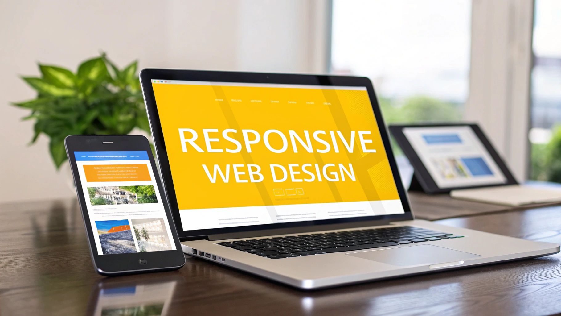
In today's multi-device world, a website that looks great only on a desktop is a business liability. Users expect a seamless experience whether they're on a phone, tablet, or laptop, and a failure to deliver that experience directly impacts user engagement and conversion rates. This is where responsive web design becomes critical. It's not just about shrinking content; it's a strategic approach to ensure your site is usable, accessible, and effective on any screen size.
This guide moves beyond generic templates to dissect what truly makes a design successful. We will break down 7 exceptional responsive web design examples, analyzing the specific techniques and tactical decisions that set them apart. For product managers, CTOs, and marketing teams, understanding these nuances is key to enhancing UX/UI and digital outreach. To truly understand the practical application and importance of fluid layouts, it's insightful to explore guides on how to build responsive layouts with AEM to see these principles in a specific framework.
Each example in this list includes annotated screenshots, direct links, and a deep strategic analysis. Prepare to uncover actionable insights and replicable strategies you can apply directly to your own web and mobile development projects.
1. Nerdify
Nerdify’s corporate website serves as an exemplary case study in responsive web design, effectively demonstrating the very expertise they offer to clients. As a development agency with over nine years of experience, their digital storefront not only communicates their value but also showcases a masterful implementation of fluid layouts, scalable typography, and adaptable navigation. The site provides a seamless experience, whether viewed on a large desktop monitor, a tablet, or a mobile phone, making it a standout choice for those studying effective responsive design.
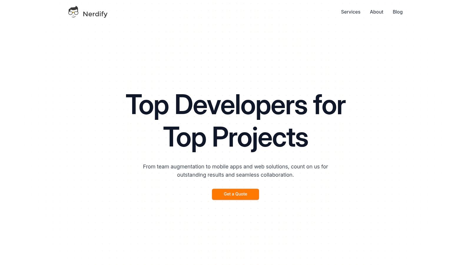
The design is built on a clean, professional aesthetic that prioritizes clarity and user experience across all devices. This commitment to responsive principles ensures that their comprehensive service offerings, from web development to UX/UI design and staff augmentation, are always presented in an accessible and engaging manner.
Strategic Analysis: The Responsive Breakdown
Nerdify’s site excels by employing a content-first approach to its responsive architecture. Instead of simply shrinking elements, the layout intelligently reflows and reorganizes to maintain readability and hierarchy.
- Fluid Grid System: The site uses a flexible grid that allows content blocks to resize and reposition dynamically. On desktop, a multi-column layout presents a wealth of information at a glance. On mobile, this gracefully collapses into a single, scrollable column that is easy to navigate.
- Navigation Transformation: The desktop navigation menu is a clean, horizontal bar. On smaller screens, it transforms into a streamlined hamburger menu, a best practice that saves valuable screen real estate without sacrificing access to key pages.
- Optimized Media: Images and graphics are not just scaled down; they are optimized for different viewports. This ensures fast load times and crisp visuals on high-resolution mobile screens, which is crucial for user engagement and SEO.
Key Takeaway and Replicable Strategy
The core lesson from Nerdify's website is the power of a balanced information architecture. The design doesn't hide critical information on mobile; it strategically reprioritizes it. For example, key calls-to-action (CTAs) and value propositions remain prominent, ensuring the user journey is consistent and effective regardless of the device.
Replicable Tactic: Prioritize the "mobile-first" indexing mindset. Design your content hierarchy for the smallest screen first, then progressively enhance the layout for larger screens. This forces you to focus on what is truly essential, a principle Nerdify’s site executes flawlessly.
Platform Vitals
| Feature | Details |
|---|---|
| Primary Offering | End-to-end web & mobile development, UX/UI, digital marketing, and nearshore staff augmentation. |
| Pricing | Custom quotes are provided upon inquiry; no public pricing is available. |
| Key Differentiator | The nearshore model offers seamless collaboration with time-zone alignment and cultural affinity. |
| Customer Experience | Praised for responsive communication and transparent project management via tools like Slack and GitHub. |
For a live demonstration of one of the best responsive web design examples that perfectly balances aesthetics with functionality, visit their website:
Website: https://getnerdify.com
2. Awwwards
Awwwards is less of a single example and more of a masterclass library for responsive web design. It serves as a curated gallery where the world’s most innovative and visually stunning websites are submitted, judged, and awarded. For designers and developers, it's an indispensable resource for deconstructing what makes a digital experience truly exceptional across all devices.
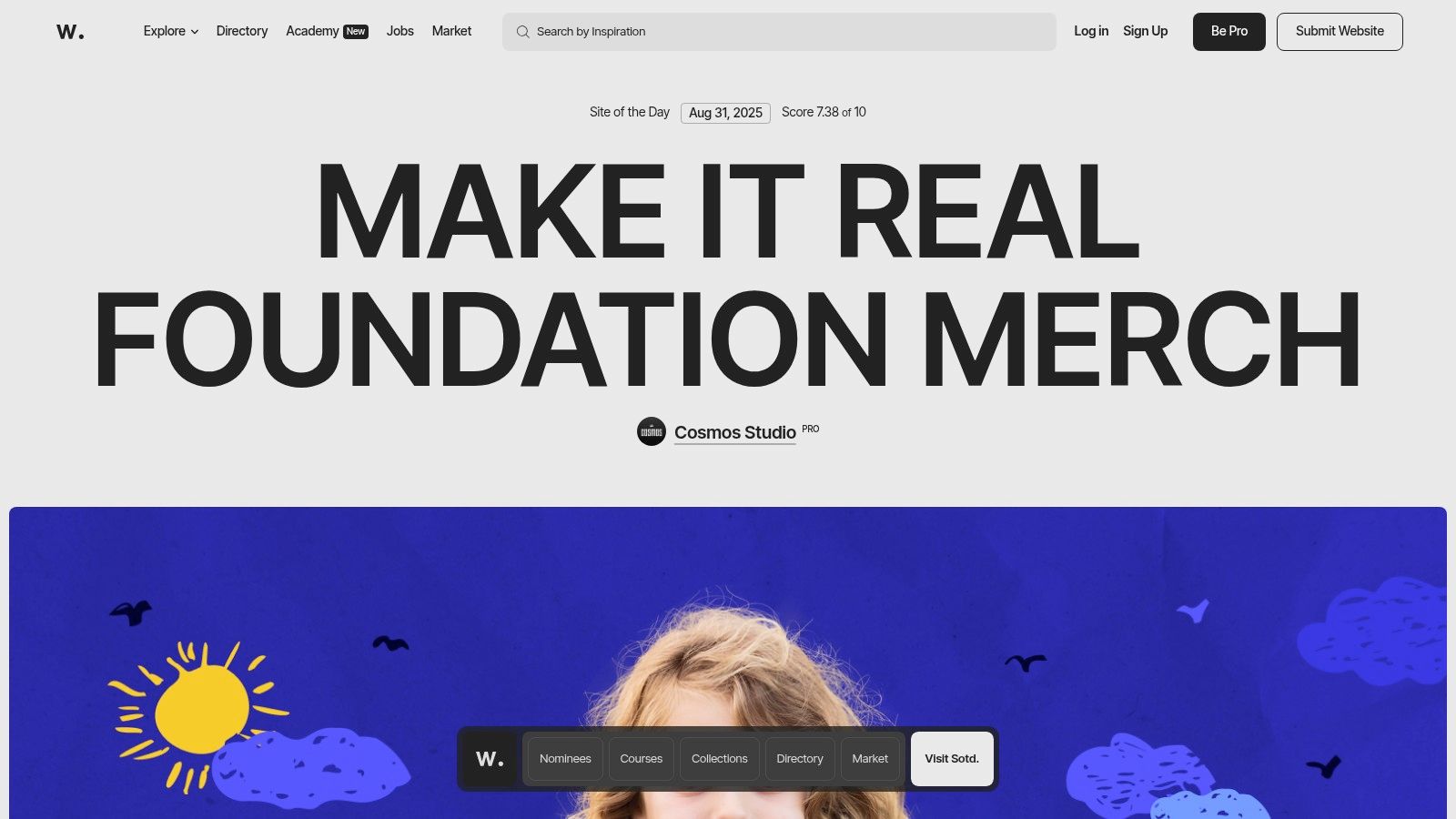
What makes Awwwards an essential tool is its unparalleled filtering capability. You can dissect thousands of responsive web design examples by category, technology stack (like React or WebGL), color palette, or even country. This allows you to pinpoint specific interaction patterns, animation techniques, and layout strategies that align with your project’s goals.
Strategic Breakdown & Key Takeaways
The platform's true value lies in its combination of inspiration and education. After finding a site you admire, you can often explore its technical details and then dive into the Awwwards Academy. The Academy offers over 100 courses on UI/UX, frontend development, and responsive design principles, turning passive browsing into an active learning experience.
Key Insight: Awwwards isn't just for inspiration; it's a competitive intelligence tool. By analyzing award-winning sites, teams can identify emerging trends in responsive navigation, micro-interactions, and performance optimization before they become mainstream.
Practical Tips for Effective Use
- Filter with Intent: Don't just browse aimlessly. Use the "Technology" and "Category" filters to find sites directly relevant to your industry or tech stack.
- Analyze Mobile-First: When you find a site, immediately inspect its mobile version. Top-tier designs on Awwwards often feature unique mobile-only navigation patterns and gestures.
- Explore the Nominees: While "Site of the Day" gets the spotlight, the "Nominees" section is a goldmine for fresh, creative ideas that haven't been widely seen yet.
While browsing the gallery is free, unlocking the full educational potential through Awwwards Academy courses requires payment. Similarly, professional profiles and directory listings for agencies come with Pro plans, offering a way to gain visibility within this elite community.
Website: https://www.awwwards.com
3. Webflow Templates
Webflow Templates offers a marketplace of production-ready designs that are more than just static images; they are fully functional, responsive websites you can dissect and adapt. The platform allows users to explore live, interactive previews directly in the browser, providing a hands-on way to understand how professional layouts adjust across different viewport sizes. It's a practical resource for both learning and rapid prototyping.
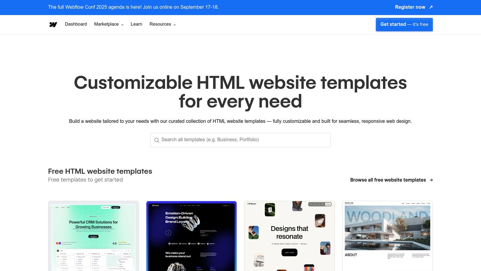
What sets this platform apart is its direct integration with the Webflow visual designer. Once you select a template, you can open it and immediately see the underlying structure, breakpoint-specific styles, and interaction triggers. This removes the guesswork from deconstructing complex responsive web design examples, turning inspiration into an editable blueprint. Many templates also include component libraries and even the original Figma files, bridging the gap between design and development.
Strategic Breakdown & Key Takeaways
The real strength of Webflow Templates is its role as an interactive learning environment. Instead of just viewing a finished product, you can manipulate its core components in a live editor. This allows you to see precisely how a designer configured the flexbox or grid settings for a tablet view versus a mobile one. It also highlights the importance of creating an accessible site structure from the start, which is a key component of modern web design. For additional information, explore some tips on how to make a website accessible.
Key Insight: Webflow Templates act as a reverse-engineering tool for responsive design. By opening a premium template in the designer, you gain access to the exact styling rules, interaction logic, and breakpoint adjustments used by professional creators, accelerating your learning curve significantly.
Practical Tips for Effective Use
- Utilize the Live Preview: Before committing to a template, use the live preview feature and resize your browser window to test its responsiveness thoroughly.
- Inspect in the Designer: Take advantage of free templates to open them directly in the Webflow Designer. Analyze the "Style" panel to see how different breakpoints trigger specific CSS changes.
- Check for Included Assets: Prioritize templates that come with Figma files or a style guide. This provides a complete picture of the design system, from initial mockups to the final build.
While many templates are available for a one-time purchase, publishing your customized site requires a paid Webflow hosting plan. The costs can add up if you need multiple templates, but the educational value and time saved often provide a strong return on investment.
Website: https://webflow.com/templates
4. Bootstrap Themes
Bootstrap Themes is the official marketplace for premium themes built on the world’s most popular front-end component library. It serves as a practical, high-quality resource for developers and designers looking for production-ready templates that are, by their very nature, built with a mobile-first, responsive grid system. For those learning the ropes or needing a reliable foundation, it’s a goldmine of clean, well-documented code.
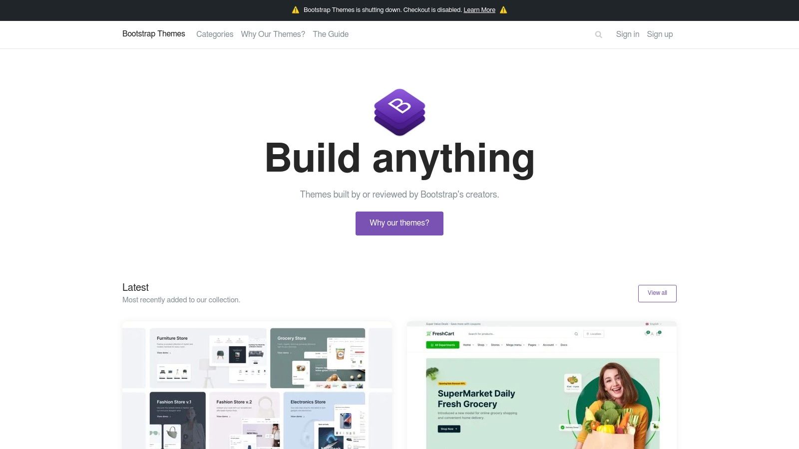
What makes the official Bootstrap marketplace stand out is its quality control. Every theme is reviewed by the creators of Bootstrap, ensuring that each one adheres to the framework's best practices for responsiveness and code standards. Users can interact with live previews, resizing the browser to see exactly how layouts, navigation, and components adapt across different breakpoints, making it one of the most transparent responsive web design examples for study and purchase.
Strategic Breakdown & Key Takeaways
The core value of Bootstrap Themes lies in its reliability and educational potential. Unlike sprawling marketplaces with inconsistent quality, every theme here is a lesson in structured, maintainable responsive design. Developers can deconstruct the Sass files and JavaScript bundles to understand how complex components like mega menus or interactive dashboards are built to be fully responsive from the start.
Key Insight: Bootstrap Themes is more than a store; it's an accelerator for development. By using these vetted templates, teams can bypass hundreds of hours of foundational coding and focus immediately on customization and feature implementation, confident that the responsive core is solid.
Practical Tips for Effective Use
- Utilize the Live Preview: Before purchasing, spend significant time with the live preview. Test it on different devices or use your browser's developer tools to simulate various screen sizes and see how the theme performs.
- Study the Documentation: The best themes come with extensive documentation. This is not just a user guide; it’s a learning tool that explains the theme's custom components and responsive utilities.
- Focus on Business Logic: Select a theme that most closely matches your required user interface for a dashboard, landing page, or admin panel. This minimizes the need for heavy structural changes.
Themes on the marketplace are premium and require a one-time payment for a license, with prices typically ranging from $39 to $59. This purchase often includes future updates and sometimes dedicated support, providing excellent value for building robust, professional-grade websites and applications.
Website: https://themes.getbootstrap.com
5. Land-book
Land-book is a highly practical and extensive gallery focused on the specific components that make up a successful website. It moves beyond just showcasing full homepage designs by curating over 200,000 individual sections like heroes, pricing tables, and footers from more than 20,000 real-world websites. This granular approach makes it an incredibly efficient tool for designers and developers looking for solutions to specific layout challenges.
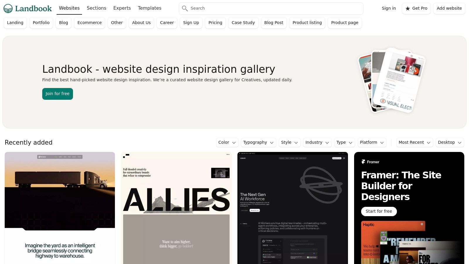
What sets Land-book apart is its focus on deconstruction. Instead of just admiring a great site, you can immediately find and analyze the exact pricing page or navigation bar that caught your eye. Its powerful filtering system allows you to search for responsive web design examples by industry, typography, style, or specific components, turning a broad search for inspiration into a targeted problem-solving session. This resource is invaluable for understanding the best practices for user interface design in a practical, applicable way.
Strategic Breakdown & Key Takeaways
Land-book's true strength is its utility for rapid pattern sourcing and competitive analysis. When tasked with designing a new feature, you can quickly gather dozens of live examples of how others have solved the same responsive challenge. This component-based library helps teams build a robust internal design system based on proven, real-world solutions rather than starting from a blank canvas.
Key Insight: Land-book excels at micro-level inspiration. By focusing on specific UI patterns (e.g., responsive data tables, mobile hero sections), it helps teams solve granular design problems quickly and effectively, accelerating the wireframing and prototyping phases.
Practical Tips for Effective Use
- Target Specific Sections: Start your search by filtering for the exact component you're working on, like "Footers" or "Pricing," to get hyper-relevant results.
- Create Pattern Boards: Use the "Boards" feature to collect and organize different approaches to a single design problem. For instance, create a board dedicated entirely to mobile-friendly navigation menus.
- Leverage the Experts Directory: If you're a freelance designer or agency, consider getting listed in the Experts directory to showcase your work to a highly relevant audience.
While browsing the vast library is free, many of the advanced features that make Land-book a power tool, such as unlimited filtering and mobile previews, are part of the affordable Pro subscription.
Website: https://land-book.com
6. Lapa Ninja
Lapa Ninja is a highly focused gallery dedicated to showcasing the best landing page designs on the web. Curated since 2015, it acts as a visual library where designers, developers, and marketers can find inspiration specifically for single-page layouts, which often require the most creative responsive solutions.
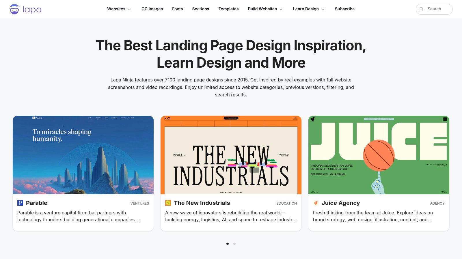
With over 7,100 curated examples, what sets Lapa Ninja apart is its sharp focus on landing pages. Users can quickly filter designs by category, such as "SaaS," "Portfolio," or "Crypto," to see how different industries tackle information hierarchy and calls to action. This specificity makes it one of the most efficient responsive web design examples for projects centered on conversion.
Strategic Breakdown & Key Takeaways
The platform's strength lies in its practical application. It not only provides visual inspiration but also directly links to a curated section of responsive website templates available for purchase. This bridges the gap between seeing a great design and implementing a similar, well-coded structure, saving significant development time for marketing campaigns and new product launches. By studying these high-converting layouts, you can learn more about how to increase website conversions.
Key Insight: Lapa Ninja is a pattern-recognition engine for conversion-focused design. By analyzing the most common layouts in your niche, you can identify proven responsive patterns for headers, feature sections, and pricing tables that resonate with your target audience.
Practical Tips for Effective Use
- Deconstruct by Component: Don't just look at the whole page. Use the "Website Sections" filter to analyze specific components like "Hero," "Testimonials," or "FAQ" across different designs.
- Study the Flow: Pay attention to how the top landing pages guide the user's eye down the page on both desktop and mobile. Note the changes in element order and size.
- Vet Template Vendors: If you consider purchasing a template featured on the site, remember Lapa Ninja is an aggregator. Always research the template creator for reviews and support quality.
Browsing the gallery is completely free. The "Templates" section lists third-party products with varying prices, and the site also aggregates learning resources like books and courses, which are external purchases. The value is in the free, high-quality curation of landing page designs.
Website: https://www.lapa.ninja
7. freeCodeCamp – Responsive Web Design Certification
freeCodeCamp offers something different: not just inspiration, but a structured curriculum to build your own responsive web design examples from scratch. It's a free, self-paced, and hands-on platform where learners construct dozens of projects, mastering the core principles of responsive layouts, accessibility, and modern CSS like Flexbox and Grid. This makes it an essential resource for moving from theory to practical application.
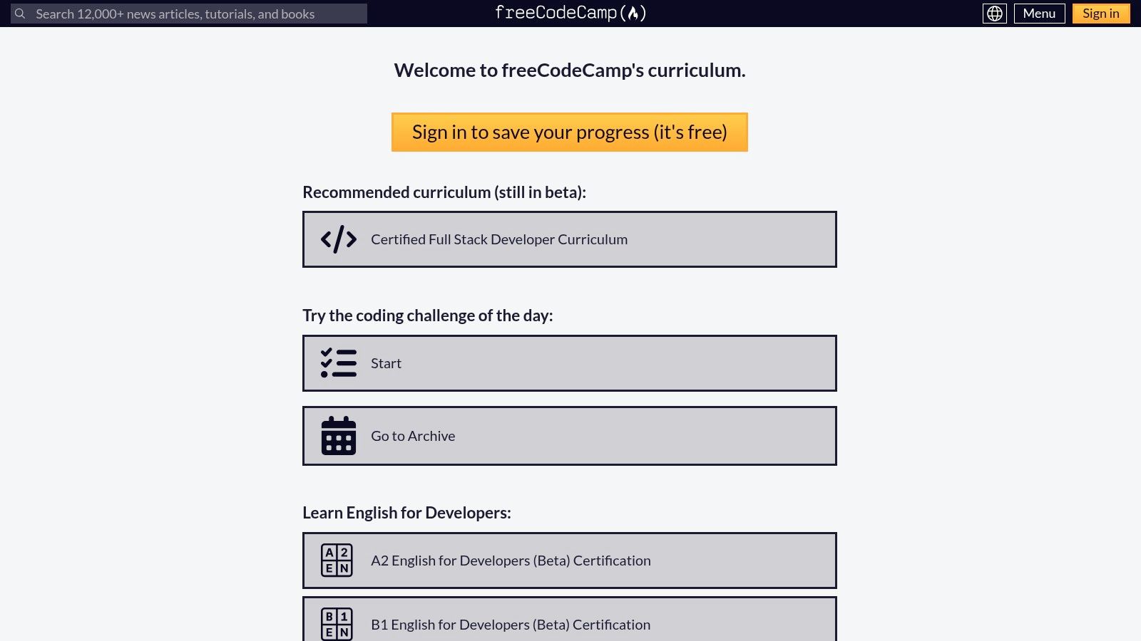
What makes freeCodeCamp stand out is its project-based learning model. Instead of just reading about media queries, you immediately apply them to build a tribute page or a survey form that must adapt to various screen sizes. This process demystifies responsive design, transforming abstract concepts into tangible, portfolio-ready projects.
Strategic Breakdown & Key Takeaways
The platform’s real value is in providing a guided path to proficiency. The curriculum is meticulously structured, starting with basic HTML and CSS before introducing advanced layout techniques. By the end, you will have built five distinct, complex projects, each one a testament to your ability to create functional and adaptable web experiences.
Key Insight: freeCodeCamp provides a standardized, industry-recognized baseline for responsive skills. Completing the certification demonstrates not just knowledge, but the discipline to apply it across multiple projects, which is a powerful signal to potential employers.
Practical Tips for Effective Use
- Build Beyond the Requirements: Use the project prompts as a starting point. Add your own creative flair, experiment with different breakpoints, and try advanced CSS features to make your portfolio pieces unique.
- Embrace the Community: If you get stuck, the freeCodeCamp forum is a massive resource. Search for similar problems or ask for help; learning to debug with others is a critical development skill.
- Analyze the Example Solutions: Review the official project solutions to understand best practices and alternative approaches to solving responsive layout challenges.
The entire curriculum, including the certification, is 100% free and accessible to anyone with an internet connection. There are no hidden fees or pro plans for learning content, making it one of the most equitable and impactful educational resources for aspiring web developers.
Website: https://www.freecodecamp.org/learn/
Responsive Web Design Examples Comparison
| Platform/Service | 🔄 Implementation Complexity | ⚡ Resource Requirements | 📊 Expected Outcomes | 💡 Ideal Use Cases | ⭐ Key Advantages |
|---|---|---|---|---|---|
| Nerdify | Medium to High – full-service development | High – skilled team, design, marketing | High-quality, custom digital products | Startups, SMEs, enterprises needing end-to-end solutions | 9+ years experience, nearshore model, scalable teams |
| Awwwards | Low – browsing & learning platform | Low to Medium – mainly time for study | High-quality design inspiration & education | Designers, studios seeking curated UI/UX examples & courses | Vetted sites, integrated academy, Pro networking |
| Webflow Templates | Low – ready-made templates, visual editing | Medium – template purchase & Webflow plan | Fast production of responsive websites | Designers/developers wanting no-code site starts | Live previews, Figma integration, broad template range |
| Bootstrap Themes | Low to Medium – applying and customizing | Low to Medium – theme purchase & Bootstrap | Clean, mobile-first responsive sites | Developers focused on Bootstrap framework | Official Bootstrap quality, well-documented code |
| Land-book | Very Low – gallery research & review | Low – just browsing or Pro plan for filters | Extensive examples for pattern sourcing | UI/UX professionals needing granular design research | Huge curated collection, advanced filtering (Pro) |
| Lapa Ninja | Very Low – browse and filter landing pages | Low – browsing templates and resources | Inspiration and template leads | Marketers and designers looking for landing page ideas | Large landing page collection, template pricing info |
| freeCodeCamp – Responsive Web Design Certification | Medium – self-paced study and hands-on projects | Low – free resources, time investment | Solid foundational knowledge and portfolio | Beginners and self-learners seeking certification | Free, project-based, community support |
Transforming Inspiration into a High-Performing Reality
Throughout this exploration of diverse responsive web design examples, a clear pattern emerges. The most successful designs are not merely about shrinking content to fit smaller screens; they are a fundamental rethinking of user interaction, content hierarchy, and performance across a spectrum of devices. From the pixel-perfect showcases on Awwwards to the practical, component-driven structures of Bootstrap Themes, the core principle remains the same: user-centricity is non-negotiable.
These examples demonstrate that responsive design is a strategic discipline. It involves making deliberate choices about what is most important to the user at any given moment, whether they are on a 4-inch phone or a 4K desktop monitor. The key is to move beyond visual imitation and adopt the underlying strategies.
Synthesizing the Key Takeaways
To translate the inspiration from these examples into your own projects, focus on these core pillars:
- Content-First Approach: Always begin with your content hierarchy. The most effective responsive designs, like those found on Land-book, prioritize essential information and actions, ensuring they are immediately accessible on mobile.
- Performance as a Feature: A beautiful design that loads slowly is a failed design. Optimize images, leverage modern CSS for layouts like Flexbox and Grid, and minimize HTTP requests. A fast, fluid experience is the hallmark of professional responsive development.
- Intuitive Navigation: Mobile navigation must be touch-friendly and intuitive. The examples we’ve seen utilize patterns like collapsible menus, tab bars, and clear call-to-action buttons to create a seamless journey on smaller screens.
- Strategic Breakpoints: Don't just design for "mobile" and "desktop." Analyze your content and user data to implement breakpoints where the layout naturally needs to adapt, ensuring an optimal experience at every intermediate screen size.
Your Actionable Next Steps: From Plan to Product
Armed with these insights, your next step is to bridge the gap between concept and execution. This transition requires a combination of smart strategy and the right technical foundation.
First, create a clear design brief that outlines your goals, target audience, and the key user journeys you need to support. Use the examples from this article as a reference point to define your functional requirements. Next, consider the technology that will power your vision. To transform your responsive design inspiration into a high-performing reality, it's essential to choose the right tools and technologies, such as the best web application frameworks available today. The right framework can significantly accelerate development and ensure your site is both scalable and maintainable.
Ultimately, the best responsive websites are a product of both brilliant design and expert engineering. They feel effortless to the user because every detail has been meticulously planned and executed. By applying the strategies and tactical insights from the examples we've analyzed, you are now better equipped to create a digital experience that not only looks stunning on every device but also achieves your business objectives.