Mastering E-Commerce User Experience for More Sales

When we talk about e-commerce user experience (UX), we're really talking about the overall feeling a customer gets when they use your online store. It goes way beyond just looking nice. The real goal is to make the entire shopping journey feel effortless, intuitive, and genuinely enjoyable. Get this right, and it directly boosts sales and builds a loyal customer base.
A great UX means shoppers can find what they're looking for quickly and check out without hitting any snags or feeling frustrated.
Why E-Commerce User Experience Is Your Greatest Advantage

Picture walking into a physical store. It's cluttered, the lighting is terrible, the aisles are a maze, and the checkout line snakes around the corner. You'd probably turn around and walk right out. Your e-commerce site makes that exact same impression, but in a split second online. E-commerce UX is the craft of making sure that digital first impression is a fantastic one.
Think of your website as that digital storefront. Your navigation menu? Those are the store aisles. The product pages are your window displays, and the checkout process is your cashier. Every single touchpoint adds up to create the customer's overall experience, and a superior UX is all about anticipating what they need and guiding them from "just looking" to "just bought it" with zero friction.
The Direct Impact on Your Bottom Line
Investing in a strong e-commerce user experience isn't just about pretty designs; it's a core business strategy that delivers tangible results. When people actually enjoy using your site, it builds immediate trust and credibility. That positive feeling is what turns a one-time buyer into a repeat customer for life.
The benefits are crystal clear:
- Increased Conversion Rates: A straightforward path from product to payment means fewer abandoned carts. Make the checkout process simple, and more visitors will actually complete their purchase.
- Higher Customer Retention: Good experiences bring people back. In fact, research shows that a staggering 88% of online shoppers are less likely to return to a site after just one bad experience.
- Stronger Brand Loyalty: An easy, pleasant shopping journey makes customers feel understood and valued. That feeling builds a kind of loyalty that can't be bought and goes far beyond just competing on price.
A great user experience is like a silent salesperson. It doesn't shout or push, but it expertly guides the customer, answers their questions before they even ask, and makes them feel confident in their decision to buy.
From Good Design to Great Business
Ultimately, focusing on UX means shifting your entire mindset from just selling products to building genuine relationships. It forces you to understand your audience on a deeper level and design every single part of your site to serve them better. To really leverage this advantage, it helps to understand what User Experience Design is at its core and how it drives business success.
Of course, you can't improve what you don't measure. Tracking the right data is key to knowing what's working and what isn't. To learn more, you can explore the various user experience metrics that give you hard data on how customers are actually behaving. By putting these principles into practice, you can transform your website from a simple sales channel into your company's most powerful asset.
The Pillars of an Unforgettable Shopping Experience

A truly magnetic e-commerce user experience doesn’t just happen by accident. It's carefully constructed on a few core pillars that turn casual window shoppers into loyal, returning customers. When these principles work together, they create a site that feels intuitive, reliable, and just plain easy to use.
Think of it like building a great brick-and-mortar store. One pillar is the logical layout that lets people find things easily. Another is the consistent branding that makes the whole space feel cohesive, from the front door to the fitting rooms. A third is giving shoppers the freedom to browse how they want. Get these right, and you create a welcoming space where people want to stick around.
Let's dig into the core elements that every successful online store needs to master.
Pillar 1: Clarity in Navigation
First and foremost, you need clarity. If shoppers can't find what they're looking for, everything else on your site is irrelevant. Confusing navigation is the online equivalent of a maze-like store with no signs—people get frustrated and walk right back out.
This is all about making the journey from your homepage to a specific product completely effortless. It means having well-organized categories, a search bar that actually works, and a predictable layout. The goal is for someone to land on your site and know exactly where to go without even thinking about it.
Imagine your website’s search bar is a helpful store employee. When a customer asks, "Where are the blue running shoes in size 10?", a great employee doesn't just gesture vaguely. They walk the customer straight to the right aisle and maybe even point out a few popular options. That’s the kind of smooth, helpful experience you’re aiming for.
This level of intuitive guidance is what separates a decent site from a great one. The clearer the path, the better the odds of a sale.
Pillar 2: Consistency in Design
Next up is consistency. When you use the same colors, fonts, and button styles across every single page, you build a powerful sense of professionalism and trust. Everything feels like it belongs, telling the customer that your brand is stable and dependable.
Inconsistency does the opposite—it creates a jarring and sloppy impression. If a product page looks like it came from a totally different website than your homepage, it makes your brand feel disjointed and untrustworthy. This visual harmony is a huge part of a strong user interface. For a deeper dive, you can explore some of the best practices for user interface design that reinforce this principle.
Pillar 3: User Control and Freedom
Finally, a great e-commerce experience puts the shopper in the driver's seat. People want the freedom to shop their way, not be herded down a pre-determined path. This pillar is all about giving them the tools to make their journey personal and efficient.
This comes to life through features like:
- Robust Filtering and Sorting: Let users slice and dice product lists by size, color, price, brand, or any other attribute that matters to them.
- Wishlists and Saved Items: Give them a low-commitment way to save products for later without cluttering their cart.
- Easy Cart Management: Make it dead simple to add items, remove them, or change quantities without any hassle.
- Guest Checkout: Offer a way to buy without forcing someone to create an account—a known friction point that causes many to abandon their carts.
When you offer these tools, you're treating your customers with respect. You're not just selling; you're providing a flexible service. To see how top brands put this into practice, it’s worth reviewing proven ecommerce user experience best practices.
By building your site on these three pillars—clarity, consistency, and control—you lay the foundation for a shopping experience that keeps people coming back.
Designing a Winning Mobile-First Shopping Journey
Let's face it: your customers aren't chained to a desk anymore. They’re shopping from everywhere—browsing your catalog while waiting for a coffee, comparing prices from their couch, and hitting "buy" while on the bus. This isn't just a trend; it's the new normal. And it means that having a website that simply "works" on a phone is no longer good enough. You have to think mobile-first.
What does that actually mean? It’s a complete shift in perspective. You design the entire shopping experience for the smallest screen first, then adapt it for larger devices like tablets and desktops. Think of it like building a go-kart before attempting a semi-truck. Starting small forces you to be ruthless with your priorities, ensuring the core experience is fast, focused, and free of clutter. This approach guarantees a solid foundation for the majority of your users.
The data doesn't lie. Mobile commerce is set to dominate over 60% of global online sales by 2025, which translates to a staggering $2.51 trillion. People are choosing their phones to shop because it's just plain convenient. For a deeper dive into the numbers, check out these online shopping statistics and their worldwide impact on SpeedCommerce.
Prioritizing Thumb-Friendly Navigation
Picture someone holding their phone. How are they scrolling and tapping? With their thumb. This simple ergonomic reality should be the guiding principle for your mobile layout. The "thumb zone"—the arc on the screen where the thumb can comfortably reach—is your most valuable real estate.
This is where your most important buttons need to live. Critical actions like "Add to Cart," "Checkout," and the main menu should be within easy thumb's reach. Making someone awkwardly stretch to the top corner of their screen is a classic design flaw. It creates friction, feels clumsy, and is a surefire way to lose a sale out of sheer frustration.
Here are a few practical ways to nail thumb-friendly design:
- Bottom Navigation Bars: Ditch the old-school top menu. Place your key navigation icons at the bottom of the screen, where they are always visible and accessible.
- Generous Tap Targets: Make sure every button and link is large enough to be tapped without causing errors. A minimum size of 44x44 pixels is a great rule of thumb to follow.
- Strategic Spacing: Give interactive elements room to breathe. Proper spacing prevents "fat-finger" mistakes, a common annoyance that can quickly sour the user experience.
Optimizing for Speed and Simplicity
Mobile users are impatient. They’re often distracted, multitasking, and have zero tolerance for slow, clunky websites. Every millisecond your site takes to load is a potential customer walking away. Performance isn't just a nice-to-have; it's the bedrock of a great mobile experience.
On mobile, speed is a direct reflection of your brand's credibility. A snappy, responsive site feels professional and trustworthy. A slow one feels broken and insecure. People won't wait around; they'll just go to a competitor who values their time.
To streamline the journey, you need to simplify everything. Get rid of anything that doesn't directly help the user find what they need and buy it.
Simplifying Forms and Checkout
Nobody enjoys pecking out their personal information on a tiny keyboard. Long, complicated forms are conversion killers, especially on mobile. Your goal is to slash the amount of typing required at every turn, particularly during the all-important checkout process.
Here’s how you can make checkout a breeze:
- Cut Down Form Fields: Be ruthless. Only ask for what is absolutely necessary to complete the order. Do you really need a second address line or a phone number right now? If it's optional, get rid of it.
- Use Smarter Inputs: Take advantage of the phone's built-in features. Automatically bring up the numeric keypad for phone numbers and credit card fields. Use simple steppers or dropdowns for quantity selectors.
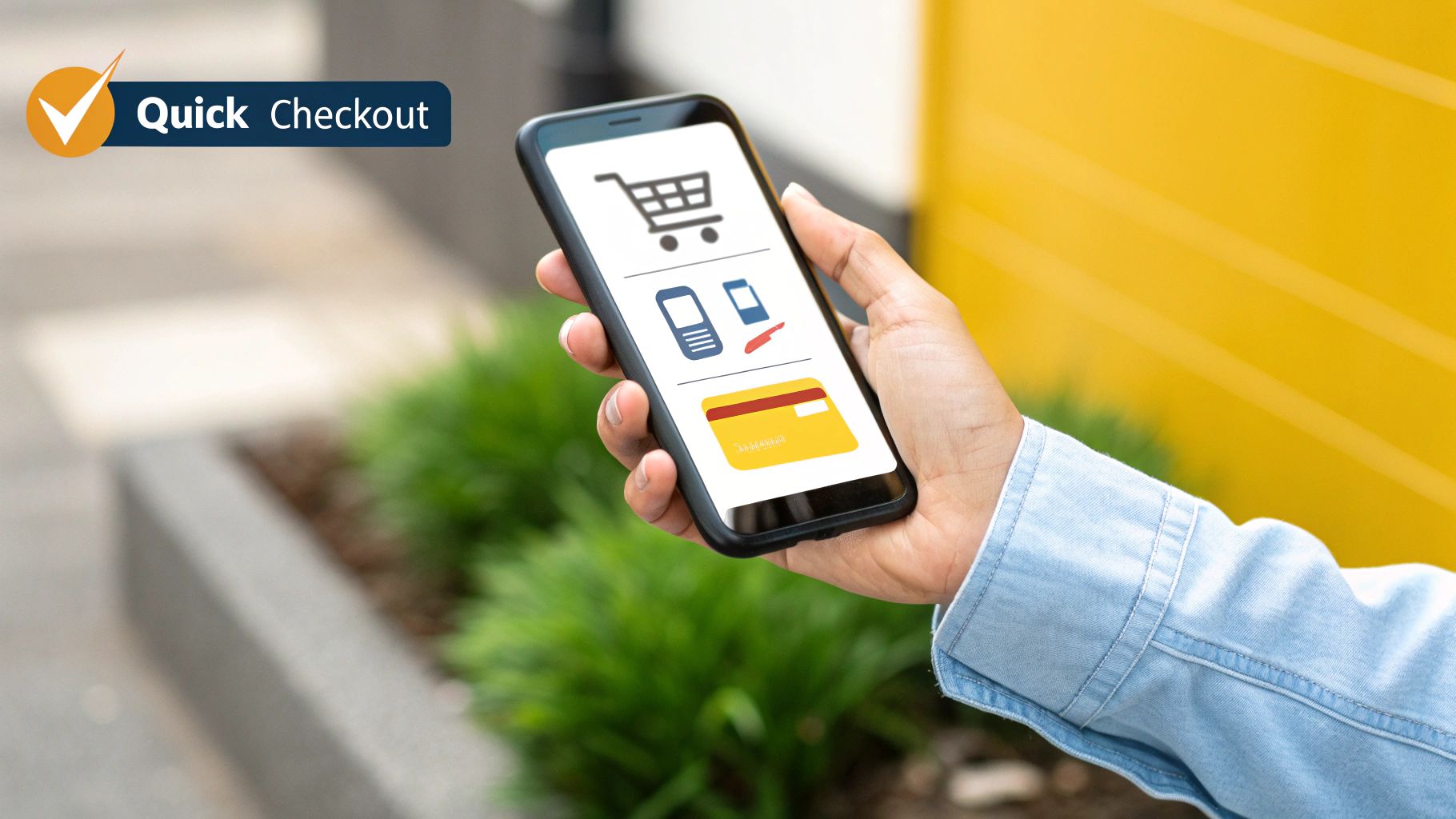
- Embrace Digital Wallets: Integrating options like Apple Pay and Google Pay is a game-changer. They let customers buy with a single tap or glance, completely bypassing the tedious process of entering their shipping and payment details.
Turning Product Pages and Checkouts Into Conversion Engines
So far, you’ve guided your customer on a smooth journey. They’ve navigated your site with ease and found a product they love. This is where the magic happens—or where it all falls apart. The product page and the checkout process are the two most critical conversion points in the entire e-commerce user experience.
Think of the product page as your store's fitting room. It's where a customer gets up close and personal with an item, checks its features, and decides if it’s the one. The checkout is the final handshake, the moment you ask for their trust and their money. Both have to be flawless.
Crafting High-Converting Product Pages
A product page really only has one job: to convince the shopper that this item is the solution they’ve been looking for. It needs to build confidence, answer questions before they're even asked, and spark a little excitement. Just listing features won't cut it; you have to sell the benefit.
Great product pages are built on three core pillars:
- Compelling Visuals: High-resolution images from every conceivable angle are non-negotiable. Customers can't touch or feel the product, so your photos have to do all the heavy lifting. Use lifestyle shots showing the product in action, close-ups of key details, and even short videos.
- Benefit-Driven Descriptions: Don't just say a backpack has "padded straps." Instead, explain that it has "ergonomically designed padded straps for all-day comfort, preventing shoulder strain on long commutes." Always connect the feature to a real-world benefit for your customer.
- Powerful Social Proof: People trust other people. Make sure you prominently display customer reviews, ratings, and testimonials. Research has shown that products with reviews have a much higher conversion rate because authentic feedback is one of the strongest trust signals you can send.
When you bring these elements together, you transform a simple product listing into a persuasive sales tool that speaks to both the logical and emotional sides of a buying decision.
Eliminating Friction at the Checkout
The checkout is the final hurdle, and it’s where an otherwise perfect user experience can completely unravel. A confusing or clunky checkout process is the single biggest reason for abandoned carts. All the hard work you put in to get the customer this far can be undone in a few frustrating clicks.
Your goal here is simple: make giving you money as easy as possible. Every extra field, every unnecessary step, and every moment of confusion adds friction. That friction dramatically increases the odds that a shopper will just give up. This is a crucial area to master if you want to understand how to increase website conversions.
A great checkout should feel like an express lane. It's fast, clear, and has zero unexpected surprises. A bad checkout is like a long, slow line where the cashier keeps asking for obscure forms of ID.
The data on this is overwhelming. Nearly 80% of shoppers have abandoned a cart because the process was too complicated, and over 20% have bailed on a purchase just because they were forced to create an account. This is a massive, preventable loss of revenue.
Eliminating these roadblocks is not just good practice—it's essential for survival. Below is a breakdown of the most common issues shoppers face and how you can fix them.
Common Checkout Friction Points and Solutions
| Friction Point | Impact on User | Recommended UX Solution |
|---|---|---|
| Forced Account Creation | Causes frustration and feels like a barrier to purchase. Users want to buy now, not commit to a relationship. | Offer a prominent guest checkout option. Allow users to create an account after the purchase is complete. |
| Lack of Progress Indication | Users feel lost in a seemingly endless process, leading to anxiety and a higher chance of abandonment. | Implement a simple progress bar (e.g., Shipping > Payment > Confirm) to show them exactly where they are and how much is left. |
| Limited Payment Options | Not offering preferred payment methods (like digital wallets) forces users to manually enter card details, slowing them down. | Integrate popular digital wallets like Apple Pay, Google Pay, and PayPal. The more easy options, the better. |
| Unexpected Costs | High shipping fees or taxes appearing only at the final step feels deceptive and is a top reason for cart abandonment. | Be transparent about all costs upfront. Use a shipping calculator on the cart page or offer free shipping thresholds. |
By addressing these common pain points head-on, you can transform your checkout from a leaky bucket into a streamlined conversion funnel.
Battle-Tested Strategies for a Seamless Checkout
To really dial in your checkout, you have to be relentless about removing obstacles. Scrutinize every single field and every click.
Here are a few proven strategies to get you started:
- Offer Guest Checkout: I'll say it again because it's that important. Never force users to create an account. It's one of the most effective ways to reduce cart abandonment, period.
- Display a Progress Bar: Show people where they are in the process. It manages their expectations and makes the whole thing feel less daunting.
- Provide Diverse Payment Methods: Cater to modern buying habits. Options like Apple Pay and Google Pay can dramatically speed up the process and boost your conversion rate.
- Keep It Simple and Secure: Only ask for the information you absolutely need. Use clear labels on form fields and prominently display trust badges (like SSL certificates) to reassure customers that their data is safe.
By meticulously refining your product pages and checkout flow, you create a path to purchase that is not only easy but also reassuring, turning more of your browsers into loyal buyers.
Using Customer Data to Continuously Refine Your UX
A top-tier e-commerce experience is never truly “done.” Think of it less like a finished painting and more like a garden that needs constant tending. The best online stores don't just launch a beautiful design and cross their fingers; they are relentless observers, constantly watching what their customers do, not just what they say.
This is where UX shifts from being a purely creative exercise to a data-driven strategy. Instead of relying on gut feelings or hunches to make changes, you can let real customer behavior be your guide. This helps you pinpoint exact friction points, test potential fixes, and make small, steady improvements that add up to huge wins in conversions and customer loyalty.
Learning to Read Your Customers’ Digital Body Language
To really get what’s happening on your site, you need to see how people actually interact with it. Analytics might tell you what happened—like a high bounce rate on a product page—but the right tools can show you why it happened. This is how you move from just looking at numbers to understanding people.
Imagine these tools are like security cameras in a brick-and-mortar shop. They let you see where shoppers linger, what displays they walk right past, where they get stuck, and the exact path they take to the checkout counter.
By watching how real people use your site, you can uncover hidden roadblocks that would never show up in a standard analytics report. A tiny design flaw you'd never notice might be causing a huge chunk of your customers to abandon their carts, and you'd be completely in the dark without seeing them struggle.
The whole point is to find undeniable proof of what needs to be fixed.
Tools for Uncovering Actionable Insights
There are a few powerful, easy-to-use methods for gathering this kind of qualitative data. Each gives you a different peek into your users' world, and when you put them together, you get a full picture of what’s working and what’s falling flat.
- Heatmap Analysis: Heatmaps create a visual overlay on your pages showing where people click, move their mouse, and scroll. Red "hot spots" mean high engagement, while blue "cold spots" are areas that get ignored. This is fantastic for discovering if people are trying to click on things that aren't links or completely missing your main call-to-action button.
- Session Recordings: These are like DVR for your website—anonymous recordings of real user visits. You can watch someone browse products, add an item to their cart, and try to check out. Session recordings are gold for spotting bugs, identifying confusing navigation, and literally seeing your site through a customer’s eyes.
- User Surveys and Feedback Polls: Sometimes, the easiest way to find a problem is just to ask. A simple on-page poll asking, "Was anything stopping you from buying today?" can give you incredibly specific and valuable feedback you’d never get otherwise.
Validating Your Changes with A/B Testing
Okay, so you've used heatmaps and session recordings to spot a problem and you have an idea for how to fix it. What's next? You test it. A/B testing (also called split testing) is the single best way to prove that a design change is actually an improvement.
Here’s how it works:
- Create a Variation: You take your original page (the "control," or version A) and make a new version with one specific change (the "variation," or version B). This could be as simple as changing a button color or as complex as rewriting a headline.
- Split Your Traffic: Your website traffic gets randomly divided. Half of your visitors see version A, and the other half sees version B. They have no idea they're part of a test.
- Measure the Results: You track a key metric—usually conversion rate—to see which version performs better. The test keeps running until the results are statistically significant, giving you cold, hard proof that one design works better than the other.
This methodical approach takes the guesswork out of design. It ensures that every change you roll out is a genuine improvement, backed by real user data. By embracing this cycle of observing, hypothesizing, and testing, you can turn your e-commerce UX into a well-oiled machine that just keeps getting better.
Your Top E-Commerce User Experience Questions, Answered

As you start tweaking and improving your online store, questions are bound to pop up. The world of e-commerce user experience can feel a little overwhelming at first, but the core ideas are surprisingly simple once you cut through the jargon.
This section is all about giving you clear, direct answers to the most common questions we hear. Our goal is to demystify the essential concepts and give you the confidence to start making real, impactful changes.
What Is the Difference Between UI and UX in E-Commerce?
This is easily the most common question, and the answer is absolutely critical. Think of it like building a house.
User Interface (UI) is the interior design. It's the color of the paint, the style of the light fixtures, and the feel of the doorknobs. UI is all about the look and feel—the aesthetics and the specific things a person interacts with.
User Experience (UX), on the other hand, is the architectural blueprint and the overall feeling of living in the house. Is the layout logical? Can you easily get from the kitchen to the dining room with your hands full? Does the whole home feel comfortable and intuitive? That's UX.
In an e-commerce context, it breaks down like this:
- UI is the visual stuff: The beautiful product photos, the crisp fonts, and the eye-catching color of your "Add to Cart" button.
- UX is the functional journey: How simple it is for a customer to find that button in the first place, how smoothly the checkout flows, and whether the entire shopping trip feels effortless.
A gorgeous website (great UI) that’s a nightmare to navigate will bleed customers. Likewise, a highly functional site (good UX) that looks dated or untrustworthy will scare people away. You need both working together to truly succeed.
How Does a Good E-Commerce User Experience Affect SEO?
This one’s simple: Search engines like Google are obsessed with making their users happy. A great user experience is one of the clearest signals you can send that your website is a high-quality result that deserves a top spot.
When you improve your e-commerce UX, you directly influence the very metrics Google watches like a hawk. For instance, a fast-loading, easy-to-use site will naturally have a lower bounce rate, meaning fewer people give up and leave right away. Visitors will also spend more time on your site (what's known as "dwell time"), which tells Google your content is engaging and valuable.
Think of it this way: Google is a matchmaker. It wants to introduce a searcher to the perfect website. If it sends someone to your store and they have a fantastic experience—browsing multiple pages and making a purchase—Google sees that as a successful match. It's then far more likely to recommend your site to others in the future.
On top of that, with most online traffic now coming from smartphones, a seamless mobile experience isn't just a nice-to-have. It's a massive ranking factor. A great mobile UX is no longer just good for sales; it's essential for being seen at all.
What Are the First Steps a Small Business Should Take to Improve Its E-Commerce UX?
For a small business, it’s all about high-impact changes that don’t drain your bank account. Don't worry about a massive redesign. Start with these practical, powerful steps.
Walk Through Your Own Checkout: This is priority number one. Go through the entire purchase process yourself on both a desktop and a mobile device. Even better, ask a friend who’s never seen your site to do it while you watch. Is it simple? Can they check out as a guest? Find every single bump in the road and smooth it out.
Beef Up Your Product Pages: Your product pages are your star salespeople. Make sure you have high-quality photos from every angle and maybe even a quick video. Write clear, benefit-driven descriptions that don't just list features but tell customers exactly how the product will improve their lives.
Check Your Site Speed: Slow load times are the ultimate conversion killer. Use a free tool like Google's PageSpeed Insights to see how you stack up. One of the quickest wins here is compressing your images to shrink their file size without noticeably hurting the quality.
Build Obvious Trust Signals: Shoppers are rightfully skeptical online. Make your contact information, shipping details, and return policy incredibly easy to find. A store that feels transparent and professional is a store people feel comfortable buying from.
How Can I Measure the Success of My E-Commerce UX Improvements?
Measurement is what separates guessing from a real growth strategy. You need to track specific Key Performance Indicators (KPIs) to know if the changes you're making are actually moving the needle.
Keep a close eye on these core metrics:
- Conversion Rate: This is the big one—the percentage of visitors who actually make a purchase. If this number ticks up after you make a change, you know you're on the right path.
- Cart Abandonment Rate: This tells you how many people add products to their cart but bail before paying. A lower number here is always better and often points to a smoother checkout.
- Average Order Value (AOV): A great UX doesn't just get people to buy; it can encourage them to buy more, often through clever cross-selling or simply by making them feel more confident in their purchase.
- Bounce Rate: This is the percentage of visitors who land on a page and leave without clicking anywhere else. A high bounce rate can be a red flag for everything from slow load times to confusing navigation.
By combining this hard data with qualitative feedback from customer surveys or reviews, you get a complete picture of your user experience. This allows you to stop guessing and start making informed decisions that consistently make your store better.