How to Conduct Usability Testing That Drives Real Results
Conducting usability testing is a five-stage process. You start by planning your test goals, then recruit representative users, choose the right testing method, run the actual test sessions, and finally, analyze the feedback to make meaningful improvements. This structured approach is the most reliable way I know to uncover what works—and what really doesn't—from a real user's perspective, long before you sink a ton of money into development.
Building Products People Actually Want to Use

Let's be honest. You’re building a product to solve a problem, but a clever solution is only half the battle. The real question is: can people actually use it without getting frustrated? This is where usability testing stops being a "nice-to-have" and becomes your most critical strategic tool. It’s not just about ticking a box; it’s the secret sauce behind products that feel intuitive, drive adoption, and win in a crowded market.
The whole point is to find and smooth out the friction points that make users want to give up. By watching real people interact with your prototype or product, you can move past your team’s assumptions and gather hard evidence about their behaviors, expectations, and pain points.
Think of this guide as your playbook for the entire process. From defining what you need to learn to turning raw feedback into action, you’ll see how each stage builds on the last to deliver insights that can save you from incredibly costly mistakes down the line.
Why Prioritize Usability Testing
Investing in user experience goes way beyond aesthetics; it has a real, measurable impact on your business. Here’s a stat that always gets people's attention: every single dollar spent on UX usability testing can yield a return of up to $100. That's a staggering 9,900% ROI, according to well-established industry benchmarks.
Despite this, only about 55% of companies are consistently conducting usability tests. This creates a massive competitive advantage for teams willing to simply listen to their users.
The benefits are clear and immediate:
- Reduced Development Costs: It's infinitely cheaper to fix a flaw in a Figma prototype than to rewrite live code after launch.
- Increased User Satisfaction: When a product just works, customers are happier. They stick around longer and are more likely to tell their friends about you.
- Higher Conversion Rates: Removing a single obstacle in a checkout or signup flow can directly boost your most important business metrics.
- Data-Driven Decisions: Usability testing replaces guesswork with evidence, empowering your team to build features that people genuinely need and will use.
"Usability testing is the practice of observing how people use your product so you can make it better. It's not about asking people what they like; it's about watching what they do."
The Usability Testing Process at a Glance
Before we get into the nitty-gritty of each step, it’s helpful to see the entire journey from a 30,000-foot view. This framework gives you a clear roadmap, so you always know what’s coming next and how each piece fits into the puzzle.
Here’s a quick summary of the process we’ll be walking through.
The Usability Testing Process at a Glance
| Stage | Key Objective | Core Activity Example |
|---|---|---|
| Planning | To define clear goals and scope for the test. | Writing a test plan that outlines what you want to learn. |
| Recruiting | To find participants who match your target user. | Screening potential testers with a short qualifying survey. |
| Conducting | To observe users as they complete specific tasks. | Facilitating a moderated session or launching an unmoderated test. |
| Analyzing | To identify patterns and prioritize usability issues. | Grouping observations into themes like "navigation confusion." |
| Reporting | To share findings and recommendations with the team. | Creating a summary report with video clips and user quotes. |
Understanding these five stages is the first step. If you want to dive even deeper into the principles behind a great user-centered design, you can check out our guide to improve user experience design. Now, let’s break down that first stage: planning.
Planning Your Test for Actionable Insights

A usability test is only as good as its plan. Seriously. The difference between a pile of random opinions and genuinely game-changing insights comes down to the prep work you do before a single participant walks through the door. It’s all about being deliberate and knowing exactly what you need to learn.
Your plan is your north star. Without one, you're just throwing ideas at the wall. A great first step is defining your project scope statement, which helps fence in your research and ensures every task you create has a clear purpose.
Setting Sharp Test Goals
First things first: what are you actually trying to figure out? Vague goals like "test our app" are a recipe for disaster. They lead to fuzzy, inconclusive results that nobody can act on. You need to frame your objectives around specific user behaviors or business outcomes you want to measure.
Good objectives are focused. They take a broad curiosity and turn it into a testable hypothesis.
Let's look at how to sharpen a vague goal into something useful:
Vague: "See if users like the new checkout flow."
Specific: "Can a first-time user add two items to their cart and complete a purchase in under 90 seconds without errors?"
Vague: "Test the website navigation."
Specific: "Can users find the 'Contact Us' page from the homepage in under 15 seconds?"
This level of detail gives your test a clear direction. It’s how you determine if a design is truly working or just looks pretty.
My rule of thumb is simple: If you can't measure it, you can't improve it. Your goals should be so clear that anyone on your team can read them and know exactly what you’re trying to discover.
Finding the Right People to Test
Once you know what you're testing, you have to figure out who you're testing with. Recruiting participants who accurately represent your target audience is non-negotiable.
Testing with the wrong users is like asking a professional chef for feedback on a children’s menu. Their insights might be interesting, but they won't be relevant to your actual customers.
Sketch out a simple user profile to guide your recruitment. Nail down the key characteristics:
- Demographics: Age range, location, and job title if it matters for your product.
- Tech Savviness: Are they power users who live in spreadsheets, or more casual browsers?
- Product Experience: Have they used your product or a competitor's before? What are their current habits?
For example, if you're testing a new feature for a project management tool, you need to find actual project managers or team leads, not just grab random people. A quick screener survey is your best friend here—it helps filter out anyone who doesn’t fit the bill.
The Magic Number Five
So, how many users do you need? This is one of the most common questions I get, and the answer is often surprisingly small.
For most qualitative tests—where your goal is to find problems—research famously shows that testing with just five users will uncover about 85% of the usability issues. After that fifth person, you start seeing the same problems over and over. Your return on investment drops off a cliff.
This "rule of five" is a game-changer for teams on a tight budget or schedule. It means you can get powerful, actionable feedback fast without needing a massive sample size. Of course, for quantitative testing where you need statistical confidence, that number is much higher, often 20 or more. But for finding and fixing friction? Five is your magic number.
Crafting Realistic Test Scenarios
Finally, you need to write the actual tasks your participants will perform. The best tasks are grounded in real-world scenarios, not abstract instructions. Instead of telling a user to "Click the blue button," give them a goal and watch how they navigate to it.
A good task scenario provides context and motivation, making the test feel more natural.
- Poor Task: "Sign up for an account."
- Good Scenario: "Imagine you just heard about our service from a friend and you want to try it out for yourself. Show me how you would create a new account."
This approach encourages genuine behavior and shows you if your design actually aligns with user intuition. Stick to the key user journeys you defined in your goals, and always—always!—run a quick pilot test with a colleague to make sure your instructions are crystal clear before the real sessions begin.
Choosing the Right Testing Methods and Tools
You’ve got a solid plan. Now comes the real tactical decision: how are you actually going to run the test? This isn’t a minor detail—it directly impacts your budget, your schedule, and the kind of feedback you'll get.
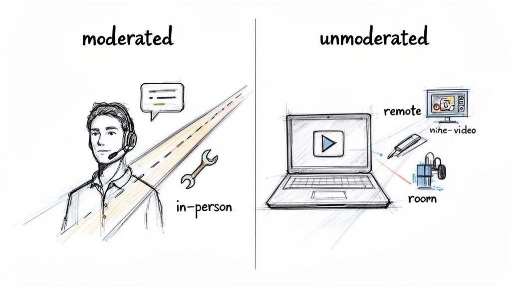
Everything boils down to one central question: how hands-on do you need to be? Your answer will lead you down a path toward one of four primary testing setups, each a combination of two key choices: moderated vs. unmoderated, and remote vs. in-person.
Moderated vs. Unmoderated Testing
The first big fork in the road is whether a facilitator will be present.
A moderated test is a live conversation. A researcher guides the participant through the tasks, asking probing follow-up questions in real time. It's interactive and lets you dig deep into the "why" behind someone's actions. Think of it as a guided tour of their thought process.
On the other hand, an unmoderated test is something a participant does on their own time. They follow a set of instructions, and software typically records their screen and voice. It's fast, scalable, and great for getting feedback from a larger pool of people, but you sacrifice the ability to ask spontaneous questions.
So, how do you choose?
- Go with moderated testing when you’re exploring a complex workflow, a brand-new concept, or you absolutely need to understand the reasoning behind user behavior. It’s all about rich, qualitative insights.
- Opt for unmoderated testing when your goal is to validate a specific, straightforward task, gather quantitative data, or get quick feedback on a minor design change.
If you want to explore this further, we break down a whole range of usability testing methods in our comprehensive guide, which can help you pinpoint the perfect technique for your goals.
Remote vs. In-Person Sessions
Next, you need to decide on the location. Are you getting everyone in the same room, or will they participate from wherever they are?
In-person testing gives you a controlled environment where you can observe body language and other non-verbal cues. This is a huge advantage when testing physical hardware or when the user's physical environment is a critical part of the experience. The downside? It’s more expensive, takes longer to coordinate, and limits you geographically.
Remote testing has become the go-to for most digital product teams for a reason. It's more affordable, lets you recruit participants from anywhere in the world, and allows people to use your product in their natural habitat—their home or office—which often leads to more authentic feedback.
My two cents: For most websites, software, and apps, a remote moderated test hits the sweet spot. You get the deep, qualitative insights of a live conversation with the convenience and global reach of remote research. It's a powerful and efficient combo.
To capture all the crucial moments, having the right free screen capture and recording tools is non-negotiable. A good tool ensures you never miss a hesitant click or a frustrated sigh.
Which Usability Testing Method Is Right for You?
Choosing the right approach can feel overwhelming, but it's really about matching the method to your specific goals and constraints. This table breaks down the four main combinations to help you decide.
| Method | Best For | Pros | Cons |
|---|---|---|---|
| Remote Moderated | Deep qualitative insights on digital products, complex workflows, and prototypes. | Flexible recruiting, natural user environment, allows for follow-up questions. | Requires a skilled moderator, potential for tech issues (bad Wi-Fi, etc.). |
| In-Person Moderated | Testing physical devices, observing body language, and when the user’s environment is key. | High control over the test environment, rich non-verbal feedback. | Expensive, geographically limited, can feel artificial to the user. |
| Remote Unmoderated | Quick feedback, validating simple tasks, A/B testing, and collecting quantitative data at scale. | Fast, affordable, large sample sizes, participants act more naturally. | No ability to ask "why," risk of low-quality or incomplete sessions. |
| In-Person Unmoderated | Kiosk testing, in-store experiences, or observing users with a physical product without interference. | Captures behavior in a specific context (e.g., a retail store). | Can be difficult to set up, provides limited qualitative feedback. |
Ultimately, the best choice is the one that gets you the clearest answers to your research questions within the time and budget you have.
Selecting the Right Usability Testing Tools
The market for usability and customer experience testing tools is booming—it's projected to jump from USD 119.7 million in 2024 to USD 572 million by 2030. For teams building high-stakes web and mobile solutions, knowing your way around these platforms is a massive advantage. In fact, one market report noted that over 90% of researchers regularly try out different platforms to find the best fit for their workflow.
Finding the right tool isn't about picking the one with the most features. It's about finding the one that fits your project.
Start by asking yourself a few practical questions:
- What kind of test am I running? A tool built for moderated interviews like Lookback is very different from a platform designed for large-scale unmoderated tests like Maze or UserTesting.
- What’s my budget? Costs vary wildly, from free plans for one-off tests to enterprise subscriptions that run into the thousands. Be realistic about what you can spend.
- Do I need help finding participants? Some platforms, like UserTesting and Lyssna (formerly UsabilityHub), have built-in panels of testers you can pay to recruit from. With others, you’ll need to bring your own participants (BYOP).
- How will I analyze the results? Look for features that will save you time later, like automatic transcription, simple clip and highlight reel creation, and built-in heatmaps or click-path visualizations.
In the end, your method and tools should serve your research goals, not dictate them. By thinking through these factors upfront, you can build a testing process that delivers the clear, reliable insights you need to move your product forward.
Running Your Test and Capturing Key Data
With your plan and tools ready to go, it’s showtime. This is where you'll gather the raw feedback that will genuinely shape your product's direction. It's a delicate dance of observing, guiding, and recording—all while making sure the insights you collect are honest and unbiased.
Whether you're sitting across from someone or thousands of miles away, your first job is to make them feel comfortable. People get nervous when they think they're being tested. I always start by making it clear: we're testing the product, not them. There are no wrong answers, and their candid feedback is pure gold.
Facilitating a Moderated Session
When you're moderating a test, you're not just an observer; you're a guide. The goal is to get people to think aloud, sharing their thought processes, expectations, and frustrations as they move through the tasks. This is truly an art form. You have to probe for deeper insights without accidentally leading them to the answer.
For instance, instead of asking, "Was that button confusing?" (which plants the idea that something is wrong), try a more open-ended approach like, "Talk me through what you expected to happen when you clicked there." That small shift in wording invites genuine reflection, not just a yes or no.
Here are a few tricks of the trade for better moderation:
- Get comfortable with silence. When a participant pauses, fight the urge to jump in and fill the void. Give them space to think and process. Some of my most profound "aha!" moments have come directly after an awkward silence.
- Use neutral prompts. Keep phrases like "Tell me more about that" or "What are you seeing on this screen?" in your back pocket. They keep the conversation moving without steering the user.
- Watch what they do, not just what they say. A user's actions often speak louder than their words. Pay close attention to where they hesitate, where they click repeatedly, or when their actions don't quite match up with what they said they were trying to do.
Setting Up a Successful Unmoderated Test
In an unmoderated test, your written instructions have to do all the work of a live facilitator. Since you won't be there to clear things up, your task descriptions and scenarios need to be incredibly clear and self-explanatory. One ambiguous instruction can completely derail a session and throw off your data.
Before I launch any unmoderated test, I always run a quick pilot with a colleague. If they have even one question about the instructions, I know they aren't clear enough. I'll rewrite them until they're foolproof.
Putting in this work upfront is non-negotiable. A well-crafted scenario gives the participant the right context and a clear goal, letting them interact with the product much more naturally.
Capturing the Most Important Metrics
While watching people interact with your product is vital, you also need some hard numbers to back up your observations. Tracking a few key usability metrics helps you move beyond anecdotes and tell a powerful, data-driven story.
I recommend focusing on these core quantitative data points:
- Task Success Rate: This is the big one. Did they actually complete the task? It’s a simple yes/no that provides a clear baseline for how effective your design is.
- Time on Task: How long did it take? A task that takes 3 minutes when you expected 30 seconds is a massive red flag for friction or a confusing workflow.
- Error Rate: How many wrong turns did the user take? This could be clicking the wrong link, using the back button excessively, or entering incorrect data. A high error rate points you directly to the parts of your design that need fixing.
A simple spreadsheet is usually all you need to track this stuff. Creating a table to log these metrics for each user and task makes it much easier to spot trends when you start your analysis.
| Participant | Task 1 Success | Task 1 Time | Task 2 Success | Task 2 Errors |
|---|---|---|---|---|
| User A | Yes | 1:45 | No | 3 |
| User B | Yes | 1:12 | Yes | 1 |
| User C | No | 2:30 | Yes | 0 |
When you combine this quantitative data with your qualitative observations—like direct quotes, sighs of frustration, or moments of delight—you get the full picture. This mixed-methods approach gives you both the "what" (the numbers) and the "why" (the human experience), which is everything you need to make smart, evidence-based improvements.
Turning Raw Feedback into a Product Roadmap
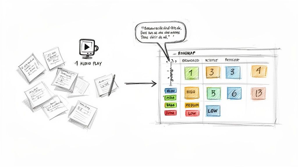
The tests are wrapped. Now comes the hard part. You’re staring at a mountain of scribbled notes, hours of screen recordings, and spreadsheets brimming with metrics. This is the exact moment where many teams lose momentum, letting those hard-won insights fade into the background.
The real magic of usability testing isn't just in gathering feedback. It's in the alchemy of turning that raw, often chaotic, feedback into a clear, actionable plan your team can actually build from. It's less about writing a formal report and more about creating a strategic brief for your product's next evolution.
Finding Patterns in the Chaos
Before you can fix anything, you need to make sense of what you've collected. The goal here is synthesis, not solutions. A fantastic starting point is affinity mapping. Get your team together in front of a virtual whiteboard and start creating digital sticky notes for every single observation, user quote, or data point from your sessions.
As you get everything out in the open, you’ll naturally start to see clusters form. Group similar notes together to create themes. Maybe a dozen stickies are all about confusion on the pricing page. Perhaps another group highlights deep frustration with the search results.
These themes are the core of your analysis. They represent the recurring patterns that signal a genuine problem, not just a one-off complaint from a single user.
- Navigation dead-ends: Users consistently got lost trying to find their account settings.
- Confusing copy: Multiple people had no idea what "synergize your workflow" meant.
- Critical task failure: Four out of five users couldn't apply a discount code successfully.
This is where you start to see the forest for the trees, turning individual comments into a compelling story about your user's experience.
The objective is to uncover the "why" behind the "what." A user failing a task is an observation. Why they failed is the insight you need to build on.
Prioritizing What to Fix First
With your key usability issues identified, you face the inevitable question: what do we tackle first? You can't fix everything at once, so ruthless prioritization is key. A typo on the "About Us" page is an annoyance; a bug that prevents users from completing a purchase is a five-alarm fire.
A simple but incredibly effective framework is to plot each issue on an impact/frequency matrix. Ask two questions for every problem:
- Impact: How bad is it? Does this issue completely block a user, or is it a minor hiccup?
- Frequency: How many people hit this wall? Was it a universal struggle or an edge case only one person found?
Your immediate focus should be on the high-impact, high-frequency problems. These are the critical blockers costing you conversions and frustrating your users the most. Low-impact, low-frequency issues can be tossed into the backlog for a rainy day.
Creating a Compelling Summary Report
Now it's time to share what you've learned with stakeholders who don't have time to read a 30-page report. Your summary needs to be concise, visual, and laser-focused on what to do next.
The user research software market is on track to hit $0.91 billion in 2025, largely because teams need better ways to report on their findings. In fact, 67% of teams use these tools to track trends and ensure insights actually lead to product changes. You can dig into more digital quality trends at Applause.com.
Your report should be built around these core elements:
- An Executive Summary: A one-page cheat sheet with the most critical findings and top-priority recommendations.
- Key Findings: A list of the top 3-5 usability problems you uncovered.
- Hard Evidence: Back up every finding with a powerful user quote or, even better, a short video clip showing a user's struggle. Nothing is more convincing than seeing it for yourself.
- Actionable Recommendations: Don't just point out problems. For each one, propose a clear, specific solution the team can start working on.
The final, crucial step is translating these recommendations directly into your team's workflow. This is how you bridge the gap between research and execution. If you need a hand with that, our guide on how to create a product roadmap can show you how to build a plan that truly gets your team aligned.
Common Usability Testing Questions Answered
When teams first dip their toes into usability testing, the same practical questions tend to surface. It's totally normal. Getting these cleared up helps demystify the whole process and reinforces why we do this in the first place: to build better products for real people. Let’s tackle some of the most common ones I hear.
How Many Users Do I Really Need for a Test?
This is probably the most-asked question, and the answer is surprisingly simple for most situations. For a standard qualitative test—where your goal is to find the biggest pain points—you only need 5 to 8 users.
That's not a number pulled out of thin air. Seminal research by the Nielsen Norman Group famously showed that testing with just 5 people is enough to uncover about 85% of the usability problems. It's a classic case of diminishing returns.
Once you get past 8 or so participants, you'll just be hearing the same feedback over and over again. The new insights will slow to a trickle. Of course, if you're trying to collect quantitative data, like benchmarking task completion rates for statistical analysis, you'll need a much larger group, often 20 or more. But for quick, high-impact feedback, five is your magic number.
What Is the Difference Between Usability Testing and UAT?
It's easy to get these two mixed up, but they have completely different goals and happen at opposite ends of the product development timeline.
Usability testing is all about the user experience. We're asking questions like: "Is this easy to figure out?" "Can people accomplish their goals without getting frustrated?" We do this throughout the design and development process using everything from rough sketches to interactive prototypes. The whole point is to find and fix UX issues while they're still cheap and easy to address.
User Acceptance Testing (UAT), on the other hand, is the final sign-off before launch. It's less about the experience and more about verification. The primary goal is to confirm that the finished product meets all the agreed-upon business requirements and works from a technical perspective.
Here’s a simple way to think about it: Usability Testing asks, "Can people use it?" while UAT asks, "Does it work the way we all agreed it should?"
Can I Do Usability Testing with a Small Budget?
Absolutely. You don't need a fancy lab with two-way mirrors or an expensive software suite to get incredible insights. In fact, some of the most effective testing is done on a shoestring budget.
One of the best-known methods is "guerrilla testing." This is as simple as it sounds: go to a coffee shop, find someone who fits your general user profile, and offer them a coffee in exchange for 10-15 minutes of their time looking at your prototype. It’s scrappy, fast, and remarkably good at uncovering those glaring, "how-did-we-miss-that?" issues.
Beyond that, plenty of remote testing tools like Maze or UserTesting offer free plans or affordable starter packages. The most important thing is just to do it. The value you get from one quick, low-budget test is infinitely greater than getting no feedback at all.
How Often Should We Be Testing?
Usability testing shouldn't be a one-and-done activity you cram in right before launch. The best teams I've worked with treat it like a habit, not a milestone. It's a continuous part of their rhythm.
By building small, frequent tests into your design sprints—even with just 3 to 5 users each time—you create a powerful, ongoing feedback loop. This iterative cycle means you can:
- Get feedback on rough ideas with low-fidelity wireframes.
- Validate a tricky workflow with an interactive prototype.
- Confirm a design tweak before a single line of code gets written.
Making testing a regular practice helps you catch design problems early, avoid expensive rework, and ensures the product evolves based on what users actually need, not just on what the team thinks they need.