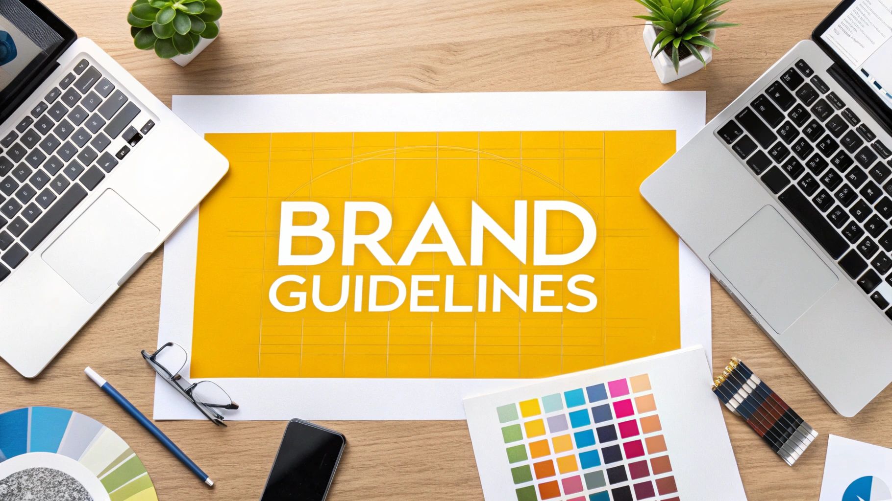
How to Create Brand Guidelines That Work
Before you can even think about logos, colors, or fonts, you have to get to the heart of what your brand is all about. Your brand guidelines won't mean much if they aren't built on a solid strategic foundation. This is the bedrock—your mission, values, and personality—that informs every single creative decision you make down the line.
Get this part right, and everything else falls into place naturally.
Building Your Brand’s Strategic Foundation

Let's be clear: a great brand is so much more than a pretty logo. The brands that really resonate with people, the ones that build die-hard fans, are built on something deeper. They have a clear purpose and a distinct personality.
This first phase is all about defining those intangible qualities. It's the "why" that fuels your "what." Without this clarity, you're just picking colors you like, not colors that mean something. Your guidelines will feel disjointed and arbitrary, rather than a true reflection of who you are.
Defining Your Mission And Vision
Your mission statement isn't just fluffy corporate-speak for your "About Us" page. It’s your reason for being. It needs to answer one simple, powerful question: what problem do you solve for your customers?
Your vision, on the other hand, is your look toward the horizon. It’s the future you’re working to create. It should feel big and inspiring.
- Mission (The What & Why): This is what you do every day and for whom. Think of Google's early mission: "To organize the world's information and make it universally accessible and useful." It's clear, focused, and actionable.
- Vision (The Where): This is the ultimate change you want to see in the world. IKEA’s vision, "To create a better everyday life for the many people," is a great example. It’s aspirational and guides their long-term strategy.
Think of these statements as your brand's North Star. They keep everyone, from marketing to product development, pulling in the same direction. We actually bake this strategic thinking directly into our https://getnerdify.com/blog/digital-marketing-plan-template, showing how a strong brand foundation fuels every marketing tactic.
Uncovering Your Core Values
Core values are the non-negotiables. They are the principles that guide how your team behaves, makes decisions, and treats customers when nobody's watching. It's crucial to move beyond generic words like "integrity" or "innovation." Those are table stakes.
Instead, define your values in terms of action. What does "collaboration" actually look like in a team meeting? If "customer-first" is a value, how does a support agent live that out on a tough call? This makes your values real and holds everyone accountable.
This isn't just a feel-good exercise; it's smart business. Studies show that 81% of consumers say they need to trust a brand to buy from them. That trust is built on a clear and consistent set of values.
A brand's values are its promise to the world. When those values are clear and consistently demonstrated, they build a deep-seated trust that no amount of advertising can buy. This is the true foundation of customer loyalty.
Crafting a Unique Brand Personality
If your brand walked into a room, what would people think? Would it be the witty, clever friend? The wise, trusted advisor? The rebellious rule-breaker? That’s your brand personality.
It's the set of human characteristics you want people to associate with your brand. Nailing this down is the key to developing a consistent and authentic brand voice.
A "rebellious" brand like Harley-Davidson will use language and imagery that feels completely different from a "nurturing" brand like Johnson & Johnson. Defining this personality ensures you connect with your audience on an emotional level, which is what makes a brand stick.
For a great, hands-on walkthrough of this entire process, check out this an easy step-by-step guide to creating brand guidelines.
To help you get started, here's a quick checklist to make sure you've covered all the essential strategic elements before moving on to the visual and verbal identity.
Your Brand Foundation Checklist
| Foundation Element | Key Question to Answer | Example |
|---|---|---|
| Mission Statement | What problem do we solve, and for whom? | "To provide a seamless, on-demand transportation experience for everyone." |
| Vision Statement | What future are we working to create? | "A world where car ownership is optional." |
| Core Values | What are the 3-5 non-negotiable principles that guide our behavior? | "Embrace challenges, prioritize people, act with integrity." |
| Brand Personality | If our brand were a person, what are its top 3-5 character traits? | "Innovative, approachable, and dependable." |
Once you've answered these questions with real conviction, you'll have a rock-solid foundation. Now, you're truly ready to start building the visual and verbal world that will bring your brand to life.
Defining Your Visual Identity System
Once your brand strategy is locked in, it's time for the fun part: translating those big ideas into a visual language people can see and connect with. This is where your brand steps out of the boardroom and into the real world. A well-defined visual identity system makes sure every single impression you make is consistent, intentional, and unmistakably you.
This system is far more than just a logo. It’s the entire toolkit that dictates how your brand looks and feels everywhere—from your website header and social media icons to your business cards and sales decks. These elements need to work in harmony to build a cohesive and memorable brand experience.
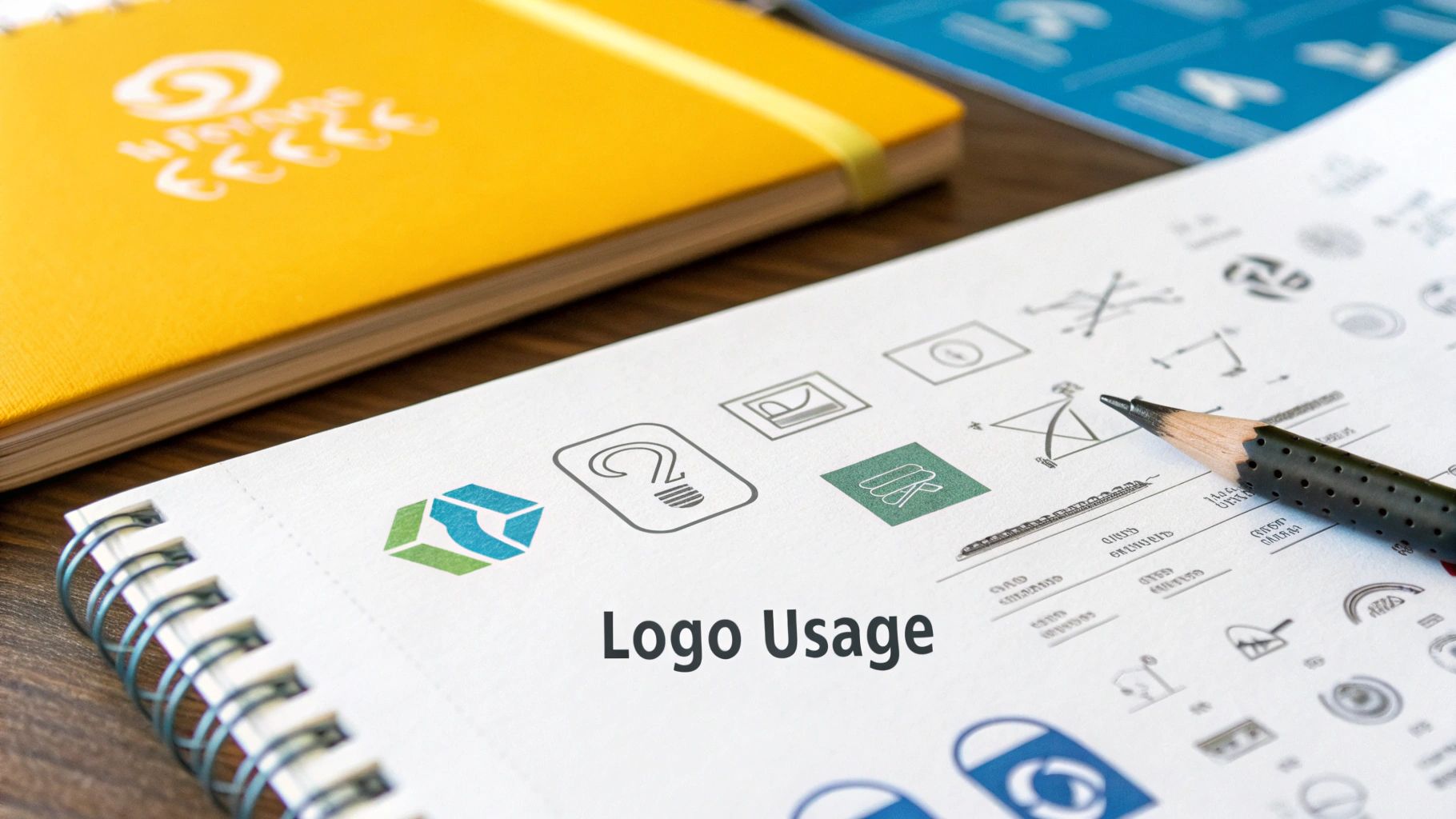
Protecting Your Most Valuable Asset: Your Logo
Think of your logo as the face of your brand. It’s often the single most recognizable asset you have, so protecting its integrity is non-negotiable. Your brand guidelines need to lay down crystal-clear rules for its use, leaving zero room for creative interpretation.
Start by defining the primary logo and all its approved variations. You might have a stacked version, a horizontal one for tight spaces, or a simple icon mark. Be specific about when and where to use each one. For instance, the full logo is perfect for official documents, while the icon is a natural fit for a social media profile picture.
Next, you need to establish rules for clear space—the minimum breathing room required around the logo. This "protective bubble" ensures it stands out and isn't suffocated by other text or graphics on the page.
Finally, and this is crucial, show people what not to do. I’ve found that a section on common misuses is often the most helpful part for preventing brand dilution.
- Don't stretch or squash it. The proportions must always stay the same.
- Don't recolor it. Unless you have specific monochrome versions, the colors are fixed.
- Don't place it on a busy or low-contrast background. If you can't see it clearly, no one else can either.
- Don't add cheesy effects. No drop shadows, glows, or bevels unless they are part of the core design.
These "don'ts" proactively shut down the most common mistakes people make when they're in a hurry.
Building Your Brand Color Palette
Color is a shortcut to emotion. It’s one of the fastest ways to communicate a feeling, and when used consistently, it can boost brand recognition by up to 80%. A well-defined palette is absolutely essential.
Your palette should be broken down into a few key categories:
- Primary Colors: These are your main brand colors, the one-to-three shades that scream "you." They'll be the most-used colors in your assets.
- Secondary Colors: This is a complementary set of colors that add some flexibility and visual interest. Use them for accents, call-out boxes, or subheadings.
- Neutral Colors: These are your workhorses—think shades of gray, black, and off-white. They provide balance and are typically used for body text and backgrounds.
For every single color, you must provide the exact color codes. This isn't optional; it's the only way to guarantee consistency.
Pro Tip: Always include multiple color codes for each shade. Provide the HEX and RGB codes for digital use and the CMYK and Pantone (if applicable) codes for print. This simple step prevents your vibrant brand blue from looking dull and murky on a printed brochure.
This level of detail is a hallmark of professional branding. To see how these visual rules fit into a bigger picture, you can learn more about how to https://getnerdify.com/blog/define-design-system.
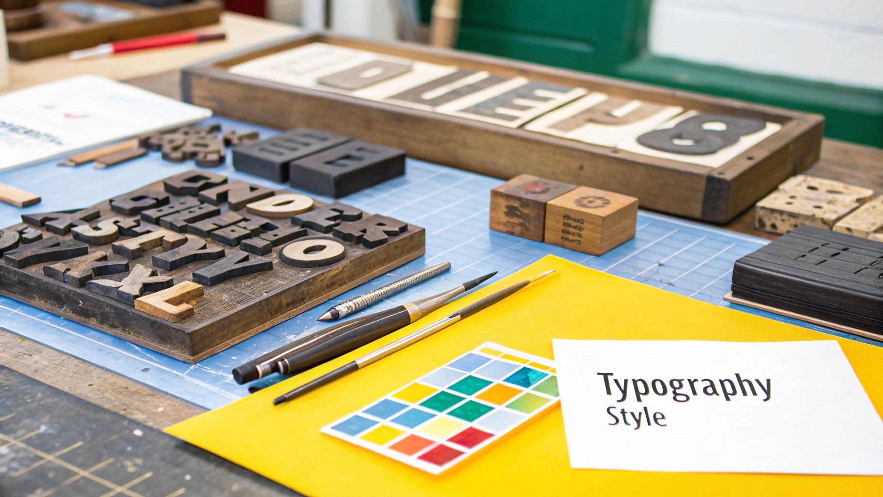
Choosing Typography That Speaks Volumes
The fonts you choose are like your brand’s tone of voice, but in visual form. A sleek, sans-serif font might feel modern and efficient, while a classic serif can convey tradition, authority, and elegance. Your guidelines need to establish a clear typographic hierarchy so everything looks orderly and intentional.
You’ll want to define a primary typeface (usually for headlines) and a secondary one (for body copy). Stick to just two or three complementary fonts to keep things looking clean and professional—any more than that, and you risk visual chaos.
For each font in your system, be sure to specify:
- Font Weights: Outline which weights (e.g., Light, Regular, Bold, Black) are approved and what they're used for. For example, "All H1 headlines use Montserrat Black."
- Sizing and Spacing: Provide clear guidance on font sizes for H1, H2, H3, body text, and captions. Also, include rules for line spacing (leading) and letter spacing (tracking) to keep your text readable and balanced.
This isn't just nitpicking; it's about empowering your team to create content that is beautifully structured, easy to read, and always on-brand.
Curating Imagery and Iconography
The last piece of the visual puzzle is your approach to photography, illustration, and icons. All of these assets need to feel like they belong to the same creative universe. Are your brand photos bright, optimistic, and full of people? Or are they moody, atmospheric, and focused on products?
Define the aesthetic from top to bottom. This has a huge real-world impact on everything from social media posts to having an effective website design and branding that truly represents you. By setting clear rules for everything—color grading, composition, subject matter, and style—you ensure every single image reinforces your brand’s unique story.
Finding and Nailing Your Brand Voice

If your visual identity is how your brand looks, then your brand voice is how it speaks. It’s the personality that shines through in every email, social media post, and line of website copy. Get it right, and you turn a faceless company into a memorable, relatable character.
But defining that voice is more than just picking a few vague adjectives like "friendly" or "professional." Those words are too open to interpretation. The real work is in digging deeper to build a communication style that’s distinct, genuine, and impossible to ignore.
This is the part of your brand guidelines that ensures every piece of writing—from a celebratory tweet to a serious support ticket—sounds like it all came from the same team with a unified purpose.
From Personality Traits to Practical Voice
Your brand's voice should feel like a natural extension of the personality you’ve already defined. If you decided your brand is "witty, insightful, and supportive," then your words need to bring those traits to life.
One of the most effective ways I've seen teams make this happen is with a simple voice chart. It’s a fantastic tool for translating those abstract personality traits into concrete, easy-to-follow rules for communication.
Let's take a "witty" brand, for example:
- You'd say things like this: "Our software works so fast, you'll have time for a second coffee. And probably a third."
- And avoid things like this: "Experience increased operational efficiency with our optimized processing speeds."
This simple "This, Not That" framework is a game-changer. It takes all the guesswork out of the writing process and empowers everyone on your team to quickly get on board.
Mapping Your Tone of Voice Spectrum
Here’s something people often mix up: voice and tone. Your brand voice is your consistent personality—it doesn’t change. Your tone, however, absolutely should adapt to the situation at hand. You wouldn't use the same casual, upbeat tone to announce a new feature as you would to address a system-wide outage.
Mapping out a tonal spectrum is a crucial step in guiding your team. It shows them how to dial the personality up or down depending on the context of the conversation.
Think of it this way: Your voice is your fixed personality, and your tone is your current mood. You're the same person every day, but your mood shifts based on what's happening. Your brand needs that same emotional intelligence.
A simple table can work wonders here, outlining how your voice should flex in different situations.
| Scenario | Audience Mindset | Appropriate Tone | Example |
|---|---|---|---|
| Marketing Campaign | Excited, Curious | Energetic, Aspirational, Confident | "Ready to build something amazing? Let's get started." |
| Help Document | Frustrated, Confused | Clear, Direct, Supportive | "To fix this, just follow these three quick steps." |
| Apology Post | Disappointed, Upset | Humble, Empathetic, Responsible | "We made a mistake, and we're truly sorry. Here is exactly what we're doing to fix it." |
This kind of map gives your writers, social media managers, and support agents the confidence to communicate appropriately in any scenario without losing that core brand personality.
Establishing Editorial Style and Grammar Rules
Now we get into the nitty-gritty of language. This is where you establish the small rules that make your brand feel polished, professional, and detail-oriented. Documenting these things eliminates endless debates and keeps everyone writing in a unified style.
Your editorial guidelines don't need to be a 100-page style manual. Just focus on answering the most common questions that pop up for your team.
Here are a few key areas I always recommend defining:
- Punctuation Preferences: Are you a fan of the Oxford comma? What’s your stance on em dashes versus hyphens? Make a call and stick with it.
- Capitalization Rules: How do you treat titles and headlines? Is it Title Case or Sentence case? Be explicit.
- Industry Jargon: Define which technical terms are okay to use and which should be simplified for a broader audience. A simple glossary can be a lifesaver.
- Numbers and Dates: How should numbers be written (e.g., spell out one through nine)? What’s the standard date format ("January 1, 2025" or "1 Jan 2025")?
And in today's world, it's not just about grammar anymore. You need to think about the other elements of modern communication.
- Emoji and GIF Usage: Are emojis on-brand? If so, which ones feel right, and where are they appropriate? A smiley face might be perfect for a tweet but totally out of place in a business proposal.
- Inclusive Language: This is non-negotiable. Provide clear guidelines on using inclusive and accessible language. This covers everything from preferred pronouns to avoiding ableist phrases or culturally insensitive metaphors.
By taking the time to document these details, you're building a truly comprehensive writing guide. It ensures every single word your company publishes works to build a stronger, more consistent, and more human connection with your audience. This is how you create brand guidelines that people will actually open and use.
Structuring Your Brand Guidelines So People Actually Use Them
You’ve done the hard work of defining your brand’s strategy, visuals, and voice. Now comes the final, crucial step: putting it all together in a way that people will actually use. A brilliant 50-page guide is totally useless if it’s gathering digital dust in a forgotten folder. The way you structure your brand guidelines is just as important as what’s inside them.
This is where all that strategy becomes reality. You’re building a resource that needs to be intuitive for everyone, from your lead designer to a new marketing intern.
Choosing the Right Format for Your Team
First things first: where are these guidelines going to live? The classic PDF has its place, but modern teams often need something more dynamic and easier to access.
Let’s break down the common options:
Shareable PDF: This is the old standby. It’s portable and can be beautifully designed, but that’s about it. PDFs are static, which makes updates a total pain and creates a real risk of old versions floating around. They work best for small teams or as a condensed "brand one-sheeter."
Internal Website or Wiki: Creating a dedicated space on your company intranet—think Confluence or SharePoint—is a fantastic, low-cost option. It keeps everything in one central, updatable spot and makes the guidelines searchable and easy to link to.
Dynamic Brand Hub: For a truly professional setup, platforms like Frontify or Bynder are the gold standard. These online hubs are interactive. Users can download assets directly, grab live code snippets for colors, and see updates in real-time. They come with a subscription fee, but for larger or distributed teams, the usability is unmatched.
The best choice really boils down to your team’s size and how you work. A startup might be perfectly fine with a well-organized wiki. A global company, on the other hand, will find a dedicated brand hub to be a worthwhile investment for maintaining consistency at scale.
Your brand guide isn't a museum piece. It’s a tool for daily work. Prioritize easy access above all else. If it takes someone more than three clicks to find the right logo, they’ll just give up and grab whatever they can find.
Organizing Content for Maximum Clarity
How you lay out the information will determine whether people feel empowered or completely overwhelmed. A logical flow is your best friend here. I’ve always found it helpful to structure the document like a story, starting with the big-picture "why" and drilling down to the nitty-gritty details.
A User-Friendly Structure
A simple, logical flow makes all the difference. Try organizing your guide this way:
| Section | Purpose | What to Include |
|---|---|---|
| 1. Brand Foundation | The "Why" | Your mission, vision, core values, and brand personality traits. This sets the stage for everything else. |
| 2. Logo Usage | The Core Asset | Primary and secondary logos, clear space rules, and a visual guide of common misuses (the "don'ts"). |
| 3. Visual Identity | The Look & Feel | Your color palette (with HEX/RGB/CMYK codes), typography hierarchy, and guidelines for imagery. |
| 4. Brand Voice | The Personality | Voice principles, a tone spectrum for different scenarios, and key editorial rules (e.g., Oxford comma). |
| 5. Applications | Real-World Action | Mockups of social media posts, presentation slides, and email signatures to show the brand in action. |
This structure moves the user from high-level strategy to practical application, making it easy for them to find exactly what they need, fast.
The Power of Visual Do's and Don'ts
Most people are visual learners. Instead of just writing "don't stretch the logo," show them a horribly stretched logo with a big red X over it. It’s instantly understood and far more memorable than a paragraph of text.
Create simple, side-by-side examples for all your key visual rules. This is especially helpful for:
- Logo Misuse: Show incorrect placements, colors, and alterations.
- Color Combinations: Display approved text and background pairings to ensure readability.
- Typography Hierarchy: Visually demonstrate how headlines, subheads, and body copy should look.
These visual guardrails eliminate any guesswork and give your team the confidence to create assets that are consistently on-brand.
Don't Forget Advanced Scenarios
Your brand doesn't live in a bubble. It will interact with other brands and show up in all sorts of different contexts. A truly comprehensive guide anticipates these situations.
Two sections are often overlooked but are critical for protecting your brand:
Co-Branding Guidelines: What happens when you partner with another company? You need to define how logos should be displayed together, which brand takes precedence, and how to handle shared marketing materials.
Partner and Affiliate Marketing: How can third parties use your brand? Give resellers, affiliates, and partners specific assets and rules to ensure they represent your brand correctly.
By thinking ahead and including these scenarios, you turn your guide from a simple style reference into a robust governance tool that protects your brand no matter what. That’s how you build guidelines that not only empower your team but also strengthen your identity over the long haul.
Making Brand Consistency a Reality
You’ve done the hard work and created a comprehensive set of brand guidelines. That’s a huge win, but it’s only half the battle. A brilliant guide that just sits in a folder is useless. The real challenge—and where the payoff is—is embedding these rules into your team's daily workflow.
Now it's time to bring your guide to life. This means launching it with intention, making it an indispensable resource for everyone, and setting up a clear system to keep it all on track. This is how you stop brand drift in its tracks and ensure every single project makes your brand stronger.
Launching Your Guidelines Internally
The way you introduce your new guidelines sets the stage for how they’ll be received. Don't just attach a PDF to a company-wide email and call it a day. Think of this as an internal product launch. You're not just demanding compliance; you're trying to build genuine excitement and understanding.
Get everyone together for a company-wide meeting or a series of hands-on workshops. And I mean everyone. This isn't just for the marketing and design teams. Sales, customer support, HR—every employee is a brand ambassador, and they all need to understand the "why" behind the new direction.
- Connect it to the Big Picture: Kick things off by revisiting your brand foundation. Show a clear line connecting the new visual and verbal rules directly back to your company's mission and core values.
- Show, Don't Just Tell: Ditch the boring slides. Use compelling mockups and before-and-after examples to demonstrate how the new guidelines will elevate everything from marketing campaigns to sales presentations.
- Open the Floor: Wrap up with a dedicated Q&A session. Answering questions and addressing concerns head-on helps build a sense of shared ownership and gets everyone on board from the start.
Creating an Accessible Brand Hub
For your guidelines to be useful, they have to be easy to find and use. If an employee has to dig through a server for more than 60 seconds to find the right logo, they're probably going to give up and use whatever old version they have saved on their desktop.
Your guide needs a central, living home. This could be an internal wiki (like Confluence), a dedicated page on your company intranet, or a professional brand management platform like Frontify. The goal is to create a single source of truth for all things brand. A well-organized hub doesn't just improve consistency; it makes people more efficient. When every touchpoint feels cohesive and intentional, it has a direct, positive impact on the customer's journey. You can learn more about how to improve user experience design in our detailed guide.
A brand guideline document is a map. A brand hub is a GPS. One shows you the destination; the other gives you turn-by-turn directions and real-time updates to get there successfully.
Establishing a Governance Process
Brands don't stand still; they evolve. To keep your guidelines from becoming obsolete, you need a straightforward process for managing changes and updates. This ensures any new brand elements are introduced with purpose, not on a whim.
Start by designating a "brand guardian" or a small committee. This person or group gets the final say on brand-related decisions. They’re the ones who will review new creative, approve one-off exceptions, and decide when it’s time to update the guidelines themselves.
Having a clear process here is crucial for long-term consistency. The numbers back this up: consistent branding can boost revenue by 10-20%. Yet, while 95% of companies have brand guidelines, research shows only about a quarter of them enforce those rules consistently. Closing that gap is a massive opportunity, a point you can explore further by checking out more branding statistics at Shapo.io.
Finally, create a simple feedback loop. Make it easy for people to ask questions or suggest improvements—a dedicated Slack channel or an email alias works perfectly. This collaborative approach keeps your guidelines relevant and turns them into a powerful tool that empowers your entire team to build a stronger brand, day in and day out.
Frequently Asked Questions About Brand Guidelines
Even the most carefully crafted brand book is going to spark a few questions. That’s a good thing! It means people are actually using it. Thinking ahead about these common queries helps make sure your guidelines are a living, breathing tool for your team, not just a PDF that gathers digital dust.
Let's walk through some of the questions that almost always come up once the guidelines are out in the wild. Having clear, practical answers ready will help everyone apply the brand confidently and keep things consistent.
How Often Should We Update Our Brand Guidelines?
Your brand guidelines should never be set in stone. Things change, and your brand needs to keep up.
A great starting point is to schedule a formal review at least annually. This gives you a dedicated time to assess what’s working, what’s not, and what’s new, without creating constant, disruptive changes.
Of course, some things can't wait for the annual review. You'll want to revisit the guidelines immediately if any of these major events happen:
- The company goes through a merger or acquisition.
- You launch a new flagship product that changes your place in the market.
- There's a big pivot in your business strategy or who you're trying to reach.
- You keep getting feedback that the guidelines are confusing or missing key information.
Think of it like tending a garden. It needs regular attention to stay healthy and vibrant.
How Do Guidelines Differ for a Small Business vs. a Large Enterprise?
While the goal of consistency is the same for everyone, the scale of the guidelines needs to match the scale of the business. It’s all about what’s practical for your team.
A small business or startup needs to be nimble. The focus should be on the core essentials. A tight, 10-15 page guide covering the non-negotiables—logo usage, color palette, typography, and voice—is usually perfect. It gives a small team the guardrails they need to move fast without getting stuck in a hundred pages of rules.
A large enterprise, on the other hand, is a different beast entirely. You’re trying to maintain consistency across multiple departments, global regions, and countless partners. The guidelines have to be incredibly comprehensive and are often best housed on a dedicated online portal. They need to anticipate niche scenarios like co-branding partnerships, international logo variations, and complex sub-brand systems.
The objective is the same for both: clarity and consistency. The difference is in the scope. A startup just needs a clear map to get started, while a global corporation needs a detailed atlas for every possible journey.
What If a New Marketing Channel Doesn’t Fit Our Rules?
This question comes up all the time, especially with how fast marketing evolves. A new social media app pops up or a new interactive ad format becomes popular, and suddenly your carefully written rules don't quite fit.
The worst thing you can do is ignore the guidelines and just wing it. Instead, see this as a chance to let your brand evolve intelligently. The person or team in charge of the brand should lead the charge in figuring out how its core essence can adapt to this new space.
Maybe you need a new logo variation that works better as a circular profile picture. Or perhaps you need to define a slightly more casual tone of voice for a video-first platform like TikTok.
The goal is intentional adaptation, not abandonment. Once you’ve figured it out, document the new rules and add them to your guide. This keeps your brand feeling fresh and relevant without losing what makes it unique.