How to Reduce Bounce Rate and Boost Engagement
Before you can tackle a high bounce rate, you have to get one thing straight: it's not always a bad thing. A "bounce" is just a single-page session. Someone lands on your site, gets what they need, and leaves. The real work is figuring out if they left happy or frustrated.
What Bounce Rate Is Really Telling You
Let's break it down. A bounce happens when a visitor hits a page on your site and then leaves without doing anything else. No clicks, no form fills, no navigating to another page. It was a one-and-done visit.
But context is everything here. You can't just look at the number in isolation; you have to consider the page's job.
Here's the bottom line: A high bounce rate on a blog post that answers a very specific question is often a sign of success. The user found their answer instantly and had no reason to stick around.
Think about it. If someone googles "what is the capital of Nebraska," lands on your page, and immediately sees "Lincoln," their mission is complete. They're going to bounce, and that's perfectly okay. On the other hand, if your main product page has a high bounce rate, you've got a serious problem. It means people are showing up and seeing nothing that makes them want to explore further.
Good Bounces vs. Bad Bounces
This is the most critical distinction to make. A high bounce rate is only a problem when it’s caused by a poor user experience. Those are the "bad bounces" that need your attention.
What causes people to leave in frustration? It usually comes down to a few common culprits:
- Slow Page Load Times: Nobody waits around anymore. If your page takes more than a couple of seconds to appear, they’re gone.
- A Terrible Mobile Experience: If your site is a mess on a smartphone, you're alienating a massive chunk of your audience.
- Misleading Titles or Meta Descriptions: Clickbait is a killer. If your content doesn't deliver on the promise made in the search results, users will feel deceived and leave immediately.
- Confusing Navigation: Can visitors easily figure out where to go next? If not, their next click will be the back button.
These issues are clear signals that something is broken in your site's performance or user experience. Digging into various user experience metrics can give you a much clearer view of what’s really happening and how users feel.
Putting Your Numbers in Context
It also helps to look at industry benchmarks to see where you stand. E-commerce sites, for instance, typically see bounce rates between 20-45%. Blogs, however, can have rates soaring from 70-90%, and that's often considered normal.
So, don't have a meltdown if your blog's bounce rate is 75%. For a more detailed breakdown, this comprehensive guide on how to reduce bounce rate is a great resource. The goal isn't just to chase a lower number; it's about fixing the real issues that make people leave before you've had a chance to show them what you've got.
Win the First Three Seconds with Site Speed
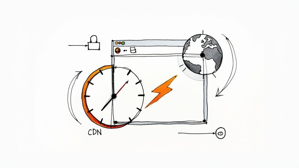
Nothing sends a visitor running for the back button faster than a page that just… won't… load. We live in an age of instant gratification, and if your page hangs for even a couple of extra seconds, you've lost someone before they've even seen your headline.
The data on this is pretty stark. The probability of a visitor bouncing skyrockets with every second of load time.
Think about it: a site that loads in one second sees a bounce rate of just 7%. Let that stretch to three seconds, and it jumps to 11%. By the time you hit five seconds, you’re looking at a 38% bounce rate. It’s a direct and punishing relationship.
This isn’t just a minor annoyance; it’s about meeting a fundamental user expectation. The good news? You have a ton of control over how fast your site feels to a visitor.
Diagnose Your Speed Bottlenecks
Before you start tweaking things, you need to know what you’re up against. This is where a tool like Google PageSpeed Insights becomes your best friend. Just plug in your URL, and it’ll spit out a performance score along with a checklist of specific, actionable recommendations.
This report is your treasure map, pointing directly to the elements bogging your site down. It’s usually a combination of a few common culprits that are surprisingly easy to fix once you know where to look.
Pro Tip: Don't just test your homepage. Run reports on your most popular blog posts, product pages, and landing pages. These often have different layouts, more images, or unique scripts that can create their own performance headaches.
Implement High-Impact Speed Fixes
With your diagnostic report in hand, it’s time to get to work. Focusing on a few key areas will give you the biggest bang for your buck and help you chip away at that bounce rate.
- Compress Your Images: Large, unoptimized images are the number one speed killer I see. Use a tool like TinyPNG to shrink your image file sizes without any noticeable drop in quality. It’s a simple drag-and-drop process that can shave seconds off your load time, especially on image-heavy pages.
- Enable Browser Caching: Caching is like giving a return visitor a VIP pass. It stores parts of your website (images, code, etc.) on their browser. When they come back, their browser loads those files locally instead of re-downloading everything, making their next visit feel almost instant.
- Minify Your Code: Minification is just a fancy word for cleaning up your code. It strips out all the unnecessary characters—like extra spaces and developer comments—from your HTML, CSS, and JavaScript files. This makes the files smaller and faster for browsers to read and process.
For a deeper dive, our guide on how to improve website speed walks through these steps in much greater detail.
I once worked with an e-commerce client who was seeing a massive bounce rate from their international visitors. The problem was pure physics—the data had too far to travel. By setting up a Content Delivery Network (CDN), they were able to store their images and files on servers located much closer to their users around the world. That one change slashed their page load times for that audience, leading to a huge drop in bounces and a very real increase in sales.
Create Content That Actually Matches User Intent
A high bounce rate often feels like a broken promise. Your title and meta description told a visitor you had the answer, but when they clicked through, the content just didn't deliver. That gap between expectation and reality is one of the biggest reasons people hit the back button.
The fix isn't about stuffing more keywords in. It’s about getting inside the visitor's head and understanding their user intent. What are they really trying to do? Do they need a quick definition? A detailed product comparison? A step-by-step tutorial? Figuring this out before you even start writing is the secret to making people stick around.
Figure Out What Searchers Are Really Looking For
Every search query is a question, even if it doesn't have a question mark. Someone typing "best running shoes" is in a different mindset than someone searching for "Brooks Ghost 15 review." The first search is broad and informational, while the second is much closer to a purchase decision. Your content has to be a perfect match for that underlying goal.
A visitor needs to know they’re in the right place within three seconds. Your headline, your first sentence, and even your hero image should instantly confirm they made the right click.
A great way to get this right is to do a little reconnaissance. Google your target keyword and look at the top-ranking pages. Are they blog posts? Listicles? Product pages? This tells you exactly what Google thinks satisfies the intent for that search, giving you a proven blueprint to follow.
Structure Your Content for Scanners, Not Readers
Once you’ve nailed the intent, you have to win the battle for attention. Let's be honest—most people don't read online content word-for-word. They scan. Your job is to make your page easy to skim so their eyes land on the good stuff.
This is a huge factor in keeping people engaged. The average website bounce rate is somewhere between 26% and 70%, with anything under 40% being a really solid score. Just look at super-engaging sites like PayPal; its bounce rate is a tiny 19.5%. They prove that when content is relevant and easy to digest, people stay. You can dig into more website statistics to see what sets the top performers apart.
So, how do you make your content "stickier"? It’s all about the formatting.
- Short Paragraphs: Keep them to 1-3 sentences. This creates breathing room and makes the text far less intimidating.
- Bolded Text: Use bolding to highlight key terms, stats, and takeaways. It’s like a magnet for a scanner's eyes.
- Bulleted Lists: When you have a lot of information, break it up into a simple list. It's instantly easier to process.
A good bounce rate can really depend on what kind of site you're running. A blog post might have a different "normal" than an e-commerce product page.
Bounce Rate Benchmarks by Website Type
Here’s a quick reference table to help you understand what a 'good' bounce rate looks like for different kinds of websites. This should help you set some realistic goals for your own site.
| Website Type | Excellent Bounce Rate | Average Bounce Rate | Poor Bounce Rate |
|---|---|---|---|
| E-commerce & Retail | 20% - 45% | 45% - 65% | 65%+ |
| Blogs & Content Sites | 30% - 55% | 55% - 80% | 80%+ |
| Lead Generation | 25% - 45% | 45% - 60% | 60%+ |
| SaaS & Tech | 25% - 50% | 50% - 70% | 70%+ |
| Landing Pages | 60% - 90% | Varies Heavily | Varies Heavily |
Remember, these are just general guidelines. A high bounce rate on a landing page designed for a single action isn't necessarily bad, but on a homepage, it's a major red flag. Use these numbers as a starting point, not a strict rule.
Write an Introduction That Hooks Them Immediately
Your first few sentences are the most important part of the entire page. They have one job: convince the user they’ve found what they’re looking for and give them a reason to keep scrolling. Don't waste this precious space with fluffy, generic intros.
Get right to it. Acknowledge the problem they’re trying to solve and tell them exactly what they'll get from your article. This builds immediate trust and makes it a no-brainer for them to stick around. When your content delivers on its promise from the very first word, you solve a core reason people leave, which is a huge step toward lowering that bounce rate.
Improve Your Website Navigation and UX
You can have the fastest site and the most brilliant content, but it won't matter if visitors can't figure out where to go next. When a website is confusing or clunky, it creates friction. And friction is a one-way ticket to a higher bounce rate.
The goal is to design a journey that feels so natural, people don't even have to think about it. They should glide through your site, finding exactly what they need without a hint of frustration. Think of your navigation as a clearly marked trail through a forest—without it, your visitors are going to get lost and give up.
Craft an Intuitive Site Structure
Your navigation menu is your visitor's primary roadmap. If you overload it with options, you'll trigger decision paralysis. On the flip side, if you hide important pages, you've made them impossible to find. A clean, logical menu is your best tool for guiding people deeper into your site.
Start by taking a hard look at your main navigation. Does every single link serve a purpose? Are the pages that matter most—like "Services," "Products," or "Contact"—instantly obvious? A heatmap is a fantastic tool for this; it shows you exactly what people are clicking on and, more importantly, what they're ignoring.
Try incorporating these structural elements to make things easier for your visitors:
- Logical Menus: Group related pages together under simple, descriptive headings. Instead of a dozen separate links, create a "Solutions" or "About Us" dropdown.
- Breadcrumbs: These little navigational trails show users their path (e.g., Home > Blog > How to Reduce Bounce Rate). They give people an easy way to backtrack without having to hit the back button and start over.
- A Prominent Search Bar: For visitors who know exactly what they're looking for, a search bar is a lifeline. Don't make them hunt for it.
A well-structured website doesn't just look good; it actively stops bounces by eliminating confusion. When someone understands where they are and where they can go, they're much more likely to stick around.
If you want to dive deeper into this topic, our guide on how to improve user experience design is packed with more advanced strategies.
Prioritize the Mobile Experience
With over half of all web traffic now coming from mobile devices, a clunky mobile site isn't just an inconvenience—it's a major liability. Nobody wants to pinch and zoom to read text or try to tap on tiny links crammed together. That kind of frustration will send mobile users running for the hills.
Your website absolutely must be responsive, meaning the layout automatically adjusts to fit any screen size. Text needs to be legible, buttons should be big enough to tap easily, and menus have to be designed for touchscreens. Not sure where you stand? Use Google’s Mobile-Friendly Test tool for a quick check-up.
Rethink Disruptive Pop-Ups
We've all been there. You land on a new site, and BAM—a massive pop-up covers the entire screen before you've even had a chance to read the headline. This is a classic bounce rate killer. It interrupts the user's journey before it even starts, feeling more like a roadblock than a welcome mat.
There's a better way. Instead of ambushing your visitors, try a less intrusive approach. Exit-intent pop-ups, which only show up when a user's cursor moves toward the exit button, can be incredibly effective. You could also try slide-in forms that appear after someone has scrolled a certain distance down the page. The idea is to add value at the right moment, not create an immediate obstacle.
Guide Users with Smart Internal Linking
When a visitor lands on a page and finds nowhere else to go, what's their next move? The back button. It’s a dead end. Every page on your site should be a launchpad, not a brick wall. This is where a thoughtful internal linking strategy comes into play, turning a single page view into a genuine journey through your content.
An internal link is more than just a hyperlink to another article. It's a contextual bridge that adds real value and keeps the reader engaged. Instead of just shoving another page in their face, you're offering helpful suggestions that feel like the logical next step. This one strategy is a cornerstone of learning how to reduce bounce rate.
Create Contextual Pathways, Not Just Links
The best internal links are the ones that blend seamlessly into the conversation you're having with the reader. They should be woven right into your sentences, offering a chance to go deeper on a specific concept or explore a related idea. I like to think of it as anticipating what my reader might ask next and having the answer ready for them.
Let's say you're writing a post about improving website speed and you briefly mention "image compression." That's your cue. Link that exact phrase to your in-depth guide on "How to Optimize Images for the Web." The anchor text is specific, relevant, and the destination expands directly on the topic.
Key Takeaway: A good internal link feels like a helpful recommendation from an expert, not a random road sign. It enriches the current experience while inviting them to stick around.
This approach does wonders for more than just your bounce rate. It's a huge boost for SEO, too. A solid internal linking structure helps search engines map out your site, understand how your content is related, and spread link authority around.
Craft Calls to Action That Guide, Not Demand
If internal links are the subtle guides, your Calls to Action (CTAs) are the more direct signposts. The right CTA can be the difference between a bounce and a conversion, but you have to get the tone right. Overly aggressive or salesy CTAs are a major turn-off for most visitors.
Your goal should be to frame CTAs as helpful next steps. You want the user to feel like they're making a smart, informed choice—not being cornered into one.
Here are a few ways to do that:
- Offer More Value: Instead of "Buy Now," try something softer like "See Plans and Pricing." This encourages exploration without demanding immediate commitment.
- Provide a Clear Path: At the end of a blog post, a CTA like "Read More Articles on This Topic" is a low-pressure invitation to keep learning.
- Be Specific: A button that reads "Download the Free Checklist" is way more compelling than a generic "Click Here." It tells them exactly what they're getting.
By combining these subtle, contextual internal links with clear, value-first CTAs, you build a powerful system. You create multiple, non-intrusive pathways that encourage visitors to click deeper, turning a potential bounce into a much longer, more meaningful visit.
Common Questions About Bounce Rate
Even with a solid plan, a few questions always seem to pop up when you start digging into bounce rate. I see them all the time. Let's clear the air on some of the most common ones so you can focus on what really matters.
What Is the Difference Between Bounce Rate and Exit Rate?
It’s incredibly easy to get these two mixed up, but they tell you completely different stories about user behavior.
Think of bounce rate as the percentage of people who land on a page and leave without clicking anything else. They came, they saw, they left. It's a one-and-done visit, measured only on the very first page they land on.
Exit rate, on the other hand, is the percentage of people who left your site from that specific page. That page could have been the first, third, or even tenth page in their journey. A high exit rate on your final checkout page is a massive red flag, but a high bounce rate on a blog post? That might be totally fine.
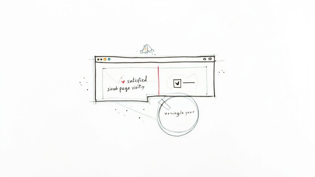
Can a High Bounce Rate Ever Be a Good Thing?
Yes, absolutely. This is where context becomes king.
Imagine someone lands on your "Contact Us" page, finds the phone number they needed, and immediately leaves to call you. In your analytics, that's a bounce. But in reality? That's a huge win. The same logic applies to a blog post that gives a quick, definitive answer to a specific question.
The user found exactly what they needed, their mission was accomplished, and they left satisfied. In these cases, a high bounce rate isn't a sign of failure—it's a sign of efficiency.
How Long Does It Take to See a Lower Bounce Rate?
This really depends on how much traffic you're getting. If you run a high-traffic website, you could see a noticeable drop in your bounce rate within a week or two after making a big change, like dramatically improving your site speed.
For smaller sites with less traffic, you'll need more patience. It might take a month or even longer to collect enough data to see a real trend emerge. My best advice is to monitor your analytics over a longer period instead of getting hung up on daily swings.
If you're looking for more ideas, you can explore some top tips for improving your bounce rate and boosting engagement.