10 Mobile App Design Best Practices for 2025
In a crowded digital marketplace, a visually stunning and intuitively functional mobile app isn't just a bonus-it's the price of entry. Users have sky-high expectations; they demand seamless, engaging, and fast experiences. Anything less leads to quick uninstalls and lost opportunities. The difference between a forgotten app and a category leader often comes down to mastering the core principles of user-centric design. This is where a deep understanding of mobile app design best practices becomes your most valuable asset.
This article moves beyond generic advice to provide actionable, expert-backed strategies that drive user retention and satisfaction. We will break down 10 essential principles that are crucial for creating high-performance applications. You will learn to implement specific techniques, from optimizing navigation for the 'thumb zone' and designing intuitive gesture-based interactions to integrating accessibility from day one. These are the details that separate a functional app from an exceptional one.
By mastering these concepts, you can build an application that users not only need but love to use. Let's dive into the core practices that will help you transform your good idea into a great, market-leading mobile experience.
1. Mobile-First Design
Mobile-first design isn't just a trend; it's a fundamental strategy for creating successful digital products in a world dominated by handheld devices. This approach flips the traditional design process on its head. Instead of designing for a large desktop screen and then stripping away elements to fit a mobile view (graceful degradation), you start with the smallest screen and progressively enhance the design for larger devices. This methodology, popularized by UX expert Luke Wroblewski, forces you to prioritize core content and functionality from the outset.
By embracing the constraints of a small screen, you create a focused, uncluttered, and highly intuitive user experience. This is a critical component of modern mobile app design best practices, as it directly addresses user behavior. Global platforms like Instagram and Spotify exemplify this by building their entire experience around a seamless mobile interface that feels natural and efficient.
How to Implement Mobile-First Design
- Start with the Smallest Canvas: Begin your wireframing and prototyping process using a baseline mobile viewport, such as the iPhone SE (375px width). This forces you to make tough decisions about what content is truly essential.
- Prioritize Touch Interactions: Ensure all interactive elements, like buttons and links, have a minimum touch target size of 44x44 pixels to prevent user frustration from accidental taps.
- Scale Up Intentionally: Use established mobile breakpoints (e.g., 320px, 480px, 768px) to define how your layout adapts. As screen real estate increases, thoughtfully add secondary features and more complex navigational elements.
- Test on Real Devices: Browser emulators are useful, but nothing beats testing on actual hardware. This helps you identify issues with performance, touch accuracy, and how the design feels in a user's hand.
2. Thumb Zone Navigation
Thumb zone navigation is a critical design principle that places key interactive elements within the natural arc of a user's thumb. Research by Steven Hoober reveals that nearly 75% of users interact with their phones using only one thumb. This approach acknowledges the physical reality of how we hold our devices, organizing the interface into zones based on reach: easy, stretching, and hard-to-reach areas. Placing frequently used controls in the easily accessible lower portion of the screen drastically improves usability and reduces physical strain.
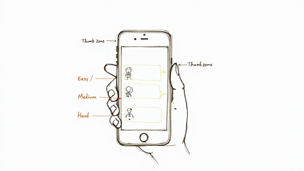
This ergonomic strategy is a cornerstone of effective mobile app design best practices because it makes interactions feel effortless and intuitive. Apps like Instagram and Uber master this by positioning their primary navigation tabs and crucial call-to-action buttons at the bottom of the screen. This ensures that core actions are always just a comfortable tap away, creating a smoother and more efficient user journey.
How to Implement Thumb Zone Navigation
- Prioritize Bottom Navigation: Place your primary navigation bar or tab bar at the bottom of the screen. This gives users immediate access to the most important sections of your app without needing to readjust their grip.
- Position Primary CTAs Strategically: Locate essential buttons, like a "Compose" button in a mail app or a "Book Now" button in a travel app, within the lower third of the screen where they are easiest to reach.
- Reserve Top Areas for Viewing: The top of the screen, often a "hard-to-reach" zone, is ideal for displaying information that doesn't require interaction, such as page titles, logos, or search bars.
- Consider Floating Action Buttons (FABs): Use FABs for the single most common action on a screen, placing them in the lower-right or lower-center area for optimal accessibility for right-handed and left-handed users.
3. Gesture-Based Interactions
Gesture-based interactions transform the user experience from a series of simple taps into a fluid, tactile dialogue with the device. By leveraging intuitive hand movements like swipes, pinches, and long-presses, designers can declutter the interface and create a more immersive, efficient navigation system. This approach replaces traditional on-screen buttons with direct manipulation, making the app feel more responsive and native to the mobile environment.
This method is a core tenet of modern mobile app design best practices because it reduces cognitive load and aligns with how users naturally interact with their phones. Powerhouse apps like Tinder, with its iconic swipe-left/right mechanic, and the native iOS swipe-back navigation demonstrate how gestures can become second nature, speeding up core tasks and enhancing user satisfaction.
How to Implement Gesture-Based Interactions
- Prioritize Platform Conventions: Start by using standard gestures that users already know (e.g., pinch-to-zoom for images, swipe-down-to-refresh). This builds on existing mental models and ensures a predictable experience.
- Provide Subtle Visual Cues: For less common gestures, guide the user with subtle visual hints. Small animations, arrows, or onboarding screens can teach functionality without being intrusive.
- Offer Immediate Feedback: A gesture should trigger an immediate visual or haptic response. This feedback confirms the action was registered and makes the interaction feel tangible and reliable.
- Include Non-Gesture Alternatives: Always provide an alternative, visible way to perform an action, such as a button. This is crucial for accessibility and helps users who may not discover or remember a specific gesture.
4. Progressive Disclosure
Progressive disclosure is a powerful UI/UX strategy that manages complexity by presenting information and actions only when they are needed. Instead of overwhelming users with every feature at once, this approach reveals more advanced options as the user interacts with the app. This method, championed by experts like Don Norman and the Nielsen Norman Group, reduces cognitive load, prevents decision paralysis, and makes the initial user experience feel clean and approachable.
By sequencing information, you guide users through the app's functionality naturally. This is a core tenet of effective mobile app design best practices because it improves learnability and satisfaction. Duolingo masterfully uses this by unlocking new lessons and features only after a user masters previous ones, while LinkedIn's profile completion wizard guides users step-by-step without showing all fields simultaneously. This creates a focused and less intimidating journey for new and experienced users alike.
How to Implement Progressive Disclosure
- Map User Journeys: Identify core tasks versus secondary or advanced functions. Hide the complex options behind a "Settings" or "Advanced" toggle until a user is ready for them.
- Use Contextual Onboarding: Introduce features with tooltips or brief tutorials the first time a user encounters them, rather than in a lengthy initial tour.
- Provide Shortcuts for Power Users: While simplifying the interface for newcomers, ensure that experienced users can still access advanced features quickly through gestures or persistent menus.
- Leverage "Learn More" Links: For features with significant depth, present a concise summary and offer a "Learn More" link that expands to reveal detailed information, preventing cluttered screens.
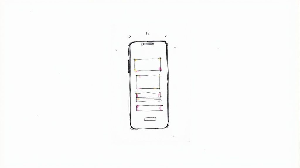
5. Responsive Typography
Responsive typography is the practice of ensuring text is legible and visually appealing across a wide range of screen sizes and resolutions. It goes beyond simply shrinking or enlarging font sizes; it involves dynamically adjusting line height, letter spacing, and even font weights to maintain an optimal reading experience. In an era where users switch between phones, tablets, and phablets, text that adapts gracefully is a cornerstone of effective design.
This adaptive approach prevents common mobile reading issues like cramped text on small screens or overly long lines on larger ones. Platforms like Medium excel at this, offering a comfortable, book-like reading experience regardless of the device. Implementing this is a key part of modern mobile app design best practices, as it directly impacts user comfort and content consumption.
How to Implement Responsive Typography
- Establish a Baseline: Start with a body text size of at least 16px. This is widely considered the minimum for readability on mobile screens without requiring users to zoom in.
- Use Fluid Techniques: Implement fluid typography using modern CSS functions like
clamp()to allow font sizes to scale smoothly between a minimum and maximum value based on the viewport width. - Maintain Optimal Line Length: Aim for a line length of 50-75 characters. On mobile, this often means your text block will take up the full screen width, but on tablets, you may need to constrain its width to prevent eye strain.
- Prioritize System Fonts: To improve performance and reduce load times, prioritize using native system fonts (like San Francisco for iOS and Roboto for Android). They are already optimized for their respective platforms. Beyond just adapting, delve deeper into how to master design in typography for stunning visuals and a superior reading experience across devices.
6. Minimalist and Clean UI Design
A minimalist and clean UI is a design philosophy centered on simplicity, clarity, and the intentional removal of non-essential elements. This approach, heavily influenced by Dieter Rams' principle that "good design is as little design as possible," reduces cognitive load on the user. By stripping away visual clutter, you elevate the core content and functionality, making the user journey more intuitive and focused. This is a cornerstone of effective mobile app design best practices, as it respects the limited screen real estate of handheld devices.
This philosophy is powerfully demonstrated in apps like the Monzo banking app or Stripe's payment interface, where complex actions are made simple through an uncluttered and direct design. While focusing on mobile apps, many universal UI principles apply across digital experiences. For instance, creating a truly minimalist and clean design often draws inspiration from diverse fields, including the principles found in a guide to modern game UI design, where clarity is paramount.
How to Implement Minimalist and Clean UI Design
- Embrace Whitespace: Treat negative space as an active design element. Use it generously to create visual hierarchy, separate content, and guide the user's eye without relying on borders or dividers.
- Use a Limited Color Palette: Select a few core colors to reinforce your brand identity and guide user actions. A strategic, limited palette prevents visual noise and helps important elements like calls-to-action stand out.
- Prioritize Essential Elements: Ruthlessly evaluate every element on the screen. If it doesn’t serve a clear purpose or support a user goal, remove it. Let the content itself be the interface.
- Focus on Typography: When visual decoration is minimal, typography becomes a critical design tool. Choose clear, legible fonts and establish a strong typographic hierarchy to communicate information effectively. For a deeper dive, learn more about these best practices for user interface design.
7. Performance Optimization and Loading States
A beautifully designed app is useless if it's slow and unresponsive. Performance optimization is the systematic process of ensuring an app loads quickly and runs smoothly, which is critical given the variability of mobile networks and device capabilities. This practice directly impacts user retention; slow load times are a primary reason users abandon an app. Thoughtful loading states provide crucial feedback, managing user perception of wait times and preventing frustration.
Effective performance management is a cornerstone of modern mobile app design best practices. By prioritizing speed and providing clear feedback during loading processes, you create a seamless and professional user experience. LinkedIn and Facebook master this by using skeleton screens that mimic the final layout, making the wait feel shorter and more integrated. To further improve app performance, developers should focus on both perceived and actual speed.
How to Implement Performance Optimization and Loading States
- Use Skeleton Screens: Instead of generic spinners, implement skeleton screens. These are placeholder UIs that show a wireframe of the page, making the app feel like it's loading progressively and faster.
- Optimize All Assets: Compress images, aiming for 30-50KB on mobile, and use modern formats like WebP with fallbacks. Minimize and bundle CSS and JavaScript files to reduce the number of server requests.
- Implement Lazy Loading: Load content and images only when they are about to enter the viewport. This technique significantly reduces the initial load time and conserves data for the user.
- Target Key Performance Metrics: Aim for a Time to Interactive (TTI) of under 3 seconds. Monitor Core Web Vitals like Largest Contentful Paint (LCP) and First Input Delay (FID) to ensure a smooth experience.
8. Clear Call-to-Action (CTA) Placement
A Call-to-Action (CTA) is the gateway to user conversion, making its placement one of the most critical elements of interface design. Strategic positioning of CTAs guides users toward desired outcomes, directly impacting engagement, goal completion, and overall business success. Effective placement ensures that primary actions are immediately discoverable and accessible without disrupting the user’s natural flow. This principle is a cornerstone of conversion-focused mobile app design best practices.
This practice moves beyond just making a button look good; it's about a deep understanding of user psychology and behavior. E-commerce giants like Amazon place their 'Add to Cart' button in a predictable, high-visibility area, while service apps like Uber feature a persistent, prominent 'Request Ride' button. These examples show how clear CTA placement removes friction and makes the core function of the app effortless.
How to Implement Clear CTA Placement
- Prioritize the Thumb Zone: Place primary CTAs within the natural arc of the user's thumb, typically at the bottom or middle of the screen. This ensures the most important actions are the easiest to reach.
- Create Visual Hierarchy: Use a single, high-contrast primary CTA per screen to avoid decision fatigue. Secondary or less critical actions should use a less prominent style, like a ghost button or a simple text link.
- Write Action-Oriented Copy: The button text should be clear and specific, telling the user exactly what will happen. Use verbs like "Start Your Free Trial" or "Book Your Stay" instead of vague terms like "Submit."
- Ensure Adequate Sizing and Spacing: Maintain a minimum touch target of 44x44 pixels for all CTAs. Surround them with sufficient whitespace to prevent accidental taps and make them stand out visually.
9. Consistent Navigation Patterns
Predictable navigation is the bedrock of a usable mobile application. By implementing consistent navigation patterns, you provide users with a reliable map, reducing their cognitive load and allowing them to explore the app with confidence. This principle involves using familiar structures and adhering to platform-specific conventions, which helps users build a mental model of your app’s layout from their very first interaction.
This practice is essential because it leverages established user habits. Apps like Instagram and YouTube utilize persistent bottom tab bars, a pattern users instantly recognize, making it easy to switch between core features. Following these established standards is a cornerstone of effective mobile app design best practices, ensuring your app feels intuitive rather than foreign.
How to Implement Consistent Navigation Patterns
- Follow Platform Guidelines: Adhere to Apple's Human Interface Guidelines for iOS and Google's Material Design for Android. This ensures your app’s navigation feels native to the user's operating system.
- Limit Primary Navigation: Keep the main navigation bar (like a tab bar or bottom navigation) focused on 3 to 5 of the most important sections. Overcrowding this space creates confusion.
- Use Clear Icons with Labels: Always pair icons with clear, concise text labels. This eliminates ambiguity and improves accessibility, making navigation understandable at a glance.
- Provide Visual Feedback: Clearly indicate the user's current location within the app. Use a contrasting color, bold text, or a distinct visual style for the active navigation item.
10. Accessibility-First Design
An accessibility-first approach treats universal usability not as a final checkbox but as a foundational pillar of the entire design process. This mindset goes beyond simple compliance, aiming to create mobile applications that are inherently usable by people with a wide range of abilities, including those with visual, auditory, motor, or cognitive impairments. By prioritizing inclusivity from the start, you avoid costly retrofitting and build a more robust, user-friendly product for everyone.
This is a non-negotiable aspect of modern mobile app design best practices because it expands your potential audience and often leads to a better experience for all users. Industry leaders like Apple and Microsoft have built comprehensive accessibility frameworks into their core operating systems, demonstrating that inclusive design is a key driver of innovation and market leadership. Designing with accessibility in mind ensures your app is perceived as ethical, professional, and welcoming to all.
How to Implement Accessibility-First Design
- Prioritize Readability: Ensure a color contrast ratio of at least 4.5:1 for text and visual elements. Use clear, legible fonts and provide options for users to adjust text size.
- Support Assistive Technologies: Provide descriptive alt text for all images and ensure every function can be accessed via keyboard or voice commands. Use semantic HTML and ARIA labels to give screen readers proper context.
- Design for Multiple Inputs: Do not rely on color alone to convey information. Use a combination of text, icons, and patterns to guide users. Ensure all interactive elements have a large enough touch target (at least 44x44 pixels).
- Test with Real Users: Conduct regular accessibility audits and test your application with users who rely on assistive technologies. For a deeper understanding of digital inclusivity, you can learn more about how to make a website accessible.
Top 10 Mobile App Design Best Practices Comparison
| Pattern / Principle | 🔄 Implementation complexity | ⚡ Resource requirements | 📊 Expected outcomes (quality) | 💡 Ideal use cases / Key advantages |
|---|---|---|---|---|
| Mobile-First Design | Medium — mindset shift and responsive planning | Moderate — designers, responsive dev, device testing | High ⭐⭐⭐⭐ — better mobile performance & UX | Mobile-heavy sites, new responsive projects / Prioritizes essentials, scalable to desktop |
| Thumb Zone Navigation | Low–Medium — layout adjustments and hand-position testing | Low — design tweaks and user testing | Medium ⭐⭐⭐ — improved one-handed usability and engagement | Social, messaging, quick-action apps / Reduces strain, increases interaction efficiency |
| Gesture-Based Interactions | High — gesture recognition, onboarding, consistency | High — dev, QA, accessibility alternatives, haptics | High for experienced users ⭐⭐⭐⭐ — faster, more natural interactions | Immersive apps, media, swiping interfaces / Reduces UI clutter, feels native |
| Progressive Disclosure | Medium — information architecture & flow design | Moderate — UX research, copy, testing, analytics | High ⭐⭐⭐⭐ — lowers cognitive load, better onboarding | Feature-rich apps, complex settings, onboarding flows / Simplifies first-time use, guides users gradually |
| Responsive Typography | Medium–High — fluid scaling, cross-device tuning | Moderate — typographic system, testing across devices | High ⭐⭐⭐⭐ — improved readability and accessibility | Content-heavy apps, publishing, long-form reading / Better readability, consistent hierarchy |
| Minimalist & Clean UI Design | Low–Medium — disciplined design & brand considerations | Low — fewer assets, simpler components | High ⭐⭐⭐⭐ — clearer UX and faster performance | Utility apps, fintech, apps prioritizing clarity / Reduced cognitive load, easier maintenance |
| Performance Optimization & Loading States | High — technical profiling, bundling, caching | High — engineering, tooling, monitoring | Very High ⭐⭐⭐⭐⭐ — lower bounce, higher retention & SEO | Media-heavy, e‑commerce, slow-network contexts / Faster loads, lower data use, improved retention |
| Clear CTA Placement | Low — strategic layout and A/B testing | Low–Moderate — design + analytics | High ⭐⭐⭐⭐ — improved conversions and task completion | E‑commerce, funnels, onboarding flows / Increases conversions, guides user goals |
| Consistent Navigation Patterns | Medium — IA and cross-platform adaptation | Moderate — design system and dev work | High ⭐⭐⭐⭐ — easier wayfinding and faster learning | Multi-section apps, complex flows / Predictability, better onboarding and retention |
| Accessibility-First Design | Medium–High — standards, audits, inclusive design | Moderate–High — training, assistive-tech testing | Very High ⭐⭐⭐⭐⭐ — wider reach, legal compliance, better UX for all | Public services, broad audiences, regulated sectors / Inclusive, reduces legal risk, improves overall quality |
Turning Best Practices into Your Competitive Advantage
The journey through mobile app design best practices reveals a powerful, unifying theme: exceptional design is fundamentally human-centric. It’s not just about creating an app that works; it's about crafting an experience that feels intuitive, respectful, and effortless for the user. From the strategic foundation of a mobile-first approach to the granular details of responsive typography and thumb-friendly navigation, each principle we've explored is a deliberate step toward removing friction and adding value.
Adopting these practices isn't about following a rigid checklist. It's about cultivating a design philosophy that places the end-user at the heart of every decision. Concepts like progressive disclosure and minimalist UI are not merely aesthetic choices; they are functional strategies designed to reduce cognitive load and guide users toward their goals efficiently. Similarly, prioritizing performance with optimized loading states and designing for accessibility aren't afterthoughts, they are core components of a respectful and inclusive user experience.
From Theory to Tangible Results
So, what are your immediate next steps? How do you transform this knowledge into a powerful competitive advantage?
- Conduct a Design Audit: Use the principles discussed, such as thumb zone optimization and CTA clarity, as a lens to review your existing application or wireframes. Identify three specific areas of high friction that can be improved immediately.
- Prioritize Accessibility from Day One: Don't treat accessibility as a final compliance check. Integrate WCAG guidelines into your initial design system, including color contrast ratios, font sizes, and ARIA labels. This proactive approach saves significant time and resources later.
- Prototype and Test Key Interactions: Before committing to code, create interactive prototypes for complex gesture-based controls or navigation patterns. Test these with real users to validate their intuitiveness and gather actionable feedback early in the process.
Ultimately, mastering these mobile app design best practices is what separates a fleetingly popular app from one that builds a lasting, loyal user base. Consistency in navigation, clarity in action, and a commitment to performance create a predictable and trustworthy environment that keeps users engaged. By consistently applying these user-centric strategies, you build more than just a functional tool; you build brand trust and a product that truly resonates with its audience. This commitment to excellence is the ultimate differentiator in a crowded digital marketplace.