10 Responsive Design Best Practices for 2025

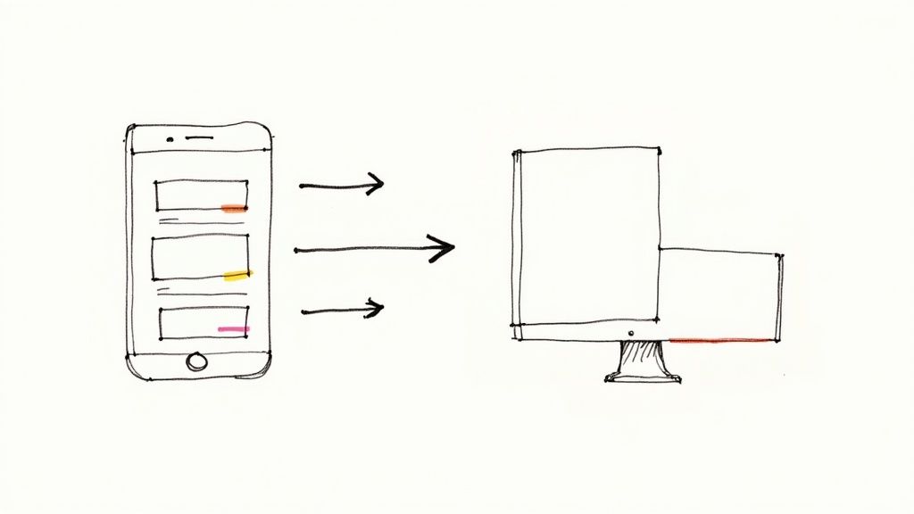
In a world of countless screen sizes, from smartwatches to ultra-wide monitors, responsive design is no longer a feature-it's the fundamental expectation for any successful digital presence. Simply making a site "look good" on a phone and a desktop is a low bar that modern users have surpassed. Today's audiences demand seamless, performant, and intuitive experiences, regardless of the device they use to access your content. True responsiveness is about creating an interface that feels native to every context.
This article moves beyond the basics, diving into ten essential responsive design best practices that distinguish exceptional websites from merely functional ones. We will provide a comprehensive roadmap for building digital products that are not just adaptable, but truly resilient and user-centric. You will learn actionable techniques to master everything from layout and typography to performance and testing, ensuring your project meets the highest standards of modern web development.
Our goal is to equip you with the specific knowledge needed to implement these strategies effectively. We will cover:
- A strategic shift to a mobile-first philosophy.
- Harnessing the power of CSS Grid and Flexbox for robust layouts.
- Implementing fluid typography and responsive images for optimal readability and performance.
- Developing a smarter breakpoint strategy and exploring component-level responsiveness with container queries.
- Ensuring your designs are touch-friendly and accessible to all users.
By the end of this guide, you will have a clear, actionable framework for creating digital experiences that perform flawlessly and resonate deeply with your audience on every possible device. Let's begin.
1. Mobile-First Design Approach
The mobile-first approach is a foundational strategy in modern responsive design, reversing the traditional workflow of designing for desktops first and then scaling down. Popularized by Luke Wroblewski, this methodology compels designers and developers to prioritize the mobile experience, focusing on core content and functionality for the most constrained environment. By starting with the smallest screen, teams are forced to make disciplined decisions about what truly matters to the user, ensuring a lean, fast, and highly functional base experience.
This philosophy aligns perfectly with user behavior trends and technical realities, like Google's mobile-first indexing, which primarily uses the mobile version of a site for ranking. The core principle is progressive enhancement: begin with a solid mobile foundation and then add more complex features, larger assets, and intricate layouts as screen real estate increases. This approach is fundamental to achieving high-quality responsive design best practices.
Why It's a Best Practice
Adopting a mobile-first mindset inherently leads to better performance, improved accessibility, and a more focused user experience. It prevents the common pitfall of "graceful degradation," where a feature-rich desktop site is stripped down for mobile, often resulting in a clunky, compromised experience. Instead, you build up from a strong, optimized core. For businesses deciding on their mobile strategy, understanding these distinctions is key. To fully understand the context of a mobile-first approach, it's beneficial to explore the distinctions between a Native Mobile App Vs Web App, and how responsive design applies to the latter.
How to Implement a Mobile-First Strategy
- Start with Content, Not Layout: Before wireframing, inventory and prioritize all content. Decide what is absolutely essential for a user to accomplish their goals on a mobile device.
- Design for Small Viewports: Begin your design process with the smallest common viewport, typically around 320px wide. This forces you to focus on a single-column layout, clear typography, and touch-friendly navigation.
- Embrace Constraints: Use mobile limitations as a creative advantage. This focus often leads to simpler, more intuitive interfaces that benefit users on all devices, including desktops.
- Scale Up Intentionally: As you design for larger screens (tablets, desktops), thoughtfully add elements, columns, and interactions that enhance the experience rather than just filling empty space.
2. Flexible Grid Layouts (CSS Grid & Flexbox)
Moving beyond rigid, pixel-based designs is essential for modern web development, and flexible grid layouts are the cornerstone of this evolution. CSS Grid and Flexbox are powerful layout modules that allow developers to create dynamic, fluid interfaces that adapt seamlessly to any screen size. Instead of defining fixed widths, these tools enable content to flow and rearrange itself intelligently within a container, forming the structural backbone of high-quality responsive design.
This approach, championed by experts like Rachel Andrew and Jen Simmons, provides precise control over both one-dimensional (Flexbox) and two-dimensional (Grid) layouts. Sites like the Mozilla Developer Network and CSS-Tricks leverage these systems to manage complex content structures that feel native on any device. Implementing these modern CSS layout systems is a fundamental step in mastering responsive design best practices.
Why It's a Best Practice
Flexible layouts eliminate the brittleness of older methods like floats or absolute positioning, resulting in cleaner, more maintainable code. They provide a logical and predictable system for arranging elements that naturally supports responsiveness without complex media query overrides for every possible screen width. This leads to faster development, fewer bugs, and a more robust final product that can handle unforeseen device dimensions with grace.
How to Implement Flexible Grid Layouts
- Use Grid for Page Layout, Flexbox for Components: A common and effective pattern is to use CSS Grid for the overall page structure (header, main content, sidebar, footer) and Flexbox for aligning items within smaller components like navigation bars, cards, or forms.
- Leverage
auto-fitandauto-fill: For grid containers, use theauto-fitorauto-fillkeywords withminmax()to create automatically responsive column layouts that wrap as viewport space decreases, often without needing explicit media queries. - Combine with
min(),max(), andclamp(): Enhance fluidity by using modern CSS functions. For example,clamp()can set a font size or width that scales between a minimum and maximum value, ensuring perfect readability and spacing. - Master Browser DevTools: Modern browsers offer powerful Grid and Flexbox inspectors. Use these tools to visualize your layouts, debug alignment issues, and understand how your containers are behaving in real-time.
3. Fluid Typography (Responsive Font Sizing)
Fluid typography is a sophisticated technique in responsive design where font sizes scale smoothly and proportionally with the viewport size. Instead of relying on fixed pixel values or abrupt changes at specific breakpoints, this method uses modern CSS functions like clamp() or viewport units (vw, vh) to ensure text remains legible and aesthetically pleasing across the entire spectrum of screen sizes, from a small mobile phone to a large desktop monitor.

This approach creates a more harmonious and truly responsive user experience, eliminating awkward text wrapping or sizing issues that can occur between breakpoints. By allowing text to breathe and adapt organically to its container, fluid typography maintains the intended design hierarchy and readability. This is a core component of advanced responsive design best practices, ensuring content is always presented optimally.
Why It's a Best Practice
Fluid typography prevents the common problem where text appears too large on a slightly bigger mobile screen or too small on a small tablet, situations that often fall between standard breakpoints. It reduces the need for extensive media queries just to manage font sizes, resulting in cleaner and more maintainable CSS. This technique ensures a consistent typographic scale and rhythm, which is crucial for a professional and polished user interface. Websites like Smashing Magazine and Stripe masterfully use this to maintain readability and design integrity on any device.
How to Implement Fluid Typography
- Use
clamp()for Optimal Control: The CSSclamp()function is the modern, preferred method. It allows you to set a minimum font size, a preferred (scalable) size, and a maximum font size, like so:font-size: clamp(1rem, 2.5vw, 1.5rem);. - Establish a Readable Minimum: Always define a minimum font size to prevent text from becoming illegibly small on narrow viewports. A common baseline is
16px(1rem). - Apply a Modular Scale: Use fluid typography to maintain a consistent typographic hierarchy. Apply a modular scale (e.g., ratios like 1.2 or 1.618) to headings and body text to ensure a harmonious relationship between elements as they resize.
- Test Extensively: Verify your fluid typography across a wide range of devices and browser window sizes. Pay close attention to how text behaves at the minimum and maximum thresholds and check user zoom accessibility.
4. Responsive Images and Media Optimization
Serving appropriately sized and formatted images is a critical component of modern web performance. Responsive images and media optimization involves delivering assets tailored to the user's device capabilities, such as screen size, pixel density, and network speed. Instead of sending a large, one-size-fits-all image to every user, this practice uses HTML attributes like srcset and the <picture> element to provide the browser with a set of options, allowing it to select the most efficient one.
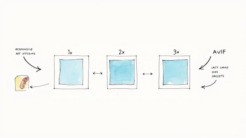
This technique dramatically improves page load times, especially on mobile devices with limited bandwidth, and conserves user data. By combining resolution switching with art direction (serving different crops for different layouts), you ensure images are not only fast but also visually compelling on every screen. This focus on performance and quality makes it one of the most impactful responsive design best practices.
Why It's a Best Practice
Unoptimized images are often the single biggest contributor to slow page loads. Implementing responsive image strategies directly addresses this performance bottleneck, leading to lower bounce rates, improved user engagement, and better SEO rankings. It ensures a high-quality visual experience without forcing mobile users to download unnecessarily large desktop-sized assets, a common issue in legacy web development. For e-commerce sites like Amazon or content-heavy platforms like The Guardian, this is not just a best practice; it is essential for business success.
How to Implement Responsive Images
- Use
srcsetfor Resolution Switching: Provide multiple image resolutions (e.g., 1x, 2x, 3x) in thesrcsetattribute of an<img>tag. This lets the browser choose the best file based on the device's pixel density. - Employ the
<picture>Element for Art Direction: When you need to serve different image crops or formats, use the<picture>element. This allows you to specify different sources for various viewport sizes or provide fallbacks for modern formats like WebP or AVIF. - Implement Native Lazy Loading: Add the
loading="lazy"attribute to images below the fold. This native browser feature defers the loading of off-screen images until the user scrolls near them, speeding up initial page rendering. - Automate Image Optimization: Utilize tools like ImageOptim, TinyPNG, or cloud-based services like Cloudinary to compress images without significant quality loss. Automating this process ensures consistent optimization across your site.
- Prevent Content Layout Shift (CLS): Always specify
widthandheightattributes on your<img>tags. This allows the browser to reserve space for the image before it loads, preventing jarring layout shifts that harm the user experience.
5. Breakpoint Strategy and Media Queries
A strategic approach to breakpoints is the engine of responsive design, using CSS media queries to apply different styles as the viewport size changes. Instead of targeting specific devices, modern best practices dictate that breakpoints should be content-driven. This means the layout should adapt or "break" at the point where the content no longer looks optimal, ensuring a seamless experience across the entire spectrum of screen sizes. This shift from device-centric to content-centric design is crucial for future-proofing a website.
This method, pioneered by figures like Ethan Marcotte, uses media queries to query the viewport's characteristics, most commonly its width. By setting these thresholds, developers can reconfigure layouts, adjust font sizes, or change image resolutions, ensuring the design is always presented in the most effective way. Adhering to this practice is a cornerstone of implementing high-quality responsive design best practices.
Why It's a Best Practice
A well-defined breakpoint strategy prevents the awkward, broken layouts that occur when content is forced into a container that is too narrow or too wide. It ensures readability, usability, and aesthetic integrity at every screen size. By focusing on the content itself, you create a more robust and adaptable system than one based on the ever-changing landscape of device dimensions, such as those used by popular frameworks like Bootstrap or Material Design.
How to Implement a Breakpoint Strategy
- Start with Major Breakpoints: Begin with 3-4 core breakpoints to represent general device categories (e.g., mobile, tablet, desktop, large desktop) to establish a baseline structure.
- Use a Mobile-First Approach: Write your base CSS for mobile and use
min-widthmedia queries to add styles for larger screens. This promotes cleaner, more efficient code. - Let Content Dictate Breakpoints: As you resize your browser window, identify where your content starts to look strained. Add minor breakpoints at these specific points to make small adjustments.
- Centralize Breakpoint Values: Use CSS custom properties (variables) or preprocessor variables (like in Sass) to define your breakpoint values in one place. This makes them easy to manage and update.
- Test at Common Viewports: While not designing for them, regularly test your design at common resolutions like 320px, 768px, 1024px, and 1440px to catch potential issues.
6. Touch-Friendly Interface Design
Optimizing an interface for touch is a non-negotiable aspect of responsive design. Unlike a precise mouse cursor, human fingers are imprecise and require larger, more forgiving targets. Touch-friendly design focuses on creating interface elements like buttons, links, and form controls that are appropriately sized and spaced, ensuring users on mobile and tablet devices can interact with them easily and accurately without frustration. This prevents common issues like accidentally tapping the wrong link or struggling to select a small checkbox.
This principle is a core tenet of major design systems, including Apple's Human Interface Guidelines and Google's Material Design. The goal is to create an experience that feels natural and effortless on a touch screen. By prioritizing tap targets and interactive element spacing, you build an interface that is not only usable but also reduces user error and enhances satisfaction, making it a critical component of modern responsive design best practices.
Why It's a Best practice
Designing for touch directly addresses the physical reality of how a significant portion of users interact with the web. Failing to do so leads to a frustrating user experience, high bounce rates, and lower conversion rates on mobile devices. Properly sized touch targets improve accessibility for users with motor impairments and make the interface more comfortable for everyone. It demonstrates a commitment to a high-quality user experience across all devices, moving beyond just layout adjustments to consider the fundamental mechanics of interaction. To explore this topic further, it's helpful to review the broader best practices for user interface design.
How to Implement Touch-Friendly Design
- Size Targets Appropriately: Aim for a minimum tap target size of 44x44 to 48x48 pixels. This size is large enough to be reliably tapped with a fingertip without requiring excessive precision.
- Ensure Adequate Spacing: Maintain at least 8-16 pixels of space between interactive elements. This "breathing room" drastically reduces the chance of users making accidental taps.
- Provide Immediate Visual Feedback: Use CSS pseudo-classes like
:activeto provide an instant visual cue, such as a color change or subtle animation, when a user touches an element. This confirms the interaction was registered. - Avoid Hover-Dependent Interactions: Functionality like dropdown menus or tooltips that rely solely on a
:hoverstate will not work on touch devices. Ensure all critical functionality is accessible via a tap or click. - Test with Real Fingers: Do not rely on a mouse cursor in a device emulator. The most effective way to test a touch interface is to use the actual devices your audience uses.
7. Performance Optimization for Responsive Design
Performance is not an afterthought in responsive design; it's a core component. A responsive site that loads slowly or feels sluggish on mobile devices fails its primary objective of providing a good user experience. Performance optimization involves a set of strategies to ensure websites load quickly and interact smoothly across all devices and network conditions, a critical factor for retaining users and improving search engine rankings.
Pioneered by web performance experts like Steve Souders and heavily promoted by Google through tools like PageSpeed Insights, this practice focuses on minimizing load times and enhancing perceived speed. A fast-loading site directly impacts user engagement, conversion rates, and SEO. Prioritizing performance is a fundamental aspect of modern responsive design best practices, ensuring that adaptability doesn't come at the cost of speed.
Why It's a Best Practice
A responsive design must perform well on a 3G mobile network just as it does on a high-speed fiber connection. Optimizing performance ensures a consistent and positive user experience for everyone, regardless of their device or connectivity. It directly addresses key metrics like Google's Core Web Vitals (LCP, FID, CLS), which are now crucial for SEO ranking. For responsive designs to truly deliver an excellent user experience, underlying server and infrastructure performance is critical. Delve deeper into how to optimize website performance to ensure fast load times and smooth interactions across all devices.
How to Implement Performance Optimization
- Set Performance Budgets: Define strict limits for page weight, image sizes, and script execution times. Use tools like Lighthouse to monitor these budgets and prevent performance regressions.
- Optimize Critical Rendering Path: Inline critical CSS for above-the-fold content to render the initial view instantly. Defer the loading of non-critical CSS and JavaScript to prevent them from blocking the initial page render.
- Compress and Optimize Assets: Use modern image formats like WebP, enable Gzip or Brotli compression on your server, and minify HTML, CSS, and JavaScript files to reduce their size.
- Audit and Monitor Continuously: Regularly use tools like WebPageTest and Google Lighthouse to audit your site. Implement Real User Monitoring (RUM) to gather performance data from actual visitors and identify real-world bottlenecks. For a comprehensive overview, check out these tips on how to improve website speed.
8. Viewport Meta Tag and Device Configuration
The viewport meta tag is a critical piece of HTML that controls how a webpage is displayed on mobile browsers. Without it, mobile browsers often render pages at a desktop screen width and then scale them down, resulting in tiny, unreadable text and forcing users to pinch and zoom. This tag, originally introduced by Apple for the first iPhone, tells the browser how to control the page's dimensions and scaling.
Including this tag in the <head> of your HTML document is non-negotiable for any responsive website. It is the fundamental instruction that enables your media queries and fluid layouts to function as intended across different devices. By setting the viewport's width to the device's width and establishing an initial scale, you create the predictable canvas necessary for building a truly responsive experience.
Why It's a Best Practice
Proper viewport configuration is the bridge between your responsive CSS and the device's screen. It ensures that 1 CSS pixel corresponds to 1 device-independent pixel, providing a consistent and scalable foundation. Neglecting this tag can render all your other responsive efforts ineffective, as the browser will simply fall back to its default, non-responsive rendering mode. This simple line of code is a cornerstone of modern responsive design best practices.
Furthermore, correct configuration directly impacts accessibility. For instance, disabling user scaling can prevent users with low vision from zooming in on content, creating a significant barrier. Modern standards, especially for notched devices, also rely on viewport settings like viewport-fit=cover to enable edge-to-edge layouts, making it essential for contemporary user interface design.
How to Implement Viewport Configuration
- Use the Standard Tag: Always include
<meta name="viewport" content="width=device-width, initial-scale=1">in the<head>of your HTML. This is the universally accepted standard that works across all modern browsers. - Prioritize Accessibility: Never use
user-scalable=noormaximum-scale=1.0. These attributes prevent users from zooming, which is an essential accessibility feature for many people and will cause accessibility audits to fail. - Account for Notched Devices: For designs that need to extend into the display cutout areas (notches or punch-holes), add
viewport-fit=coverto your viewport content string. You can then use CSS environment variables likesafe-area-inset-*to pad your content appropriately. - Test on Real Devices: While browser developer tools offer excellent device simulation, nothing replaces testing on actual physical devices. This helps you catch rendering inconsistencies and interaction issues that simulators might miss.
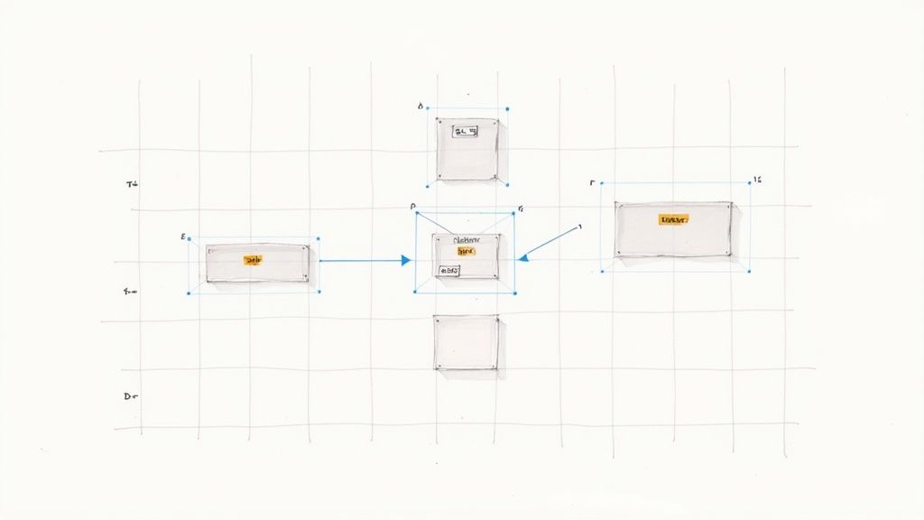
9. CSS Container Queries (Component-Level Responsiveness)
For years, responsive design was synonymous with viewport media queries, forcing components to adapt based on the overall screen size. CSS container queries represent a paradigm shift, allowing a component to respond to the size of its parent container rather than the entire viewport. Spearheaded by advocates like Miriam Suzanne, this modern CSS feature enables true component-level responsiveness, making UI elements genuinely modular, portable, and context-aware. A component can now adapt its layout whether it's placed in a narrow sidebar or a wide main content area, independent of the device screen.
This evolution from page-level to component-level control is a crucial step forward in implementing responsive design best practices. Instead of writing complex, location-specific CSS, developers can create self-contained components that know how to display themselves optimally in any available space. This simplifies CSS architecture, enhances reusability, and makes maintaining complex UIs significantly more manageable.
Why It's a Best Practice
Container queries solve a long-standing challenge in component-based development. They decouple a component's styling from the page layout, leading to more robust and predictable design systems. A card component, for instance, no longer needs modifier classes like .card--small or .card--large; it can intrinsically adapt its own structure based on the container's width. This approach fosters cleaner code, reduces CSS specificity issues, and empowers teams to build more resilient interfaces that work seamlessly across any part of an application.
How to Implement CSS Container Queries
- Define a Containment Context: First, establish a container by setting the
container-typeproperty (e.g.,container-type: inline-size;) on the parent element. This tells the browser to monitor its dimensions. - Write the Query: Use the
@containerat-rule, similar to a media query, to apply styles when the container meets specific size conditions. For example:@container (min-width: 400px) { ... }. - Focus on Intrinsic Sizing: Design components to be flexible by default. Use relative units like
em,rem, and%inside your container queries to ensure styles scale proportionally with the container's size and font settings. - Use for Modular Elements: Container queries are ideal for dashboard widgets, product cards, sidebars, and any reusable element in a design system. They ensure a component behaves predictably wherever it's placed.
10. Testing and Debugging Responsive Designs
Even the most thoughtfully designed responsive layout can fail under real-world conditions. A comprehensive testing and debugging strategy is therefore not just a final step but an integral part of the development lifecycle. This practice involves systematically verifying that a website’s content, layout, and functionality adapt correctly across a vast spectrum of devices, screen sizes, browsers, and network conditions to ensure a consistent and high-quality user experience for everyone.
This process moves beyond a simple check on a few popular devices. It involves a multi-layered approach that combines automated and manual testing to catch visual regressions, performance bottlenecks, and usability issues before they reach production. Effective testing is a cornerstone of professional responsive design best practices, guaranteeing that the final product is robust, reliable, and truly device-agnostic.
Why It's a Best Practice
Without rigorous testing, you risk delivering a broken or frustrating experience to a significant portion of your audience. A layout that looks perfect on a developer's high-end monitor might be unusable on an older smartphone or a specific browser version. This practice prevents costly post-launch fixes, protects brand reputation, and ensures that accessibility and performance goals are met across the board. Implementing a solid testing strategy is crucial for maintaining quality at scale. For a deeper dive into structured QA processes, this comprehensive software testing checklist on getnerdify.com provides an excellent framework.
How to Implement a Responsive Testing Strategy
- Use Browser DevTools for Initial Checks: Leverage the responsive mode in Chrome, Firefox, or Safari DevTools for quick, initial layout verification at different viewport sizes during development.
- Leverage Device Emulators and Simulators: Use cloud-based testing platforms like BrowserStack, Sauce Labs, or LambdaTest to check your design on hundreds of real device and browser combinations you don't physically own.
- Test on Real Devices: Always validate critical user flows on a selection of actual physical devices (e.g., popular iOS and Android models). This is the only way to accurately test touch interactions, performance, and hardware-specific quirks.
- Implement Visual Regression Testing: Integrate tools like Percy or Applitools into your CI/CD pipeline. These tools automatically take screenshots of your UI and compare them against a baseline to catch unintended visual changes.
- Simulate Varied Network Conditions: Use built-in DevTools features to throttle network speed, simulating 3G or slow 4G connections. This helps identify performance issues related to large images or unoptimized assets that are not apparent on a fast developer connection.
10-Point Responsive Design Best Practices Comparison
| Technique | Implementation complexity 🔄 | Resource requirements ⚡ | Expected outcomes ⭐📊 | Ideal use cases 💡 | Key advantages ⭐ |
|---|---|---|---|---|---|
| Mobile-First Design Approach | 🔄 Medium — requires discipline & mobile testing | ⚡ Moderate — device testing, analytics | ⭐⭐⭐ — improved mobile UX, SEO, lower bounce 📊 | Content-first sites, consumer apps, SEO-driven projects 💡 | Prioritizes essentials; performance by default ⭐ |
| Flexible Grid Layouts (CSS Grid & Flexbox) | 🔄 Medium — learning curve for Grid/Flexbox | ⚡ Low — dev time; modern CSS only | ⭐⭐⭐ — adaptable, maintainable layouts 📊 | Complex page layouts, responsive grids, article layouts 💡 | Cleaner CSS; fewer hacks; easier alignment ⭐ |
| Fluid Typography (Responsive Font Sizing) | 🔄 Low–Medium — CSS tuning (clamp/viewport) | ⚡ Low — minor testing and font strategies | ⭐⭐ — smoother scaling, better readability 📊 | Editorial sites, portfolios, typographic-heavy designs 💡 | Reduces media queries; consistent hierarchy ⭐ |
| Responsive Images & Media Optimization | 🔄 Medium — create variants + markup | ⚡ Medium — storage, build tools, formats | ⭐⭐⭐⭐ — faster loads, lower bandwidth 📊 | E‑commerce, news, media-heavy/high-traffic sites 💡 | Bandwidth savings; improved visual quality across devices ⭐ |
| Breakpoint Strategy & Media Queries | 🔄 Low (can escalate) — straightforward CSS | ⚡ Low — testing at breakpoints | ⭐⭐⭐ — precise layout control 📊 | Sites needing fine-tuned responsive adjustments, frameworks 💡 | Wide browser support; predictable behavior ⭐ |
| Touch-Friendly Interface Design | 🔄 Low–Medium — design & gesture handling | ⚡ Medium — prototyping & device testing | ⭐⭐⭐ — fewer touch errors; better accessibility 📊 | Mobile apps, tablet-first interfaces, interactive web apps 💡 | Improved usability; WCAG alignment; fewer errors ⭐ |
| Performance Optimization for Responsive Design | 🔄 High — many techniques & monitoring | ⚡ High — tooling, CI, RUM, audits | ⭐⭐⭐⭐ — faster pages, better SEO & conversions 📊 | High-traffic sites, e‑commerce, media platforms 💡 | Improves Core Web Vitals; lowers costs; better conversions ⭐ |
| Viewport Meta Tag & Device Configuration | 🔄 Very Low — single meta + testing | ⚡ Very Low — minimal effort | ⭐⭐ — correct scaling & rendering 📊 | Every responsive project (basic requirement) 💡 | Ensures correct mobile rendering; prevents horizontal scroll ⭐ |
| CSS Container Queries (Component-Level) | 🔄 Medium — new syntax & approach | ⚡ Low–Medium — fallbacks/polyfills for old browsers | ⭐⭐⭐ — modular components that adapt to context 📊 | Design systems, reusable components, dashboards 💡 | Component-level responsiveness; reduces media-query duplication ⭐ |
| Testing & Debugging Responsive Designs | 🔄 Medium — test matrix & automation setup | ⚡ Medium–High — device labs, services, CI | ⭐⭐⭐ — consistent UX; fewer production issues 📊 | Production-critical sites, large teams, complex UIs 💡 | Catches regressions early; improves overall quality ⭐ |
Building a Future-Proof Web with Smart Design
Navigating the landscape of responsive design can feel like chasing a moving target. Yet, as we've explored, the journey from a fixed-width past to a fluid, device-agnostic future is guided by a set of powerful and established principles. This isn't just about making websites that "work" on a phone; it's about architecting digital experiences that are inherently adaptable, performant, and inclusive. By integrating these responsive design best practices into your workflow, you transition from a reactive approach of fixing layouts to a proactive strategy of building for resilience.
The core of this modern approach is a fundamental shift in perspective. Moving away from pixel-perfect comps for a few specific devices and embracing a mobile-first mindset ensures that the essential user experience is solid from the ground up. This foundation, built for the most constrained environments, scales gracefully when enhanced with the sophisticated layouts made possible by CSS Grid and Flexbox. These tools are not just for arranging boxes; they are the grammar of a flexible, content-aware web.
From Theory to Tangible Results
Mastering the practices outlined in this guide delivers more than just aesthetic consistency. It directly impacts your bottom line and brand perception. For instance, a deep focus on responsive images and performance optimization isn't merely a technical exercise. It's a direct response to user expectations for speed, resulting in lower bounce rates, better engagement, and improved SEO rankings. Similarly, crafting touch-friendly interfaces and ensuring your typography is fluid and readable on any screen are critical components of a positive user experience that builds trust and encourages repeat visits.
The true value of these practices lies in their synergy. A smart breakpoint strategy is useless without a flexible grid to support it. A fast-loading site can still fail if its touch targets are too small. True success comes from a holistic implementation where every element, from the overarching layout down to the individual component, is designed with adaptability in mind.
Your Action Plan for a Responsive Future
To turn these insights into action, here are your immediate next steps:
- Conduct a Cross-Device Audit: Use browser developer tools and real devices to rigorously test your current key pages. Don't just look for broken layouts; evaluate the user experience. Is text legible? Are buttons easy to tap? How does it perform on a simulated 3G connection?
- Prioritize Mobile-First Refactoring: For your next feature or redesign, commit to a mobile-first workflow. Start all design and development from the smallest viewport and scale up. This will force you to prioritize content and functionality effectively.
- Embrace Modern CSS: If you're still relying on older layout methods, it's time to fully adopt Flexbox and CSS Grid. Begin experimenting with Container Queries for self-contained components that can be placed anywhere without breaking.
Adopting these responsive design best practices is an investment in longevity. It’s about building a digital presence that is not only prepared for the countless devices in users' hands today but is also structurally ready for the form factors of tomorrow. The web will never stop evolving, and by building with flexibility and user experience at the core, you ensure your work evolves with it, delivering a seamless, high-quality experience to every visitor, everywhere.