Mastering ui ux design for mobile apps: A practical guide to better usability

Great mobile app design isn't just about making things look pretty. It’s the difference between an app people use daily and one they delete after five minutes. The core of this is understanding both how the app feels (UX) and how it looks (UI). This entire process starts not with a design tool, but with a deep dive into the people you're building for.
Building a Foundation on User Understanding
Before you even think about wireframes or color palettes, you have to start with people. This initial discovery phase is all about building a solid foundation rooted in real human needs. I’ve seen projects fail because teams skipped this step, trying to build a complex structure on pure guesswork. It never ends well.
This is where you find the sweet spot between what the business wants to achieve and what users actually need. You have to get out there and talk to real people to uncover their motivations, their daily frustrations, and the specific situations where they’d use your app. This early investment in understanding pays off massively down the road. In fact, companies that seriously improved their mobile experience saw a 28% increase in conversion rates and a 15% boost in user retention. These numbers show that mobile-first design isn't just a trend; it's a core business strategy.
Aligning Stakeholders and Defining Users
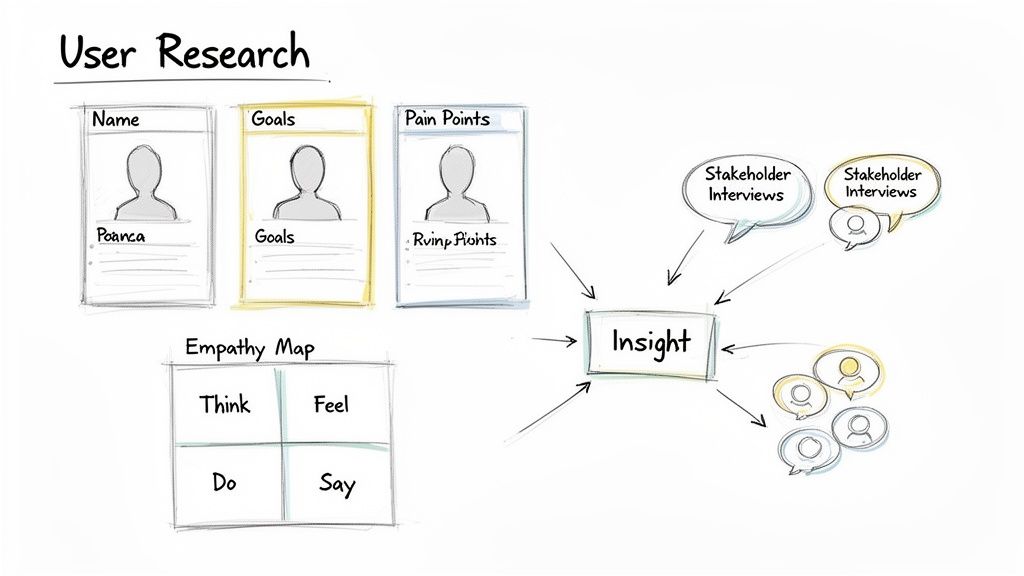
The first conversations are often internal. Kicking off with stakeholder interviews is crucial for getting everyone on the same page about business goals, technical limitations, and what success actually looks like. What problem is this app solving for the company? What do we want to see in six months? A year? Answering these questions upfront prevents a lot of headaches later.
At the same time, you need to look outward and get to know your end-users. This is where you create detailed user personas—not just generic descriptions, but believable archetypes of your key audience. A good persona feels like a real person with a name, goals, and frustrations. For instance, instead of a vague "busy professional," you might create "Maria, a 34-year-old project manager who needs a fast way to update team tasks while on her morning train commute."
A design that doesn't stem from a deep understanding of its users is merely a decorative assumption. Empathy isn't a soft skill in design; it's the core technical requirement for building something people will actually use and value.
This upfront research gives you the raw material for every design decision you'll make. If you want to dig into the specifics of these techniques, our guide on https://getnerdify.com/blog/how-to-conduct-user-research is a great place to start.
The Discovery Phase: From Research to Action Plan
The discovery phase is a structured process of turning insights into a concrete plan. Here's a breakdown of the typical activities and what you get out of each one.
| Activity | Objective | Key Outcome |
|---|---|---|
| Stakeholder Interviews | Align on business goals, constraints, and success metrics. | A clear project brief and a shared understanding of project vision. |
| User Interviews & Surveys | Uncover user needs, pain points, behaviors, and motivations. | Raw qualitative and quantitative data to build personas. |
| User Personas | Create archetypes of the target audience. | Empathetic, human-centered focus for the design team. |
| Empathy Mapping | Document what users say, think, do, and feel. | Deeper insight into the user's emotional and cognitive state. |
| Competitive Analysis | Evaluate competitors' strengths and weaknesses. | Identification of market gaps and opportunities for differentiation. |
| User Journey Mapping | Visualize the end-to-end user experience. | A clear narrative of user interactions, identifying pain points and opportunities. |
These activities ensure that by the time you start designing, you're not just guessing—you're solving clearly defined problems for well-understood users.
Mapping the User Journey
Once your personas are fleshed out, the next step is mapping their journeys. A user journey is a visual story that walks through the steps a person like Maria takes to get something done in your app. This isn't just a clinical list of actions; a good journey map captures her thoughts, feelings, and frustrations at every single stage.
This process is fantastic for spotting hidden opportunities. Maybe you discover that Maria feels anxious when creating a new project, worried she’ll miss a critical detail. That insight could directly lead to a design solution, like a simplified, step-by-step setup wizard that guides her through the process. By mapping these paths, you turn abstract research into a tangible roadmap for building a more intuitive and helpful app. To learn more about the foundational principles, check out this excellent resource on UX Design For App.
Building Your App’s Blueprint: IA and User Flows
Now that you've gotten inside your users' heads, it's time to build the skeleton of your app. This stage is all about logic and structure, not pixels and colors. We're talking about Information Architecture (IA), which is essentially the digital blueprint for your app. Think of it like a building's floor plan—it ensures everything is easy to find and the layout just makes sense.
Get this part wrong, and users will be endlessly tapping around, hunting for basic features. That's a recipe for frustration and a quick uninstall. But when the IA is done right, it's completely invisible. Users don't even notice it because everything is right where they expect it to be. This foundational work is what makes great ui ux design for mobile apps feel so effortless.
How to Organize Your App's Content
Before you can even think about screens, you have to figure out how to group and label all your content and features. A classic, battle-tested technique for this is card sorting. It's a surprisingly simple method: you write down all your features on "cards" and ask real users to group them in a way that feels logical to them. This pulls you out of your own head and prevents you from organizing things based on internal company jargon that means nothing to your audience.
Let's say you're designing a fitness app. You’ve got a list of features:
- Daily Calorie Tracker
- Workout Library
- Progress Photos
- Community Forums
- Meal Recipes
Instead of just guessing where everything goes, you let users do the organizing. You might discover that people consistently group "Meal Recipes" and "Calorie Tracker" together under a "Nutrition" tab—a connection you might have missed entirely. This kind of direct feedback is gold.
Your app's structure shouldn't be a puzzle for users to solve. A logical Information Architecture acts as an invisible guide, leading users to their goals without them ever feeling lost or confused.
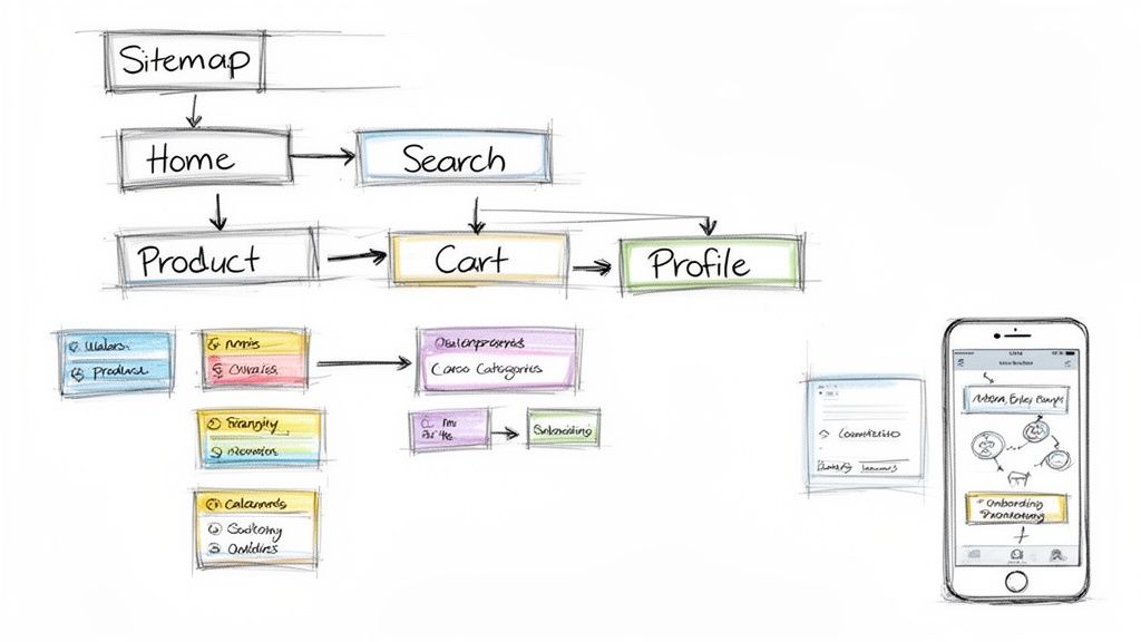
Once you’ve validated how your content should be grouped, you can build a sitemap. This is a simple visual chart that shows the hierarchy of your screens and how they all connect. A clear sitemap is your insurance against creating dead ends or confusing, looping user journeys.
Charting the Course for User Goals
With a solid structure in place, the next step is to map out how people will actually move through it. This is where user flows are critical. A user flow is a diagram that traces the exact path a person takes to get something done in your app, from the moment they start to the moment they finish.
Take an e-commerce app, for instance. One of the most important flows is the checkout process. By mapping this out, you're forced to consider every single step: adding an item to the cart, viewing the cart, plugging in shipping details, adding payment info, and hitting that final confirmation button.
Real-World User Flow Examples
Visualizing these paths is a game-changer. It immediately highlights potential bumps in the road or points of friction before you’ve spent a single minute designing a screen.
Here are a few common user flows you'll almost certainly need to map out:
- New User Onboarding: What’s the very first thing a new user sees? This flow is all about creating a great first impression, introducing key features without just dumping a wall of text on them.
- Searching for a Product: How does someone find what they're looking for? This isn't just a search bar; it's the entire journey, including filtering, sorting results, and tapping through to a product detail screen.
- Password Reset: It's a boring one, but absolutely essential to get right. When a user is locked out, the last thing they need is a confusing process. This flow needs to be simple, secure, and fast.
By meticulously planning these key journeys, you ensure the most important tasks in your app are as smooth as possible. This architectural phase is the true foundation of top-tier ui ux design for mobile apps, turning what you learned about your users into a structure that actually works.
4. From Blueprints to Visuals: Crafting a High-Fidelity UI
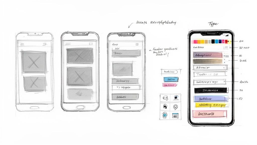
With your app's structural blueprint—the wireframes—locked in, it's time for the fun part. This is where the app starts to get its personality. We're moving from a black-and-white skeleton to a living, breathing interface that people will actually want to use. It's so much more than just splashing on some color; it's about making deliberate visual choices that guide, inform, and feel right to the user.
Your initial low-fidelity wireframes were all about function over form. By keeping things simple, you could focus purely on placement, user flow, and making sure every screen had a clear purpose. It’s the best way to hash out the core experience without getting derailed by debates over button colors. (If you want a deeper dive, our guide on https://getnerdify.com/blog/how-to-create-wireframes is a great place to start.)
Breathing Life into the Design
Now, you graduate to high-fidelity mockups. This is where you transform those basic layouts into a polished, visually engaging interface. Every element, from the smallest icon to the main navigation bar, needs to feel intentional and part of a cohesive system.
You’ll be making several critical decisions at this stage:
- Color Palette: Color is a powerful tool. It sets the mood, communicates brand identity, and guides the user’s eye. A common trick is to use a single, vibrant color for all primary calls-to-action (CTAs), which instantly tells the user where to tap.
- Typography: The right fonts make an app feel professional and easy to read. A good typography system defines specific sizes and weights for everything—headings, body copy, labels, and captions—to create a clear and consistent visual hierarchy.
- Iconography & Imagery: Custom icons can give your app a truly unique character and make features easier to understand at a glance. The same goes for imagery; the right photos or illustrations can forge a real emotional connection with your users.
As you start pulling these elements together, check out these excellent tips for Mastering Mobile App Interface Design.
The Secret Weapon: A Component Library
One of the best habits you can get into in ui ux design for mobile apps is building a component library from the get-go. Think of it as your personal set of LEGO bricks for the interface: buttons, text fields, modals, and navigation bars that are pre-designed and ready to use.
Why is this so important? Instead of designing a new button from scratch for every single screen, you design one perfect button component and simply reuse it.
A component library is more than just a design file; it's a strategic asset. It becomes the single source of truth that keeps designers and developers perfectly in sync, slashing rework and preventing inconsistencies as the app grows.
The payoff here is huge. For designers, it's a massive time-saver and guarantees visual consistency. For developers, it means they can code a component once and plug it in wherever it's needed, which dramatically speeds up development and reduces bugs. A solid component library is truly the foundation of any scalable design process.
Navigating iOS and Android Design Differences
One of the biggest mistakes you can make is designing a single, generic interface for both iOS and Android. It’s a surefire way to make your app feel clunky and foreign. Users are deeply familiar with their device's ecosystem—they have muscle memory for how things are supposed to look, feel, and behave. When your app ignores these conventions, you're creating friction and forcing people to learn your way of doing things. That's a tall order.
Great ui ux design for mobile apps embraces the native platform. This isn't just about blindly following rules; it's about speaking the user's language. A truly intuitive app feels like a natural extension of the device it's on, and that means understanding the core design philosophies of Apple's iOS and Google's Android.
The Two Pillars of Mobile Design
At a high level, you’ll be working within two master-class design systems. Each one provides a complete framework—from guiding principles down to specific component specs—that shapes the entire user experience.
- Apple's Human Interface Guidelines (HIG): The HIG is built on principles of clarity, deference, and depth. The aesthetic is typically minimalist, designed to let the content shine. It uses subtle cues like blurs and layering to create a clear sense of hierarchy without getting in the way.
- Google's Material Design: Material Design draws inspiration from the physical world of paper and ink. It uses tangible concepts like elevation, shadow, and responsive motion to make interfaces feel more grounded and interactive. The system is known for its bold use of color, structured grid layouts, and very clear visual feedback.
Grasping these core ideas is the first step. Apple generally wants the interface to feel light and almost invisible, while Google wants it to feel tangible and responsive. These philosophies directly influence every single element you'll design.
iOS Human Interface Guidelines vs. Android Material Design
While the big-picture philosophies are your starting point, the real test comes down to the specific UI patterns and components. Ignoring these is what makes an app immediately feel like a cheap port.
Here’s a quick breakdown of how some common elements differ across the two platforms.
| UI Element | iOS (HIG) Approach | Android (Material Design) Approach |
|---|---|---|
| Primary Navigation | A bottom tab bar is the gold standard for top-level navigation, keeping the main app sections persistently visible and tappable. | Historically favored a navigation drawer (the "hamburger menu"), but now commonly uses a bottom navigation bar, offering more layout flexibility. |
| Back Navigation | Uses a prominent back chevron (<) in the top-left of the navigation bar. This is paired with a deeply ingrained swipe-from-left gesture. |
Relies on a universal, system-level back button (either physical or on-screen) and an "up" arrow (↑) within the app's top bar to go up in the hierarchy. |
| Buttons & CTAs | Buttons are often simple text with a tint color or contained within a soft, rounded rectangle. There's a strong emphasis on clean, minimalist actions. | The Floating Action Button (FAB) is a signature pattern for the primary action on a screen. Buttons are typically contained, with distinct shadows indicating elevation. |
| Alerts & Dialogs | Alerts are modal pop-ups that appear in the center of the screen, demanding a user's attention and requiring a specific action before they can proceed. | Dialogs are also modal, but the system includes less intrusive "snackbars" and "toasts" for brief, non-critical messages that disappear on their own. |
Designing for a specific platform isn't about restriction; it's about fluency. Speaking the user's native design language builds trust and makes your app feel like a natural extension of their device, not a foreign visitor.
Think about it from the user's perspective. An iPhone user instinctively swipes from the left edge of the screen to go back. If that gesture fails because you implemented an Android-style navigation, you’ve just created a moment of pure frustration. These "small" details compound, ultimately shaping whether your app feels polished and professional or just plain broken. The goal is to make your app feel right at home, no matter which device it’s on.
Testing and Iterating With Real User Feedback
A polished, high-fidelity mockup feels like a huge win, but let's be honest—it's still just a well-educated guess. I've seen the most beautiful interfaces fall apart the moment they meet a real user. This is where the real work begins, turning your design hypothesis into something that’s been validated by the very people you’re building it for.
This iterative loop is arguably the most critical part of ui ux design for mobile apps. It’s where you test your assumptions, gather raw feedback, and refine your work. Skipping this is like trying to navigate a new city without a map; you’ll get somewhere eventually, but it won’t be where you intended, and you’ll waste a lot of time and money on detours.
Building Prototypes That Feel Real
To get feedback that actually means something, users need to be able to tap, swipe, and interact. This is where prototyping tools like Figma, Adobe XD, or ProtoPie become your best friends. They let you stitch your static screens together into an interactive prototype that mimics the genuine app experience.
A great prototype doesn't need every single feature to be functional. Its job is to simulate a specific user flow so you can see if it holds up. For instance, you could build a prototype that only covers the new user onboarding journey or the steps to complete a purchase. This focused approach makes testing sessions much easier to manage and yields feedback that is far more specific and actionable.
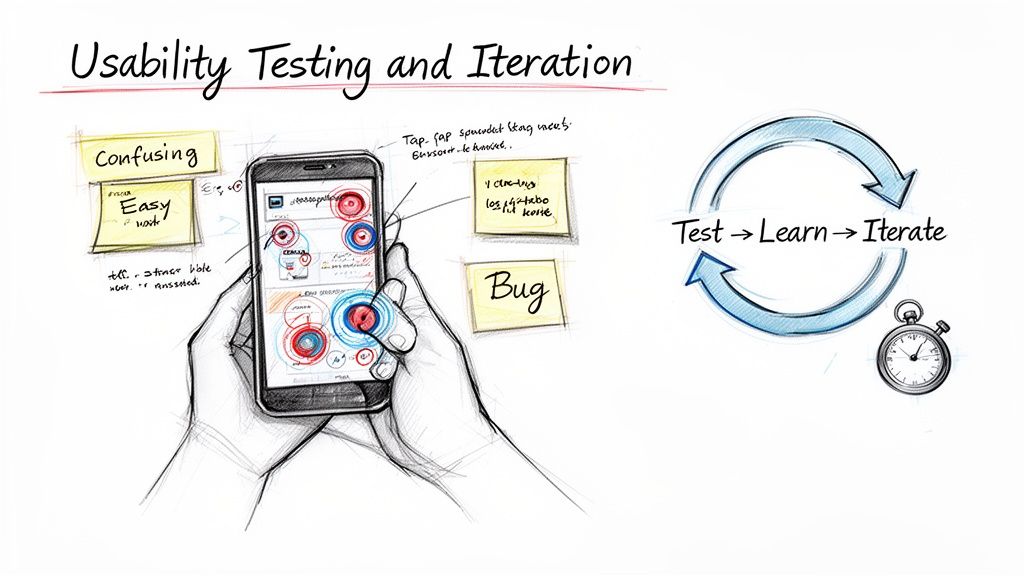
Running Effective Usability Tests
Once your prototype is ready, it's time to put it to the test. This isn't about asking people if they like the color palette. It’s about watching them try to complete specific tasks. Giving users a concrete scenario to work through is the key to unlocking real insights.
Instead of a vague question like, "What do you think of this screen?" try giving them a job to do:
- "Imagine you just finished a run and want to log it in the app. Show me how you would do that."
- "You’ve forgotten your password. Can you walk me through how you’d reset it?"
- "Find a pair of men's running shoes in a size 10 and add them to your cart."
As they navigate the prototype, your role is to be a quiet observer. Where do they hesitate? What do they try to tap that isn't clickable? What questions do they mutter to themselves? These moments are pure gold, revealing the friction points and confusing elements that you're simply too close to the project to see. For a deeper look into structuring these sessions, you can learn more about different usability testing methods in our detailed guide.
Your design is not your baby. You have to be willing to see its flaws through the eyes of your users. The goal of testing isn't to defend your design; it's to find every reason to make it better.
From Feedback to a Better Design
After you’ve run a few tests, patterns will start to emerge. Maybe three out of five users couldn't find the "Settings" menu, or perhaps everyone stumbled over a confusing icon. This is where you synthesize all that raw feedback into a clear, prioritized list of action items.
This analysis phase kicks off a simple but powerful cycle:
- Identify Top Issues: Pinpoint the 3-5 most critical problems that multiple users ran into.
- Brainstorm Solutions: Rework the confusing flow, redesign the problematic component, or simply rewrite a confusing button label.
- Update the Prototype: Jump back into your design file and implement the changes.
- Test Again: Get the updated prototype in front of a fresh set of users to validate that your fix actually worked.
This loop—build, test, learn, and repeat—is the engine of great mobile app design. Each cycle strips away your own assumptions and replaces them with user-validated improvements, ensuring the final product isn't just nice to look at, but genuinely effortless to use.
Making the Developer Handoff Seamless
Even the most beautiful, user-tested design is just a collection of pixels until it’s turned into working code. The handoff from designer to developer is where so many projects hit a wall, creating friction, frustrating rework, and painful delays.
Getting the handoff right isn't just a final checklist item. It's the critical moment where your carefully crafted vision gets translated into a real, tangible product. Your job is to leave absolutely no room for interpretation.
The goal is simple: eliminate ambiguity. Developers shouldn't be guessing about spacing, hex codes, or how an animation is supposed to feel. Just dropping a disorganized Figma file in their lap and saying "go build this" is a recipe for disaster. What you need is a comprehensive package that becomes the single source of truth for the entire engineering team.
Building a Bulletproof Handoff Package
To really bridge the gap between design and code, your handoff documentation has to be ruthlessly clear. Think of it as an instruction manual for assembling your app. Every interaction, every edge case, every asset—it all needs to be there.
Here’s what your package must include:
- Detailed Design Specs: Don't just show the happy path. Document the dimensions, colors, fonts, and spacing for every single element on the screen. Modern tools generate specs automatically, which is a great start, but you still need to review them and add your own notes for clarity.
- A Complete User Flow Diagram: Give the developers a map. Show them how all the screens connect so they understand the user's entire journey, not just a bunch of isolated designs. This context is invaluable.
- Clear Interaction Notes: Static mockups can't explain everything. How does that button transition? What’s the micro-interaction when a user pulls to refresh? Use annotations or, even better, short video recordings from your prototype to show exactly how dynamic elements should behave.
- All Necessary Assets: Export every icon, illustration, and image in the right formats and resolutions for both iOS and Android. A little organization here goes a long way—put them in logically named folders so developers can find what they need instantly.
The Power of Design Systems and Constant Refinement
A well-maintained design system is your secret weapon for a smooth handoff. It acts as a shared library of approved components, locking in consistency and seriously speeding up development. When a developer can just grab a "primary button" component that already has its states (default, hover, disabled) defined, all the guesswork vanishes.
Beyond the initial build, remember that great ui ux design for mobile apps is never truly finished. The handoff isn't the end—it's the start of a new feedback loop fueled by real-world analytics. Tracking user behavior after launch tells you exactly what’s working and what isn’t, pointing the way for your next round of design improvements.
This investment in a solid design process pays off big time. The UX field is always moving forward, and a strong process supports business goals with a massive return—often anywhere from $2 to $100 for every dollar invested. For more on where the industry is headed, check out the latest insights from the Nielsen Norman Group.
A developer handoff is a conversation, not just a delivery. The goal is to build a shared understanding so clear that the final product perfectly matches the design intent. That's how you ensure the user experience is executed flawlessly.
Answering Your Questions About Mobile App Design
Even the most buttoned-up process has a few curveballs. When you get deep into a mobile app design project, specific questions always come up. Here are some of the most common ones we hear, along with answers drawn straight from our experience in the trenches.
What Is the Biggest Difference Between UI and UX for Mobile Apps?
I like to explain it like this: UX (User Experience) is the foundational blueprint of a house, while UI (User Interface) is the interior design.
UX is all about the structure and the journey. It’s born from your user research, information architecture, and user flows. It’s the invisible logic that makes an app feel intuitive and actually solve the user's problem. UX is how the app feels and works.
UI, on the other hand, is everything you see and touch. It’s the color palette, the typography, the buttons you tap, and the slick animations that happen when you do. UI is how the app looks and responds.
You can have the most beautiful UI in the world, but it can't save a confusing or broken UX. The magic in top-tier ui ux design for mobile apps happens when these two disciplines are completely in sync.
How Much Does Professional Mobile App UI and UX Design Cost?
This is the big question, and the honest answer is: it depends. The cost can swing wildly based on the app's complexity, the project scope, and the design team you work with. A straightforward app with a handful of screens might land in the low thousands, whereas a complex, feature-rich enterprise platform can easily push into six figures.
Here are the main things that move the needle on cost:
- App Complexity: Are we talking about a simple calculator or a multi-faceted social network? The number of unique screens, features, and user flows is the biggest factor.
- Platform Specificity: Designing for just iOS is one thing. Designing for both iOS and Android, with each one feeling native to its platform, is a bigger lift.
- Research Depth: The amount of upfront user research, persona creation, journey mapping, and usability testing all play a role.
A better question isn't "How much does it cost?" but "What's the return on this investment?" Putting money into quality design at the start saves a fortune later by preventing costly rebuilds and, more importantly, keeps users from deleting your app on day one.
How Can I Integrate Accessibility From the Start?
Treating accessibility as a final checkbox is a recipe for disaster. It needs to be part of your design DNA from the very first sketch. Weaving it in from the beginning is not only more efficient but also leads to a fundamentally better product for every single user.
Start with the basics. Make sure your color palette has sufficient contrast—there are plenty of contrast checker tools that make this easy. Choose clear, legible fonts and give every interactive element a descriptive label. This is non-negotiable for anyone using a screen reader.
When you get to prototyping, put your design through its paces. Crank up the font sizes and see if your layouts break. Try navigating with voice commands. By thinking about these diverse needs from the wireframing stage, you build an inclusive app that won’t need a massive, expensive overhaul down the line.