How to Create Wireframes for Better Product Design

Before you even think about writing a single line of code or picking a color palette, you need a blueprint. This is where wireframing comes in. It's the absolutely essential first step in designing any website or app, forcing you to focus purely on structure and user flow. Think of it as building the skeleton of your project before putting any skin on it.
Why Wireframing Is Your Project's Blueprint

I like to think of a wireframe as the architectural plan for a digital product. It's a non-negotiable step for any successful team because it saves countless hours—and a significant amount of budget—by catching structural problems early. You wouldn't build a house without a blueprint, right? The same logic applies here.
This initial phase is all about stripping away the distractions. Forget about colors, fonts, or images. Those elements can spark endless debates that aren't productive at this stage. Instead, the focus stays squarely on the core components:
- Information Architecture: How is all the content organized and structured?
- User Navigation: What paths will people take to move through the site or app?
- Core Functionality: What does this thing actually do and how does it work?
- Page Layout: Where do we put the header, the buttons, and the main content blocks?
When you nail these foundational elements from the start, you build a solid framework that makes the rest of the design process smoother and more effective.
Fidelity Levels Matter
Knowing the different types of wireframes is key to working efficiently. A low-fidelity wireframe could be as simple as a quick sketch on a whiteboard or a napkin. This approach is perfect for brainstorming sessions when you just need to get ideas out fast without getting bogged down in details.
On the other hand, a high-fidelity wireframe is a much more polished digital layout, often built with software. While it’s still grayscale, it provides a clearer picture of the final product's structure and can even be made interactive for early user testing. The right choice really depends on your project's complexity and timeline.
A wireframe acts as the critical bridge between your initial, abstract concept and a polished, user-friendly final product. It sets the stage for everything that follows.
This practice isn't just a niche step; it's a massive part of the industry. The market for online wireframe tools is projected to hit USD 7.64 billion by 2033, growing at a staggering rate of about 15% each year. This boom shows just how seriously businesses are taking this foundational design step.
Good wireframing is also a cornerstone of modern development, fitting perfectly with agile software development best practices. It gets everyone—from developers to stakeholders—on the same page from day one, fostering collaboration and clarifying the project scope before costly mistakes can be made.
Mapping Your User Journey Before You Draw
It’s tempting to jump right into drawing boxes and laying out screens, but a great wireframe starts long before you ever touch a design tool. Designing without first understanding who you're designing for is like trying to draw a map without knowing the destination. All this early work is about building a solid foundation on real user needs, not just your own assumptions.
Before you can build wireframes that actually work, you need to walk in your user’s shoes. This journey begins with some basic user research. You don’t need a massive budget for this, either. Simple surveys, quick chats with potential users, or even just digging through competitor reviews can give you a goldmine of information about what people want and what frustrates them.
From Brainstorm to User Flow
Once you have a good handle on what motivates your users, you can begin to map out their journey. This is where you visualize every single step a person needs to take to get something done on your website or app. We call this visualization a user flow diagram.
Think about an e-commerce site. The main goal is probably "Buy a product." The user flow would break down every action they take to get there:
- Lands on the homepage
- Uses the search bar to find "running shoes"
- Clicks on a product to see the details
- Adds their size to the cart
- Goes to the checkout page
- Fills in their info and completes the purchase
Visualizing this path makes sure your wireframe supports it logically, creating an experience that just feels right. To get started, you can use a free customer journey mapping template to structure your thoughts and keep everything organized.
The whole point of a user flow is to make the ideal path the easiest one to follow. When you define these steps first, your wireframe becomes a thoughtful solution, not just a random collection of screens.
The Value of Early Planning
Putting in this work upfront pays off big time. In fact, testing wireframes has been shown to cut down design phase time by up to 50%, which helps get projects finished faster. What’s more, 82% of UX pros rely on wireframing to get the whole team on the same page and refine ideas together.
This whole process is a fundamental piece of the broader mobile app development process, where having a clear blueprint is non-negotiable.
Ultimately, mapping the journey means you're designing with a purpose. Instead of guessing where a button should go, you're placing it strategically based on a user-focused plan. It’s this critical step that elevates your wireframe from a simple sketch into a powerful tool that solves real problems.
Choosing the Right Wireframing Toolkit
Picking the right tool for wireframing can make or break your workflow. It's not just about software; it’s about finding the most efficient way to get your structural ideas out of your head and into a shareable format. The options are vast, stretching from the classic pen-and-paper to powerful digital platforms that build intricate, clickable prototypes. The best choice really boils down to your project's specific needs, your team's comfort level, and of course, your budget.
Believe it or not, sometimes the best place to start is with a gridded notebook and a good pen. This low-fidelity approach is incredibly fast for hammering out a dozen different layout concepts in a single brainstorming session. It’s all about quantity and speed at this stage, letting you capture raw ideas without getting distracted by software menus and settings.
Digital Tools for Every Need
Once you’re ready to move your sketches to the screen, you’ll find a whole world of software waiting for you. These tools generally fall into a few different camps, depending on how detailed and interactive you need your wireframes to be.
Quick and Dirty Sketching Tools: For low-fidelity, sketch-style wireframes, a tool like Balsamiq is a fantastic choice. It intentionally keeps things looking simple and hand-drawn, which forces everyone to focus on layout and user flow, not colors and fonts. It's perfect for getting core concepts across quickly.
All-in-One Design Platforms: This is where the industry heavyweights live. Tools like Figma, Sketch, and Adobe XD are the go-to for many design teams. You can start with basic wireframes and evolve them into high-fidelity, interactive prototypes and final pixel-perfect designs, all in the same file. Their real-time collaboration features are a huge win for any team project.
Specialized Prototyping Software: If your project demands really complex interactions, you might need something more specialized. Tools like Axure RP or Proto.io let you build prototypes with conditional logic, variables, and dynamic content. This is a game-changer for user testing complex flows before a single line of code is written.
The global wireframe software market is valued at around USD 2.3 billion in 2024, a number that highlights just how essential this step is. And it's only expected to grow, which tells you something about its importance in building successful digital products. You can dig deeper into the wireframe software market growth if you're interested in the data.
Making the Right Choice for Your Project
So, how do you pick the one for you? Start by thinking about your project's complexity. A simple landing page probably just needs a basic digital sketch. But if you're designing a sprawling mobile app with tons of features, a more robust tool that handles interactivity and collaboration will be your best friend.
Your team's existing skills are another huge factor. Sticking with a tool your team already masters saves a ton of ramp-up time. But if you're starting fresh, investing in a versatile, industry-standard platform like Figma can set your team up for success in the long run.
To help you compare some of the most popular options at a glance, here’s a quick breakdown.
Wireframing Tool Comparison
| Tool | Best For | Fidelity Level | Collaboration Features | Starting Price |
|---|---|---|---|---|
| Figma | All-in-one design, from wireframes to prototypes | Low to High | Excellent, real-time | Free plan |
| Balsamiq | Rapid, low-fidelity wireframing and ideation | Low | Good | $9/month |
| Sketch | UI/UX design on macOS, strong plugin ecosystem | Low to High | Good, via workspaces | $10/editor/month |
| Adobe XD | Designers in the Adobe Creative Cloud ecosystem | Low to High | Good | Free starter plan |
| Axure RP | Complex, interactive, and data-driven prototypes | Low to High | Good | $25/user/month |
The best tool is simply the one that removes the most friction from your process. It should feel like an extension of your thinking, helping you visualize, test, and iterate on your ideas without getting in the way.
Ultimately, there’s no single "best" tool for every person and every project. The goal is to find a toolkit that fits your needs. Don't hesitate to take advantage of free trials—play around with a few different options and see what feels right. The right tool will make the entire design process smoother and lead to a much stronger final product.
Building Your First Wireframe from Scratch
Alright, let's get down to it. Staring at a blank screen can be intimidating, but building your first wireframe is more about logic than artistic flair. Think of yourself as an architect, not an artist. Your goal here is to create a simple, skeletal blueprint that maps out your product's flow and structure, long before you start worrying about colors and fonts.
Your very first move? Set up a basic grid. A grid is the invisible skeleton that holds your design together, ensuring everything is aligned and looks intentional. You don't need anything fancy—a standard 12-column grid is a great starting point. This simple foundation provides structure and makes the handoff to developers a whole lot smoother down the line.
Blocking Out Key Content Areas
With your grid ready, it's time to start blocking out the main sections of your page. Just use simple gray boxes to represent the big pieces of the puzzle. Most websites or apps share a few common components, which is a perfect place to begin.
- Header: This is the strip at the top, home to your logo and the primary navigation.
- Main Body: The biggest chunk of real estate where all the important stuff goes. You'll likely subdivide this later for things like a hero section, feature lists, or customer testimonials.
- Footer: The very bottom, which usually contains less critical links, contact details, or social media icons.
Starting with these large, high-level blocks helps you establish a clear hierarchy from the get-go. It gives you that crucial bird's-eye view to see if the overall layout feels balanced and makes sense.
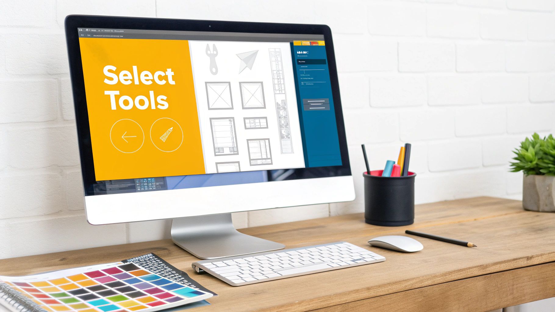
Using Shapes to Represent UI Elements
Once you've mapped out the major zones, you can start filling them in with basic UI elements. The trick is to stick with simple, universally recognized shapes. Remember, you're indicating function, not designing the final look.
- A box with an 'X' drawn through it is the classic shorthand for an image or video.
- Simple lines or thin rectangles work perfectly for text. You can use a thicker, bolder line for a headline and thinner lines to show where a paragraph will sit.
- Rectangles with a simple outline are your go-to for buttons. Feel free to add a simple label like "Submit" or "Learn More" to make its purpose crystal clear.
The real magic of a low-fidelity wireframe is its simplicity. By sticking to grayscale and basic shapes, you keep the focus squarely on structure, flow, and usability—not on whether someone likes the color of a button.
This keeps early feedback sessions productive and centered on what matters most at this stage. How you arrange these elements directly impacts the user's journey, so it's a great time to think about how to improve user experience design through smart layout choices.
Adding Placeholder Content and Annotations
To make your wireframe even clearer, you'll want to add some context. Use placeholder text like "Lorem Ipsum" for body copy and generic labels like "Main Headline" or "Feature Title" for headings. This shows the scale and placement of text without getting lost in the weeds of copywriting just yet.
More importantly, sprinkle in small notes, or annotations, to explain how things work. For instance, next to a component that will be a dropdown menu, you might add a quick note: "Click to reveal category list." These annotations are gold for developers and stakeholders, giving them a clear picture of the intended interactivity.
After you’ve put these pieces together, your wireframe serves as the foundational blueprint for everything that follows. When you're ready for the next phase, having a grasp on the entire process of building a website from scratch helps you see exactly how this crucial step fits into the bigger picture.
How to Test and Refine Your Design

It's easy to fall in love with your first draft, but remember this: your initial wireframe is just a hypothesis. It’s a well-informed guess about what will work for your users. The real magic happens when you put that guess to the test. This is where you start gathering feedback to see if your layout's structure, clarity, and overall flow actually make sense to other people.
You don’t need a fancy, expensive usability lab for this. Honestly, some of the best insights come from informal user testing. Just grab a few colleagues from other departments or even some friends who fit your target user profile. The goal is to get fresh eyes on the design—people who haven't been staring at it for hours like you have.
Gathering Actionable Feedback
When it's time to show your wireframe, your only job is to watch and listen. Resist the urge to explain or defend your design choices. Instead, give your tester a simple task to complete.
Don't ask, "So, what do you think?" That's too vague. Give them a real-world scenario. For instance: "Pretend you landed on this page and you want to see our prices. Walk me through how you’d do that."
To get genuinely useful answers, you need to ask open-ended questions that uncover their thought process. Here are a few I always come back to:
- "What do you expect to happen if you click on this?"
- "If you were looking for the contact info, where would you go first?"
- "In your own words, what is the main purpose of this page?"
These types of questions quickly reveal whether your navigation and information hierarchy are as intuitive as you thought. When you collect this feedback, you'll start to see patterns emerge. Maybe three out of five people you talk to can't find the sign-up button. That’s not their fault—it's a clear signal that the design needs a tweak. If you want to dive deeper, exploring different usability testing methods can provide more structured approaches for this phase.
Iterating on Your Design
Once you've gathered all your notes, it's time to connect the dots. Consolidate the feedback and pinpoint the most common points of friction. Was the main call-to-action getting lost? Was a navigation label causing confusion? These are your priority fixes.
Head back to your wireframing tool and make specific, targeted changes based on what you learned. This could be as simple as moving a button to a more prominent spot, renaming a menu item to be more direct, or reordering sections to better align with what users actually care about.
This cycle of creating, testing, and refining is what turns a decent wireframe into a great one. Each round of feedback helps you sand down the rough edges, ensuring the final product is built on a solid, user-validated foundation.
This whole process isn't about getting it perfect on the first try. It’s about making steady, informed improvements that bring your layout closer to a truly intuitive experience. By solving these structural problems early, you create a much stronger blueprint for the visual design and development work that comes next.
Answering Your Top Wireframing Questions

If you're new to wireframing, you've probably got questions. That's a good thing. Over the years, I've seen the same handful of questions come up again and again from designers, developers, and clients alike. Let's clear the air on a few of them so you can move forward with confidence.
One of the most common mix-ups is the difference between a wireframe and a mockup. It's an easy mistake to make, but the distinction is critical. Think of a wireframe as the bare-bones architectural blueprint of your website—it's all about structure, layout, and how a user will move through the site. A mockup, on the other hand, is the fully decorated model home. It brings in the visual layer: colors, fonts, real images, and branding.
A wireframe shows a blank rectangular box, a mockup shows a resulting blue button, and a prototype shows what happens when you click it.
Keeping this straight is vital for gathering the right kind of feedback. When you present a wireframe, you're asking, "Does this layout make sense?" not "Do you like this color?"
How Much Detail Is Too Much?
Ah, the classic question of fidelity. The honest answer is: it depends entirely on where you are in the design process and what you need to accomplish. There's no single right answer.
Early on, when ideas are still just taking shape, rough sketches and low-fidelity wireframes are your best friend. They're quick, disposable, and keep the focus purely on concepts and flow. As you get more consensus on the core structure, you can gradually increase the detail. This might mean adding more specific labels, refining element placement, or using placeholder text to show what kind of content will go where.
My rule of thumb? If you start debating font choices or specific color hex codes, you've strayed from wireframing into visual design. Pull it back.
Does Every Single Project Need a Wireframe?
In my experience, just about every project gets a huge boost from wireframing. I would never recommend skipping the step entirely, but the scale of the effort can definitely change based on the project's scope.
You have to be practical about it.
- Small Personal Projects: Building a simple portfolio with a few pages? You can probably get by with a few quick sketches on a notepad. A full-blown digital wireframe might be overkill.
- Large, Complex Sites: For an e-commerce platform or a corporate site with dozens of user pathways, a detailed wireframing phase is absolutely non-negotiable. It’s the only way to get everyone on the same page and avoid incredibly expensive mistakes down the line.
At the end of the day, even a 30-minute sketch on a whiteboard is infinitely better than nothing. It forces you to think structurally before you start coding or designing visuals, and that discipline always pays off.