Mastering the UI UX Design Process Step by Step
The UI/UX design process is really just a structured way of solving problems. It’s how we create digital products that people find not only easy to use but genuinely enjoyable. This isn't about following a rigid checklist; it's more of a cycle. We constantly move between understanding users, pinpointing their problems, brainstorming solutions, building mockups, and then—most importantly—testing those mockups with real people. This iterative loop ensures that what we build actually solves a real-world need.
Building the Blueprint for a Great User Experience
Think of the UI/UX design process like an architect drafting the plans for a custom home. Before they even think about drawing a single line, they need to know everything about the family who will live there. What’s their lifestyle like? How will they move through the space? This deep understanding is what prevents costly mistakes and ensures the final home is both functional and loved.
In the same way, a solid design process takes a great idea and grounds it in the reality of user needs, turning a concept into a successful product.
This entire framework is built on a simple philosophy that’s often broken down into five key phases: Empathize, Define, Ideate, Prototype, and Test. This cycle is the heart of human-centered design, guiding teams from a vague idea all the way to a concrete, tested solution.
The Foundation of Modern Design
This user-first mindset isn't new; its roots go back to major shifts in technology. Back in the 1970s, Xerox's PARC was already pioneering concepts like the graphical user interface (GUI) and the computer mouse. But it was Apple’s launch of the Macintosh in 1984 that really brought user experience into the spotlight. They proved that intuitive design wasn't just a nice-to-have—it was a massive competitive advantage that directly swayed what people chose to buy.

Why a Process Matters
So, why bother with a formal process? Because it stops us from designing based on our own assumptions. It gives the entire team a clear roadmap that accomplishes a few critical things:
- Minimizes Risk: When you test ideas early and often, you avoid sinking a ton of time and money into a concept that’s fundamentally flawed.
- Creates Alignment: It gets everyone—designers, developers, and stakeholders—speaking the same language and working toward the same goals.
- Ensures Consistency: A process is the best way to maintain a coherent and predictable user experience across your entire product.
To get started on the right foot, it’s crucial to have a firm grasp of the fundamental UX principles that underpin all great design. Building on this framework is what sets a project up for success from day one.
1. Research: Uncovering User Needs and Defining the Core Problem
Every great design starts with a simple, powerful idea: empathy. Before a single pixel is placed, we have to get inside the heads of the people we're designing for. Think of this first phase of the UI/UX design process like a detective gathering clues at a crime scene. You can't solve the case by guessing—you need to understand the situation, the motives, and the people involved.
The whole point is to move past our own assumptions and find out what our audience truly needs, wants, and struggles with.
If you skip this step, you risk building a beautiful, flawless product that nobody actually uses because it doesn't solve a real problem. It's no surprise that companies investing in user experience see lower customer acquisition costs and much higher retention. Why? Because from day one, they’re focused on fixing genuine pain points.
This discovery work is all about collecting two kinds of data: quantitative (the "what") and qualitative (the "why"). Each research method gives you a different piece of the puzzle.
Gathering the Right Clues
To really get to know your user, you need to pick the right tools for the job. Your choice of research technique will depend on your project's goals, timeline, and, of course, budget. If you want to get into the weeds on this, our guide on how to conduct user research is a great place to start.
Here are a few of the go-to methods in a designer's toolkit:
- User Interviews: These are just one-on-one conversations, but they're incredibly powerful. They give you a direct line into a user's motivations, feelings, and day-to-day life.
- Surveys and Questionnaires: When you need to see the bigger picture, surveys are fantastic for gathering quantitative data from a large group. They help you spot broad trends and patterns you might otherwise miss.
- Competitive Analysis: It’s always smart to see what everyone else is doing. By looking at competitor products, you can find gaps in the market, learn from their mistakes, and discover ways to make your product stand out.
- Contextual Inquiries: This is where you observe people in their natural habitat—their office, their home, wherever they'd actually use the product. You'd be amazed at the insights you get just by watching, things people would never think to tell you in an interview.
All this raw data is gold, but it's not a finished product. The real magic happens when you start to synthesize these findings into something the whole team can use.
Creating a Shared Understanding
The next step is to take all that research and turn it into something tangible that brings the user to life. These tools make sure everyone—from developers to marketers—is building for the same person.
The most powerful tool for a designer is empathy. Personas and empathy maps are not just deliverables; they are vessels for that empathy, ensuring the user's voice is present in every decision.
User Personas are the most common way to do this. They're fictional characters we create based on our research to represent key user groups. We don't just give them a name and an age; we flesh them out with goals, motivations, and frustrations.
For example, you stop designing for "a 30-year-old manager." Instead, you start designing for "Maria, a 30-year-old project manager who is completely overwhelmed juggling multiple platforms and just needs a single source of truth to track her team's progress." See the difference?
This clarity helps the team rally around a focused problem statement. This is a simple, clear sentence that defines the user, their need, and the core insight. It becomes the North Star for the entire project, keeping every decision anchored to the user's reality.
Structuring the Solution with Wireframes and User Flows
Once you’ve nailed down the problem you're solving, the design process shifts gears. We move from understanding the "why" to exploring the "how." This stage is all about building the product's skeleton—giving shape to the solution before we even think about what it will look like.
Think of it like an architect drafting a blueprint. They’re not picking out paint colors or furniture just yet. Instead, they're focused on where the rooms go, how people will move between them, and making sure the entire layout is logical. This foundational work is crucial for creating an experience that feels natural down the road.
Mapping the User Journey
Before you can start designing screens, you need to map out the paths people will take through your product. A couple of key tools help visualize this journey from start to finish.
Storyboarding, a technique borrowed straight from filmmaking, is a fantastic way to brainstorm. It involves sketching a simple sequence of frames that tell the story of someone using your product to solve their problem. This narrative approach is great for building empathy and understanding the user’s context and feelings at each step.
From there, a User Flow turns that story into a more structured diagram. It maps out every single screen, decision, and action a user takes to complete a task. For an e-commerce app, a user flow would show the exact path from finding a product to completing the checkout process.
A user flow is like a GPS for your product. It shows every possible turn a user can make, ensuring there are no dead ends or confusing detours on the way to their goal.
This detailed map is your secret weapon for spotting potential roadblocks or missing steps long before you’ve written a single line of code. It gets the whole team on the same page about how the product should work from the user's point of view.
Building the Digital Blueprint
With the user’s path laid out, it's time to build the actual structure. This is where we get into the nitty-gritty of Information Architecture and wireframing, which together form the true backbone of the design.
Information Architecture (IA) is all about organizing and labeling your content so people can find what they need without thinking too hard. Imagine walking into a library where none of the books are sorted—that’s a product with bad IA. Good IA makes navigation feel effortless.
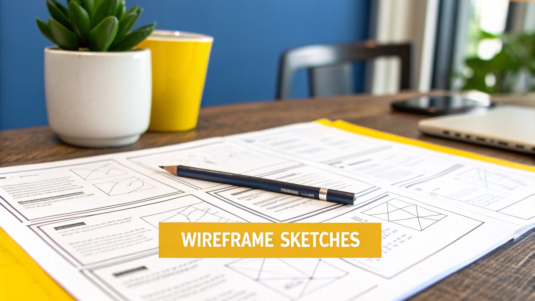
Once the IA is set, you can start creating wireframes. These are simple, black-and-white layouts that focus purely on structure and function. They are intentionally stripped down, using basic shapes and placeholder text to represent different elements on a page.
- Focus on Function: Wireframes remove all visual distractions—no colors, fonts, or images. This forces everyone to concentrate on usability and how the layout actually works.
- Speed and Iteration: Because they’re so basic, you can create and change wireframes in a flash. This lets you quickly test different ideas without wasting a ton of time or money.
- Clear Communication: They act as a clear blueprint for the entire team, from stakeholders to developers, ensuring everyone agrees on the core structure before moving forward.
Getting good at wireframing is a fundamental design skill. If you want to dive deeper, you can learn more about how to create wireframes and turn your ideas into a solid plan. This early, low-cost iteration is what separates good products from great ones.
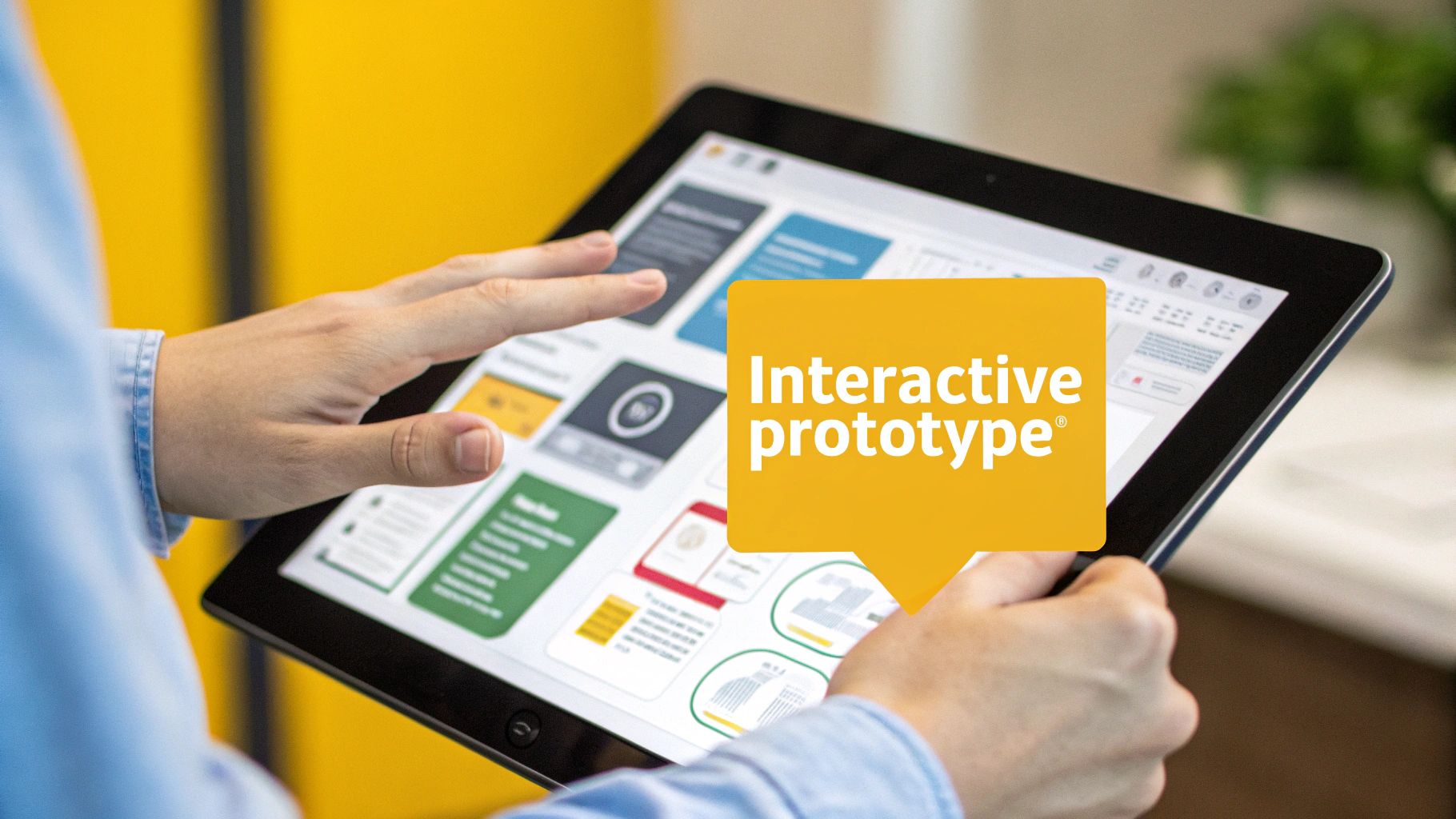
Bringing Your Designs to Life with Prototypes
Once you’ve hammered out the blueprint with wireframes, the design process enters its most exciting phase. This is where those static, black-and-white layouts start to breathe. We're talking about prototyping—turning your sketches into something you can actually click, tap, and interact with.
Think of it as a dress rehearsal for your product. It’s your chance to test out all your assumptions and see how things really feel before a single line of code gets written. This step is absolutely crucial. It bridges the gap between a simple wireframe and the final, polished product, letting you experience the user flow firsthand instead of just imagining it. Catching issues here saves so much time and money down the road.
This idea of creating testable, user-focused models isn't new. We owe a lot to cognitive scientist Don Norman, whose work in the late 1980s and early 1990s really set the stage for modern experience design. His 1988 book, "The Design of Everyday Things," was all about making products intuitive and reducing friction for users. When he joined Apple in the mid-90s as their first "User Experience Architect," he solidified UX as a core part of product development. You can learn more about the history of UX design and its pioneers to see how far we've come.
From Low-Fidelity to High-Fidelity Prototypes
Prototypes aren't a one-and-done deal. They evolve right alongside your project, growing in detail and complexity. Each level of "fidelity" has a specific job, helping you test different things at just the right moment.
You almost always start with low-fidelity (lo-fi) prototypes. These are the quick and dirty versions. Sometimes they’re just clickable wireframes you stitch together in a tool like Balsamiq or Figma. The whole point is to focus purely on functionality and user flow. They help answer one simple question: "Can someone actually complete their task with this layout?"
Once you’ve got the basic structure locked down, you graduate to high-fidelity (hi-fi) prototypes. These are the showstoppers. They look and feel incredibly close to the final product, incorporating the full visual design—colors, fonts, animations, the works. Built in tools like Figma or Adobe XD, hi-fi prototypes let you test the entire experience, from basic usability to that all-important emotional connection.
Choosing the Right Prototyping Tool
Your choice of tool can make or break your workflow. While there are tons of options out there, a few have really become the go-to choices in the industry for their power and collaborative features.
- Figma: This is the current king of the hill. Everyone loves it for its real-time collaboration, which is a total game-changer for teams. You can design, prototype, and hand off to developers all in one place.
- Adobe XD: A very strong contender, especially if you're already living in the Adobe Creative Cloud ecosystem. It’s known for being incredibly fast and has some neat features for creating realistic prototypes with voice commands and slick animations.
- Sketch: For a long time, this was the darling of the Mac-using design world. While Figma has definitely eaten into its market share, Sketch is still a fantastic, clean tool that many teams rely on.
The whole point of a prototype is to learn. Every click, every tap, every moment a user hesitates—that's gold. It's priceless data that helps you refine your design and avoid building the wrong thing.
At the end of the day, the "best" tool is simply the one that works for your team. The goal is always the same: make a version of your product that you can put in front of real people to get feedback. This cycle of building, testing, and learning is what turns a good idea into a genuinely great product that people will love to use.
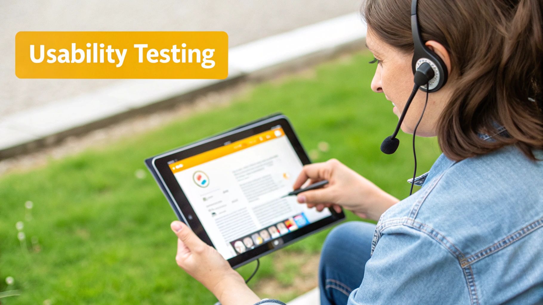
Testing Your Designs with Real Users
Everything you've built up to this point is, essentially, a well-informed guess. You've done the research, you understand the user, and you've designed a solution you believe will work. But it’s still just a hypothesis. The testing phase is where that hypothesis gets a reality check.
This is the moment you hand over your interactive prototype to actual people and see what happens. It's about discovering what works, what falls flat, and what you completely missed.
Think of it like a chef doing a taste test before putting a new dish on the menu. They need to see how real customers react to the flavor, the texture, and the presentation. You can't know if you've got a hit until someone actually takes a bite. Usability testing is your taste test—it reveals the confusing parts of your navigation, the awkward workflows, and all the little friction points you’d never spot on your own.
The goal here isn’t to prove you were right all along. It’s to find out where you were wrong so you can fix it. The insights you gather are pure gold, fueling the next round of improvements and making your final product that much stronger.
Choosing Your Testing Method
There’s no one-size-fits-all approach to testing. The best method really depends on what you need to learn, how much time you have, and what your budget looks like. The trick is to pick the approach that gives you the most valuable feedback for where you are in the process. For a deeper dive, you can explore various usability testing methods and see which one fits your project.
Here are a few of the most common ways to do it:
- Moderated Usability Testing: This is where you sit down with a user (in person or virtually) and guide them through a set of tasks. You can ask questions in real-time, which is incredibly powerful for understanding the "why" behind their actions.
- Unmoderated Usability Testing: Users complete tasks on their own time, usually with software that records their screen and voice. This is a fantastic way to get a lot of feedback from a wide range of people without a huge time commitment.
- A/B Testing: This is more of a numbers game. You show two different versions of a design element to two different groups of users and see which one performs better on a specific goal, like getting more sign-ups or clicks.
Usability testing really came into its own as a formal practice in the early 2000s, cementing the idea that products should be built around the user. It was during this time that dedicated usability labs and standardized reporting became common, giving designers a systematic way to measure and improve their work. You can find more on the history and adoption of these methods and how they shaped the industry.
Gathering Actionable Feedback
The whole point of testing is to get feedback you can actually do something with. This means you have to pay more attention to what users do than what they say. People are often too polite to tell you they hate something, but their actions will tell the truth.
Don't just ask users if they like your design. Ask them to complete a task and watch where they struggle. The most valuable feedback comes from silent observation of their frustrations.
As you run your tests, keep an eye out for patterns. If one person stumbles, it might just be them. But if three or four people get stuck in the exact same spot, you’ve just uncovered a serious usability problem that needs your attention. This data-driven approach pulls your own biases out of the equation and makes sure your next design iteration is based on solid evidence, not just a hunch.
Finalizing the Handoff and Supporting Development
The design has been tested, tweaked, and is finally ready for prime time. Now comes one of the most crucial moments in the entire ui ux design process: the handoff. This isn't about just zipping up some files and emailing them to the engineering team. A smooth handoff is the difference between a seamless build and a project plagued by guesswork and delays.
Think of it like an architect giving a detailed blueprint to a construction crew. The more precise and clear the plans, the more likely the final structure will match the original vision. This stage is all about packaging your design work so meticulously that it becomes the single source of truth for the developers building the product.
Crafting the Perfect Handoff Package
Your handoff package is far more than just the final screens. It’s the complete instruction manual for bringing the interface to life. Thankfully, modern design tools have made this step way more efficient than it used to be.
A rock-solid handoff package should always include:
- Pixel-Perfect UI Screens: You'll need to provide the final, high-fidelity mockups for every single screen and all its possible states. Don't forget things like empty states, error messages, and loading screens.
- Interactive Prototypes: A clickable prototype is worth its weight in gold. It doesn't just show developers what a screen looks like; it demonstrates how it feels and behaves in action.
- Detailed Design Specifications: This is the nitty-gritty: spacing, typography, exact color codes, and component dimensions. Tools like Figma's Dev Mode or Zeplin are fantastic here, as they let developers inspect elements and grab code snippets directly.
- A Complete Asset Library: All your icons, illustrations, and images need to be neatly organized and exported in the right formats and sizes for various devices.
Beyond the Handoff: Collaboration and Improvement
Shipping the handoff package doesn't mean your job is done. Not even close. Your role now shifts from creator to collaborator, becoming a key partner for the development team. The design process is a loop, not a straight line, and this phase is where you start gathering fuel for the next cycle.
A designer's work isn't finished when the files are sent. Real success is measured by how faithfully the final, coded product captures the intended user experience. The only way to get there is through constant collaboration.
This ongoing partnership is vital for maintaining quality. One of your most important jobs here is Design QA (Quality Assurance). This is where you get your hands on the product in a staging environment and hunt for any visual bugs or interaction hiccups before real users see them. It's your last chance to make sure a button isn't a few pixels off or that an animation's timing feels just right.
And once the product goes live? The work still continues. By digging into user data and collecting feedback, you can pinpoint what’s resonating with users and where they’re getting stuck. These real-world insights are the bedrock for the next round of research and iteration, proving that great design is never truly finished—it just keeps evolving.
A Few Common Questions About the Design Process
As you get more familiar with the UI/UX design process, you'll naturally start asking how it fits into the real world. Does it change depending on the project? Are all the steps really necessary every single time? Let's clear up a few of those common questions.
Understanding these practical details helps you adapt the framework to your team's specific needs, making the whole workflow much smoother from start to finish.
How Does This Work in Agile vs. Waterfall?
One of the biggest questions is how the design process fits into different development methodologies. The good news is that it’s flexible, and yes, it looks quite different depending on whether your team uses Agile or Waterfall.
In a classic Waterfall model, the process is completely linear. You have to finish and get sign-off on each distinct phase before moving to the next. That means all the research, all the wireframing, and all the visual design get done and approved before a single developer starts coding. It’s a one-and-done approach.
Agile, on the other hand, breaks that long race into a series of short sprints. Designers and developers work in tandem. A designer might be researching and wireframing one feature while the developers are building the feature from the last sprint.
The core ideas—research, design, test—are still there in both models. But Agile turns them into a continuous, collaborative loop instead of a rigid, sequential handoff. This means you can adapt to new feedback and changing requirements on the fly.
What Are the Must-Have Tools for Designers Today?
The tool landscape is always shifting, but a few have become the go-to choices for getting the job done efficiently. A modern designer's toolkit usually has a mix of these:
- Design & Prototyping: Figma is king right now, mostly because its real-time collaboration is just so seamless. That said, Sketch and Adobe XD are still powerful and popular alternatives.
- User Research & Feedback: To get real insights from actual users, platforms like UserTesting.com, Maze, and Hotjar are invaluable for running tests and seeing how people actually interact with your designs.
- Wireframing: When you need to get ideas down fast, nothing beats a quick wireframing tool. Balsamiq is fantastic for this, but honestly, many designers just stick with the basic shape tools in Figma to keep everything in one place.
Is It Okay to Skip a Step to Save Time?
Ah, the age-old question. It’s so tempting, especially when a deadline is breathing down your neck. But skipping a phase almost always costs you more time in the long run.
Think about it: if you skip research, you might build a beautiful product that solves a problem nobody has. If you skip testing, you’re basically asking your developers to build a design that's full of hidden flaws, which means they'll have to undo and redo their work later. That’s expensive.
Instead of skipping, scale each phase to fit your timeline. Don't have weeks for research? Do a handful of quick user interviews. No time for a polished prototype? Test with simple, clickable wireframes. The goal is to keep the spirit of the process intact by adjusting the scope, not by cutting out entire steps.