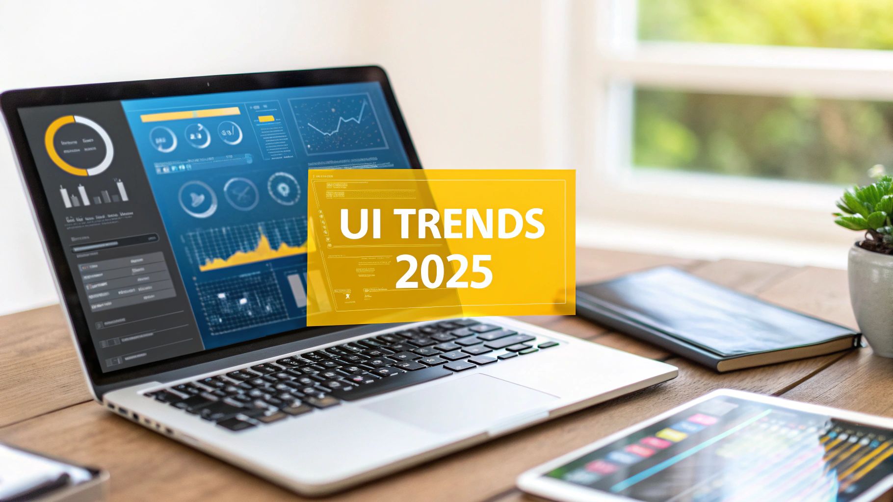
Top User Interface Design Trends to Watch in 2025
In the competitive digital marketplace, a compelling user interface is no longer a luxury; it's the cornerstone of user engagement and product success. As we move forward, understanding the latest user interface design trends is crucial for any business aiming to create intuitive, memorable, and effective digital experiences. These trends are not just aesthetic shifts; they represent fundamental changes in how users interact with technology, from the tactile appeal of Neumorphism to the immersive potential of Augmented Reality.
This guide will unpack nine pivotal trends that are shaping modern digital products. We'll move beyond the surface, offering practical insights and actionable steps to help your design and development teams stay ahead of the curve. For those seeking a deeper dive into how these elements are converging, it's helpful to explore the latest UI Trends 2025 for a broader perspective on the evolving landscape.
Whether you're refreshing an existing application or building a new one from the ground up, the concepts we'll cover are essential for crafting interfaces that are both beautiful and highly functional. Let's explore the designs that will define the future of digital interaction.
1. Neumorphism (Soft UI)
Neumorphism, often called Soft UI, is a visual style that blends minimalist aesthetics with a subtle, tactile sense of three-dimensionality. It creates the illusion that UI elements are extruded from or pressed into the background, resembling soft, molded plastic. This effect is achieved through a meticulous combination of the same background color for both the element and its container, along with two distinct shadows: a light inner shadow on one corner and a dark outer shadow on the opposite corner. This creates a fresh take on an established user interface design trend.
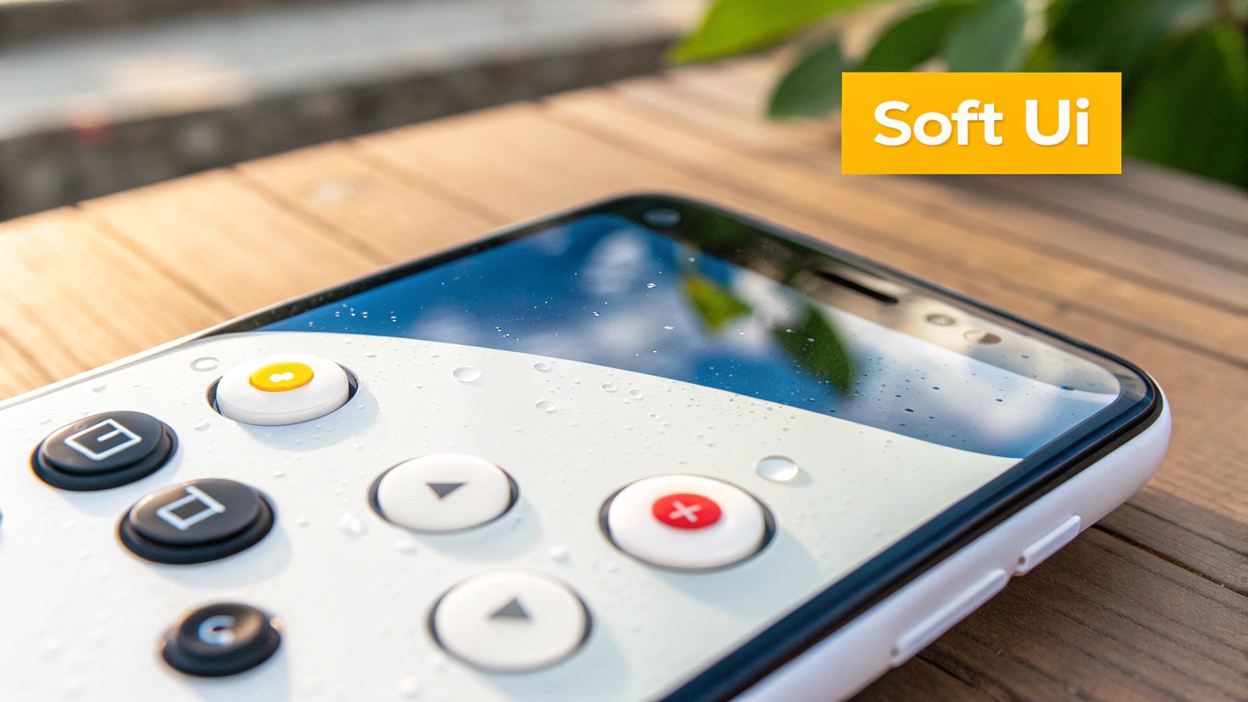
This style has been popularized through concept designs on platforms like Dribbble and can be seen in elements of Apple's Calculator app and various smart home control panel interfaces. The primary benefit of neumorphism is its ability to create a clean, modern, and visually soothing interface that feels tangible and interactive to the user.
Best Practices for Implementation
While visually appealing, neumorphism presents significant accessibility challenges, particularly with contrast. Interactive elements like buttons can be difficult to distinguish from the background, especially for users with visual impairments.
To implement it effectively:
- Use it sparingly: Reserve neumorphism for non-critical, decorative elements or large, easily identifiable components like cards and containers. Avoid using it for primary call-to-action buttons or essential text inputs where clarity is paramount.
- Prioritize accessibility: Ensure all interactive elements meet WCAG contrast guidelines. Supplement neumorphic buttons with clear icons, bold typography, or subtle color shifts in their active state to provide better visual cues.
- Combine with other styles: Integrate neumorphic elements into a more traditional UI framework. Use flat design for text and vital controls while applying neumorphism to larger background elements to get the aesthetic benefit without sacrificing usability.
2. Dark Mode UI
Dark Mode UI is an interface design that utilizes a dark color scheme, typically a dark gray or black background with light-colored text, icons, and graphical elements. This approach inverts the traditional light-background aesthetic to reduce eye strain in low-light environments, conserve battery life on devices with OLED or AMOLED screens, and offer a sleek, modern visual experience. As a prominent user interface design trend, it has become a standard feature in most major operating systems and applications.

This trend was widely popularized by its system-wide implementation in Apple's macOS Mojave and iOS 13, as well as Google's Android 10. Popular applications like Spotify, Discord, and Twitter have long embraced dark themes, proving their effectiveness in creating focused, immersive user experiences, particularly for content-heavy platforms. The primary benefit is improved ergonomics for the user, reducing visual fatigue during prolonged use and enhancing content legibility by making foreground elements stand out.
Best Practices for Implementation
Designing an effective dark mode requires more than simply inverting colors. A poorly designed dark theme can hinder readability and create a jarring user experience. The key is to manage contrast and color saturation carefully to maintain a clear visual hierarchy.
To implement it effectively:
- Avoid pure black: Use dark gray (#121212 is a common choice) as the primary background color instead of pure black. This reduces strain by minimizing extreme contrast and allows for a greater range of depth and elevation using subtle shadows.
- Prioritize accessibility: Ensure all text and interactive elements meet WCAG AA contrast standards of at least 4.5:1. Desaturate colors to prevent them from vibrating against the dark background and test your palette extensively in both light and dark modes.
- Provide user control: Always offer an easy-to-find toggle that allows users to switch between light and dark themes. Consider adding an "auto" or "system" setting that syncs with the device's operating system preference for a seamless experience.
3. Glassmorphism
Glassmorphism is a visual style defined by its use of multi-layered elements with a frosted-glass appearance. This effect is achieved through a combination of transparency, a subtle background blur, and a thin, light border to simulate the edge of a glass pane. The result is an interface where elements appear to float over the background, creating a sense of hierarchy and depth. This modern approach is a prominent user interface design trend that adds elegance and focus to complex layouts.
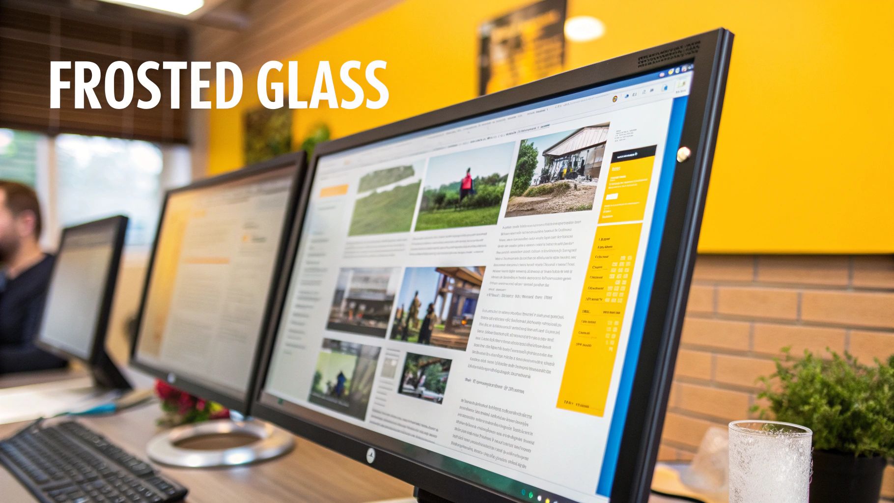
This trend has been widely adopted by major technology companies, most notably in Apple's iOS control center and macOS Big Sur interface, as well as Microsoft's Fluent Design System for Windows 11. Its main benefit is its ability to draw attention to foreground content by subtly obscuring the background, which helps users maintain context while interacting with overlays like modals or navigation menus. The aesthetic is clean, light, and highly sophisticated.
Best Practices for Implementation
The key to successful glassmorphism is balancing the aesthetic with readability and performance. Overusing the effect or choosing a poor background can quickly make an interface cluttered and difficult to use, especially on lower-end devices that may struggle to render the blur effect smoothly.
To implement it effectively:
- Ensure readability: Always use high-contrast text and icons on glassmorphic surfaces. The background blur must be strong enough to prevent the underlying content from interfering with the readability of the foreground text.
- Define clear boundaries: Add a subtle 1px inner border to your glass elements. This helps define their shape and makes them appear to "lift" off the background, preventing them from blending in too much.
- Use it for layering: Glassmorphism works best for elements that sit on top of other content, such as sidebars, modals, or notification cards. It is less effective as a primary background for an entire application.
4. Microinteractions and Motion Design
Microinteractions are small, purposeful animations that provide visual feedback and guide users through an interface. These subtle movements, from a button's ripple effect to a loading spinner, acknowledge user actions, prevent errors, and make digital experiences feel more human and responsive. By adding a layer of dynamic feedback, this user interface design trend transforms a static screen into a lively, interactive environment, enhancing both usability and brand personality.

This approach has been effectively integrated into countless platforms, from the satisfying heart animation on Instagram to the smooth payment form interactions on Stripe’s website. These small touches build user confidence by clearly communicating what is happening, what has just happened, and what will happen next. Well-executed motion design can significantly boost user engagement and create a more memorable, polished product.
Best Practices for Implementation
The key to successful microinteractions is subtlety and purpose; animations should enhance, not distract. Overly complex or slow animations can frustrate users and hinder accessibility, making thoughtful implementation crucial.
To implement them effectively:
- Prioritize performance and purpose: Keep animations short, typically under 300ms, and ensure they serve a clear function, such as providing feedback or guiding focus. Test motion design across various devices and network conditions to prevent lag.
- Respect user preferences: Always provide an option to reduce motion for users who are sensitive to it, adhering to accessibility best practices. This ensures the interface remains usable and comfortable for everyone.
- Use natural easing functions: Apply easing functions (like ease-in, ease-out) to make movements appear more natural and less robotic. This small detail makes the interface feel more organic and high-quality.
5. Voice User Interface (VUI) Integration
Voice User Interface (VUI) integration embeds voice commands and audio feedback into traditional graphical user interfaces, allowing users to interact with devices and applications hands-free. This trend is driven by the widespread adoption of voice assistants and the demand for more accessible and convenient interaction methods. By bridging the gap between spoken commands and on-screen actions, VUI creates a more intuitive and efficient user experience, making it a pivotal user interface design trend.
This technology has been successfully popularized by major tech companies like Google with its voice search and Assistant, Amazon through its Alexa ecosystem, and Apple's integration of Siri across its devices. The primary benefit of VUI is its ability to streamline complex tasks, enhance accessibility for users with physical or visual impairments, and provide a seamless, hands-free control method ideal for multitasking environments like driving or cooking.
Best Practices for Implementation
Designing an effective VUI requires more than just adding voice recognition; it demands a thoughtful approach to user interaction and feedback. The system must clearly communicate its status and understand user intent, even with varied accents and phrasing.
To implement it effectively:
- Provide clear visual feedback: Use on-screen cues, such as a pulsating icon or a transcription of the spoken command, to show when the application is actively listening, processing, or has completed a task. This reassures the user that their input is being received.
- Design for error recovery: Plan for situations where the VUI misinterprets a command. Implement conversational prompts like "Did you mean...?" or provide simple ways for users to correct mistakes without having to restart the entire process.
- Offer alternative input methods: VUI should complement, not completely replace, traditional touch or mouse inputs. Always give users the option to perform tasks manually, ensuring the app remains usable in noisy environments or public spaces where speaking aloud is not feasible.
6. Minimalist and Clean Design
Minimalist and Clean Design is an enduring approach that prioritizes simplicity, functionality, and clarity by stripping away non-essential elements. The core principle is "less is more," focusing the user's attention on the most critical content and actions. This style is characterized by generous use of white space, a limited color palette, clean typography, and a strong visual hierarchy, making it a foundational user interface design trend.
This philosophy is famously embodied by Google's uncluttered search interface and Apple's product pages, where the design recedes to let the product shine. The primary benefit of minimalism is a reduction in cognitive load, allowing users to navigate and complete tasks more efficiently. It creates a calm, focused, and timeless user experience that feels both modern and accessible.
Best Practices for Implementation
While seemingly simple, effective minimalism requires careful planning to avoid creating a barren or confusing interface. Every element must have a clear purpose and be executed with precision.
To implement it effectively:
- Master white space: Use negative space strategically to guide the user's eye, create separation between elements, and establish a clear visual hierarchy. It is an active element, not just an empty background.
- Prioritize typography: With fewer visual elements, typography becomes paramount. Choose a clear, legible font family and use size, weight, and color variations to communicate importance and guide the user through the content.
- Focus on essential functionality: Ruthlessly edit your UI to include only what is necessary for the user to achieve their goals. If an element doesn't serve a clear function or add significant value, it should be removed. For a deeper look into this approach, explore these best practices for user interface design.
7. Augmented Reality (AR) Interface Elements
Augmented Reality (AR) interface elements blend digital information and interactive objects with the physical world, viewed through a device's camera. This creates immersive experiences by overlaying contextual data, 3D models, and controls directly onto a user's real-world environment. This approach is transforming how users interact with technology by moving beyond the screen, making it a pivotal user interface design trend.
Prominent examples include IKEA Place, which lets users visualize furniture in their homes, and Google Maps Live View, which provides navigational arrows in a real-world camera feed. The primary benefit is the ability to provide intuitive, context-aware information that enhances user understanding and decision-making in a uniquely engaging way. For a deeper exploration into how artificial intelligence is accelerating these immersive interfaces, learn about AI-Driven Augmented Reality.
Best Practices for Implementation
Designing for AR requires careful consideration of both the digital interface and the user's physical surroundings, which can be unpredictable. Usability depends on creating intuitive interactions that don't overwhelm or disorient the user. Explore more about what a futuristic user interface design could look like with these advancements.
To implement it effectively:
- Design for the environment: Ensure UI elements are clearly visible against various backgrounds and in different lighting conditions. Use high contrast, simple shapes, and clear typography that remain legible when overlaid on a complex real-world view.
- Prioritize user comfort: Be mindful of potential motion sickness. Design interactions that require minimal head or device movement and provide stable anchor points for digital objects to prevent them from jittering or drifting.
- Make AR features discoverable but optional: Introduce AR capabilities with clear onboarding but always provide a fallback to a standard, non-AR interface. This ensures users without compatible devices or those in unsuitable environments can still access core functionality.
8. Data Visualization and Dashboard Design
Data visualization and dashboard design transform complex datasets into accessible, intuitive, and interactive visual narratives. This approach focuses on making information digestible for both technical and non-technical users, enabling them to identify patterns, insights, and key performance indicators at a glance. By using charts, graphs, and maps within a unified dashboard, this approach has become a cornerstone user interface design trend for business intelligence, analytics, and performance monitoring.
This trend is powerfully demonstrated in tools like Tableau and Google Analytics, where users can explore data dynamically. Other notable examples include Spotify Wrapped, which turns personal listening data into a shareable story, and GitHub's contribution graphs. The primary benefit is its ability to democratize data, making sophisticated information understandable and actionable for a wider audience.
Best Practices for Implementation
Effective data visualization is more than just creating attractive charts; it requires a deep understanding of the user's goals and the data's context. Poorly designed dashboards can easily misrepresent information or overwhelm users, leading to incorrect conclusions.
To implement it effectively:
- Start with user goals: Before choosing chart types, identify the key questions users need to answer. Design the dashboard to provide clear, immediate answers to those questions, focusing on the most critical metrics first.
- Use progressive disclosure: For complex datasets, present a high-level overview first. Allow users to click or drill down into specific elements to reveal more detailed information, preventing initial cognitive overload.
- Prioritize accessibility: Ensure your visualizations are usable for everyone. Use high-contrast color palettes and supplement color cues with patterns, icons, or labels to make charts comprehensible for users with color vision deficiencies.
- Provide clear context: A number without context is meaningless. Always include clear labels, legends, and brief explanations for each metric. Indicate time periods and units of measurement to help users interpret the data accurately.
9. Inclusive and Accessible Design
Inclusive and accessible design is a foundational approach that ensures digital products are usable by people with the widest possible range of abilities. This goes beyond mere compliance with standards; it’s a mindset focused on creating equitable experiences for users with diverse visual, auditory, motor, and cognitive needs. Instead of being an afterthought, accessibility is integrated into the entire design process, making it a core component of any modern user interface design trend.
This trend is championed by industry leaders like Microsoft, with its comprehensive Inclusive Design toolkit, and Apple, whose products are known for robust, built-in accessibility features. The core benefit is not just expanded market reach but the creation of more thoughtful and resilient products that are better for everyone. By designing for users at the margins, the overall user experience is often enhanced for all.
Best Practices for Implementation
True inclusivity requires a proactive and empathetic approach. Simply running an automated checker is not enough, as these tools often miss critical nuances of the human experience. To learn more about the technical specifics, read about how to make a website accessible.
To implement it effectively:
- Design from the start: Embed accessibility principles into the initial stages of your design process, from wireframing to final UI. This prevents costly and difficult retrofitting later on.
- Test with real users: Involve users with disabilities and who use assistive technologies in your testing phases. Their direct feedback is invaluable for identifying real-world barriers that automated tools cannot detect.
- Provide multiple interaction methods: Offer various ways for users to access information and complete tasks. This could include keyboard navigation, voice commands, and clear visual cues alongside text, ensuring flexibility for different needs.
- Prioritize clarity and contrast: Ensure text has sufficient color contrast against its background, use readable typography, and provide clear, descriptive labels for all interactive elements to support users with visual impairments.
UI Design Trends Comparison Matrix
| UI Trend / Aspect | Implementation Complexity 🔄 | Resource Requirements ⚡ | Expected Outcomes 📊 | Ideal Use Cases 💡 | Key Advantages ⭐ |
|---|---|---|---|---|---|
| Neumorphism (Soft UI) | Moderate to High - subtle shadows and highlights | Moderate - precise design and testing | Engaging, tactile interfaces with 3D feel | Key interactive elements in apps, portfolios | Fresh take on flat design, visual depth |
| Dark Mode UI | Moderate - color palettes and toggles | Low to Moderate - involves system-wide sync | Reduced eye strain, battery saving | Low-light environments, prolonged screen use | Eye strain reduction, modern aesthetic |
| Glassmorphism | High - transparency, blur, layering | High - performance-intensive effects | Visually appealing depth with frosted glass | Overlays, control centers, modern dashboards | Premium look, background visibility |
| Microinteractions and Motion Design | Moderate - timing and smooth transitions | Moderate - animation libraries and testing | Responsive, engaging UI with feedback | Buttons, loading states, user feedback | Improved UX, guides user attention |
| Voice User Interface (VUI) Integration | High - voice recognition and NLP integration | High - audio processing and AI capabilities | Hands-free, natural interaction | Accessibility, multitasking scenarios | Accessibility, faster commands |
| Minimalist and Clean Design | Low to Moderate - focus on essentials and whitespace | Low - simple graphics and layouts | Fast, focused, easy-to-scan interfaces | Content-focused apps, mobile responsiveness | Better performance, reduced cognitive load |
| Augmented Reality (AR) Interface Elements | Very High - 3D spatial UI and sensors | Very High - advanced hardware and software | Immersive, contextual real-world digital blend | Education, training, gaming, retail | Immersive experience, new interaction modes |
| Data Visualization and Dashboard Design | Moderate - interactive charts and real-time data | Moderate to High - real-time data processing | Accessible complex data, actionable insights | Analytics, reporting tools, business intelligence | Data-driven decisions, user engagement |
| Inclusive and Accessible Design | Moderate to High - compliance and broad testing | Moderate - development and maintenance | Usable by diverse abilities, legal compliance | All user-focused products, government sites | Expands user base, improves usability |
Integrating Tomorrow's UI Today
The landscape of user interface design trends is a dynamic and compelling field, constantly shifting to meet evolving user expectations and technological capabilities. As we've explored, the dominant themes are not merely aesthetic fads; they represent a fundamental move towards more intuitive, immersive, and human-centric digital experiences. From the tangible depth of Neumorphism and Glassmorphism to the seamless integration of Voice User Interfaces and Augmented Reality, the goal is to reduce cognitive load and create more natural, engaging interactions.
However, the true mastery of modern UI design lies not in the indiscriminate adoption of every new style, but in the strategic application of these principles. The most successful products will be those that thoughtfully select and adapt trends to serve a core purpose: enhancing usability, improving accessibility, and delivering genuine value to the user. A minimalist interface, for example, is not just about empty space; it’s about clarity and focus. Similarly, sophisticated microinteractions are not just for visual flair; they provide crucial feedback and guide the user's journey.
From Trend to Implementation: Your Actionable Roadmap
To effectively leverage these insights, your team must move beyond simple observation and into strategic action. The journey from understanding user interface design trends to implementing them successfully requires a clear, deliberate process.
Here are the critical next steps to consider:
- Audit Your Current UX/UI: Begin with a comprehensive review of your existing interfaces. Identify areas where the user experience feels dated, clunky, or disconnected. Which of the trends discussed, such as enhanced data visualization or a dedicated dark mode, could directly address these pain points?
- Prioritize Based on User Needs: Don't implement a trend for its own sake. Align your design choices with your user personas and their specific goals. Is your audience tech-savvy and likely to appreciate AR features, or would they benefit more from the foundational improvements offered by inclusive and accessible design principles?
- Prototype and Test Rigorously: Before committing to a full-scale redesign, create prototypes to test how these new design elements perform with real users. This iterative process is crucial for validating your assumptions and ensuring that new features genuinely improve the user experience rather than complicating it.
The Future is a Strategic Blend
Ultimately, the most impactful user interfaces will not be built on a single trend but on a thoughtful combination of several. Imagine a clean, minimalist dashboard that uses subtle microinteractions to confirm actions, presents complex data through clear visualizations, and is fully accessible to all users. This is the future we are building: a digital world that is not only beautiful but also functional, empathetic, and universally usable.
Embracing these user interface design trends is more than a simple update; it is a strategic investment in your product's future success. By focusing on a user-centric approach and making deliberate, well-researched design decisions, you can create digital experiences that not only meet but exceed expectations, fostering loyalty and driving meaningful engagement for years to come.