Visual Regression Testing: Prevent UI Bugs Before They Reach Users
You know that sinking feeling when a tiny code change inexplicably breaks the layout on a completely different page? We've all been there. Your functional tests all pass with flying colors, but users are suddenly complaining that the "Buy Now" button has vanished. This is precisely the problem visual regression testing solves.
What Is Visual Regression Testing and Why It Matters
At its core, visual regression testing is an automated process that acts like a game of "spot the difference" for your user interface. It takes a pixel-by-pixel snapshot of your application's UI before a code change (the "baseline") and compares it to a new snapshot taken after the change. Any unexpected differences are immediately flagged.
While your functional tests confirm a button works, visual tests ensure that button looks right—and is actually visible and clickable for the user.
Beyond Functional Testing
Traditional testing is great at checking the logic under the hood. It can confirm an API sends the correct data or a function returns the right value. What it can't do is tell you if that data is rendered as an overlapping, unreadable jumble on the screen.
This is a huge blind spot. A surprising number of functional bugs first manifest as visual glitches.
Visual regression testing closes this gap by focusing on the one thing that matters most to your users: what they actually see. It helps your team:
- Protect Your Brand: Nothing erodes user trust faster than a sloppy, glitchy UI. Visual testing ensures your application looks professional and consistent on every screen.
- Speed Up Development: Manually checking every page for visual bugs after each deployment is a soul-crushing, error-prone task. Automating it frees up your team to tackle bigger challenges.
- Prevent Lost Revenue: It catches those critical, show-stopping bugs—like a hidden checkout button—before they ever reach your customers and tank your conversion rates.
The process is straightforward: compare the approved design with the current one and highlight anything that's out of place.
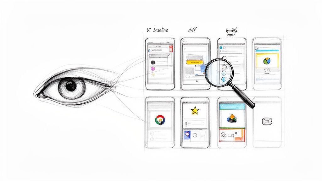
This simple visual comparison instantly spots everything from a slightly shifted logo to a completely broken layout, giving you an automated safety net for your UI.
Visual regression testing isn't just about catching cosmetic flaws; it's a fundamental part of a robust quality assurance strategy. It bridges the gap between code functionality and user experience, ensuring the final product is not only operational but also polished and reliable. Explore more about comprehensive quality assurance in software development in our detailed guide.
This isn't just a niche practice anymore; it's becoming a standard. The market for this technology was valued at USD 1.2 billion in 2024 and is expected to skyrocket to USD 3.5 billion by 2033. You can read more on the market growth of visual regression testing to see just how essential it's become.
For any team that's serious about delivering a top-tier user experience, visual regression testing has moved from a "nice-to-have" to a "must-have."
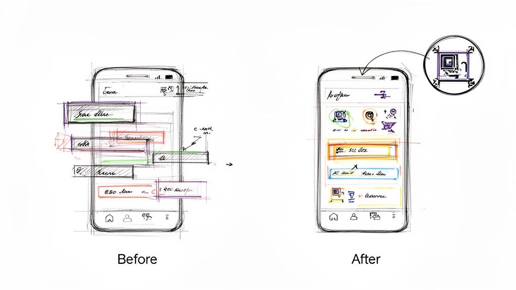
Understanding the Anatomy of a Visual Bug
A visual bug is more than just an ugly mistake; it’s a direct hit to the user experience. These problems can be as small as a button that's a few pixels off-center, subtly undermining your brand's credibility. Or they can be catastrophic, like a broken layout that makes your app completely unusable.
Unlike functional bugs that are buried deep in the code's logic, visual bugs are right there on the screen for everyone to see.
They often pop up from what seems like a totally harmless code change. A developer might tweak a shared CSS component to fix one page, but in the process, they accidentally break the layout on three other pages. This is the classic domino effect, and it’s precisely why visual regression testing is so critical—it catches these unintended side effects before they ever reach your users.
These issues aren't just about aesthetics, either. They're often functional blockers in disguise. In fact, research shows that a staggering 62% of users will ditch a website after a bad visual experience. Suddenly, a simple styling error turns into lost revenue.
Common Types of Visual Bugs
Visual problems show up in all sorts of ways. If you know what to look for, you can get ahead of them. Here are the usual suspects that visual regression testing is designed to hunt down.
Layout and Positioning Errors: These are probably the most common and jarring bugs. You'll see elements overlapping each other, text wrapping in weird places, or entire sections shifting out of place. It creates chaos. The classic example? A "Submit" button on a checkout page that's hiding behind an image.
Styling Inconsistencies: This covers everything from fonts and colors to spacing and padding. A heading might suddenly appear in the wrong font, or a button could lose its background color, making it nearly invisible against the page.
Cross-Browser and Cross-Device Issues: What looks picture-perfect in Chrome on your laptop can be a total mess in Safari on an iPhone. Responsive design is tricky, and visual bugs love to appear when CSS rules don't play nicely with different screen sizes, resolutions, or browser engines.
Content and Element Rendering: Sometimes, the content itself is the issue. An image might not load, a video player could vanish, or dynamic text could spill out of its container and wreck the whole layout.
Each of these can have a massive business impact, leading to abandoned shopping carts, frustrated users, and a tarnished brand reputation.
From Minor Glitch to Major Blocker
To really get why visual bugs are so dangerous, let's walk through a real-world scenario. Imagine an e-commerce site pushes a small styling update to its product page. On that page, everything looks great.
But that tiny CSS change also affected a shared component used in the checkout flow. Now, on the final payment screen, the input fields for the credit card number and expiration date are stacked on top of each other. Users can't type in their details, and the "Complete Purchase" button is half-hidden.
In this situation, a simple visual glitch has turned into a critical functional blocker. The app is technically "working"—no server errors, no crashes—but from the user's perspective, it's completely broken.
This is the exact kind of revenue-killing bug that traditional testing misses but visual regression testing catches every single time. It proves that these issues can't be brushed off as "minor."
Why You Cannot Afford to Ignore Them
Ignoring visual bugs is like seeing a small crack in a dam and hoping for the best. It might seem insignificant at first, but it can quickly escalate into a full-blown disaster. Every visual flaw that slips through erodes user trust and sends a message that you don't care about the details.
This is where automated visual regression testing comes in. It acts as your quality gatekeeper, making sure every single deployment lives up to the high standards your users expect. It shifts quality assurance from a slow, manual chore into a proactive, automated part of your workflow—protecting both your user experience and your bottom line.
How to Integrate Visual Testing into Your CI/CD Workflow
Let's be honest, manual UI checks are a drag. They're slow, error-prone, and happen way too late in the game. Integrating visual regression testing into your workflow flips that script entirely. It turns a reactive, hope-for-the-best chore into an automated, proactive safety net.
Instead of crossing your fingers that someone catches a visual bug before a release, you can build a system that automatically flags unintended UI changes on every single code commit. This integration is what unlocks the real power of visual testing, making quality a built-in part of your development cycle, not an afterthought.
The whole idea is to embed automated screenshot captures and comparisons directly into your Continuous Integration/Continuous Deployment (CI/CD) pipeline. It doesn't matter if you're using GitHub Actions, Jenkins, or something else—the core steps are the same. The goal is simple: make visual validation as routine as running your unit tests.
Establishing the Initial Baseline
Before you can spot what's broken, you need to know what "good" looks like. This is where your baseline images come in. Think of them as the "golden" or "approved" screenshots of your application's UI, a perfect snapshot of every component in its correct state.
You'll typically generate these by running your visual testing script against your main branch. The script will cruise through your app, snapping pictures of key pages and components, and then store them as the official reference. This initial set of images becomes your source of truth.
A common pitfall here is generating baselines on a local machine. It’s a classic mistake. Why? Because rendering can vary slightly across different operating systems, which leads to a flood of false failures once your tests run in the CI environment. The best practice is to generate the initial baseline images inside the exact same containerized environment your CI pipeline uses. Consistency is everything.
Automating Comparisons on Every Commit
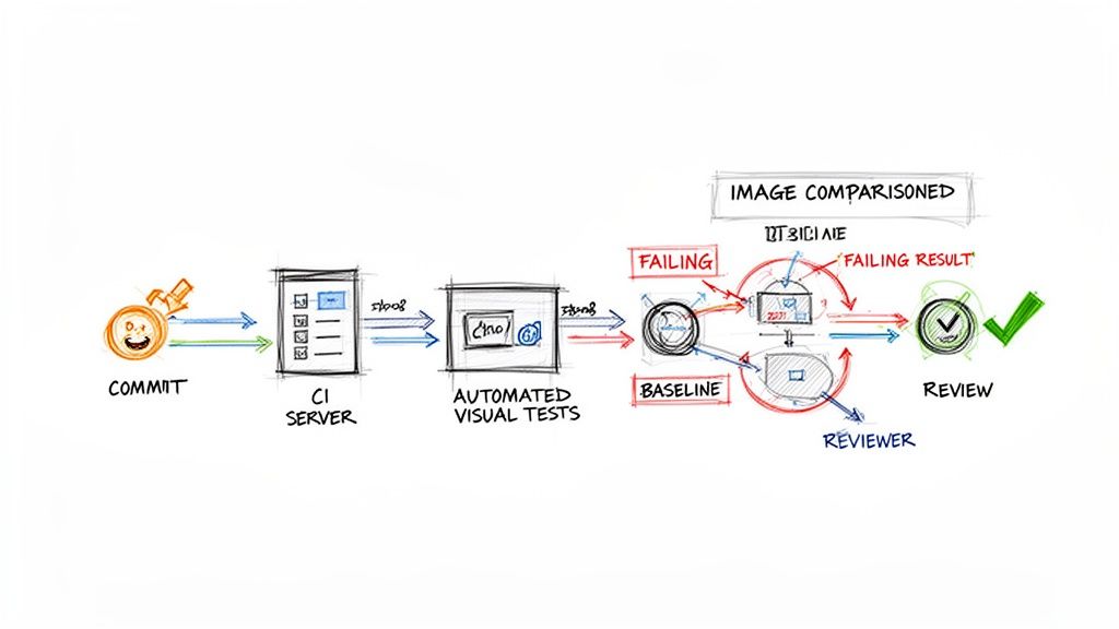
With your baselines in place, the real magic begins. You'll configure your CI pipeline to kick off the visual testing script automatically whenever a developer pushes new code or opens a pull request.
Here’s how it works in practice:
- Code Commit: A developer pushes a change to their feature branch.
- CI Trigger: This push instantly triggers the CI workflow.
- Test Execution: The pipeline runs your visual testing script, which captures a fresh set of screenshots from the modified application.
- Automated Comparison: The tool then compares these new images against your established baselines, pixel by pixel.
- Report Generation: If any differences are detected, the test fails. The pipeline then spits out a report showing the baseline image, the new one, and a handy "diff" image that highlights exactly what changed.
This process gives developers immediate feedback, letting them see the visual impact of their code in minutes, not days. This kind of rapid loop is a cornerstone of great agile development, which we cover more in our guide on Agile software development best practices.
Managing Reviews and Updates
A failed test doesn't always signal a bug. Sometimes, the change was completely intentional—a button was moved, a color was updated. This is where a human needs to step in to make the final call.
The developer or a QA team member simply reviews the visual diff report. From there, they have two clear choices:
- If it's a bug: The change is rejected. The developer goes back, fixes the UI issue, and pushes again.
- If it's intentional: The change is approved. With a single command, they tell the testing tool to update the baseline, replacing the old reference image with the new one.
This "accept and update" mechanism is crucial. It ensures your baselines are always in sync with the latest approved version of your UI, ready for the next test run.
Visual testing really started gaining traction around 2015 as tools finally emerged to solve the scaling problems of manual checks. Today, the automated segment of this market is growing over 25% annually as more CI/CD pipelines mandate visual diffs. North America currently leads the charge with over 40% market share, often driven by regulatory needs in fintech. Meanwhile, flexible cloud-based tools now account for over 60% of deployments. You can dive deeper into these visual testing tool market trends and their adoption.
Choosing the Right Visual Regression Testing Tools
Picking the right tool for visual regression testing is one of those decisions that can make or break your team's success. The market is packed with options, each with its own quirks, features, and price tags. The key is to find something that fits your team's skills, your project's complexity, and your budget without causing a ton of friction.
You'll generally find two paths: the flexible, do-it-yourself route with open-source libraries or the powerful, all-in-one commercial platforms. There's no single "best" choice here—the right tool is the one that slots into your workflow and actually solves your UI quality headaches.
Open-Source Libraries for Maximum Control
Open-source tools are a natural fit for teams who love to be in the driver's seat and have the engineering muscle to build a custom setup. These are usually extensions for popular testing frameworks you might already be using, like Playwright or Cypress.
Playwright & Cypress: Both of these frameworks come with great screenshot testing features baked in or available as simple plugins. They give developers fine-grained control over the entire process. You can write your tests in the same language as your app, manage your own baseline images, and plug them into any CI/CD pipeline you can dream up.
Pros: The price tag is hard to beat—they're free. You also get complete flexibility to build a visual testing process that's perfectly suited to your team’s specific needs.
Cons: The trade-off is the setup and ongoing maintenance. Your team has to handle everything, from storing and versioning baseline images to tweaking the comparison logic and building a decent workflow for reviewing changes. Getting consistent rendering across different browsers and operating systems can also become a major time sink.
These tools are a great match for startups with strong engineering talent or for projects that demand a highly customized testing solution.
All-in-One Commercial Platforms for Speed and Scale
On the other side of the fence, you have commercial platforms like Applitools and Percy. These are built to be comprehensive, out-of-the-box solutions. They take on all the heavy lifting of visual testing so your team can spend more time shipping features and less time managing test infrastructure.
These platforms essentially offer a managed service. They handle screenshot storage, run tests across a huge matrix of browsers, and provide polished web dashboards to review visual changes collaboratively.
Their secret sauce is often AI-powered comparison. Instead of a simple pixel-by-pixel check that flags every tiny anti-aliasing difference, they use smart algorithms to spot only the changes a real user would actually see. This dramatically cuts down on the noise from false positives.
No matter which tool you're looking at, you absolutely need to understand its core image diffing capabilities. This will tell you if it can find real UI bugs without burying your team in a mountain of irrelevant notifications.
Making the right choice often comes down to balancing your team's resources and priorities. The table below breaks down the key differences between the two main types of visual regression testing tools to help you decide which path is right for you.
Comparison of Visual Regression Testing Tools
| Tool | Type | Key Features | Best For |
|---|---|---|---|
| Playwright/Cypress | Open-Source Library | Integrated with existing E2E tests, full control over image storage and diffing logic, free to use. | Engineering teams that want maximum control, have time for setup, and need a custom solution. |
| Applitools | Commercial Platform | AI-powered "Visual AI" diffing, cross-browser cloud grid, management dashboard, integrations. | Teams needing to scale quickly, reduce false positives, and offload infrastructure management. |
| Percy (by BrowserStack) | Commercial Platform | SDK-based integration, responsive diffing, seamless integration with CI/CD, review workflows. | Teams focused on component libraries and design systems who need a fast, developer-friendly workflow. |
| Chromatic | Commercial Platform | Built specifically for Storybook, focuses on UI components, provides review and sign-off tools. | Teams using Storybook to build and maintain their UI component libraries. |
Ultimately, this isn't just a technical decision; it's a strategic one. The right tool should feel like a natural extension of your team, not another chore to manage.
If your startup is lean and your engineers are comfortable with a DIY approach, open-source is a fantastic way to get started. But if your main goal is to implement a rock-solid visual regression testing strategy fast and at scale, a commercial platform will get you there much quicker. For more insights on this topic, check out our complete guide to user experience testing tools.
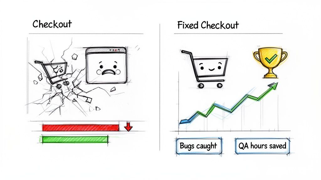
Real-World Success Stories and Key Metrics to Track
The real value of visual regression testing isn't just in the code; it’s in the moments it saves you from disaster. When you move past the theory, you see how these automated checks have a direct, measurable impact on brand reputation and revenue by catching UI bugs before a single user sees them.
Think about a classic e-commerce nightmare. Your team is gearing up for a huge Black Friday sale. A developer pushes a seemingly harmless CSS update to the site’s footer—something totally unrelated to the checkout flow. Except, it isn't. That tiny change accidentally knocks the "Complete Purchase" button behind another element, but only on mobile.
Without visual testing, you wouldn't find this bug until panicked customers start hammering your support lines. By then, it's too late. You’re losing thousands in revenue every minute. With visual testing, an automated check flags the discrepancy immediately, the fix is pushed in minutes, and the sale goes off without a hitch. That’s the difference we’re talking about.
From Anecdotes to Actionable Data
While war stories are powerful, you need hard numbers to make a business case. Tracking the right metrics proves the ROI and helps you tune your quality process. After all, you can't improve what you don't measure.
The goal is to show exactly how visual testing impacts your team's efficiency and your product’s stability.
By focusing on specific metrics, you can clearly demonstrate how visual regression testing reduces risk, saves time, and directly protects the user experience. This data provides the concrete evidence needed to justify the investment in tools and team training.
Here are the essential metrics to start tracking:
- Number of Visual Bugs Caught Per Release: This is your most direct proof of impact. It’s a running tally of every UI issue the automated system caught that would have otherwise made it to production.
- Reduction in Manual QA Hours: Figure out how much time your team used to spend manually checking layouts, fonts, and colors. Compare that to the time they now spend reviewing automated test results. The difference is pure time and money saved.
- Decrease in Customer-Reported UI Issues: This is the ultimate win. A sharp drop in support tickets about broken layouts or weird visual glitches is a clear sign your strategy is paying off.
Key Performance Indicators for Visual Quality
Once you have the basics down, you can dig deeper with more specific KPIs to get a better read on your UI's health.
- Mean Time to Resolution (MTTR) for UI Bugs: Automated tests don’t just find bugs; they provide visual diffs that show developers exactly what broke. This slashes debugging time. If this number is going down, your team is getting faster at fixing things.
- Test Flakiness Rate: Sometimes tests fail because of a hiccup in the test environment, not a real bug. Tracking this "flakiness" helps you build a more stable and trustworthy test suite. A low rate is what you're aiming for.
- Baseline Update Frequency: This metric simply tracks how often you’re intentionally accepting UI changes as the new "correct" version. It helps you distinguish between actual development progress and bug-fixing cycles.
For marketing teams and companies where the user experience is everything, these numbers are non-negotiable. Studies show that 62% of users will ditch a site after a single bad visual experience. In industries like retail or healthcare, where a perfect UI drives sales and ensures compliance, automated testing can slash manual QA effort by up to 80%. You can learn more about the market growth of automated visual testing and see how it's becoming a standard practice.
Your Top Visual Regression Testing Questions, Answered
Jumping into any new testing strategy brings up a lot of questions. For visual regression testing, the big ones usually revolve around handling the messy, real-world stuff—like dynamic content and planned UI updates. Let's tackle these head-on.
These are the practical challenges that developers, QA engineers, and product managers run into every day. Getting these answers right will help you bring this powerful quality check into your workflow with confidence.
How Does Visual Testing Handle Dynamic Content?
This is probably the number one concern, and modern tools are built specifically to solve it. They let you "mask" or simply ignore specific areas of the screen. Think ad banners, user profile names, or animated GIFs—anywhere content is expected to change. You just tell the tool to look the other way for that spot.
Even better, some of the smarter tools use a bit of AI to tell the difference between a minor content swap and a major layout break. This intelligence means you only get flagged for genuine visual bugs, not for content doing what it's supposed to do.
Is This Too Slow or Expensive for a Startup?
Nope, not at all. In fact, the return on investment can be almost immediate. You’ll save a ton of time on manual QA and catch embarrassing bugs before they ever see the light of day. Startups can get going with some fantastic free and open-source tools to build a solid foundation without spending a dime.
As you scale, the time you save by automating this process will more than pay for any tool upgrades. A startup’s user experience is its most valuable asset, and visual testing is a surprisingly affordable way to protect it.
What's the Difference Between Pixel and Perceptual Diffing?
Understanding this is key to avoiding a lot of noise and focusing on what actually matters.
- Pixel-to-Pixel Diffing: This is the old-school, rigid approach. It’s a machine-vision method that flags any pixel that's different, even tiny shifts from anti-aliasing that a human would never notice. It tends to create a lot of false positives.
- Perceptual Diffing: This is the much smarter way. It’s designed to mimic human vision, so it only flags changes a user would genuinely see. This dramatically cuts down on false alarms and lets your team focus on real issues.
For pretty much any modern web application, perceptual diffing is the way to go.
How Do We Manage Intentional UI Updates?
This is a standard part of the workflow, and it's quite simple. When you push an intentional UI change, the visual test will fail—which is exactly what you want it to do. The tool will then show you the "before" and "after" side-by-side.
If the change looks right, a developer or QA engineer just hits "approve." That one click updates the baseline image, making the new design the official "golden record" for all future tests. Most tools have a clean, simple UI for reviewing and approving these updates, making it a quick and painless step in your code review process.