Website design for startups: Build a high-converting, investor-ready site
For a startup, a great website is more than just a digital brochure—it’s the bedrock of your entire business. This is your number one tool for grabbing new customers, winning over investors, and building a brand that people trust. It’s where your marketing, sales, and product all come together in one cohesive experience.
Why Your Website Is a Strategic Asset, Not Just an Expense
It’s easy for founders to see their website as just another line item on a budget, a box to tick off. But that’s a huge mistake.
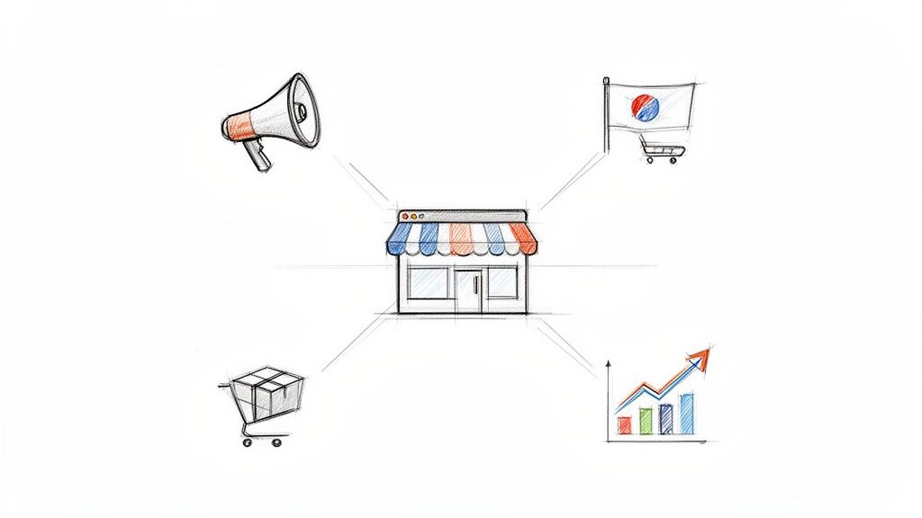
Think of your website as your hardest-working employee. It’s on the clock 24/7, acting as your top salesperson, your brand evangelist, and your first line of customer support, all rolled into one. It’s the digital version of your flagship store on Main Street.
If that storefront is messy or confusing, you’re turning away potential customers before they even get a chance to see what you offer. On the flip side, a sharp, intuitive site builds instant trust—and that’s everything when you’re trying to win over early adopters and investors who are watching your every move.
The Digital Nervous System of Your Startup
Smart website design for startups is about much more than just looking good. Your site is the central hub that connects every part of your operation. It’s where your marketing campaigns lead, where your product demos live, and where your sales funnels are built. Done right, it becomes a powerful engine for growth.
Just think about how a well-built website directly fuels your key startup goals:
- User Acquisition: It's the landing pad for every single marketing initiative, whether it's a paid ad or a blog post.
- Investor Confidence: A polished, professional website sends a clear signal: "We're serious, and we know what we're doing."
- Brand Identity: This is your stage. It’s where you tell your story, explain your value, and build a real connection with your audience.
The numbers back this up. The global web design market was valued at $58.5 billion in 2022 and is expected to rocket past $100 billion by 2031. With nearly 72% of small businesses already having an online presence, a quality site isn’t a bonus anymore—it’s the price of entry.
A startup's website is its ultimate pitch deck. It must clearly answer three questions in seconds: What do you do? Who is it for? And why should I care? If it fails, everything else—from marketing spend to sales outreach—becomes exponentially harder.
At the end of the day, your website is a crucial piece of your digital marketing strategy for startups, working tirelessly to turn curious visitors into loyal fans.
Defining Your Strategy Before You Design Anything
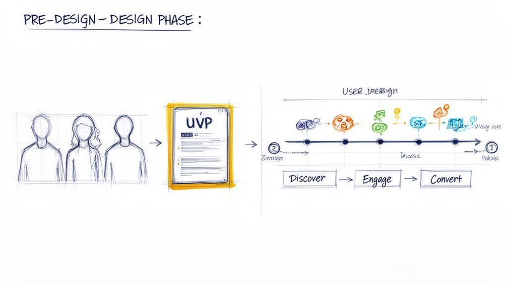
It’s incredibly tempting to jump right into the fun stuff—picking out colors, playing with fonts, and sketching layouts. But that’s like trying to build a house without a blueprint. You'll end up with a lot of expensive rework and a site that doesn't actually help your business grow.
Before you even think about pixels, you need a rock-solid strategy. This pre-design phase is where you make sure every single element on your website has a purpose. It's the foundation that holds everything else up.
Know Who You Are Building For
You can't build a website for "everyone." The very first step is getting laser-focused on who, exactly, you’re trying to connect with. This is where user personas become your best friend.
A user persona is a simple, semi-fictional snapshot of your ideal customer. It goes way beyond basic demographics. You're trying to get inside their head to understand their goals, their frustrations, and what really makes them tick.
- Pain Points: What's the nagging problem they're desperate to solve—the one your startup was built for?
- Goals: What does a "win" look like for them? What are they trying to achieve with a product like yours?
- Behaviors: How do they use technology? Where do they hang out online? Are they scrolling on a phone or sitting at a desk?
You don't need a dozen of these. Just 1-3 well-defined personas will give you incredible clarity. Suddenly, every decision—from the tone of your headlines to the features you spotlight—has a clear "why" behind it, because you're designing for a real person, not just a vague concept.
Nail Your Unique Value Proposition
Okay, you know who you’re talking to. Now, you need to tell them why they should care—and why they should choose you over anyone else. This is your Unique Value Proposition (UVP), and it's a non-negotiable. It’s a short, punchy statement that screams the main benefit you deliver.
Your UVP needs to immediately answer your visitor's subconscious question: "What's in it for me?" It has to be front and center, probably the first thing they read on your homepage.
A strong UVP isn’t a fluffy slogan or a corporate mission statement. It’s a clear promise of a result. It should be specific, focus on the user's pain, and differentiate you from the pack in under five seconds.
Think of it as your entire sales pitch boiled down to one powerful sentence. For example, instead of a generic "We sell accounting software," a killer UVP might be: "The ridiculously simple accounting software for freelancers that saves you 10 hours a month." See the difference?
Map the Critical User Journey
Once you've got your audience and your message dialed in, it's time to map out the path you want people to take. The user journey is just that: an outline of the key steps a visitor takes from the moment they land on your site to the moment they convert.
For most startups, a basic user journey looks something like this:
- Discovery: The user lands on your homepage or a dedicated landing page. First impressions matter.
- Education: They start digging deeper. They check out your features, look at the pricing, or read your 'About' page to see if you're legit.
- Conversion: This is the moment of truth. They take the action you want them to take, whether that’s signing up for a free trial or booking a demo.
Mapping this flow helps you spot potential roadblocks and ensures your calls-to-action (CTAs) are leading people logically to the next step. It's what turns your website from a simple digital brochure into an engine for growth.
4. UX and UI Principles That Turn Visitors Into Advocates
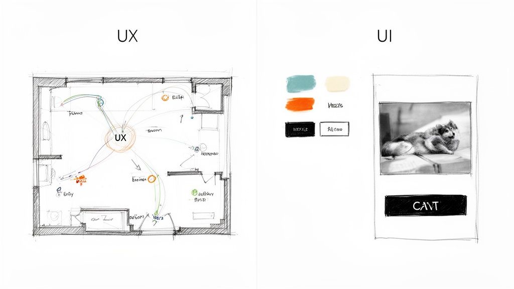
Okay, you've got your strategy nailed down. Now comes the fun part: turning that blueprint into a real, living experience that guides people from "just browsing" to becoming die-hard fans. This is where User Experience (UX) and User Interface (UI) design step in. They're often mentioned in the same breath, but they play very different roles.
Let's stick with a simple analogy: building a house.
UX is the architectural plan. It’s the logic behind the layout—the flow from the kitchen to the living room, the number of bedrooms, and the overall structure that makes the house functional and easy to live in. UI is the interior design. It’s the paint on the walls, the style of the furniture, and the fixtures that make the house feel like a home.
You absolutely need both. A brilliant floor plan with terrible decor is uninviting. On the flip side, a beautifully decorated house with a maze-like layout is just plain frustrating. The best startup websites get both right, creating an experience that’s not just intuitive, but genuinely enjoyable.
Creating Intuitive and Effortless Navigation
Think of your website's navigation as its central nervous system. If visitors can't find what they're looking for almost instantly, they’re not going to stick around to solve the puzzle. They'll just leave. The goal is to make getting around your site feel so natural they don't even have to think about it.
Here’s how to get there:
- Keep It Simple: Don't get clever with your main menu. Stick to the essentials—most people are looking for familiar terms like "Product," "Pricing," or "About Us." Overly creative labels just cause confusion.
- Be Consistent: Your navigation bar should be in the exact same spot on every single page. This builds a mental map for your users, giving them a sense of confidence and control as they explore.
- Prioritize Mobile: On a phone, your navigation will likely be tucked into a "hamburger" menu (those three little lines). Make sure it’s easy to tap and that the most important links are right at the top.
A clean navigation structure doesn't just help your users; it also gives search engines a clear map of your site, which is a nice little boost for your SEO.
Good design is invisible. It’s when you visit a website and find exactly what you need without a second thought. That’s the feeling great UX creates—an experience so smooth it feels like the site is reading your mind.
When a site is easy to use, it immediately signals that you're professional and, more importantly, that you respect your visitor's time. That’s the first step to building real trust.
Designing Calls-to-Action That Actually Convert
Every single page on your website should have a job to do. Usually, that job is accomplished with a Call-to-Action (CTA)—a button or link that asks the user to do something specific, like "Start Free Trial" or "Schedule a Demo."
But a great CTA isn't just a brightly colored button. It's the logical conclusion to a compelling argument you've just made on the page. To craft CTAs that really work, you need to think about both the visual design and the user's motivation.
Key CTA Principles
- Use Action-Oriented Language: Kick things off with a strong verb. Instead of a passive word like "Submit," try something more exciting and benefit-driven, like "Get Your Free Ebook." The language should tell people exactly what they're getting.
- Create Visual Contrast: Your CTA button needs to pop. Use a color that stands out against the background of the page, making it impossible to miss.
- Place Them Logically: Put your CTAs right where a user’s journey would naturally lead them. For example, after a section explaining the key benefits of your product, a "Sign Up Now" button feels like the perfect next step.
To really get this right, you'll need to master a few essential UX design techniques. Ultimately, these principles go way beyond aesthetics; they are the bedrock of a high-performing website. For more specific strategies, our guide on how to increase website conversions offers even more actionable advice.
Building Your Site for Speed and Mobile Users
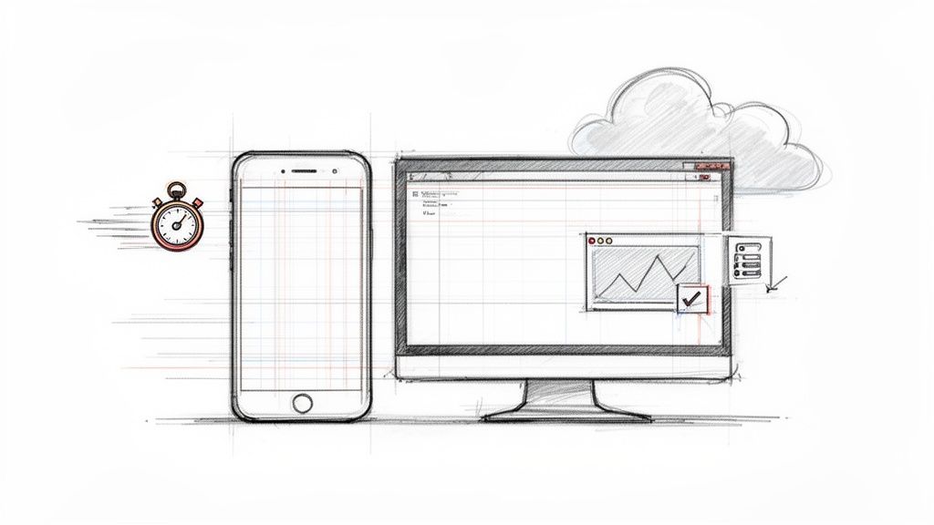
Let's try a quick thought experiment. Imagine you've built the perfect restaurant. The food is to die for, the vibe is just right, and your team is amazing. But there's a catch: it takes thirty minutes for a server to even bring you a menu. How long are you sticking around before you walk out?
Your website operates on the exact same principle. In a world of fleeting attention spans, a slow website is an absolute deal-breaker. It doesn't matter how brilliant your product is or how stunning your design is—if your page doesn't load almost instantly, your visitors will leave. And they probably won't be back.
For a startup, this isn't some minor hiccup; it's a direct threat to your survival. Performance isn’t a nice-to-have feature; it's a core part of great website design for startups. Every single millisecond counts.
The Mobile-First Imperative
Gone are the days of designing a beautiful desktop site and then trying to cram it onto a phone screen as an afterthought. Today, the overwhelming majority of your traffic—from potential customers to curious investors—will find you on a mobile device. This means you have to think mobile-first.
This isn’t just a trend; it's a fundamental shift in how people behave online. A mobile-first mindset means you design the experience for the smallest screen first, then scale it up for tablets and desktops. This approach forces you to be disciplined and prioritize what's truly essential, making sure your core message and key calls-to-action are front and center on any device.
A slow mobile website is the digital equivalent of a locked door. Users who have a bad mobile experience are 62% less likely to purchase from that brand in the future. For a startup, that’s a massive, self-inflicted wound to your growth potential.
The data here is crystal clear. Fifty-three percent of users will abandon a mobile site if it takes longer than 3 seconds to load. Every second of delay can slash your conversions by around 7%. On the flip side, embracing a mobile-first design can lead to 20% higher engagement. With over 70% of e-commerce sales expected to happen on mobile by 2026, you simply can't afford to get this wrong.
Key Ingredients for a Lightning-Fast Site
So, how do you actually make your site fast? You don't need to be a developer, but understanding the fundamentals will help you have productive conversations with your team. Think of these as the essential ingredients for a speedy digital experience.
Here are the non-negotiables to discuss with your developers:
- Image Optimization: Huge, uncompressed images are the number one killer of website speed. Make sure every visual is compressed and served in modern formats like WebP, which can slash file sizes without wrecking the quality.
- Browser Caching: This clever trick lets a user's browser "remember" parts of your site, like your logo and navigation. When they click to another page, those elements load instantly because they're already stored locally.
- Clean and Minified Code: Your site's code (HTML, CSS, JavaScript) can get cluttered with extra spaces and comments that machines don't need. "Minifying" the code strips all that out, making the files smaller and faster to download.
- Quality Hosting: Your web host is the engine powering your site. A cheap, shared hosting plan might save you a few bucks upfront, but it’s a recipe for slow load times. Investing in reliable hosting from the start is a must.
Building a fast website isn't a one-and-done task; it's an ongoing process of measuring and tweaking. For a deeper look at the practical steps involved, check out this guide on how to improve website speed. By making speed and mobile usability a priority from day one, you give your big idea the seamless platform it deserves.
Choosing the Right Tech Stack and Build Approach
Okay, you've got your strategy nailed down and a solid design direction. Now comes the big question: how are we actually going to build this thing? This isn't just a technical detail; it’s a foundational decision that will shape your launch speed, your budget, and how easily you can grow down the road.
Think of it like picking the right engine for a car. A small, efficient four-cylinder is perfect for a daily commuter—it’s cheap, reliable, and gets the job done. But if you’re building a race car, you're going to need a custom-built V8. There's no single "best" engine, only the one that's right for the job at hand. Your tech stack is the engine of your website.
Understanding Your Core Build Options
For most startups, this choice boils down to three main routes. Each one represents a different trade-off between speed, cost, and creative freedom. Getting a handle on these will help you avoid getting locked into a system that can't keep up with your vision.
Let's break them down:
- No-Code/Low-Code Website Builders: These are platforms like Webflow, Wix, or Squarespace. They let you build gorgeous, professional websites visually, often without writing a single line of code. It's the fastest way to get a great-looking site live.
- Content Management Systems (CMS): This is the classic middle ground, with WordPress being the undisputed king. A CMS offers far more power and flexibility than a simple builder, using themes and plugins to get you started quickly while leaving room for custom work.
- Custom Development: This means building from the ground up with code, using modern frameworks like React, Vue.js, or Angular. It gives you complete control and limitless possibilities, but it demands a serious investment of time, money, and expertise.
Wading through these options can feel like a chore. That's why understanding the ins and outs of choosing a Content Management System is so crucial. It forces you to think clearly about what you need now versus what you'll need later, ensuring your tech is a tailwind, not an anchor.
A Framework for Making the Right Choice
So, how do you actually decide? The best way is to map each option against your startup's biggest constraints: your budget, your timeline, and your ambition for scale.
Here’s a simple table to help you visualize the trade-offs.
Comparing Website Build Options for Startups
| Build Option | Typical Cost | Time to Launch | Scalability | Best For |
|---|---|---|---|---|
| Website Builders | Low ($) | Fastest (Days/Weeks) | Moderate | MVP sites, landing pages, and early-stage startups focused on pure speed and validation. |
| CMS (WordPress) | Moderate ($$) | Medium (Weeks/Months) | High | Startups needing strong content marketing, blogs, and a smart balance of speed and customization. |
| Custom Development | High ($$$) | Slowest (Months+) | Unlimited | Tech-heavy startups with unique features, complex third-party integrations, or proprietary platforms. |
Seeing it laid out like this really clarifies things. Your decision becomes less about the technology itself and more about your business strategy.
The goal for an early-stage startup isn’t to build the perfect website for the next ten years. It's to build the right website for the next twelve months—one that lets you test, learn, and iterate as quickly as possible without over-investing in technology you might not need.
For instance, a pre-seed startup that just needs to validate a service idea could get a beautiful, effective site up on Webflow in less than two weeks. On the flip side, a fintech company building a secure user dashboard will need a custom-coded solution from day one. Your choice should be a direct reflection of your business model and your most immediate goals.
Budgeting Realistically for Your Startup Website
For any founder, time and money are the only two resources you can’t get more of. When it comes to your website, a smart financial plan isn't just about pinching pennies—it's about putting your capital where it will actually make you money. A solid budget keeps you from delaying your launch and ensures you don't skimp on what is arguably your most important business asset.
Think of your website budget like fuel for a rocket. You need enough to get into orbit (your MVP launch) but you have to hold some in reserve for the rest of the journey (scaling, new features, and upkeep). A realistic budget plans for the big upfront build and the smaller, ongoing costs that keep the lights on.
Breaking Down the Initial Investment
The upfront cost to get a startup website off the ground can swing wildly depending on how you build it. You could spin up a simple DIY site on a platform like Squarespace or Wix for a few hundred bucks, or you could hire a top-tier agency to build a custom site for tens of thousands. There's no single right answer; it all comes down to your startup's stage and what you need the site to accomplish right now.
For founders who decide to bring in the pros, the average cost for a solid, professionally built website typically lands between $2,000 and $9,000. That ballpark figure usually covers everything from the initial design and development to getting your first batch of content loaded. Knowing this benchmark helps you have more productive conversations with freelancers and agencies. You can dig into these typical website costs and other stats to get a better feel for the landscape.
The most common mistake I see founders make is underestimating the true cost of "free." A free template or a dirt-cheap theme often turns into a money pit of expensive fixes, security headaches, and hours of your own time spent wrestling with it—time you should be spending talking to customers.
Planning for Ongoing Operational Costs
Getting your website live is just the starting line. A huge blind spot for many first-time founders is forgetting to budget for all the recurring expenses that keep the site running, secure, and effective. These aren't just nice-to-haves; they are the basic costs of doing business online.
Your ongoing budget needs to account for a few key line items:
- Hosting and Domain: This is essentially the rent for your website's home on the internet and its address. Expect to pay anywhere from $100 to $500+ a year, depending on your traffic and the quality of your hosting provider.
- Premium Plugins and Software: Most powerful websites rely on paid plugins for things like e-commerce, advanced contact forms, or serious SEO tools. These usually require an annual subscription to keep them updated.
- Maintenance and Security: Regular software updates, security scans, and daily backups are absolutely non-negotiable. If you have a professional manage this, annual maintenance fees average around $1,200. It's a small price to pay to protect your investment.
- Content and SEO: If you're serious about content marketing (and you should be), you’ll need to budget for writers or powerful tools like Ahrefs or Semrush to help you actually get seen on Google.
By planning for both the initial build and these recurring costs from day one, you create a sustainable financial model for your website. It becomes an asset that fuels your growth, not a drain that holds you back.
Common Questions About Website Design for Startups
If you're building a startup, you've probably got a dozen questions swirling around about your website. That's a good thing. Asking the right questions now can save you a ton of headaches, time, and—most importantly—cash down the road.
Let's cut through the noise and tackle the big questions we hear from founders every single day.
Should I Use a Template or Get a Custom Design?
This is the classic debate, but the answer is usually pretty straightforward and depends entirely on what stage you're at.
For most startups just getting off the ground (think pre-seed or seed stage), a high-quality template is your best friend. Why? Because your main goal isn't to have the prettiest site on the block; it's to validate your idea, fast. A template gets you live in days, not months, so you can start testing your value proposition with real users without burning through your runway. At this point, speed is everything.
But once you've found that sweet spot of product-market fit and you're ready to hit the gas (hello, Series A), a custom design becomes a game-changer. It’s your chance to build a truly unique brand experience, fine-tune user journeys based on your own data, and create complex features that nobody else has.
The Rule of Thumb: Start lean with a template to prove your concept. Only invest in a custom build when you have the traction and the resources to back it up.
What Are the Most Important Pages for a Launch?
It’s easy to get carried away and try to build a 50-page monstrosity. Don't. Your first website should be lean, mean, and focused on a single, critical job: turning curious visitors into early believers.
To pull that off, you only need a handful of essential pages:
- Homepage: This is your elevator pitch. It needs to answer "What is this?" and "Who is it for?" in the first five seconds. Clarity is king.
- Product/Service Page: Dive a little deeper here. Forget listing features and focus on the benefits. How does your product solve a painful problem for your customer?
- Pricing Page: Don't be shy. Be upfront and crystal clear about your pricing. Any confusion here is a guaranteed way to lose a potential customer.
- About Us Page: People connect with people. Tell your story, show the faces behind the brand, and build a little trust.
- Contact Page: Make it dead simple for anyone—customers, partners, investors—to reach out.
How Do I Measure the Success of My New Site?
Launching the site is just the beginning. The real work is figuring out if it's actually working. Success isn't about traffic; it's about action. You need to be tracking the metrics that directly impact your business goals from the moment you go live.
Keep your eyes glued to these Key Performance Indicators (KPIs):
- Conversion Rate: This is your north star. It’s the percentage of visitors who do the one thing you want them to do (sign up, request a demo, buy something). Everything else is secondary.
- Bounce Rate: Are people landing on your site and immediately leaving? A high bounce rate often means there’s a major disconnect between what you promised in your ad or social post and what your landing page delivers.
- User Flow Analysis: Fire up a tool like Google Analytics and see how people actually move through your site. Where are they getting stuck? Where do they drop off? This is your treasure map for finding and fixing conversion bottlenecks.