10 Best Practices for Mobile App Design to Master in 2025

In the crowded digital marketplace, a functional mobile app is no longer enough to capture and retain user attention. The apps that truly succeed and become indispensable are those that feel intuitive, responsive, and seamlessly integrated into a user’s daily life, almost like an extension of their own intent. Achieving this level of excellence isn't a matter of chance; it's a discipline built on proven, foundational principles. Great design anticipates needs, reduces friction, and creates a sense of effortless control for the user.
This guide moves beyond generic advice to provide a detailed blueprint of the essential best practices for mobile app design. We will dissect ten critical areas, from performance optimization and intuitive navigation to creating accessible and personalized experiences. Each section offers actionable strategies, practical implementation details, and real-world examples to help you craft an application that not only looks polished but also drives meaningful engagement and fosters long-term user loyalty.
Whether you're a product manager refining a roadmap, a CTO building a development team, or a designer aiming to elevate your craft, mastering these fundamentals is non-negotiable. This list is your comprehensive resource for building an app that not only meets but exceeds modern user expectations. Let's explore the core components that transform a good app into a truly remarkable mobile experience.
1. Mobile-First Design
Mobile-first design is a strategic approach that flips the traditional design process on its head. Instead of designing for a large desktop screen and then trying to shrink it down for smaller devices, you start with the most constrained environment first: the mobile screen. This methodology, popularized by pioneers like Luke Wroblewski, forces you to prioritize core content and functionality from the outset, ensuring a focused and clutter-free user experience.

The primary benefit is that it inherently addresses the challenges of smaller screens, touch-based interactions, and variable network conditions. By solving for mobile first, you create a solid foundation that can be progressively enhanced for tablets and desktops, adding more features and complex layouts as screen real estate increases. This approach is fundamental to creating a seamless and high-performing application, making it one of the most crucial best practices for mobile app design.
How to Implement Mobile-First Design
Adopting a mobile-first mindset involves practical, specific steps. It requires a shift from "graceful degradation" (starting big and removing features) to "progressive enhancement" (starting small and adding features).
- Prioritize Ruthlessly: Begin by identifying the single most important action a user needs to accomplish on each screen. Build the initial design around this core function.
- Design for Touch: Ensure all interactive elements, like buttons and links, have a touch target of at least 48x48 pixels. This accommodates the imprecision of fingertips and improves usability.
- Embrace Content-First Wireframing: Start with low-resolution wireframes that focus purely on content hierarchy and user flow without the distraction of visual elements.
- Test on Real Devices: Simulators are useful, but nothing replaces testing on actual mobile devices to understand how the app feels and performs in a real-world context.
This strategy is especially vital when developing a new product or when analytics show a high percentage of mobile users. For a deeper dive into the considerations when transitioning from website to mobile app, including crucial design implications, you might find this article useful. The principles of mobile-first design ensure that your core user experience is optimized for the platform where users are most likely to engage.
2. Intuitive Navigation
Intuitive navigation is the invisible hand guiding users through an application, allowing them to find information and complete tasks with minimal effort. It relies on creating a clear information architecture and using familiar patterns that reduce cognitive load. When users don't have to think about how to get from point A to point B, they can focus on the app's content and value, which is a cornerstone of effective mobile app design.
The primary benefit is a drastic reduction in user frustration and abandonment rates. A logical, predictable navigation system, championed by usability experts like Steve Krug, ensures that users feel in control and can accomplish their goals efficiently. For example, Instagram’s bottom tab bar provides instant access to its core features, while Uber’s simple menu structure makes booking a ride feel effortless. Implementing these best practices for mobile app design is non-negotiable for creating a positive user experience.
How to Implement Intuitive Navigation
Building a seamless navigation system requires a strategic approach that prioritizes clarity, consistency, and accessibility. It's about making the user's journey feel natural and predictable from the moment they open the app.
- Prioritize Thumb Accessibility: Place primary navigation elements, such as a tab bar, at the bottom of the screen. This makes them easy to reach with a thumb on most mobile devices.
- Limit Core Options: Restrict the main navigation menu to a maximum of five items. This prevents decision paralysis and keeps the interface clean and focused.
- Use Clear Icons and Labels: Combine recognizable icons with concise text labels. Icons alone can be ambiguous, so labels remove any guesswork for the user.
- Maintain Consistency: A user should always know where they are within your app. Keep navigation elements in the same location and functioning the same way across all screens.
- Implement Robust Search: For content-heavy apps, a prominent and effective search bar is a crucial navigation tool, allowing users to bypass multiple steps to find what they need.
This approach is vital for any app, but it is especially critical for applications with complex features or large amounts of content. By following established patterns from guidelines like Apple's Human Interface Guidelines, you can leverage user expectations to create a more intuitive and user-friendly experience from the start.
3. Performance Optimization
Performance optimization is the practice of ensuring a mobile app loads quickly, responds instantly to user input, and operates efficiently. It's about more than just speed; it’s about creating a seamless and frustration-free experience that respects the user's time and device resources. Slow, laggy applications lead to high abandonment rates, while fast and responsive ones build user trust and encourage continued engagement.
The core benefit of performance optimization is a dramatic improvement in user satisfaction and retention. Apps like Facebook Lite and Google Maps excel by delivering core functionality even on low-end devices or slow networks, demonstrating that performance is a feature, not an afterthought. This focus on efficiency is a cornerstone of modern mobile app design best practices, directly impacting an app's success and its ability to serve a broad audience.
How to Implement Performance Optimization
A high-performing app is the result of deliberate choices made throughout the development lifecycle. It requires a commitment to efficiency, from initial coding to asset management.
- Optimize All Media: Compress images using modern, efficient formats like WebP or HEIC. Similarly, ensure video files are optimized for mobile streaming to reduce load times and data consumption.
- Establish Performance Budgets: Set strict limits for key metrics like load time, app size, and memory usage. Use tools like Lighthouse to monitor these budgets and prevent performance regressions.
- Implement Lazy Loading: Load content and features only when they are needed. For example, in a long feed, only load images and data for the content currently visible on the screen.
- Leverage Caching and Offline Support: Use caching strategies and service workers to store data locally. This allows the app to load instantly on subsequent launches and provide core functionality even without an internet connection.
This approach is non-negotiable for any mobile application, but it is especially critical for apps targeting emerging markets or users with variable network conditions. To explore more advanced techniques, you can find helpful resources to improve app performance on getnerdify.com. By prioritizing performance, you ensure your app is accessible, reliable, and delightful to use for everyone.
4. Responsive Typography
Responsive typography is a design practice focused on ensuring text remains legible, aesthetically pleasing, and hierarchically consistent across a wide range of screen sizes and resolutions. Instead of using fixed font sizes, this approach employs scalable units and dynamic rules to adapt text elements to the user's device. This ensures that an article heading looks like a heading and body text is comfortable to read, whether on a small smartphone or a large tablet.
The core benefit is a universally accessible and comfortable reading experience. Good responsive typography, as championed by Apple's Human Interface Guidelines and Google's Material Design, prevents users from needing to pinch-and-zoom to read content, which significantly reduces friction. By making readability a priority, you create a more professional and user-friendly application, a key factor in mastering best practices for mobile app design.
How to Implement Responsive Typography
Implementing responsive typography goes beyond just choosing a font; it involves creating a systematic and flexible type scale that works everywhere. It’s about making text adapt gracefully to its container and context.
- Use Scalable Units: Avoid fixed pixel (
px) units for font sizes. Instead, use relative units likeremorem, which scale in relation to a base font size, or viewport units (vw,vh) for text that needs to scale directly with the screen dimensions. - Establish a Readable Base: Set a minimum base font size of at least 16px for body text on mobile devices. This is a widely accepted standard for comfortable reading.
- Maintain Proper Line Height: Aim for a line height between 1.4 and 1.6 times the font size for body paragraphs. This provides enough space between lines to prevent text from feeling cramped and improves readability.
- Prioritize Performance and Accessibility: Whenever possible, use system fonts (like San Francisco for iOS and Roboto for Android). They are optimized for performance and legibility on their native platforms and guarantee high contrast and accessibility compliance.
This approach is crucial for any content-heavy application, such as news apps like The Guardian or blogging platforms like Medium, where reading is the primary user activity. To explore how typography integrates into a broader design system, reviewing Google's Material Design typography guidelines provides a comprehensive framework. Responsive typography ensures your message is not just seen but is also clearly and comfortably understood on any device.
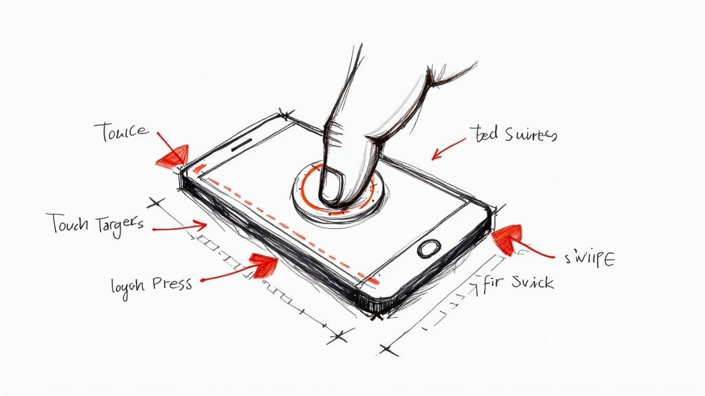
5. Touch-Friendly Interface Design
Touch-friendly interface design is the practice of creating app layouts that are optimized for the physical reality of human fingers. It goes beyond aesthetics to focus on ergonomics, ensuring that every tap, swipe, and pinch is accurate, comfortable, and intuitive. This approach, heavily influenced by guidelines from Apple and Google's Material Design, acknowledges that fingers are much less precise than a mouse cursor and require larger targets and more generous spacing to prevent user frustration.
The core benefit of this practice is a significant reduction in interaction errors, which directly enhances usability and user satisfaction. When users can confidently navigate an app without accidentally tapping the wrong button, their experience feels seamless and efficient. Prioritizing touch-friendly elements is a cornerstone of effective mobile app design, as it addresses the primary way users interact with the device. It transforms the interface from a static screen into a responsive and forgiving physical environment.
How to Implement a Touch-Friendly Interface
Building a truly touch-friendly interface requires a deliberate focus on size, spacing, and feedback. It means designing for the physical world, not just the digital one.
- Enforce Minimum Touch Target Sizes: All interactive elements, including buttons, icons, and links, should have a touch target of at least 44x44 pixels (Apple) to 48x48 pixels (Google). This provides an adequate area for a fingertip to land accurately.
- Maintain Ample Spacing: Ensure there is a minimum of 8 pixels of space between tappable elements. This buffer zone prevents "fat finger" errors, where a user accidentally activates an adjacent control.
- Provide Clear Feedback: Every touch should trigger immediate visual or haptic feedback. This confirms to the user that the system has registered their input, making the interaction feel more tangible and responsive.
- Design for Common Gestures: Use standard, intuitive gestures like swipe, tap, and pinch-to-zoom. Avoid creating complex or non-standard gestures that require users to learn a new interaction language.
- Test with Real Fingers: Do not rely solely on a mouse cursor during testing. Use actual devices and your own fingers to navigate the app to get a true sense of the interface's comfort and accuracy.
This strategy is non-negotiable for any mobile application, as it forms the foundation of user interaction. When designing an app, every screen must be evaluated through the lens of touch ergonomics to create a functional and pleasant experience. For more on creating intuitive user journeys, understanding the user experience design process is essential. These principles ensure that your app is not just usable but genuinely enjoyable to interact with.
6. Effective Use of Whitespace
Effective whitespace, or negative space, is the intentional use of empty areas around elements in a design. It's not just "blank" space; it's an active component that brings balance, clarity, and sophistication to a user interface. In the constrained environment of a mobile screen, strategic whitespace is critical. It prevents cognitive overload by creating visual breathing room, which helps guide the user's focus to essential content and interactive elements.
The primary benefit is improved legibility and comprehension. Whitespace separates distinct blocks of content, defines relationships between elements, and establishes a clear visual hierarchy. Think of Apple's iOS or the Calm meditation app; their generous use of space feels deliberate, making the interface seem organized, uncluttered, and premium. This approach is a cornerstone of the best practices for mobile app design because it directly impacts user comfort and task efficiency.
How to Implement Effective Whitespace
Mastering whitespace goes beyond simply leaving empty areas; it involves a disciplined and consistent approach to spacing and layout. It’s about creating a visual rhythm that makes the design feel intuitive and easy to navigate.
- Adopt a Grid System: Use a consistent spacing system, like the popular 8-pixel grid. This ensures all margins, padding, and distances between elements are uniform and predictable, creating a harmonious layout.
- Prioritize Padding: Ensure all screen edges have a minimum padding of 16-24 pixels. This prevents content from feeling cramped and provides a comfortable margin for users to interact with edge-to-edge displays.
- Group and Separate Content: Use whitespace to visually group related items, like a form field and its label. Use larger amounts of whitespace to separate unrelated sections, signaling a shift in context to the user without needing lines or borders.
- Balance Density and Breathing Room: While whitespace is crucial, avoid excessive emptiness that forces users to scroll unnecessarily. Test different layouts on actual devices to find the optimal balance between content density and visual clarity.
This technique is especially vital for content-heavy applications, such as news readers like Medium, or for apps aiming for a minimalist, high-end aesthetic, like Dropbox. By using whitespace to emphasize key calls-to-action, you can significantly boost usability and create a more polished and professional user experience.
7. Accessibility and Inclusive Design
Accessibility and inclusive design is a practice centered on creating products that are usable by everyone, regardless of their abilities. This means designing and building mobile apps that people with disabilities, including visual, motor, auditory, speech, or cognitive impairments, can navigate and interact with effectively. Pioneered by organizations like the W3C Web Accessibility Initiative and championed by companies like Microsoft, this approach moves beyond compliance to create truly equitable user experiences.
The primary benefit is that it expands your app’s potential audience and enhances usability for all users, not just those with disabilities. For instance, high-contrast text is crucial for someone with low vision but also helps users in bright sunlight. By integrating accessibility from the start, you avoid costly retrofits, improve your brand's reputation, and ensure your product serves the widest possible audience. This commitment to inclusivity is a hallmark of modern, responsible app development and is a non-negotiable best practice for mobile app design.
How to Implement Accessibility and Inclusive Design
Adopting an inclusive mindset requires a deliberate and empathetic approach throughout the design and development lifecycle. It involves proactively considering diverse user needs rather than treating accessibility as an afterthought.
- Prioritize Visual Clarity: Maintain a minimum text contrast ratio of 4.5:1 to ensure readability. Provide high-contrast modes and allow users to adjust text size within the app settings.
- Support Assistive Technologies: Ensure compatibility with screen readers like VoiceOver (iOS) and TalkBack (Android). Use semantic elements and ARIA labels correctly so that non-visual users can understand the content and structure of each screen.
- Design for Multiple Interaction Methods: All functionality should be accessible via keyboard-only navigation for users with motor impairments. Ensure touch targets are at least 48x48 pixels to accommodate different levels of motor control.
- Provide Content Alternatives: All non-text content must have a text alternative. This includes adding alt text for images, providing closed captions and transcripts for videos, and describing what icons represent.
- Test with Real Users: Go beyond automated checkers and conduct usability testing with people who have disabilities. Their direct feedback is invaluable for identifying real-world barriers that tools might miss.
This approach is vital for any app, but especially for those serving a broad public audience, such as government, healthcare, or e-commerce platforms like Target's. To understand the foundational principles that apply to both web and mobile, you can explore this guide on how to make a website accessible on getnerdify.com. Implementing these principles ensures your app is not just functional, but genuinely welcoming to every user.
8. Consistent Visual Design System
A consistent visual design system is a comprehensive set of standards, reusable components, and guidelines that dictate the look and feel of an application. Pioneered by thought leaders like Brad Frost with his "Atomic Design" methodology, this approach ensures every element, from buttons and icons to color palettes and typography, is unified across the entire app. It functions as a single source of truth for both designers and developers, promoting cohesion and efficiency.
The core benefit of a design system is scalability and brand consistency. Instead of making isolated design decisions for each new screen, teams pull from a pre-defined library of components. This not only speeds up the development process but also creates a predictable and intuitive user experience. When users encounter familiar patterns and interactions, they can navigate the app more easily, which is a cornerstone of effective mobile app design.
How to Implement a Consistent Visual Design System
Building a design system is an investment that pays dividends in consistency and speed. It involves codifying design principles and creating a library of reusable assets that can be shared across teams.
- Establish Design Tokens: Start by defining your foundational visual elements as "tokens." These are variables for colors, fonts, spacing, and shadows. Documenting these ensures consistency at the most granular level.
- Build a Component Library: Create core UI components like buttons, input fields, cards, and navigation bars. Use a tool like Figma to build these as reusable assets that can be easily shared and updated.
- Create Living Documentation: Your design system should not be a static document. Create a centralized, accessible website or repository that documents guidelines, principles, and component usage.
- Ensure Cross-Team Collaboration: A design system is most effective when it is adopted by both design and development teams. Build the component library in code to mirror the design assets, creating a shared language.
This practice is essential for any app planning to scale or for organizations with multiple teams working on a single product. For those looking to deepen their understanding, these best practices for user interface design on getnerdify.com offer further insights into creating coherent and effective interfaces. Adopting a design system transforms your interface from a collection of screens into a cohesive and professional product.
9. User Feedback and Error Handling
Effective user feedback and error handling are cornerstones of a transparent and trustworthy mobile app. This practice involves communicating the app's current state, system status, and any errors clearly and constructively. Instead of leaving users in the dark when something goes wrong or a process is underway, this approach provides them with timely information, from success confirmations and loading states to meaningful error messages that guide them toward a solution.
This constant dialogue between the app and the user builds confidence and prevents frustration. When an app communicates effectively, users understand what is happening, why it's happening, and what they need to do next. For instance, Uber’s real-time trip status updates keep users informed, while Gmail’s "undo send" option provides a safety net for accidental actions. Implementing robust feedback mechanisms is a non-negotiable best practice for mobile app design, as it directly impacts usability and user retention.
How to Implement User Feedback and Error Handling
Creating a seamless feedback loop requires a thoughtful and user-centric approach. The goal is to make every interaction, whether successful or not, feel clear and manageable.
- Write Human-Friendly Error Messages: Avoid generic or technical jargon like "Error 404". Instead, use plain language to explain what went wrong and provide a clear, actionable solution. For example, "Oops, that email address is already in use. Try logging in instead."
- Provide Reassurance and Undo Options: For critical actions like deleting an item or making a payment, offer a confirmation step. Better yet, provide an "undo" option, which gives users the freedom to correct mistakes without fear.
- Show Progress for Long-Running Tasks: Don't leave users staring at a static screen. Use progress bars, spinners, or skeleton screens to indicate that the app is working on their request, which manages expectations and reduces perceived wait times.
- Use Contextually Appropriate Feedback: Leverage different feedback types based on the situation. Use subtle in-line validation for form fields, a temporary toast notification for a successful action, and a more prominent modal for a critical error that requires immediate attention.
This strategy is crucial at every touchpoint within an application. By anticipating user needs and potential points of confusion, you can design a more forgiving and intuitive experience. For more insights on creating user-centric communication, the Nielsen Norman Group's articles on error messages offer foundational principles that remain highly relevant. Applying these principles ensures your app feels supportive, not punishing.
10. Contextual and Personalized Experiences
Contextual and personalized experiences involve tailoring app content, features, and notifications to individual users based on their behavior, preferences, location, and past interactions. Instead of a one-size-fits-all approach, this strategy makes the app feel uniquely designed for each person. Giants like Netflix and Spotify pioneered this, using data to power recommendation engines that anticipate user needs, thereby boosting engagement and retention.
This practice moves beyond basic functionality to create a truly intelligent and responsive user experience. When an app understands and adapts to a user's context, it feels less like a tool and more like a helpful assistant. By delivering relevant content at the right moment, such as Google Maps suggesting nearby restaurants at lunchtime, you create meaningful interactions that build user loyalty. This level of customization is a hallmark of modern, high-performing applications and a critical best practice for mobile app design.
How to Implement Contextual and Personalized Experiences
Successfully implementing personalization requires a thoughtful approach to data collection, privacy, and algorithm design. The goal is to be helpful, not intrusive, by giving users control over their experience.
- Gather Data Responsibly: Collect user data explicitly through onboarding questions, in-app behavior tracking, and preference settings. Always be transparent about what data you collect and why.
- Provide User Control: Include clear settings that allow users to manage their personalization preferences or opt out entirely. This builds trust and complies with privacy regulations like GDPR and CCPA.
- Use Contextual Cues: Leverage device capabilities like location services, time of day, and user activity to provide timely and relevant information or features.
- Test and Iterate: Continuously test your personalization algorithms to ensure they are accurate and genuinely improving the user experience. Avoid creating filter bubbles by balancing personalization with opportunities for discovery.
This strategy is most effective for apps with large content libraries or diverse functionalities, where guiding users to relevant information is key. For more insights on how data-driven approaches shape modern applications, understanding the role of AI in app development can provide a deeper appreciation for the technology behind effective personalization. By making an app feel personal, you transform it from a generic utility into an indispensable part of a user's daily life.
Top 10 Mobile App Design Best Practices Comparison
| Item | Implementation Complexity 🔄 | Resource Requirements ⚡ | Expected Outcomes 📊 | Ideal Use Cases 💡 | Key Advantages ⭐ |
|---|---|---|---|---|---|
| Mobile-First Design | Medium — constrained-first workflow, responsive scaling 🔄 | Low–Medium — front‑end dev, device testing | 📊 Better mobile UX, faster loads, broad reach | 💡 Startups, content-first apps, mobile-primary audiences | ⭐ Ensures core functionality; ⚡ improved load times |
| Intuitive Navigation | Low–Medium — IA, prototyping, testing 🔄 | Low — UX research, usability testing | 📊 Higher task completion, lower abandonment | 💡 Feature-rich apps, frequent-task flows | ⭐ Reduces friction; ⚡ speeds task completion |
| Performance Optimization | High — profiling, front & back changes 🔄 | Medium–High — dev, infra, monitoring tools | 📊 Faster loads, lower data & battery use | 💡 High-traffic apps, offline/low-connectivity cases | ⭐ Superior responsiveness; ⚡ faster perceived performance |
| Responsive Typography | Low — scaling rules and testing 🔄 | Low — design tokens, QA across devices | 📊 Improved readability and accessibility | 💡 Content-heavy apps, news and articles | ⭐ Better legibility; ⚡ consistent reading experience |
| Touch-Friendly Interface Design | Medium — touch targets, gesture logic 🔄 | Low–Medium — device testing, UX work | 📊 Fewer input errors, higher accuracy | 💡 Native mobile apps, gesture-driven UIs | ⭐ Improved usability; ⚡ faster interactions |
| Effective Use of Whitespace | Low — spacing systems and layout tweaks 🔄 | Low — design iterations, QA | 📊 Cleaner UI, improved focus and scanability | 💡 Minimalist brands, content presentation | ⭐ Enhanced clarity; ⚡ easier content scanning |
| Accessibility and Inclusive Design | High — standards compliance, assistive support 🔄 | Medium–High — specialized testing, dev effort | 📊 Wider audience reach, legal compliance, better UX | 💡 Public services, enterprise, regulated industries | ⭐ Inclusive usability; ⚡ better SEO & reach |
| Consistent Visual Design System | Medium–High — system creation & governance 🔄 | Medium — designers, devs, tooling | 📊 Faster dev, consistent UI, reduced design debt | 💡 Scaling products, multi-team organizations | ⭐ Scalability & consistency; ⚡ faster prototyping |
| User Feedback and Error Handling | Low–Medium — messaging patterns, states 🔄 | Low — UX writing, small dev changes | 📊 Reduced frustration, clearer recovery paths | 💡 Transactional apps, workflows with errors | ⭐ Builds trust; ⚡ speeds error recovery |
| Contextual & Personalized Experiences | High — data infra, ML & rules 🔄 | High — data engineering, privacy, ML ops | 📊 Increased engagement, higher conversions | 💡 Streaming, e‑commerce, recommendation systems | ⭐ Greater relevance; ⚡ more efficient journeys |
From Principles to Practice: Building Your Next Great App
The journey through the best practices for mobile app design reveals a clear, unifying theme: user-centricity is non-negotiable. The principles we've explored are not isolated checkboxes to be ticked off a list. Instead, they are interconnected pillars that support a single, overarching goal: creating an experience that is intuitive, efficient, and genuinely valuable to your users. From the foundational structure of a mobile-first approach to the subtle nuance of a well-timed microinteraction, every decision you make contributes to the final user perception of your app.
A truly successful mobile app feels like an extension of the user's own intent. This is achieved when intuitive navigation guides them effortlessly, when performance optimization eliminates frustrating delays, and when a consistent visual design system builds trust and familiarity. Mastering these concepts moves you beyond the role of a developer or designer and into the role of an experience architect. You are not just building features; you are crafting the digital environment where your users will solve problems, find entertainment, and connect with others.
Key Takeaways for Immediate Impact
Reflecting on the comprehensive strategies discussed, several core ideas stand out as particularly crucial for modern app development. Prioritizing these can dramatically elevate your project:
- Performance is a Core Feature: Users have zero tolerance for slow, buggy applications. Treat performance optimization not as a final step, but as a continuous priority throughout the entire development lifecycle. A fast, responsive app is the foundation of a positive user experience.
- Accessibility is Not an Add-On: Inclusive design benefits everyone. By building for accessibility from the start, you not only comply with standards and expand your potential user base, but you also create a more robust and user-friendly product for all. Simple considerations like high-contrast typography and clear touch targets improve usability across the board.
- Consistency Breeds Confidence: A cohesive design system, covering everything from color palettes to button styles and error messages, eliminates confusion. This consistency makes your app predictable and easy to learn, which fosters user trust and encourages deeper engagement.
Your Actionable Next Steps
Turning these principles into practice requires a deliberate and structured approach. Don't let the scope of these best practices feel overwhelming. Instead, focus on integrating them into your workflow with these immediate next steps:
- Conduct a Heuristic Evaluation: Audit your current app (or your next project's wireframes) against the principles in this article. Where are the biggest gaps? Identify the top three areas for improvement, whether it's simplifying navigation, improving feedback mechanisms, or enhancing typography.
- Prioritize User Testing: You cannot be your own user. Implement a regular cadence of user testing, even if it's small-scale and informal. Fresh eyes will uncover usability issues you've become blind to and provide invaluable, unbiased feedback.
- Study the Masters: Analyze the apps you use and admire every day. Deconstruct their onboarding flows, study their navigation patterns, and observe how they handle errors. To see how these principles are successfully translated into real-world applications, explore the portfolios of professional design studios. View exemplary mobile app design projects to find inspiration and see how leading brands execute flawless user experiences.
Ultimately, adhering to the best practices for mobile app design is what separates fleeting digital novelties from indispensable tools that earn a permanent place on a user's home screen. It's a commitment to quality, empathy, and relentless improvement. By embracing this mindset, you position yourself to not only meet user expectations but to consistently exceed them, creating mobile experiences that are not just functional, but truly exceptional.