Mobile First Design Principles Explained

Mobile-first design is a pretty simple concept at its core: you design for the smallest screen first—the phone in your pocket—and then scale up to tablets and desktops. This forces you to get crystal clear on what's absolutely essential. Instead of trying to cram a massive desktop experience onto a tiny screen, you start with a clean, focused foundation and build from there.
The Essential Shift to Mobile First Design

Think of it like building a house. The old "desktop-first" way was like designing a huge, sprawling mansion and then trying to squeeze it down into a tiny cottage. You’d end up cutting out entire rooms and crucial features, leaving you with a cramped, awkward, and frustrating final product.
The mobile-first approach completely flips that script. You start by designing the perfect tiny house, where every single inch is planned for maximum function and usability. Once you’ve nailed that essential core, you can start thinking about adding a second story or a new wing for the mansion. This way, you know the foundation is rock-solid, no matter how big the final structure gets.
From Degradation to Enhancement
This change in thinking is best seen by comparing two design philosophies: graceful degradation and progressive enhancement. The old way, graceful degradation, started with a feature-packed desktop site and then tried to strip away elements to make it "work" on a phone. The result was often a clunky, broken, or just plain frustrating mobile experience.
In stark contrast, mobile-first design is built on the principle of progressive enhancement. You start with a fast, functional, and focused baseline experience for mobile users. As the screen real estate grows, you progressively add more features, richer content, and more complex interactions.
This isn't just some design trend; it's a direct response to how people actually use the internet. Mobile devices now drive the majority of web traffic, accounting for 57% of all internet traffic worldwide in 2023. That's a massive jump from just 10% back in 2010. You can explore the data on mobile usage trends on Lambdatest.com to see just how dramatic this shift has been.
By designing for the smallest screen first, you force yourself to prioritize. You make tough decisions about what truly matters, which ultimately benefits users on every device.
Comparing the Two Approaches
The difference between these two mindsets isn't just academic—it fundamentally changes the final product. One approach starts with complexity and subtracts, while the other starts with simplicity and adds.
Here’s a quick breakdown to make the distinction clear.
Mobile First vs Desktop First: A Comparison
| Aspect | Mobile First (Progressive Enhancement) | Desktop First (Graceful Degradation) |
|---|---|---|
| Starting Point | Designs for the smallest screen first. | Designs for the largest screen first. |
| Core Philosophy | Add features as screen size increases. | Remove features as screen size decreases. |
| User Focus | Prioritizes essential content and core tasks. | Prioritizes a feature-rich, complex experience. |
| Performance | Naturally faster and lighter on mobile devices. | Often slower and heavier on mobile devices. |
| Outcome | A lean, focused mobile UX that scales up. | A cluttered mobile UX that is a scaled-down version. |
Ultimately, choosing a mobile-first approach means you’re building for the modern majority, not a dwindling legacy audience. It helps you create a better, faster, and more accessible product right from the start.
Understanding the Core Principles of Mobile-First
To really nail a mobile-first experience, you have to move past the buzzwords and adopt a different way of thinking. It’s less about a rigid rulebook and more about a set of guiding ideas that demand clarity, focus, and efficiency from the get-go.
Think of these principles as the foundation for a design that just feels right to users, no matter what device they’re holding. By making these ideas second nature, you stop creating scaled-down desktop sites and start building powerful, purpose-built experiences that meet the user's most immediate needs first.
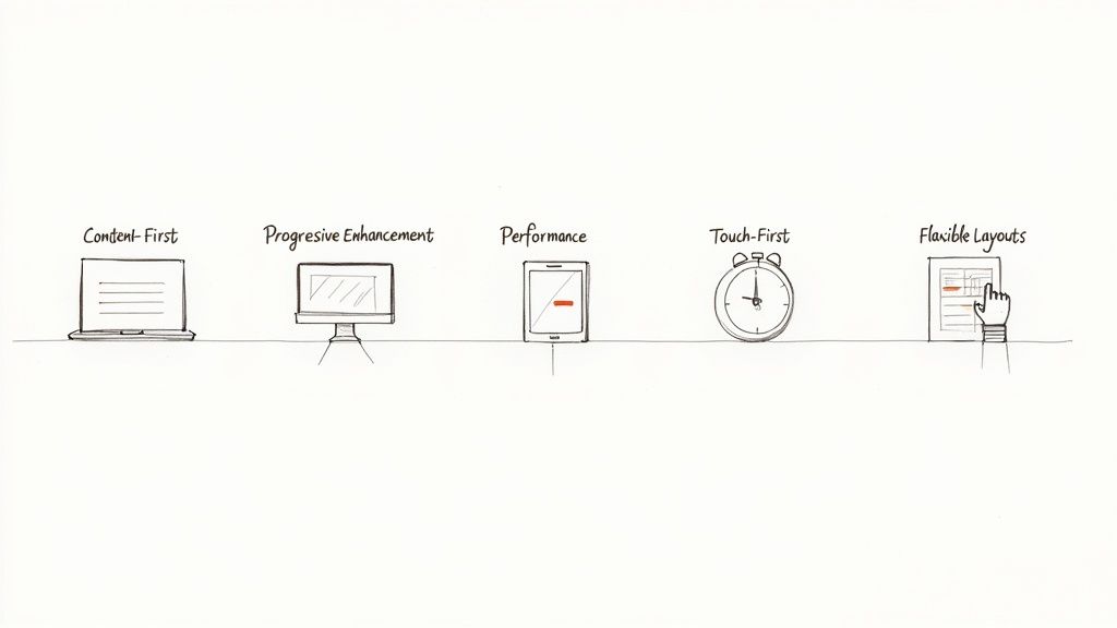
Let's break down the five foundational principles that make this all possible.
Start with Content First
This is the bedrock of mobile-first design: content is king. On a small screen, there's simply no room for fluff or decorative elements that don’t serve a purpose. This constraint is actually a blessing in disguise, as it forces you to figure out what information is absolutely essential for a user to achieve their goal.
It’s like packing for a week-long backpacking trip with only a small carry-on. You can't bring everything, so you have to choose the items critical for survival and success. That’s the kind of ruthless discipline you need with your content, stripping your message down to its most potent form.
The content-first mindset ensures the core value of your page is crystal clear on the smallest screens. Everything else is just a nice-to-have that can be introduced as more screen real estate becomes available.
Build with Progressive Enhancement
Progressive enhancement is how you put the mobile-first philosophy into action. Instead of building a feature-rich desktop site and then painfully stripping it down for mobile (a process called "graceful degradation"), you flip the script. You start by building a solid, functional baseline that works for every user on any device.
Once that core experience is rock-solid, you can begin layering on enhancements for users with more powerful browsers or larger screens. This might include high-resolution images, slick animations, or extra interface features that enrich the experience but aren't vital to its function. This way, you guarantee your site is accessible and useful to everyone, right from the start.
Prioritize Performance as a Feature
On mobile, speed isn't a luxury; it's a core feature. Mobile users are often on the move, dealing with spotty network connections. A slow-loading site is one of the fastest ways to lose a visitor. In fact, studies consistently show that even a one-second delay in page load time can cause a major drop in conversions.
A mobile-first workflow naturally leads to better performance because you’re forced to start light. You begin with optimized images, minimal code, and only the most essential scripts. This lean foundation guarantees a snappy experience for mobile users and creates a high-performance base that stays fast, even after you add enhancements for bigger screens.
Design for Touch-First Interactions
People use their thumbs and fingers on mobile devices, not a pixel-perfect mouse cursor. This fundamental difference demands a complete shift in how we design interactive elements. A key tenet of mobile-first is creating an interface that’s built for touch right from the beginning.
This means designing for the "thumb zone"—the parts of the screen a user can comfortably reach while holding their phone one-handed. To truly get this right, you have to make a website mobile-friendly by focusing on how real people hold and interact with their devices.
Keep these critical aspects of touch-first design in mind:
- Generous Target Sizes: Buttons and links need to be big enough to tap accurately without frustrating miss-clicks. A target size of at least 44x44 pixels is a great rule of thumb.
- Ample Spacing: Don’t cram tappable elements together. Leave enough breathing room between them to prevent users from accidentally hitting the wrong one.
- Intuitive Gestures: Feel free to use common mobile gestures like swiping and pinching, but never make them the only way to access crucial information or features.
Use Flexible and Fluid Layouts
Finally, a mobile-first design is built on flexible layouts that can adapt to countless screen sizes and orientations. This is where fluid grids and flexible images come into play. Instead of designing for a few specific device widths, you create a layout that can stretch or shrink gracefully to fit whatever space is available.
This ensures a consistent, seamless experience as the design scales up from a tiny smartphone to a huge desktop monitor. By using relative units like percentages instead of fixed pixels, you’re building a resilient and future-proof layout. This adaptability is the final piece of the puzzle, allowing your carefully curated content and touch-friendly interactions to shine on any screen.
Building a Mobile-First Design Workflow
Making the switch to a mobile-first mindset is about more than just a philosophical shift; it’s about putting a concrete, step-by-step workflow in place. This is where the rubber meets the road, turning abstract principles into a repeatable process that puts mobile users at the forefront from the very beginning. It's how you establish a clear sequence for your team to follow, ensuring everyone stays focused and efficient.
Adopting this workflow means flipping your traditional design and development process on its head. Instead of starting with a sprawling desktop canvas and trying to subtract elements, your team begins with the most restrictive screen. This forces creativity and some ruthless prioritization. In the end, this disciplined approach not only leads to a better product but also builds a more aligned, user-centric culture.
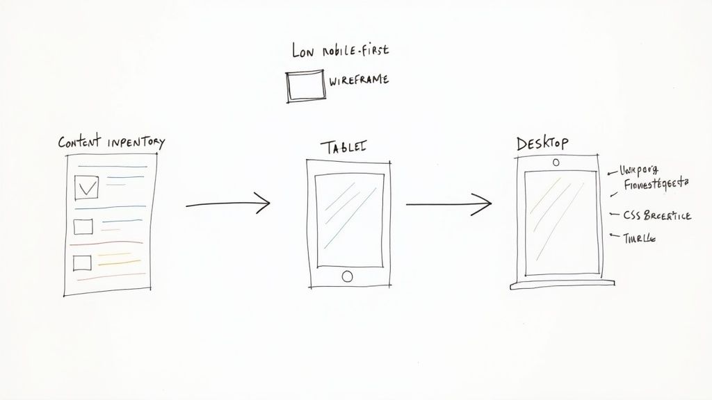
Start with a Content Inventory
Before you even think about sketching a layout, you have to know what you’re building with. The first, and most critical, step is conducting a content inventory. This means cataloging every single piece of content you have—text, images, videos, data tables—and then figuring out its purpose and priority.
Think of it like packing for a long trip with only a tiny backpack. You lay everything out, decide what’s absolutely essential for the journey, and leave the rest behind. This forces tough but necessary conversations about what your users really need to do.
A rigorous content inventory isn't just an audit; it's a strategic exercise that defines the core value proposition of your experience. It ensures the most critical information is presented first, directly aligning with mobile first design principles.
Once you have this prioritized list, you can organize it into a clear hierarchy. This hierarchy becomes the blueprint for your design, dictating the flow of information and guiding the user’s journey on the smallest screen.
Create Low-Fidelity Mobile Wireframes
With your content strategy nailed down, it’s time to start sketching low-fidelity mobile wireframes. These are simple, block-level diagrams that focus entirely on layout, structure, and user flow. Forget about colors, fonts, or branding for now. The goal here is to solve the core usability puzzles for the mobile experience before you invest a single second in polished visuals.
This stage is all about speed and iteration. Using tools like Balsamiq, Figma, or even just a whiteboard and markers, your team can quickly explore different ways to arrange the prioritized content. Does the navigation feel intuitive? Are the calls-to-action obvious and easy to tap? These are the kinds of questions you answer here. Wireframing is a foundational part of the design journey; for a deeper dive, you can explore the fundamental steps of the UX design process to see how it all fits together.
Define Logical CSS Breakpoints
Once your mobile wireframes feel solid, you can start planning how the design will adapt to larger screens. This is where CSS breakpoints come into play. A breakpoint is simply the point at which your website's layout shifts to better suit a different screen size.
Instead of designing for specific devices—the "iPhone layout" or the "iPad layout"—a true mobile-first approach uses content-driven breakpoints. You should only add a breakpoint when the design actually needs it, like when a line of text gets uncomfortably long or a layout starts to look awkward.
This method keeps your design fluid and ensures it looks great on any screen, not just a few popular ones. That said, common starting points are:
- Small screen (mobile): Up to 600px
- Medium screen (tablet): 600px to 900px
- Large screen (desktop): 900px and up
Scale Up with Progressive Enhancement
With your mobile foundation and breakpoints in place, you're finally ready to scale the design up for tablets and desktops. This is the progressive enhancement phase. Here, you strategically add features, content, and complexity that enhance the experience on larger screens but aren't essential for core functionality on mobile.
For instance, a complex data table might be simplified into a tappable list on a phone. On a desktop, you can show the full table with advanced sorting and filtering tools. As you build out your workflow, it's also smart to explore efficient development tools. The Flutter framework, for example, is excellent for building native apps across different platforms. This approach ensures the experience is enriched—not cluttered—as screen real estate grows, creating a perfectly tailored experience for every user.
Key Mobile UI Patterns in Action
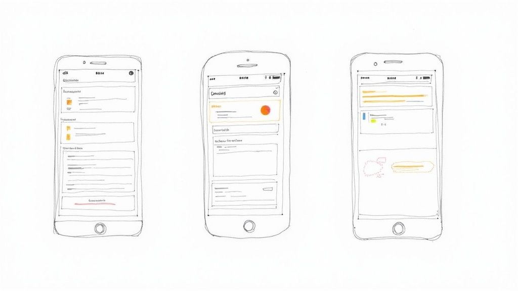
Talking about mobile-first principles is one thing, but actually putting them to work is where the magic happens. This is where UI patterns come in—they're the time-tested, reusable solutions for the common design puzzles you'll face on a small screen.
Think of them as the shared language of mobile design. These patterns create familiar, intuitive interactions for users, so your app feels natural from the very first tap. By building your foundation on these mobile-native solutions, you set the stage for an experience that can gracefully expand as more screen space becomes available.
Let's dive into some of the most crucial UI patterns and see how they turn abstract concepts into interfaces that just work.
Hiding Complexity With The Hamburger Menu
You’ve seen it a thousand times: those three little horizontal lines tucked into a corner. That's the hamburger menu, and it's perhaps the most iconic pattern in mobile design. Its job is simple but essential: get complex navigation out of the way so the user can focus on the content.
This pattern is the embodiment of mobile-first thinking. A desktop site can afford a sprawling navigation bar, but that same approach on a phone would be a complete mess. The hamburger menu tidies it all up behind a single, recognizable touchpoint.
By tucking away secondary options, the hamburger menu forces designers to prioritize what truly matters, ensuring the user's primary journey is always front and center.
When tapped, a navigation drawer typically slides into view with the full menu. As the design moves to a tablet or desktop, this hidden menu can unfurl into a traditional, always-visible navigation bar, making smart use of the extra room.
Taming Dense Content With Accordions
So, you have a ton of information to present but only a few inches of vertical space. How do you avoid creating an endless wall of text? Enter the accordion. This clever pattern organizes content into collapsible sections, giving users a high-level summary they can dive into as they please.
Accordions are a lifesaver for things like FAQ pages, detailed product specs, or lengthy forms. Instead of overwhelming users, you present information in neat, bite-sized chunks. It's a perfect example of progressive disclosure—revealing complexity only when the user asks for it.
A few reasons why accordions are so effective:
- They cut down on scrolling: This makes pages feel much shorter and far less intimidating.
- They make scanning easy: Users can quickly read the headers to find exactly what they're looking for.
- They create focus: Expanding one section helps the user concentrate on that specific piece of information.
Like other mobile-first patterns, accordions adapt beautifully. On a big screen, you might have enough space to show all the content at once or perhaps convert the sections into a tabbed interface. This is a classic example of applying the best practices for user interface design to ensure a great experience on any device.
Organizing Everything With Card-Based Layouts
Cards are essentially neat little rectangles of information that act as a portal to more detail. Each card bundles related content—like a picture, a headline, and a short snippet of text—into one cohesive unit. This modular design is a perfect fit for mobile screens.
Just look at the feeds on apps like Instagram or Pinterest. Every post is a self-contained card, making the content stream incredibly easy to scan and interact with. They stack perfectly in a single column on a phone, creating a clean, organized flow.
But the real power of cards becomes clear as the screen gets wider. Those same cards can effortlessly reflow into a multi-column grid, filling the space on a tablet or desktop without needing a complete overhaul. This built-in flexibility makes cards one of the most versatile tools in any mobile-first designer's kit.
To help you choose the right navigation, here’s a quick breakdown of common patterns and where they work best.
Key Mobile UI Navigation Patterns
| Pattern | Best For | Considerations |
|---|---|---|
| Hamburger Menu | Hiding extensive, non-critical navigation links (5+ items). Ideal for keeping the main screen uncluttered. | Can reduce discoverability of menu items. The icon must be placed in a standard, expected location (top-left/right). |
| Tab Bar | A few (3-5) top-level destinations of equal importance that users need to switch between frequently. | Limited to a small number of items. Icons should be universally recognizable, often paired with text labels for clarity. |
| Cards | Displaying browsable, heterogeneous content in a feed or collection (e.g., articles, products, photos). | Requires clear visual hierarchy within each card. Ensure tap targets are large enough and spacing prevents mis-taps. |
| Accordions | Condensing long pages of content with distinct sections, like FAQs or detailed settings menus. | Overuse can create a frustrating "pogo-sticking" effect. Headers must be clear and descriptive of the content within. |
Choosing the right pattern isn't just about aesthetics; it’s about making your app feel intuitive and effortless for the user, regardless of the device they're using.
How to Test and Measure Your Design's Success
A brilliant design is just a well-educated guess until it meets real users and hard data. After you've poured your effort into mobile-first principles, the most important step comes next: testing, measuring, and refining. This is the process that turns a thoughtfully designed product into one that actually delivers results.
Think of it as creating a feedback loop. This isn't about hunting for flaws; it's about uncovering opportunities. By blending direct user feedback with cold, hard performance metrics, you get the full story of how your design is really working. This is how you prove its value and make smart, data-driven improvements.
Combining Qualitative and Quantitative Testing
To truly understand your design's impact, you need two kinds of data. Quantitative data gives you the what—the raw numbers like conversion rates or page load times. On the other hand, qualitative data gives you the why—the human context behind those numbers, gathered through user feedback and observation.
Relying on just one tells an incomplete story. A high bounce rate (the what) is definitely a red flag, but watching a user get completely lost trying to find your contact page during a usability test (the why) shows you exactly what you need to fix. A solid testing strategy always uses both.
Hands-On Usability Testing
There's simply no substitute for watching someone use your product on their phone. This is the heart of usability testing. The whole point is to spot the friction points and confusing moments that you, as the creator, are naturally blind to.
Set up simple tasks for them to complete, like "find the shipping policy" or "buy this t-shirt in a size medium." Then, just watch. Where do they pause? What makes them squint or tap furiously? These observations are pure gold. For anyone new to this, exploring different usability testing methods can give you a great framework for getting started.
A design isn't truly finished until a real user has successfully and easily completed their goal. Usability testing is the bridge between your design and the user's reality.
Auditing Performance and Speed
On mobile, performance isn't just a feature; it's the feature. A slow, janky website is a broken website in a user's eyes. That's why regularly checking your site's technical performance is absolutely non-negotiable.
Tools like Google PageSpeed Insights and GTmetrix are your best friends here. They crawl your site and give you a report card based on crucial performance indicators.
Pay close attention to these metrics:
- Largest Contentful Paint (LCP): How quickly the main, viewable content loads. You should be aiming for under 2.5 seconds.
- First Input Delay (FID): How fast your page responds when a user first taps or clicks. Shoot for less than 100 milliseconds.
- Cumulative Layout Shift (CLS): This measures visual stability—stopping those annoying moments when content jumps around as the page loads.
These performance audits provide a clear, quantitative baseline. Improving these numbers doesn't just make for a better user experience; it can also give your SEO rankings a nice boost.
Tracking Key Business Metrics
At the end of the day, your design has to serve the business's goals. Tracking the right metrics is how you connect the dots between your mobile-first efforts and the bottom line.
Keep a close eye on these data points in your analytics:
- Mobile Conversion Rate: The percentage of mobile visitors who do what you want them to do, whether that’s buying a product or signing up. This is your number-one indicator of success.
- Task Completion Rate: A direct measurement from your usability tests, this tells you how many users could actually finish the tasks you gave them.
- Bounce Rate: The percentage of people who land on a page and leave without doing anything else. A high mobile bounce rate often screams performance problems or a confusing layout.
- Session Duration: How long people are sticking around. Longer sessions generally mean users are more engaged with your content.
The shift to mobile-first can have a huge impact on these numbers. Reports have shown that a mobile-first approach can cut bounce rates by up to 30% and lift conversion rates by 20% when compared to older desktop-first strategies. You can discover more insights about these performance gains on thinkforwardmedia.com and see how this approach pays off for businesses in the real world.
Clearing Up Common Questions About Mobile-First Design
When teams first start thinking mobile-first, a lot of questions pop up. It’s completely normal to wonder about the finer points, especially when you're trying to figure out how it differs from other approaches or if it’s truly the right call for your project.
Getting these details straight from the beginning helps get everyone on the same page. Let's walk through some of the most common questions that come up.
What’s The Difference Between Mobile-First and Responsive Design?
This is probably the number one question, and the distinction is important. Think of it like this: responsive design is the technical result, while mobile-first is the strategic process. A responsive site can reflow its layout to fit any screen, which is great.
But you can build a responsive site by designing for a desktop first and then just shrinking everything down. That's not mobile-first. The mobile-first process is about designing for the smallest screen from the very beginning and then progressively adding features and complexity as the screen gets bigger. The final product is naturally responsive, but it’s built on a much more focused foundation.
Should We Always Use a Mobile-First Approach?
For most projects out there today, the answer is a resounding yes. Since the majority of web traffic now comes from phones, starting there just makes sense. But there are a few exceptions where a desktop-first approach is still the smarter move.
Imagine you're building a complex, data-heavy web application like a specialized analytics dashboard or a company's internal CRM. If you know for a fact that 95% of your users are on large monitors at their desks, it makes perfect sense to design for that experience first. The golden rule is to let your user data—not just a trend—drive your strategy.
A mobile-first strategy doesn’t just improve the user experience; it directly impacts your visibility in search results. It’s a crucial component of modern technical SEO.
How Does Mobile-First Design Affect SEO?
It has a massive impact. Back in 2019, Google switched over to mobile-first indexing. In simple terms, this means Google primarily looks at the mobile version of your website to understand and rank it in search results.
If your mobile site is a slow, watered-down version of your desktop site, your rankings will take a hit. By designing a fast, content-complete mobile experience right from the start, you're building your site exactly the way Google wants to see it. This gives you a huge leg up in search visibility and organic traffic.
What Are The Biggest Hurdles When Making the Switch?
Honestly, the biggest challenge is usually a mindset shift. Designers and developers who are used to the endless real estate of a desktop monitor often struggle with the constraints of a small screen at first. It forces you to be ruthless about prioritizing what's truly important.
The other hurdle is simply changing old habits and managing expectations. It can take some effort to explain to clients or stakeholders why you're starting with a "simple" mobile view. Showing them interactive mobile prototypes early on is one of the best ways to get them excited and on board with the process.