Mastering the UX Design Process Steps
It's tempting to view the UX design process as a simple, step-by-step checklist. But in my experience, that's one of the biggest mistakes a designer can make. The reality is much more fluid and human.
Think of it less as a rigid set of instructions and more as an adaptable, cyclical framework for solving real-world problems. Great design isn't born from blindly following steps; it comes from a deep sense of empathy for the people you're designing for.
The 4 Key Phases of the UX Design Process

While the process is flexible, it generally moves through four core phases: understanding user needs, exploring potential solutions, materializing those designs, and finally, validating them with actual users. The magic happens in how you adapt and revisit these stages based on the unique goals, budget, and timeline of your project.
It's Always Been About People
This human-centered mindset isn't a recent trend. Long before cognitive scientist Don Norman coined the term "User Experience Design" in the early 1990s, pioneers were already laying the groundwork.
Back in the 19th century, figures like Frederick Winslow Taylor and Henry Ford were studying how workers interacted with their tools to make things more efficient. Fast-forward to 1955, when industrial engineer Henry Dreyfuss published his book, Designing for People. His core argument was simple but powerful: we should design products that create as little friction as possible for the user.
These early innovators established the fundamental idea of focusing on human-machine interaction, which is still the heart and soul of what we do in UX today.
The Iterative Cycle of Design
Because the UX process is built on learning, it's never really "finished." It's a continuous loop of building, testing, and refining. The four core phases give us a high-level map for this journey.
Here's a quick breakdown of what each phase entails.
Core Phases of the UX Design Process
| Phase | Primary Goal | Key Activities |
|---|---|---|
| Understand | Gain deep empathy for users and align on business objectives. | User interviews, surveys, competitive analysis, stakeholder workshops. |
| Explore | Generate a wide range of ideas and define the product's structure. | Brainstorming, user journey mapping, information architecture, sketching. |
| Materialize | Turn abstract concepts into tangible, testable designs. | Wireframing, creating high-fidelity mockups, building interactive prototypes. |
| Validate | Gather feedback from real users to identify what works and what doesn't. | Usability testing, A/B testing, analyzing user feedback, preference tests. |
Ultimately, this cycle ensures you're constantly moving closer to a solution that truly resonates with your audience.
The secret to exceptional UX isn't just following the process; it's knowing when to bend the rules. Flexibility is your most powerful tool.
This means being ready to jump back to an earlier phase. Did user testing reveal a fundamental flaw in your concept? It’s time to go back to the Explore phase. That's not a failure; it's the process working exactly as it should.
Thinking this way allows for far more creativity and responsiveness. It also helps to understand broader project management frameworks. For example, learning the principles of Agile Methodology can be incredibly helpful for integrating design work into fast-paced development cycles.
This mindset shift is what separates good designers from great ones. It’s about building a foundation to create products that people don’t just use, but genuinely find helpful and even enjoyable.
Uncovering User Needs and Business Goals
Great user experiences aren't born from a flash of genius or a lucky guess. They're built on a solid foundation: a deep, evidence-based understanding of the people you’re designing for and the business you're trying to serve.
This initial discovery work is easily the most critical part of the entire UX design process. I've seen it time and again—teams that rush or skip this stage almost always build a product that nobody wants or needs. The goal here is simple but crucial: move from risky assumptions to a shared, evidence-based understanding. We need to nail down the answers to two fundamental questions: "Who are our users?" and "What problem are we truly solving for them that also moves the business forward?"
Aligning Business Objectives and User Needs
Before you can truly empathize with your users, you have to understand the business landscape. This alignment kicks off with stakeholder interviews. These aren't just casual chats; they are targeted conversations designed to pull out essential information about business goals, technical limitations, and what success actually looks like to the people funding the project.
It’s vital to get a mix of perspectives. Talk to the CEO, product managers, engineers, and especially the customer support agents on the front lines. Each person holds a unique piece of the puzzle. For a deeper dive into this, there are some great methods for identifying customer needs.
The insights you gather here are pure gold. They set the scope and direction for everything that follows, ensuring your design solutions are not only user-friendly but also viable and valuable for the company. This clarity is also a cornerstone of good project planning, a topic we cover in our guide on project planning for software development.
Gathering Actionable Insights from Users
With a clear picture of the business goals, it’s time to shift your focus to the star of the show: the user. This is where user research turns abstract ideas into human-centered design. It's how you step out of your own biases and into the world of your audience. While there are tons of methods, a few are my go-to's for their effectiveness.
- User Interviews: One-on-one conversations are perfect for digging deep into a user’s behaviors, motivations, and frustrations. The secret is to ask open-ended questions that encourage storytelling, not just one-word answers.
- Surveys and Questionnaires: When you need quantitative data from a bigger crowd, surveys are fantastic. They help you validate hunches from your interviews and spot trends you might otherwise miss. Pro tip: keep them short and focused. A long survey is a quickly abandoned survey.
- Contextual Inquiry: This is a fancy term for a simple idea: go watch users in their natural habitat. Observing someone struggle with an existing tool or process reveals powerful insights they'd never think to tell you in an interview.
Always remember, the goal isn't just to listen to what users say but to observe what they do. The gap between the two is often where the most important design opportunities hide.
Don’t confuse process for outcome—knowing UX practices is important, but not sufficient. More important is a UX mindset—a commitment to seeing the world from the perspective of your users and doing everything you can to make sure what you’re doing makes sense to them.
This mindset is what transforms raw data into design fuel.
Synthesizing Research into Powerful Tools
So you’ve got piles of interview transcripts, survey results, and observation notes. It's messy. The real magic happens when you synthesize all that raw data into clear, actionable artifacts that your entire team can get behind. Two of the most powerful tools for this are user personas and empathy maps.
User Personas
A user persona isn't just a demographic profile; it's a fictional character you create to represent a key user group. It’s a vivid summary of their goals, motivations, and pain points, all rolled into one.
A good persona feels like a real person. Give them a name, a photo, and a believable backstory. This simple act makes it so much easier for everyone—from developers to marketers—to ask the most important question throughout the project: "What would Sarah do?"
Empathy Maps
An empathy map is a collaborative whiteboard exercise that helps the team get inside a user's head. It’s typically split into four simple quadrants:
- Says: What are some direct quotes you pulled from user interviews?
- Thinks: What's going on inside their head that they might not say out loud? This is where you infer their real motivations and worries.
- Feels: What emotions are they experiencing? Frustrated? Confused? Delighted?
- Does: What actions and behaviors did you actually observe? What steps do they take to get things done?
By working through an empathy map, you stop seeing users as data points and start understanding their experience on a deeply human level. These tools are what ensure the user stays at the heart of every decision you make in the ux design process steps that follow.
Generating and Refining Your Core Ideas
Okay, you've done the deep dive into research. You understand your users, and you know the business goals inside and out. Now, it's time to switch gears from analysis to pure creativity. This is the ideation phase, where you build the bridge between all that valuable research and an actual, tangible design.
This isn't about waiting for a single "eureka!" moment. True innovation in UX comes from a structured, collaborative process. The goal here is to go wide first—explore every possibility, no matter how wild—before you start narrowing things down to the most viable concepts.
Sparking Innovation with Structured Brainstorming
Just getting everyone in a room to "brainstorm" can be a recipe for chaos, where the loudest person in the room wins. To get real, actionable ideas, you need a framework. One of the best I've ever used is the "How Might We" (HMW) exercise.
This simple technique is brilliant because it reframes problems into opportunities. So, instead of stating a problem like, "Users can't find the search bar," you'd ask, "How might we make the search function impossible to miss?" This slight shift in language encourages positive, solution-focused thinking and gets the creative juices flowing.
The leap between research insight and the design action is the most important part of a UX designer’s job. It's where raw data becomes a tangible vision.
Another fantastic tool, borrowed from the world of film, is storyboarding. Sketching out a user's journey, panel by panel, forces you to think about the context of their interaction. It helps you visualize their entire experience, making it easier to spot potential roadblocks and moments of frustration before you've written a single line of code.
From Ideas to Structure
Once your walls are covered in sticky notes full of promising ideas, you need to bring order to the chaos. This is where you translate those abstract concepts into a logical framework that will become the backbone of your design. The two key deliverables here are user flows and information architecture (IA).
A user flow is essentially a map that charts out the path a user takes to get something done. Think about an e-commerce site: a user flow would diagram every single step from landing on the homepage to completing a purchase. This forces you to think through the journey sequentially, ensuring it feels intuitive and seamless.
Information architecture, on the other hand, is the art and science of organizing and labeling everything within your product. A great IA means users can find what they need without even thinking about it. Get it wrong, and they'll feel lost and frustrated.
Prioritizing What Truly Matters
It's so easy to get excited and want to build every single feature you've dreamed up. But that's a fast track to a bloated, confusing product that never ships. This is why prioritization is one of the most critical ux design process steps. It's about focusing your team's precious time and energy on what delivers the most bang for the buck—for both the user and the business.
A classic, battle-tested framework for this is the MoSCoW method:
- Must-Haves: These are the absolute, non-negotiable features. Without them, the product is fundamentally broken.
- Should-Haves: These are important and add significant value, but the product could still launch without them if push came to shove.
- Could-Haves: The "nice-to-haves." These are great additions if you have the time and resources, but they're the first on the chopping block.
- Won't-Haves: Features that are explicitly out of scope for this version. This is just as important for setting clear boundaries.
Using a framework like this forces you to have honest conversations and make tough decisions, which is essential for defining your minimum viable product (MVP). If you want to dive deeper into this, our guide on how to define project scope offers more great strategies for keeping your project focused and on track.
By the end of this phase, you won't have a pixel-perfect design. What you will have is something far more valuable: a clear, prioritized blueprint for success, ready for the next stage of the process.
From Wireframes to Prototypes: Giving Your Design a Pulse
With a clear, prioritized blueprint from your research, it's time for the fun part: bringing your ideas into the visual world. This is where abstract user flows and feature lists start to look and feel like a real product. You’re moving from concept to concrete, creating the tangible elements your users will eventually click, tap, and swipe.
This stage is a journey, not a single step. It’s about building up detail layer by layer, starting with rough sketches and ending with a detailed, interactive model. Each fidelity level has a specific job—to validate structure, refine aesthetics, and simulate the final experience. Trust me, getting this right now saves countless hours of development headaches later. It’s a core part of the ux design process steps for a reason.
This iterative approach isn’t some new trend. The core idea was cemented way back in the 1970s at Xerox's legendary Palo Alto Research Center (PARC). This is where psychologists and engineers first teamed up to create things we now take for granted, like the graphical user interface (GUI). Their work forever shifted product development toward user-centric thinking. You can get a great overview of how PARC's early work shaped the design process we use today from the UX Design Institute.
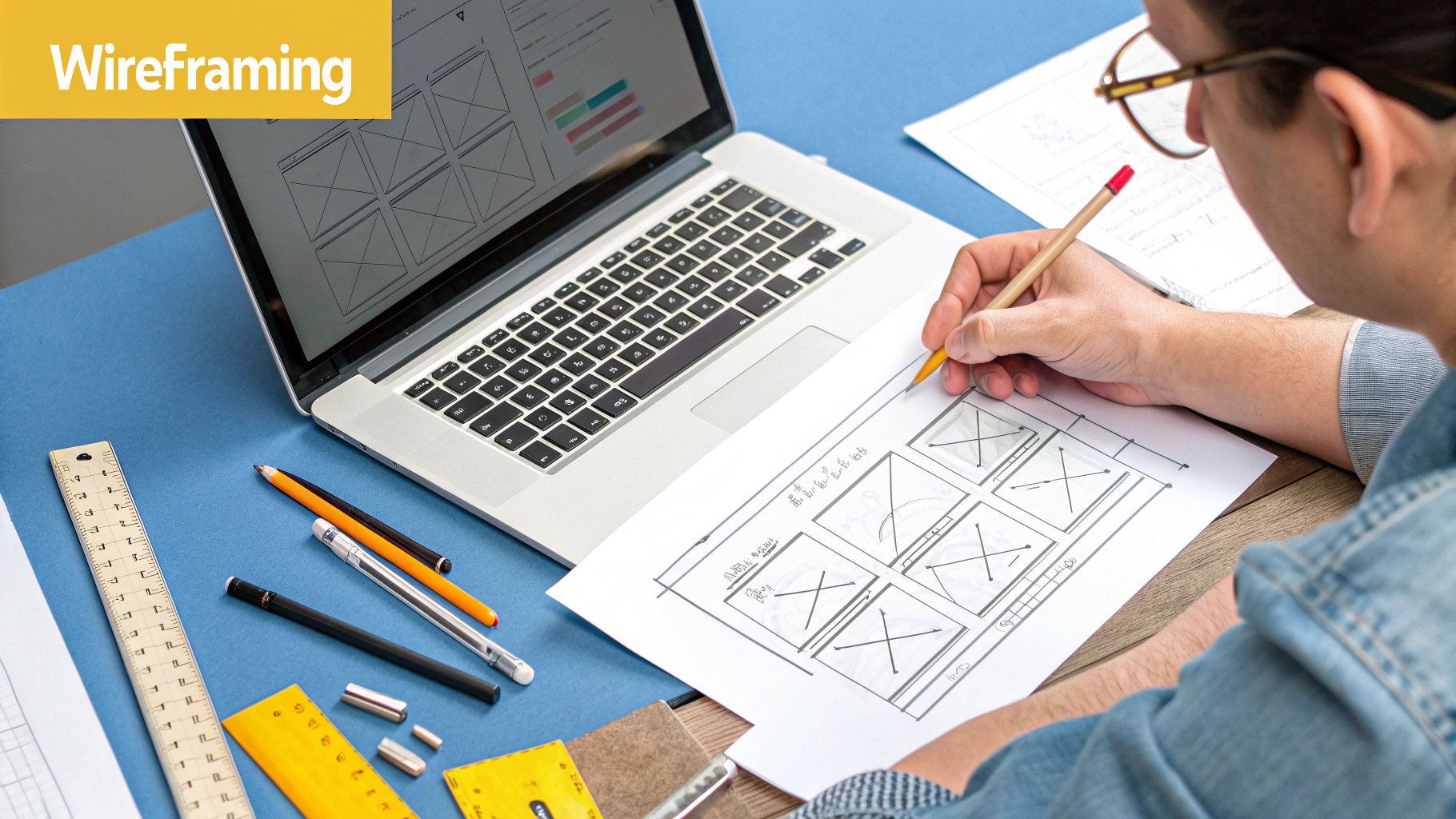
Starting with Low-Fidelity Wireframes
First up: low-fidelity wireframes. I like to call these the architectural blueprints of your product. They are simple, bare-bones layouts, often just black and white, that focus purely on structure, content hierarchy, and basic functionality. Nothing more.
And I can't stress this enough: resist the urge to play with colors, fonts, or logos at this stage. The entire point of a low-fi wireframe is to answer one fundamental question: "Does this layout work?" Keeping it simple forces everyone—you, your team, your stakeholders—to focus on the bones of the experience without getting distracted by the paint color.
Whether you're sketching on a whiteboard or using a simple digital tool, these wireframes are incredibly efficient. You can test out a half-dozen layout ideas in an afternoon and get quick feedback on the core structure. It’s a lot easier to erase a box on a whiteboard than it is to rebuild a fully coded screen.
Creating High-Fidelity Mockups
Once you're confident in the structural foundation, it's time to build high-fidelity mockups. This is where you apply the visual skin—the colors, typography, imagery, and branding that give the product its personality. Mockups are static but pixel-perfect images of what the final screens will look like.
To do this effectively, you need a solid design system. This becomes your single source of truth for every visual and interactive element.
A design system isn't just a style guide; it's a living library of reusable components and clear standards that ensures consistency across the entire product. It's the secret to scaling design without creating chaos.
A good design system should always include:
- UI Components: Your library of buttons, forms, navigation bars, and modals, complete with defined states (like hover, active, or disabled).
- Typography Scale: A defined hierarchy for headings and body copy that ensures readability and visual rhythm.
- Color Palette: Your primary, secondary, and accent colors, with clear rules on how to use them to convey meaning and brand identity.
- Iconography: A unified set of icons that are visually consistent and instantly recognizable.
Building this system as you go ensures every part of your product feels like it belongs to a cohesive whole.
Building Interactive Prototypes
The last step before handoff is creating an interactive prototype. Mockups show how a product looks, but prototypes show how it feels. By linking your static screens together, you create a clickable simulation that allows people to navigate through flows just as they would on a live app.
This is one of the most powerful tools in our entire UX toolkit. A prototype lets you test the actual usability of your design. You can hand it to a user and watch them try to complete a task, quickly spotting where they get stuck or confused—all before a developer writes a single line of code.
For instance, you can build a prototype that lets someone try the entire checkout process, from adding an item to their cart to confirming the purchase. Watching a real person go through that flow will reveal friction points you would never have noticed just by looking at the static designs.
Choosing the Right Tools
There’s no shortage of great software out there for wireframing and prototyping. The "best" one really boils down to your team’s workflow and budget.
| Tool | Best For | Key Feature |
|---|---|---|
| Figma | Collaborative, all-in-one design | Its real-time collaboration is unmatched, letting designers, developers, and PMs all work in the same file at once. |
| Adobe XD | Integration with Adobe Creative Cloud | A no-brainer for teams already deep in the Adobe ecosystem, with seamless connections to Photoshop and Illustrator. |
| Sketch | Mac-native UI design | A long-time favorite for Mac users with a massive library of third-party plugins that can supercharge your workflow. |
Ultimately, don't get too hung up on the tool. The principle is what matters. The goal is to move from low to high fidelity, increasing detail and interactivity at each step while gathering feedback along the way. This methodical process is what turns a good idea into a great user experience.
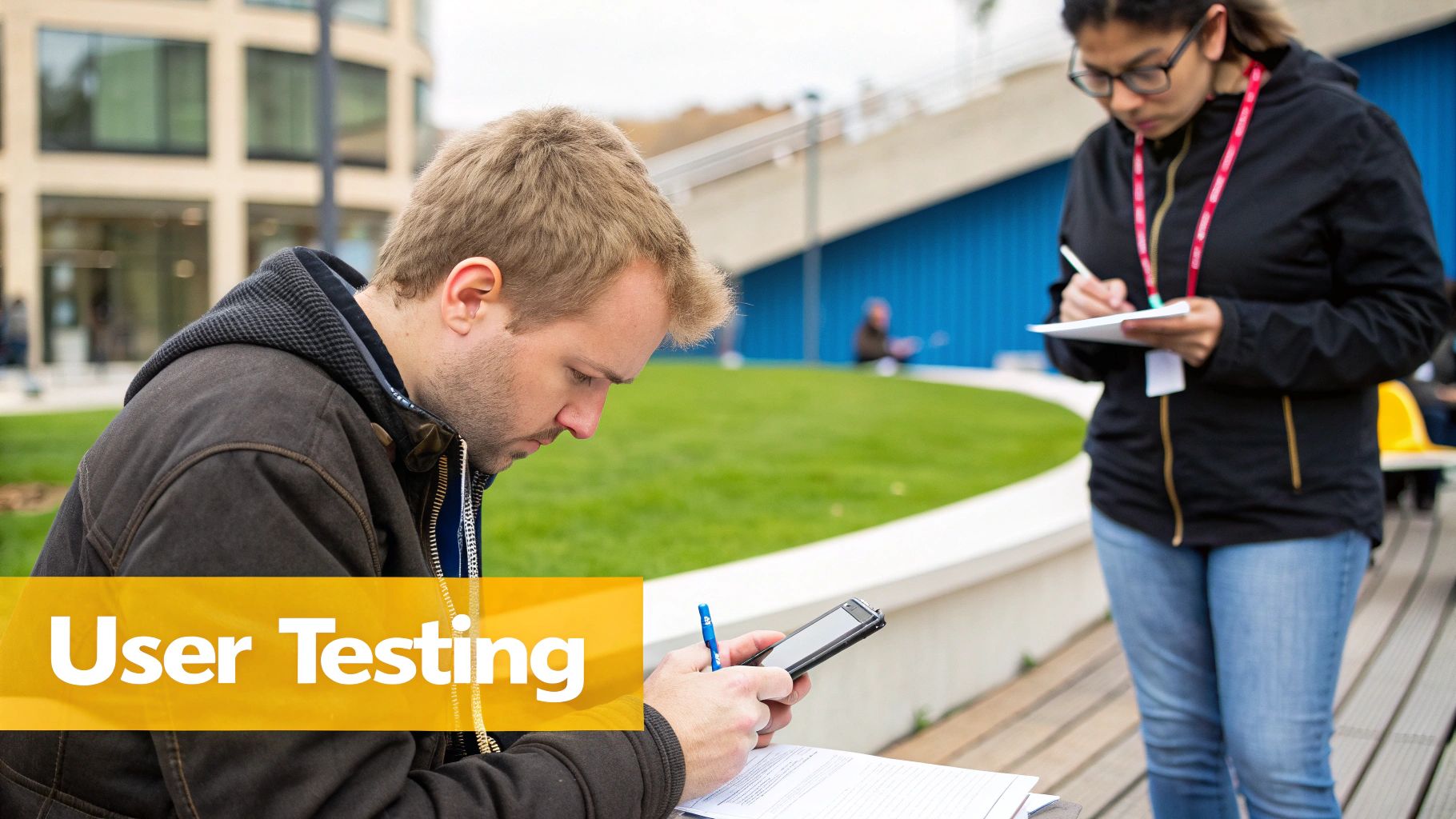
Testing and Iterating with Real Users
So, you’ve done the research, sketched out your ideas, and built some beautiful prototypes. Now for the moment of truth. Does your design actually work for real people? This is where you find out, and it's easily one of the most critical parts of the entire UX design process. It’s the step that separates a design that just looks good from one that genuinely works.
Don't think of this as a hunt for compliments. You're on an honest, humble search for flaws. The goal is to get raw, unfiltered feedback that shows you exactly where the user experience falls apart. That feedback is pure gold—it lets you fix your product before you sink a ton of time and money into development.
Recruiting the Right Participants
The feedback you get is only as good as the people you get it from. You can't just pull random people out of the hallway and expect meaningful results. Your testers have to be a close match to the user personas you built way back in the research phase.
For example, if you've designed a financial planning app for freelance artists, testing it with corporate accountants won't tell you much. Their goals, tech-savviness, and entire way of thinking about money are worlds apart.
So, how do you find the right people?
- Tap into your existing user base if you're working on a redesign. A small gift card or discount can be a great motivator.
- Use screener surveys to filter a larger group of potential testers. Ask specific questions about their habits and demographics to find your ideal match.
- Work with a recruiting agency if you have the budget. They're pros at finding very specific types of users.
Honestly, getting feedback from five to eight well-matched users is infinitely more valuable than testing with 20 people who aren't your target audience.
The biggest mistake you can make in usability testing is to fear what you might find. Embrace negative feedback—it’s not criticism, it’s a roadmap to a better product.
Discovering these pain points is the whole reason you're doing this.
Facilitating a Productive Testing Session
How you run the test is just as important as who you test with. As the facilitator, your job is to create a relaxed space where users feel comfortable being brutally honest. You are not there to sell or defend your design—you are there to watch, listen, and learn.
A solid test script is your best friend here. It should guide the user through specific scenarios and tasks without giving away the answers.
| Avoid This (Leading Question) | Try This (Open-Ended Task) |
|---|---|
| "Was it easy to find your order history?" | "Show me how you would find a list of your past orders." |
| "Do you like the new checkout button?" | "What are your thoughts on this page?" |
Keeping your questions neutral encourages users to "think aloud," giving you a live feed of their thought process. Those unfiltered, off-the-cuff comments are where the deepest insights hide.
Getting this right has a massive business impact. A well-run UX process, topped off with smart testing, delivers real results. Some reports show that companies investing in UX can see a return on investment (ROI) of up to 9,900%, all thanks to better conversion and happier customers. It's no wonder that 70% of companies see UX as a major competitive advantage. For more on this, check out this insightful article on UX Planet about how the process has evolved.
Analyzing Feedback and Planning Your Next Move
After just a few sessions, you'll start to see patterns. Don't get lost in every single piece of feedback. Look for the recurring themes—the problems that tripped up multiple users. Did three out of five people get stuck trying to update their profile? That's a huge red flag telling you exactly what to fix.
I like to pull all the findings together and sort them by severity:
- Blockers: These are the showstoppers. Issues that completely prevent someone from finishing a key task. Fix these first. No exceptions.
- Major Frustrations: Problems that cause a lot of confusion or difficulty but don't completely derail the user.
- Minor Annoyances: Small friction points that are "nice to fix" but aren't critical.
This prioritized list is your roadmap for the next design iteration. This is the "iterate" part of the process. You'll take these findings, jump back into your wireframes or prototypes, make smart, targeted changes, and, if needed, test again. This loop of building, testing, and learning is what transforms a good idea into a truly great user experience. While UX covers this entire journey, the visual and interactive components are a whole other craft. For a deeper dive, read our guide on the best practices for user interface design.
Common Questions About the UX Design Process
Even with a solid grasp of the UX design process steps, questions always pop up on the job. The framework we use is inherently flexible, and that can sometimes feel like uncertainty, whether you're a seasoned pro or just starting out. Let's dig into some of the most common questions I hear, so you can handle real-world projects with more confidence.
How Long Does the UX Design Process Typically Take?
Honestly, there's no single answer. The timeline is completely tied to the project's scope, complexity, and the team you're working with.
I've seen minor feature updates for an existing app go from initial research to testing in just a couple of weeks. On the other hand, building a complex, brand-new product from scratch? That can easily take several months, and rightfully so.
The process is also rarely a straight shot from start to finish. Most teams I've worked on, especially agile ones, operate in sprints. This means you're in a constant cycle of designing, getting feedback, and refining your work.
The most important takeaway is to never rush the foundational research and testing. A little extra time spent understanding the user and validating your ideas upfront can save immense resources and prevent costly mistakes down the road.
Getting this right isn’t about speed; it’s about effectiveness.
Is the UX Design Process Always Linear?
Almost never. We often lay out the process in clean, sequential steps—Understand, Explore, Materialize, Validate—because it’s easier to teach that way. But in reality, the work is much more fluid and cyclical. It’s less of a straight line and more of a flexible loop. You'll constantly find yourself jumping between phases as new information comes to light.
For example, you might get to a usability test and discover a core assumption you made about the user's needs was completely wrong. That’s not a failure! It’s actually a huge win because you caught it early. The right move is to jump back to the research or ideation phase and rethink your approach. This flexibility is a massive strength of the process, ensuring the final design is built on evidence, not just wishful thinking.
What Is the Difference Between UX and UI Design?
This is probably the question I get asked most, and it’s a critical distinction to understand.
UX (User Experience) Design is the big picture. It’s the entire process of making a product useful, usable, and enjoyable for someone. It covers the strategy, the user research, the information architecture, and all the testing—essentially, the whole journey a person takes.
UI (User Interface) Design is a crucial part of that journey. It’s all about the look and feel—the specific visual and interactive elements a user sees and clicks on. Think buttons, typography, color palettes, and the overall layout of the screen.
Here’s an analogy that always seems to click with people:
If a product were a house, UX design is the architectural blueprint. It’s the structural foundation and the logical flow of the rooms that makes the house livable. UI design is the interior decorating—the paint colors, the furniture, and the light fixtures that make the house beautiful and pleasant to be in.
Both are absolutely essential. A house can be structurally sound but ugly, or beautiful but impossible to navigate. For any digital product to be truly successful, you need great UX and great UI working together seamlessly.